6 tips for creating charts for social media


These days we’re as likely to be sharing data on social media as we are on a dashboard, an interactive data story or a slide. Our media consumption is now faster than ever, so if you’re going to use Twitter, LinkedIn, Instagram, Facebook or TikTok—you need a new set of design choices. And the ones you used to build good dashboards might not apply. How, then, should you design for social media?
With all visualizations, you must first consider the goal. Dashboards must be designed to allow for exploratory, guided analysis, with multiple levels of details. On social media, the idea is to make people stop and either dwell on your post or click through to an accompanying link. How long do you have to capture someone’s attention? According to Meta, people spend 1.7 seconds on a Facebook post while on their mobile devices. Your message must be clear, obvious and compelling.
1. Titles should be descriptive or provocative
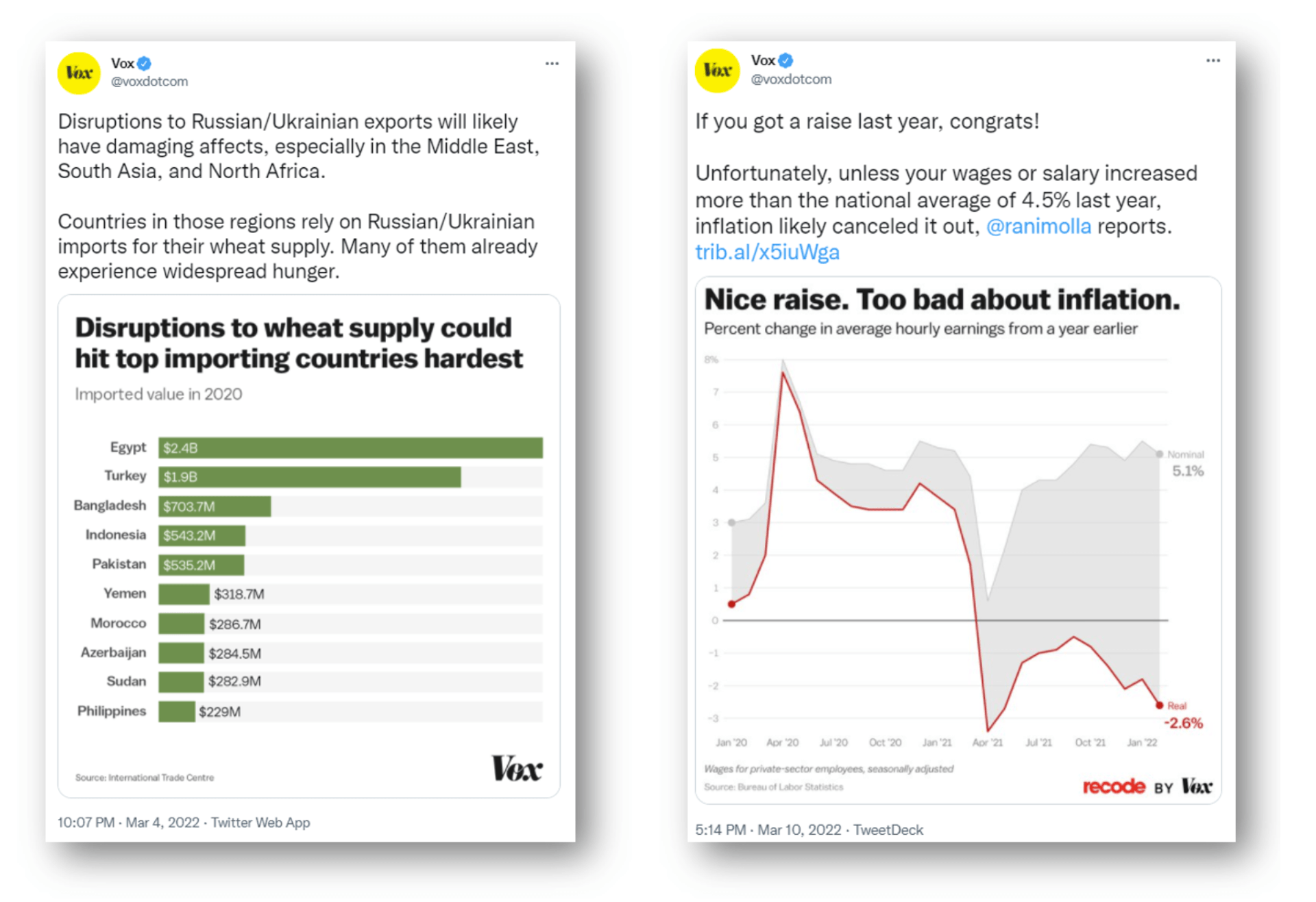
Research by Michelle Borkin and Zoya Bylinski into the memorability of data visualization showed that the title is the part of a chart most commonly recalled. Their eye-tracking work also showed that the title is the first part of a chart people focus on. Thus, whichever chart you choose, the title needs to tell the user what they are seeing. The title should use plain language and do one of three things: explain the insight contained in the chart; pose a question the viewer can answer in the chart; or perhaps be a little provocative to cause the viewer to stop and pause. The examples from Vox above keep it clear and simple. Keep it honest, though - other research has shown that the way you word a title can influence how a chart is interpreted.
2. Choose a simple chart type
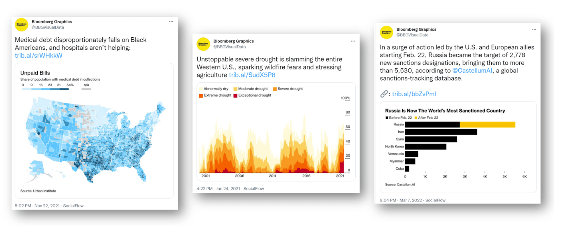
Storytelling on social media is probably not the time or place for a multi-level Sankey or ten-category chord-diagram. You need a chart that clearly shows a trend, or an outlier, or has a shape that supports your title. This means bar charts, line or area charts and maps should be your focus. As you look through the images in this post, note that they are all based on simple charts. Choose layouts that emphasise the trends in the data. The examples from Bloomberg above show how maps, area and bar charts deliver messages with speed and efficiency.
3. Animate
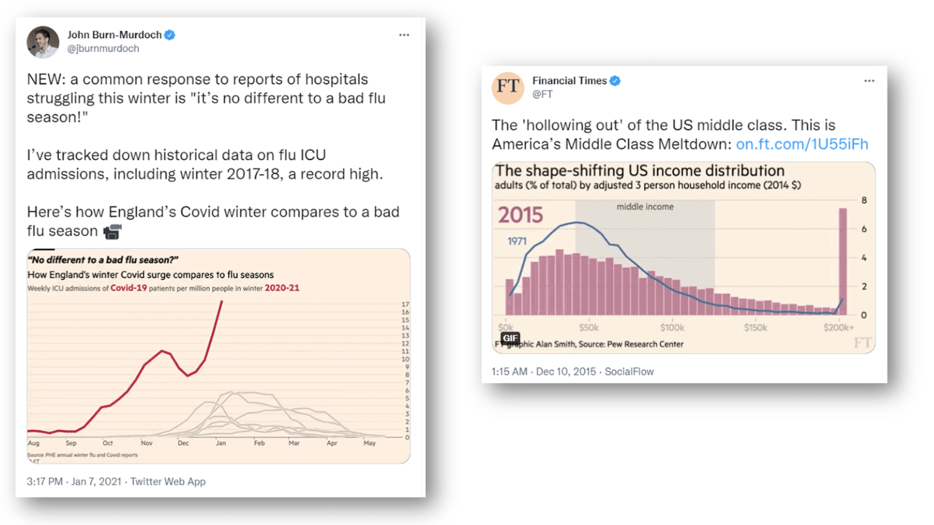
Animation captures attention and brings storytelling to your social posts. The examples above from the Financial Times show how COVID-19 compared to flu in England, and how income distribution is changing in the U.S. You can see John Burn Murdoch describe the production process of the COVID-19 chart and explain why animation works in Chart Chat 24. The COVID-19/flu example above demonstrates this well: John says that “the extension of the y-axis at the end shatters the Covid skeptics’ argument” that COVID deaths were similar to flu deaths.
For more on animation there is some excellent research by Xinhuan Shu et al on what makes animation work on social media. Also, Lena Groeger from ProPublica has an extensive collection of animated GIFs taken from tweets. Lena also talked about animation on social media in If Data Could Talk.
4. Accessibility and trust
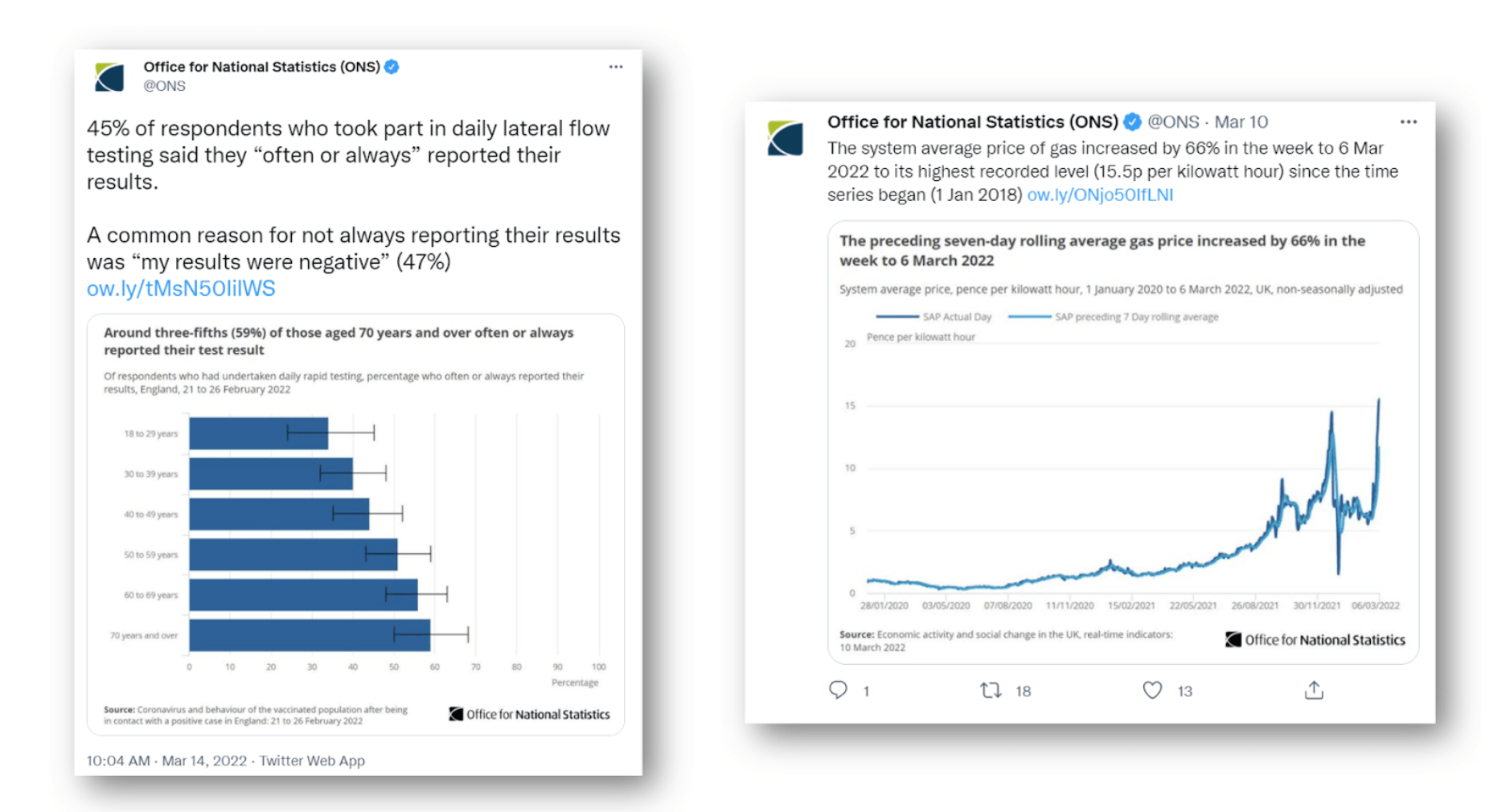
Don’t forget to add Alt Text to your charts to ensure they are accessible. The UK’s Official for National Statistics has useful guidance here.
Also, always put a data source in your chart. Social media posts can be easily reshared and, sometimes, the message might become distorted. It’s always useful to ensure the data source goes with the chart.
5. Formatting: design for mobile and simplicity
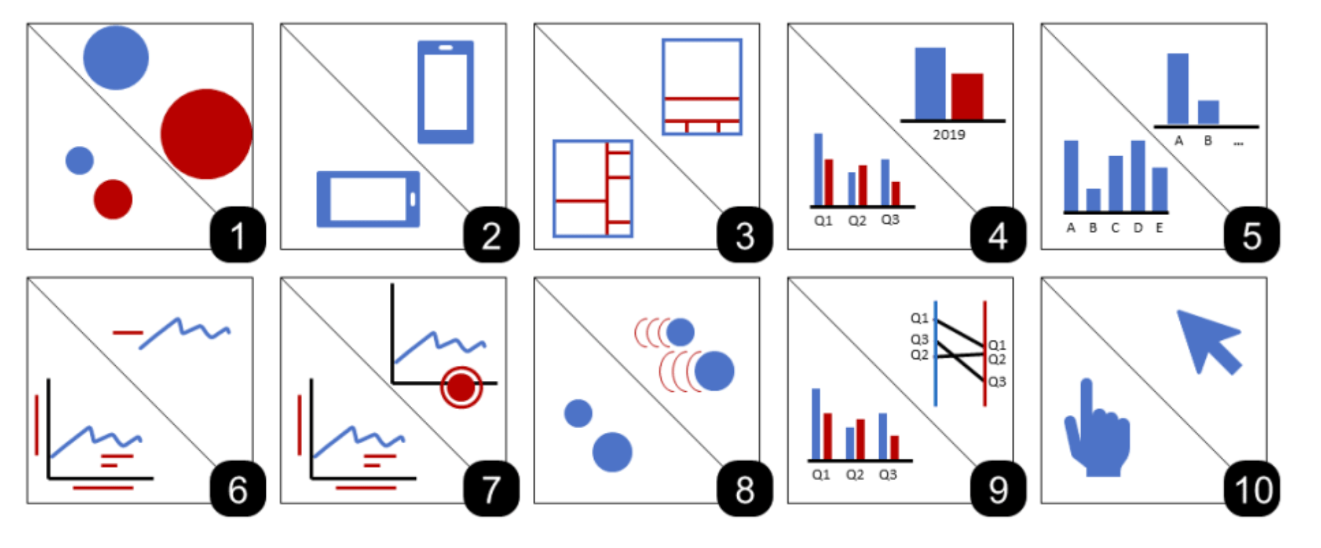
Most consumption of social media is on mobile devices, and thus your charts need to be designed to work there. Writing in the book Mobile Data Visualization, Tom Horak and Tableau’s Matt Brehmer, outlines 10 strategies for responsive visualization design, many of which can also be applied to any chart for social media. For example:
- Scale, aspect ratio, and visual hierarchy. It’s not ok to simply take your chart designed for your big home office monitor and paste it into your social post. Marks, text, axes and all other aspects need to be considered for the smaller form factor.
- Level of detail. A large-screen visualization can pack in a lot of information. For social, you want to reduce that as far as you can. Not only does it make the chart more readable, it also condenses the story of the chart such that it can be understood more quickly.
- Be judicious with annotations and guides. For operational dashboards and reports, you’d happily add annotations, axis labels, gridlines, etc. For social media, it’s better to remove as much as you can while still delivering the visual impact that conveys your message.
6. Break the rules
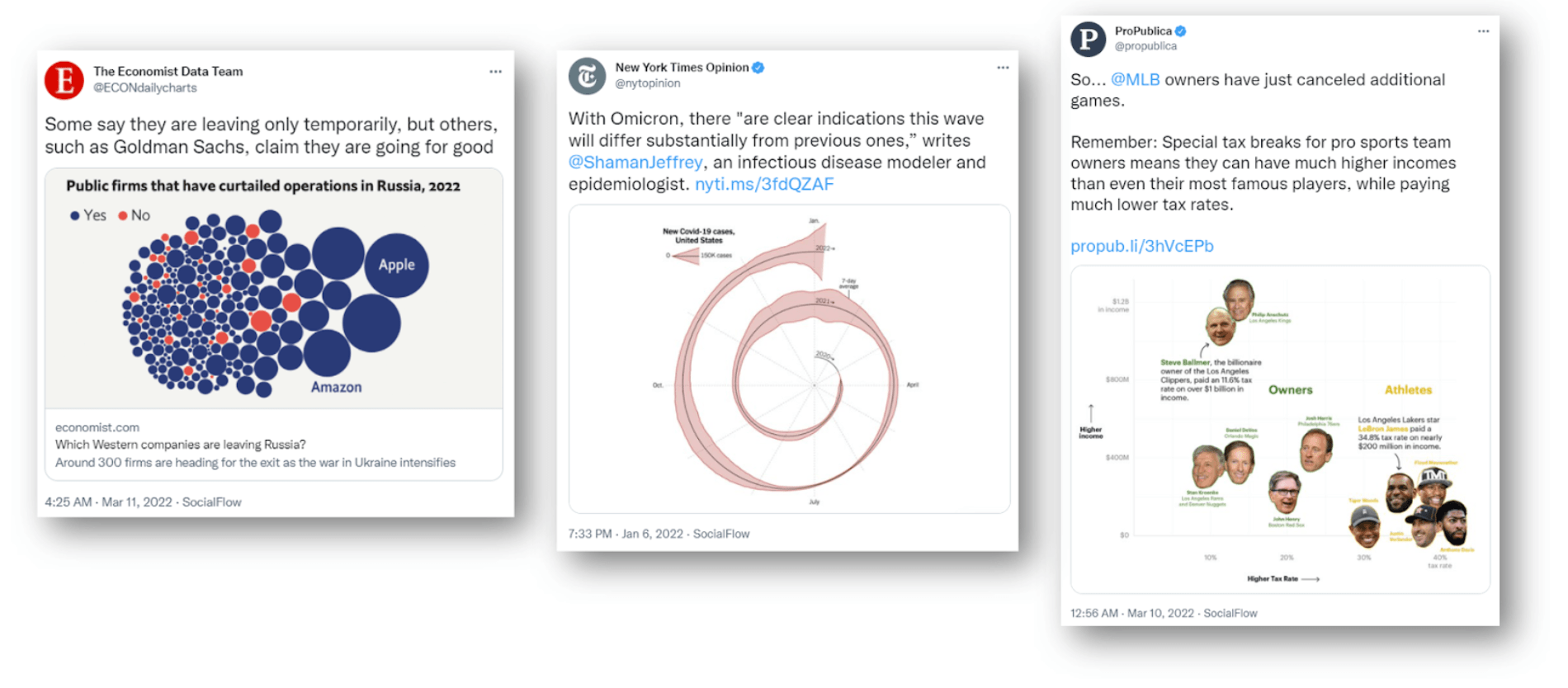
Of course, sometimes you need to break the mould to stop people scrolling. With care and thought, you can use non-standard chart types to grab attention. See the examples above from The Economist, New York Times and ProPublica.
- Bubble charts do not communicate information accurately but they are expressive, which allows The Economist to succeed in its goal. The bubbles are visually effective and show the overwhelming proportion of companies who have boycotted Russia.
- The NYT’s spiral chart generated huge amounts of conversation. Its highly unorthodox style seemed to intentionally break the rules of accepted norms, and in doing so, created massive engagement. We discussed it in Chart Chat 26; check out the conversation here.
- ProPublica, meanwhile, replaced data marks on its scatterplot with headshots of MLB team owners. Notice there’s also no title on this chart. The combination in this case is a way to stop the scroll: the viewer is likely to stop and try to parse the display.
- Sketch it? Mona Chalabi’s engaging charts adopt a hand-drawn style to make them more approachable. Joss Fong from Vox, uses print-outs and physical interactions; she says that seeing a person’s hands creates a personal connection to the chart (see Chart Chat 28).
The above is a brief summary of design advice I’d give when building charts for social media. I’d adopt a clear style and be consistent in your social media strategy. As the team at The Economist say in their great guide on designing for Instagram, “it’s okay to be flexible when needed, as long as there’s a strong template to fall back on.”
I’d like to thank Matt Brehmer from Tableau’s research team for help with this article.
Let me know on Twitter or LinkedIn what other principles you use for social media charts.
相关故事

A Guide to Mapping and Geographical Analysis in Tableau
 2024/11/15

How To Get Your Fitness Data Ready For Tableau
 2024/11/03

How to Use the Intersects() Calculation in Tableau
 2023/03/27