
Learning
The best visualisation for you
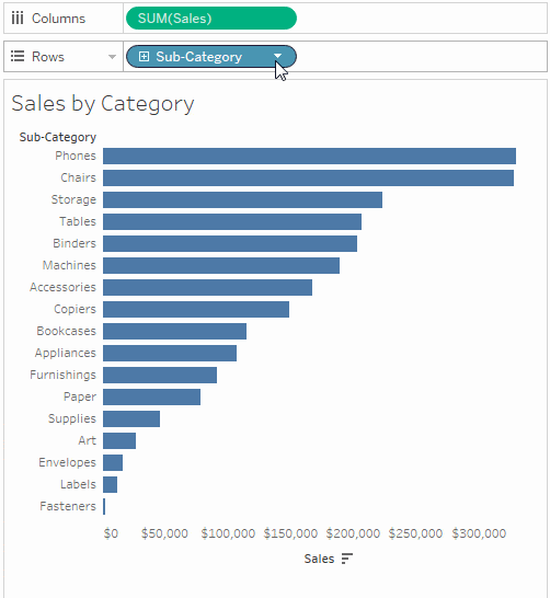
There are a lot of ways to visualise your data in Tableau. Depending on what you're analysing, some chart types work better than others. Often, a simple bar chart is all you need to communicate your findings.
A bar chart will answer most of your questions
You usually won't need a complex viz to answer all your questions. Bar charts – the most popular chart type in Tableau – make it easy to compare information at a glance. It's best to use a bar chart when comparing data across categories like sales per country. Below are a few examples of when a bar chart works better than other chart types.
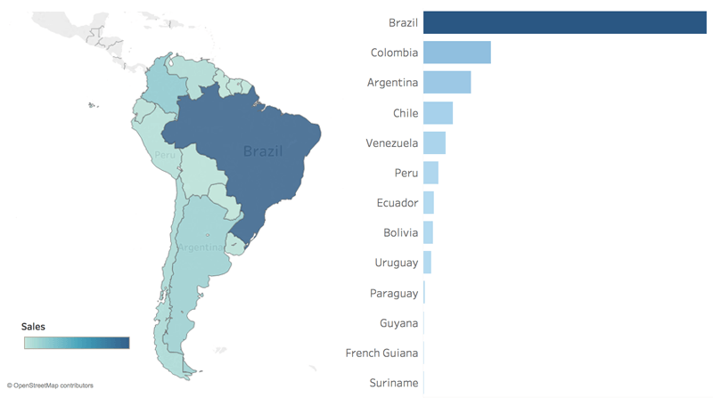
Map vs bar
Which country has the second most sales? Rather than trying to compare colours across dissimilar areas on a map, the bar chart makes comparison easy. The location of each country is not important to this analysis. The question is solely about comparing sales results. Maps are more useful when geographic features are relevant.
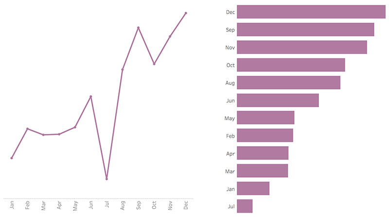
Line vs bar
How many months had lower profit than April? Although timelines are wonderful for looking at trends, it can be difficult to compare discrete points in time. A bar chart allows for faster comparison across the months themselves instead of showing profit changing over time.
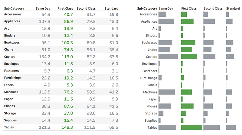
Text table vs bar
Which sub-category has the highest cost for first class orders? Text tables are great for exposing the actual numbers, but it’s harder to compare values (a mathematical operation) than it is to compare the length of bars (a preattentive attribute). For comparative questions like this, text isn’t as effective as a bar chart.
Filters = interactivity
See exactly what you’re looking for with filters. Adding a filter to your viz is simple. Just right-click on a pill and select "show filter". Filters are also the easiest way to add interactivity to your viz for your audience.
Animate your visualisation
Viz animations help you see and understand your changing data. It’s easy to track the logical steps behind data’s evolution and tell powerful data stories. Sorting, filtering, adding fields and other actions will now smoothly animate your visualisations. Choose whether to turn viz animations on or off, and decide how you’d best like to apply animations to your new workbooks.
Learn howChart types taught by the experts
Let our expert instructors teach you how to build advanced chart types in our Desktop II: Intermediate course.
What are pills?
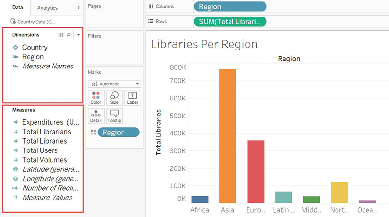
Dimensions vs measures
Dimensions contain qualitative values (such as names, dates or geographical data). You can use dimensions to categorise, segment and reveal the details in your data. Dimensions affect the level of detail in the view. Measures contain numerical, quantitative values that you can measure. You can apply calculations to them and aggregate them. When you drag a measure into the view, Tableau applies an aggregation to that measure (by default).
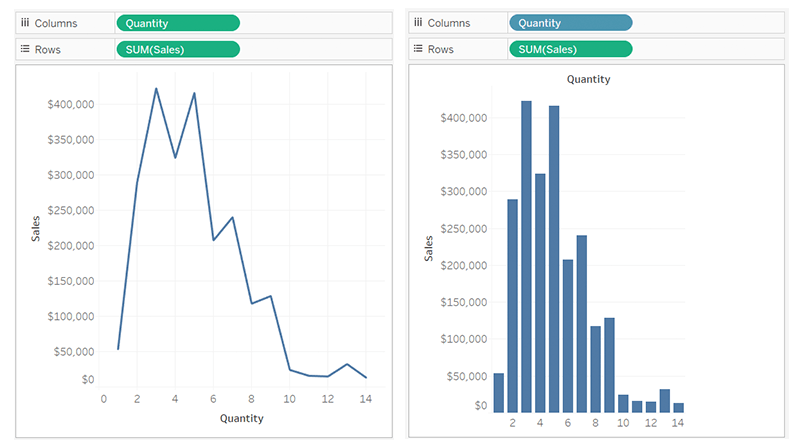
Continuous vs discrete
Tableau represents data differently in the view depending on whether the field is discrete (blue) or continuous (green). Continuous and discrete are mathematical terms. Continuous means "forming an unbroken whole, without interruption"; discrete means "individually separate and distinct".
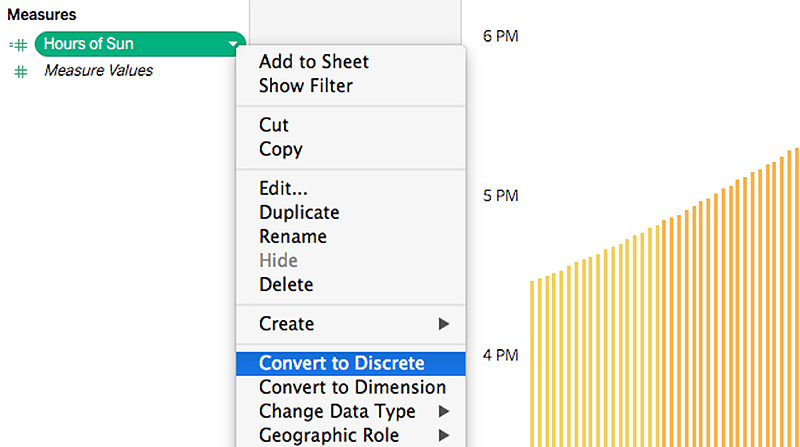
Changing default pill types
Most of the time, dimensions are discrete and measures are continuous. However, this isn’t always true. It’s possible to have a numerical dimension be continuous, or to convert a measure to be discrete. For example, right-clicking on a continuous measure brings up the options “Convert to discrete” and “Convert to dimension”. Note that those two operations – converting to discrete and converting to a dimension – are not synonymous.