
LEARNING
Dashboards done right
Tips to build effective dashboards
Get the basics down
Once you’ve created one or more views on different sheets in Tableau, you can pull them into a dashboard in two simple steps:
Step 1: Open a dashboard sheet: select Dashboard from menu, then New dashboard
Step 2: Add views to your dashboard by dragging sheets onto the dashboard
Build the best dashboard
Know your audience
Ask yourself: who am I designing this for, why do they need it and what is their level of understanding with the subject matter and data?
Use the sweet spot
Most people instinctively start scanning a screen in the upper left-hand corner. Put your most valuable data point there.
Give direction
Don't assume your audience knows where to start interacting with your dashboard. Provide guidance or instructions on how to get started.
One dashboard does not tell all
Trying to cover every business challenge with one dashboard can result in information overload for viewers. Remember: you can always create additional dashboards.
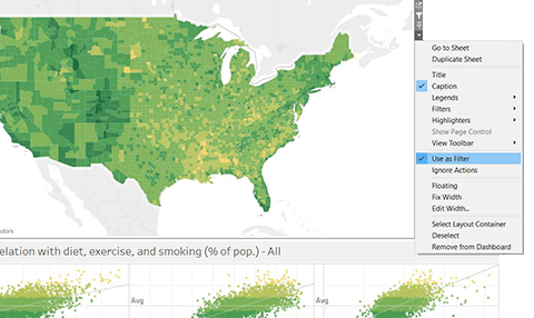
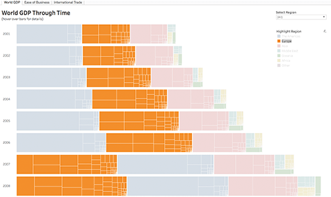
Limit views & colours
Stick with two or three main views and only use colours when meaningful. Too many views and colours can create visual overload and get in the way of analysis.
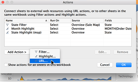
Format tooltips
Tooltips can add great context or information for the viewer without taking up any precious real estate. Using tooltips helps to build interactivity and reinforce your data’s story. For example, when you hover over a mark, you get information about just that mark.
Read the white paper
Share your work
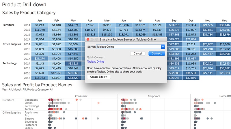
Share workbooks to Tableau Cloud or Tableau Server so your colleagues can view, interact and ask their own questions of the data. Once published, alerts and subscriptions can be set up to help you stay in the know.
Publish a workbook
Data-driven storytelling
Building dashboards that inform and inspire
Dive into five webinars hosted by Tableau dashboard experts that cover topics from eye tracking and how we can apply it to dashboard creation, design tricks and dead-end dashboards and how to avoid them.
Watch a webinar