Students visualize for change with UNICEF


If data is at the heart of what we do, then Tableau students have been using their hearts to make a difference for The United Nations International Children's Emergency Fund (UNICEF). For this year's Student DataViz Challenge, students offered their Tableau skills to visualize UNICEF’s mission.
How can a visualization make a difference?
Data visualization is key for creating fact-based insights about the world around us and can empower more equitable decision-making. In the charity sector, data is fundamental in raising awareness. Karoline Hassfurer, Communications Specialist at UNICEF and judge at this year's Student Dataviz Competition shared, "A lot of our work is about policy change and that is driven by data. It is more important than ever to communicate in an evidence-based way." Using a combination of analytical and creative thinking, students created their vizzes to paint a new picture of the world using UNICEF data.
We could not be more proud of this year’s DataViz Challenge students—using their talents to motivate, inform and spark change in a positive way. Margaret Mead said, "Never doubt that a small group of thoughtful, committed citizens can change the world; indeed, it's the only thing that ever has." This quote could not be more true for our Tableau students creating a better future through data. Hear from some students at this year’s Student DataViz Challenge.
What makes a good viz for social good?
Experts in business, data, and UNICEF made up the judging panel at the Student DataViz competition. They assessed the success of each visualization on four criteria: analytical depth, creativity, design, and overall. Mazars’ Chief Technology & Innovation Officer, Claire Cizaire, was part of the judging panel and shared what makes a visualization stand out, "The beauty of the dashboard that is created, it is something to put time and effort into as it conveys a message and attracts attention. Creativity, beautiful evidence, and the storyline are key. It should make sense with an introduction, the analysis, and a conclusion."
Explore the highlights of the student visualizations:
First place viz:
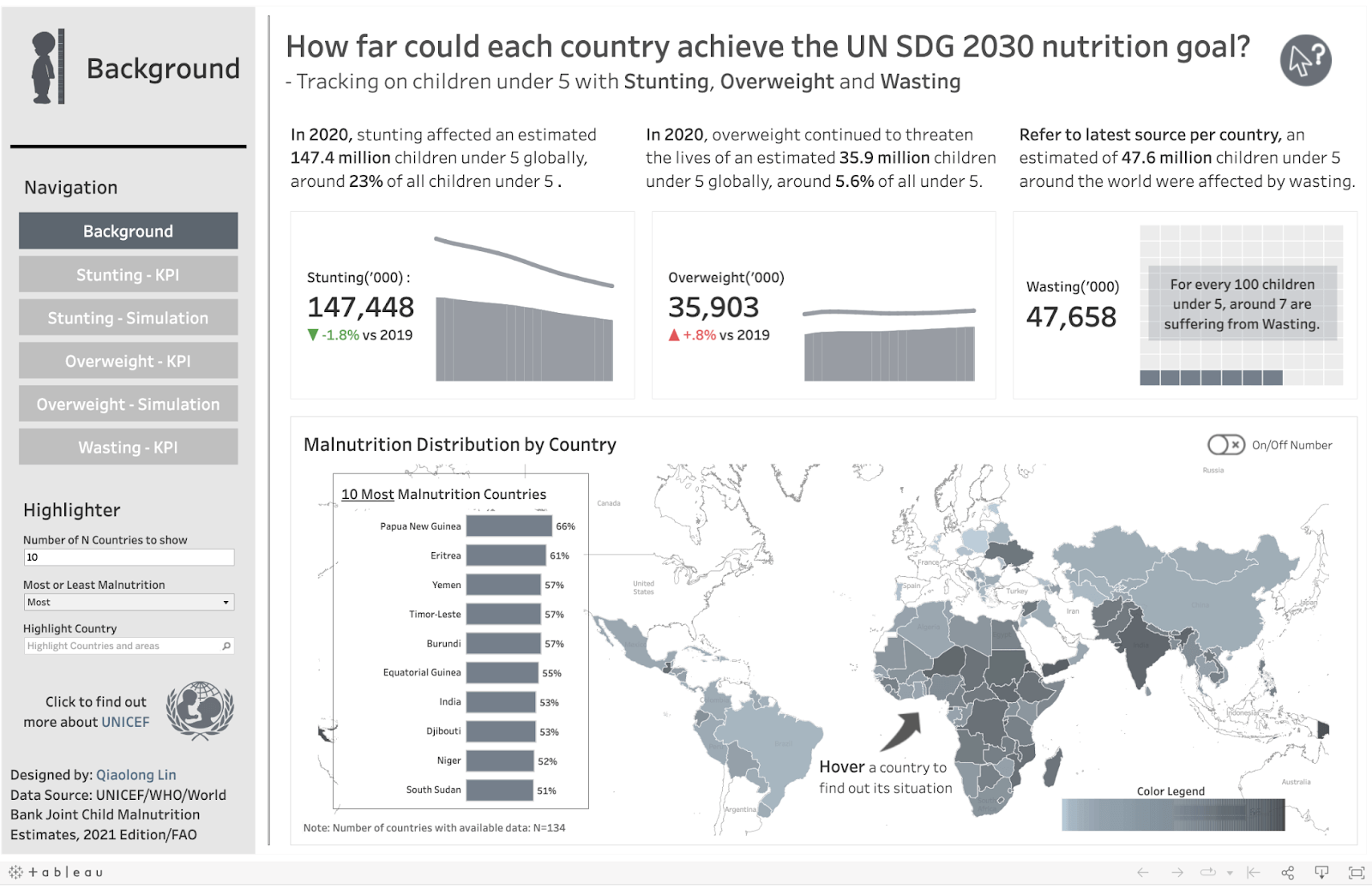
How far could each country achieve the UN SDG nutrition goal by 2030 by Qiaolong Lin
Second place viz:
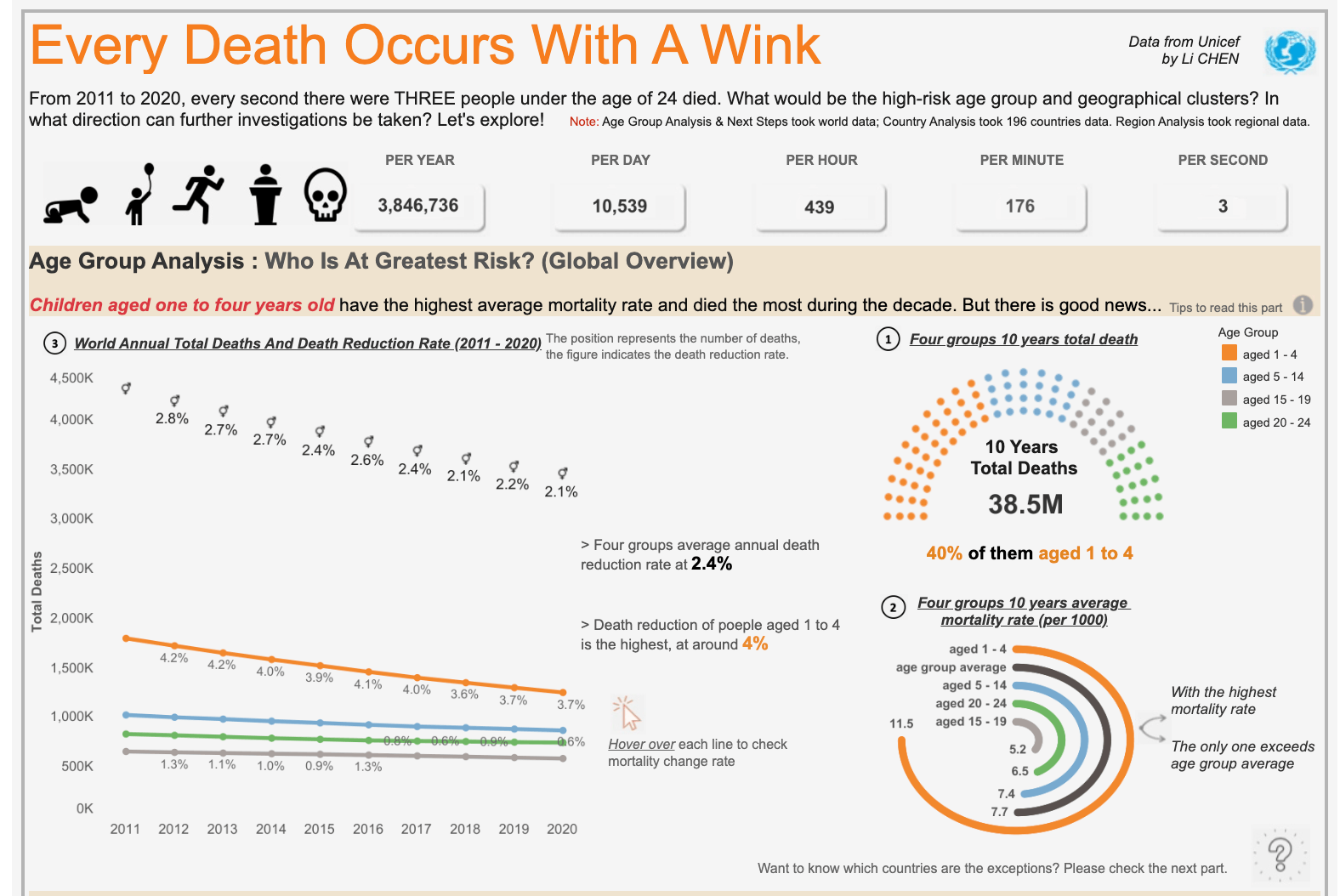
Under 24 Mortality Rate & Deaths | #StudentdataViz2022 by Li CHEN
Third place viz:
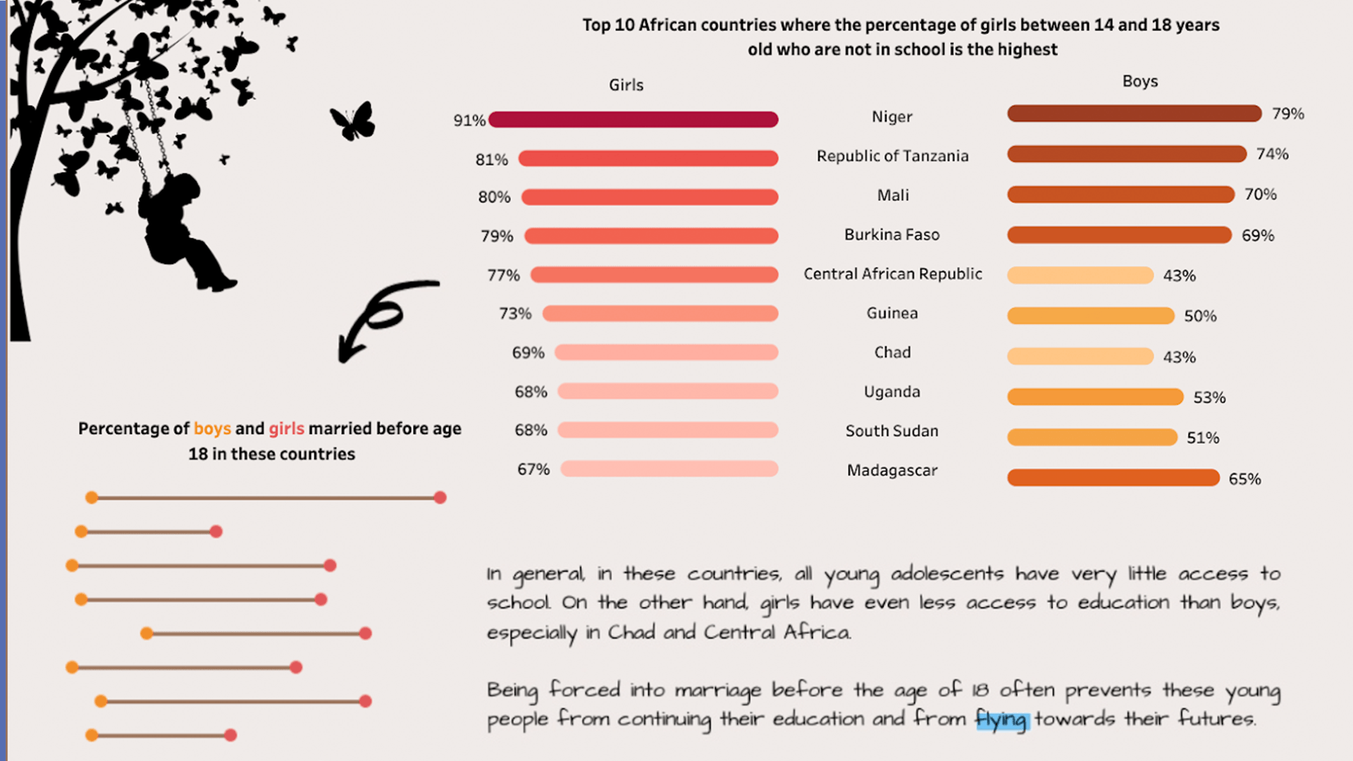
An African child's journey to education | #StudentdataViz2022 by Hugues Rubin de Cervens
Explore all the Student DataViz Challenge entries on Tableau Public. Connect with fellow data students and get inspired to make a difference of your own. A huge thank you and congratulations to all of the students who entered the competition.
How can you make a difference with Tableau?
Feeling inspired? Help a cause close to your heart, and make a difference by showcasing your data skills on Tableau Public with the hashtag #VizForSocialGood. Remember you can receive a free Tableau license through our Tableau for Students program any time of the year.
Related stories
DataFam Roundup June 2026
DataFam Roundup May 2026

Iron Viz 2026: Read Between the Data
 28 May, 2026