Learning about Data-Driven Journalism in Davos


What is the opposite of foreshadowing? Reporters covering the World Economic Forum in Davos can be excused for getting a false sense of tranquility as they make their way up to the Swiss ski resort. Boarding the train at Zurich airport, you can still see them chatting on their phone and typing away on their laptops.
But soon after changing trains at Landquart, all devices get put away. Even the most seasoned Davos attendees can’t resist the charms of the winter wonderland that presents itself as the old Rhaetian Railway train slowly snakes up the mountain, through snow-covered forests that open up every now and then to breathtaking views over sun-swept valleys. There you realize why Thomas Mann referred to Davos as the Magic Mountain in his eponymous novel.
Tranquility is not the word that one would use to describe the buzz of the annual conference that brings in nearly 3,000 attendees. That number includes more than 40 heads of states, royalty, leaders of the world’s largest companies, foremost thought leaders, and a number of celebrities from various fields (Leonardo DiCaprio was there this year) all there to discuss the state of the world (officially) and to meet and greet and be seen (unofficially).
As a reporter, you spend the day covering the more than 200 sessions that take place in the congress center. At night, you try to mingle with the jet-set at one of the many soirees and parties—all in the name of work, of course. In between, you hustle through the snow—the Swiss don’t deice their roads for environmental reasons, so snow is safer than ice—to meet the wealthy and powerful for an interview opportunity at one of the many hotels in town.
Only the lucky few who get to arrive a day early, and get to enjoy half a day of skiing or so. For most attendees, the spectacular mountain scenery of the Graubündener Alps serves as a backdrop to one of the most surreal stages in the world.
Learning on the Job: The Student Experience
Every year a handful of students who are interested in journalism get to experience what being a reporter at Davos is like. Since 2012, the organization Pro Journo has selected a few lucky candidates every year, providing them training and mentorship from experienced editors, putting them in touch with potential informants, and setting them loose to write stories about Davos itself and—more importantly—the topics discussed there.
This year’s cohort, who were in Davos last month, had an extra module attached to the curriculum. With the support of Tableau, they received a three-day crash course, prior to the conference, in data visualization and data-driven journalism.
“Being able to work confidently with numbers is a critical skill for any journalist today,” says Pro Journo’s executive director Sunmin Kim, who is also a deputy editor at the Economist Intelligence Unit.
To gain that confidence, the students received an introduction on the scope of modern data journalism, with examples ranging from quick bar charts attached to articles to fully data-driven pieces that have been produced through a long research process. They learned about principles of clean design and good data visualization, and about how to get started with Tableau Public to create neat-looking charts out of bare data.
“We learnt how to prepare data sets and choose the most appropriate type of visualization to display meaningful information,” said Cristiana Bedei, a Pro Journo reporter. “We also got insights into effective color schemes, which I thought was really useful, too.”
Following the theoretical part, the students went to work to produce their own data-journalism pieces. They worked day and night to look for potentially interesting data sets. They converted, cleaned, sorted, and merged data sets. They analyzed the data, looking for different angles. And finally, in an iterative process, they built charts that were then posted on Tableau Public and embedded in the respective articles.
Learning the Ropes of Data-Driven Journalism
Like the unsuspecting first-timer to Davos, the students were perhaps caught a bit off-guard about how much hard work can go into a little chart. They all said that they were especially surprised to learn what it takes to get right the frontend of the process, the data preparation, even more so when you are chasing that exclusive scoop.
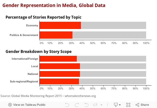
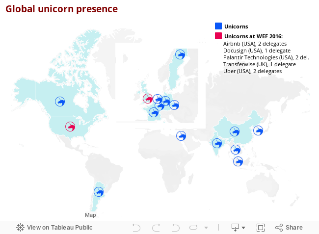
But the hard work was worth it. The student reporters produced some high-quality data journalism pieces, looking at anything from gender ratios of reporting journalists to the presence of unicorn startup firms in Davos. Whether they also met Leonardo DiCaprio at one of the soirees is not known.
“At Davos, it's both easy and difficult to produce impactful stories—interviews that would normally take weeks to negotiate can be just a casual intro away and scheduled a few hours in advance. At the same time, there is so much orchestrated, PR-driven content out there that it's easy to get caught up in it,” says Sumin Kim. “By reporting through numbers, we were able to teach our student journalists how to put Davos stories into context. This way, there's a lot of room for improvement for how journalists can continue to report on Davos with a fresh and critical angle.”
Then the curtain drops. After a few days that feel much longer, you are back on that train. Quiet surrounds you. Like a deep-sea diver in a decompression chamber, you review the impressions that have been etched into your brain. You long for a holiday, but you also know you are richer for those memories—Davos moments, as insiders call them. We hope that for the Pro Journo batch, working with data was one of those experiences.
Let us know if you are embarking on your own journey into the world of data journalism this year. Follow our blog posts about the topic of data-driven journalism this month, meet us and like-minded people at the Tapestry and NICAR conferences in March, or simply get in touch with us via email or Twitter using the hashtag #DDJmonth to get started.
Related stories

Iron Viz 2026: Read Between the Data
 28 May, 2026

Tableau's Iron Viz Winners

Explore the 2026 Iron Viz Entries
 15 December, 2025