Best of Tableau Web: May 2022


Reunions come in all shapes and sizes. Some are modestly anticipated or even awkwardly avoided (think: class reunions), while others draw us together from near and far to rekindle relationships, ignite new ones, and celebrate a common purpose. Tableau Conference 2022 was unmistakably the latter, as summed up by Sarah Bartlett, one of the many data lovers who attended TC22 in Las Vegas last month.
After two years of virtual conferences, many Tableau Community members descended on the desert for the long awaited—in-person—DataFam reunion! And for those that didn’t or couldn’t, there were still opportunities to make meaningful connections by attending the conference virtually or through local TC22 watch parties.
The Vegas event offered a smorgasbord of absolutely fantastic sessions, many by and for the community. Here are just a few:
- Bring the WOW Factor with Tableau Public Portfolios: Ghafar Shah and Chantilly Jaggernauth shared some amazing insights on how you can use Tableau Public to grow your skills, expand your network, and land that dream job.
- How to Do Cool Stuff in Tableau: Is there anybody that consistently does more cool stuff in Tableau than Ken and Kevin Flerlage?! Get a glimpse behind the scenes at how the brothers use ordinary Tableau things, like calcs, shapes, images, and color, to do extraordinary stuff with data.
- Beautiful Business Dashboards: The How and the Why: Samuel Parsons and Simon Beaumont are masters at their craft, and it was so cool to see how these two took ordinary charts and made them absolutely beautiful, sharing some tips and tricks along the way.
And of course, I would be remiss if I failed to mention the energy and excitement (as always, bravo!) that Emily Kund and Matt Francis brought to the seventh annual Vizzies award show. In my fourth time attending the Vizzies, I reflected on how good it was to see community members being recognized, and how that spotlight can spur honorees on to accomplishments they never thought possible.
And finally, much to my delight … the main event. The inflatable bam-bams, judges, eccentric hosts, and most importantly, contestants being cheered on by the DataFam, all filling the Iron Viz arena with the type of fervor that only the world’s preeminent data visualization competition can produce.
Once again, each contestant had 20 minutes to build a visualization using the same dataset—this year, they focused on global education indicators. For me, part of the Iron Viz allure is that despite these constants, the resulting visualizations are always as distinct and varied as the competitor’s themselves.
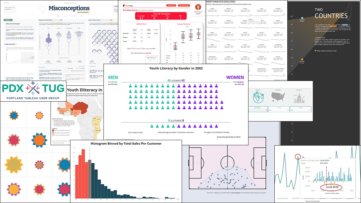
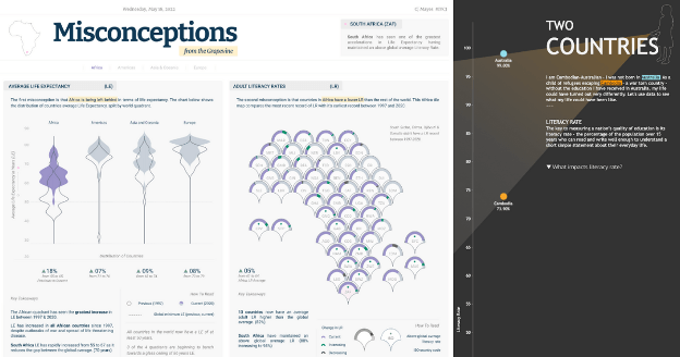
CJ Mayes produced a visually stunning piece on the misconceptions around African literacy rates and global health. He used violin plots to show the significant increase in average life expectancy when compared to other regional world quadrants.
Kimly Scott moved everyone with her storytelling, using her own life to shine the spotlight on educational differences between her birth country of Cambodia and her home country of Australia. Punctuated by the data, her personal story demonstrated the staggering impact of quality education.
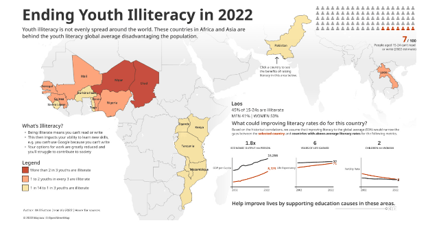
And last but not least, Will Sutton claimed the trophy through a combination of an amazing visual that traced the improvement in literacy rates over the last decade, with a compelling reminder that improving access to education doesn’t just improve the life of an individual, it also improves the lives of everyone around them.
Cheers to the ultimate DataFam reunion—and the promise of more data-filled reunions ahead!
With that, enjoy Best of the Tableau Web with tips, tricks, inspiration and more produced by the Tableau community. Don't forget to check out the list of blogs we follow for Best of the Tableau Web. If you don’t see yours on the list, we invite you to add it here.
Calculations
- Adding a Dynamic Reference Line to Viz-in-Tooltips
Marc Reid, datavis.blog
- How to Highlight a Single Column in Tableau
Eric Parker, OneNumber
- How to Dynamically Switch Data Sources Using Tableau Parameters
Maggy Muellner, Playfair Data
- Let’s build a trellis chart!
Donna Coles, Donna + DataViz
Code
- Advanced Analytics in Tableau Series: One-Way ANOVA Tests
Maddie Dierkes, Playfair Data
Data Culture, Blueprint
- How the Portland TUG Survives and Thrives
Danny Steinmetz, InterWorks
- Explore #data22 Through the eyes of our Visionaries
Donna Coles, Biztory
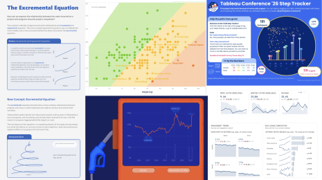
- Tableau Conference 22
CJ Mayes
- Tableau Conference Highlights 2022 #data22
Sarah Bartlett, Sarah Loves Data
- TC22 from Afar - My Experience of a Virtual Tableau Conference
David Yang, The Data School
Formatting, Design, Storytelling
- Data visualisation/Design resources
Alexander Waleczek, Curvediscussion
- Tableau's Order of Operations or Everyone's Data Can Dance Many Times
Dawn Harrington, Tech Tips Girl
- Her Data Learns: Map Layers and Iron Viz
Dinushki De Livera and Jennifer Dawes with guest Kimly Scott, Her Data
- 5 Things You Can Do in Web Edit, But NOT Tableau Desktop
Kevin Flerlage, The Flerlage Twins
- Definitive Guide to the Analytics Pane in Tableau
Ethan Lang, Playfair Data
Inspiration
- How to Build Lovely Histograms in Tableau
Ken Flerlage, The Flerlage Twins
- The Incredible Women of Data Visualization
Nicole Lillian Mark
- Totally Useless Charts & How to Build Them – Lotus Flowers
Brian Moore, Do Mo(o)re with Data
- Let’s Keep This Between Us… What’s My Secret?
Adam Mico
Iron Viz
- Violin Over Time
CJ Mayes
Tips and Tricks
- Convex Hulls in Tableau
CJ Mayes
Visualizations
View last month’s Viz of the Day on Tableau Public gallery.
Related stories
DataFam Roundup June 2026
DataFam Roundup May 2026

Iron Viz 2026: Read Between the Data
 28 May, 2026