Using an Equality Lens in Data Visualization


The events that have taken place over the past two years—from social and systemic racial injustices to the disproportionate impacts felt in Black and brown communities during a global pandemic—have highlighted the ways that diversity, equity, and inclusion (DEI) impact our lives and work.
In my job, I have the great fortune of working in both digital analytics, and DEI. Because of that, I’m often focused on how DEI impacts the work we do and the workplace we do it in. Through this work, I’ve been able to recognize how embracing and implementing DEI can positively impact the look and feel of the work we do.
When you develop research with equality in mind, you ensure that every end user or reader of your work understands and benefits from your findings. Everyone can read your information and see themselves in it. Additionally, you often get the benefit of mitigating potential issues with your findings.
Here are a few ways to viz with an equality lens:
1. Understand your bias
We all have it. The way we view the world is mostly a function of how we have experienced it in our lives. We have formed opinions about certain individuals, organizations, political parties (I work in Washington, D.C., this is a big one!) and other groups, based on our affiliations with those organizations or groups. In the same way that we have a bias in research based on our hypotheses, our lived experience can alter how we understand, and ultimately present, our analysis.
If you know that upfront, then you can adjust it. First, understand where your bias has already influenced certain pieces of information in your dashboard. For example, if you are in the US, the two major political parties are signified by the colors blue and red. However, if your findings are going to a global audience, these colors are not as easy to understand. Make sure the groups in your findings are clearly labeled so that anyone can understand your findings.
Another classic example is color contrast. In the data viz community we love a nice read and green viz to indicate when something is going well vs. not so well.
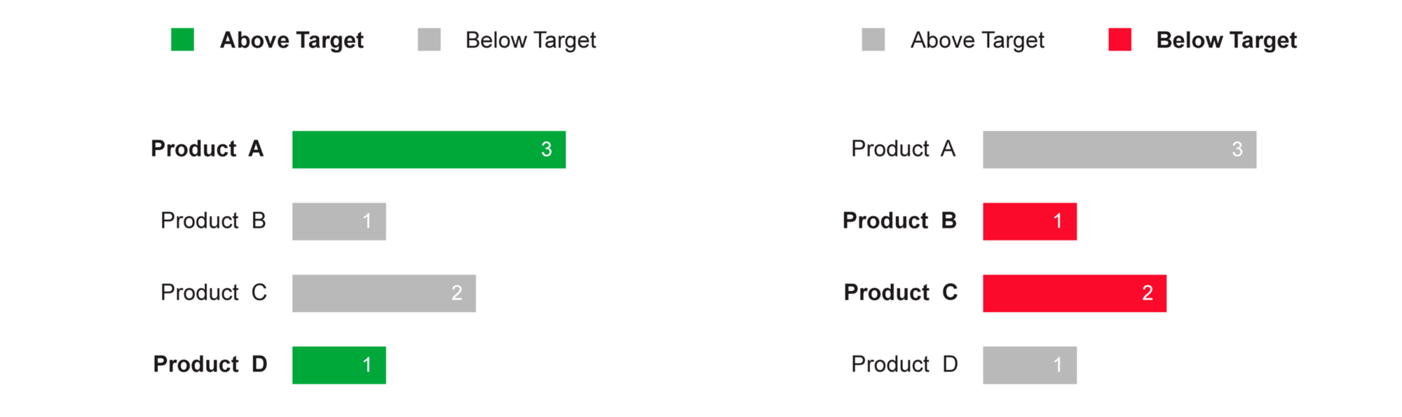
Visualization using red and green colors. Source: The end of the traffic light dashboards
However if you have deuteranopia, one of the more common forms of colorblindness. That viz looks like this:
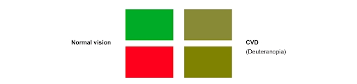
Visualization using red and green colors and the resulting color someone with Deuteranopia would see. Source: The end of the traffic light dashboards
Make sure that your assumptions about what people may see clearly, literally or figuratively, don’t get in the way of an inclusive viz!
2. Measure twice, cut once
Fortunately, our work as analysts is virtual so maybe we can cut more than once. But you get the point.
Most often, we see our errors when we take a second look (or a third!). For example, a lot of datasets don’t have enough representation of people of color, those who identify as LGBTQ+, or people from other countries. At first glance, you might believe your analysis is insightful and ready to go, but a second glance at your data and your resulting graphs would highlight this error.
Take for example, the visualization Color of COVID-19, shared with author Eleonora Nazander’s permission, that showed COVID-19 deaths in the U.S. among African Americans.
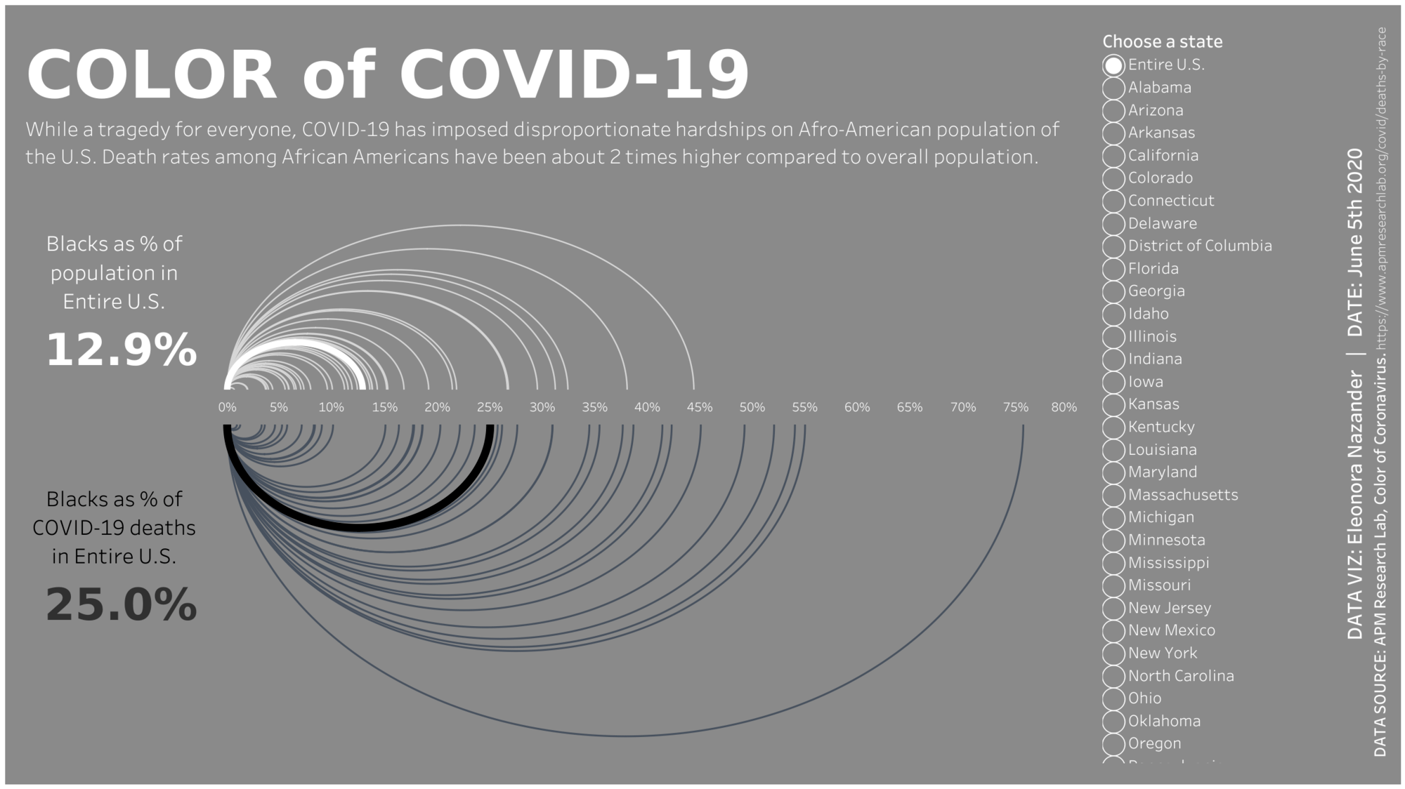
Tableau Public Visualization: Color of COVID-19 by Eleonora Nazander
While the viz is beautiful and tells the beginning of an important story. But, taken by itself, it’s not clear what’s driving this disparity. Are African-Americans somehow more predisposed to getting COVID-19? Are their occupations putting them in harms way? Something else?
Don’t let “getting it done” get in the way of “getting it right.” Dig deep to make your vizzes even more clear.
3. When in doubt, phone a friend
When you’re “head-down” into your work, it can be really hard to see the issues or flaws. Having someone else look at your work and consider inclusion, will help you see what you’re missing. I often choose two individuals. One person is an analyst who can speak to the technical portions of what you’re working on. The second person is outside of research who can tell you how easy it is to understand your findings. If you have a D&I expert at your company, even better!
These tips aren’t time intensive—especially if you acknowledge and address your bias before you even start vizzing (a good life skill as well as research!). Taking a second look and a quick review from a friend can be done in a day or two. Following these tips will help you create representative, inclusive work that makes your findings better for all readers.
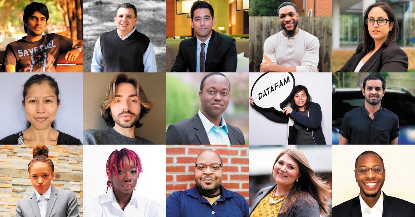
The 15 members of the Tableau Equity Task Force, the team working with Tableau on ensuring representation is a centerpiece of the work we do within the Tableau Community.
If this post was interesting to you, head over to the Tableau YouTube and check out this Diversity + Data session on designing inclusive data sets. You can also learn more about our work as a Tableau Community Equity Task Force here.
Learn more about building inclusive data visualizations with the free Equity and Inclusion Guidelines for Data Visualization badge on Trailhead.
相关故事

9 Tips to Succeed in a Tableau DataDev Hackathon
 2025/01/08

A Guide to Mapping and Geographical Analysis in Tableau
 2024/11/15

Making Tables Smarter: Key Features of the Tableau Table Viz Extension
 2024/11/14