What is a Tree Map?
Understanding and using Tree Maps
How do I read a Tree Map?
Treemaps provide an accessible way for viewers to interpret their data at a glance. Color can represent dimensions (such as categories) or measures (such as KPIs). If used to represent a KPI, a darker color may highlight extremes, high or low. For dimensions, a user might use a categorical palette, assigning a different color for each available shipping mode. For measures, a continuous color palette would show a company’s sales numbers or profit.
When analyzing a tree map for insights, the largest box shows the largest part of the whole, while the smallest box shows the smallest part. For a deeper analysis, these boxes can be nested to show many categories. For example, a box within the “office expenses” data set might display “percentage spent on furniture.” A box nested within that box might display “percentage spent on desks.”
What type of analysis does a tree map support?
Treemaps best depict data that needs to show a part-to-whole relationship. Percentages of a measure for each dimension are displayed as squares that, when added together, comprise the whole. Using our Superstore dataset, we can divide the total number of sales into categories. Adding the Product Sub-Category dimension would create “seating,” “tables,” and “lamps”. In this example, three specific items of furniture that fall under their respective categories become smaller nested squares.
In his visualization of data from the Electoral College in the 2012 U.S. Presidential election, Steve Wexler found a treemap was the best way to tell his data story. He used red and blue to distinguish between the Republican and Democratic parties, respectively, and each state’s vote for a candidate fell into either the red part or the blue part.
When and how to use Tree Maps for Visual Analysis
Treemaps are helpful when visualizing a large number of related categories. If specific values should be prominently displayed, a bar chart may be a better choice.
A good treemap will have:
- Distinct numerical values
- A distinct hierarchy
- No more than three or four labeled tiles
- An obvious highest level of the hierarchy
- Not display negative values
However, a poor treemap will:
- Look cluttered with too many categories and labels
- Have too many similar values
Great Examples of Tree Maps
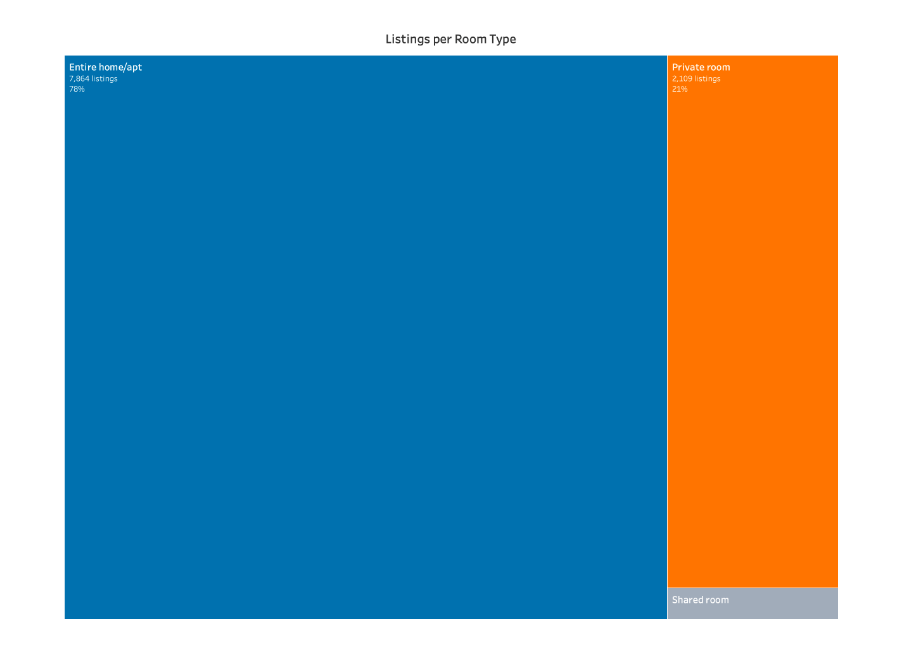
This tree map looks at the listings per type of lodging available. The biggest box tells the viewer that most of the rooms available are the entire home or apartment, while the second biggest box measures the number of private rooms available.
- This tree map only measures a few categories in relation to each other
- The white borders indicate that all three measures make up a whole
- The colors are distinct from each other