Viz Variety Show: Donut charts do have value—yes, really!


Editor’s note: Viz Variety Show is an occasional series that aims to help you go beyond bar charts and line charts. The series will showcase various types of visualizations and outline how to build them, when they should be used, and when they should be avoided altogether. Tableau Zen Master Andy Kriebel also has a great post on this chart type. Check out the post on his blog, VizWiz.
This is, without question, the most controversial chart type that I present. I almost saved it for last, lest you be offended by the subject matter and decide not to check out the rest of the posts in the series. But I actually get made fun of internally for how much I like this chart, so I’ve worked up a bit of bravery when broaching the subject of this one.
I know that it’s a poorly-disguised pie chart. I know that it can only be used with a few members of a dimension. I know all the objections…but I don’t care. I know desire when I see it, and this is a good-looking chart. It’s easily understood, interesting, and, most importantly for this series, it’s different from a bar chart or a line chart.
The chart in question this time is the donut chart. The slightly younger, trendier, and more attractive sibling to the old classic, the donut chart is just a pie chart with a hole cut out of the middle.
The donut chart is simple, but you see it a lot these days, especially in a KPI format. Facebook analytics? Donut charts. Fitbit dashboards? Donut charts. Apple Watch health metrics? Donut charts. Google trends data? Donut ch—you get the point. As always, “popular” does not a quality visualization make. As I mentioned, this one is controversial, but I think half the flak donut charts catch is simply because of their similarity to pie charts. Even though I’m starting out at a net loss, let me try to make my case here.
Pie charts are widely disliked because of how often they are abused and overused—not the times they are used well. It turns out that humans are very good at comparing lengths of items when they are side-by-side, and not quite as strong at comparing areas and/or angles. Take the below image, for example:

If someone asked you how many times larger the bigger circle is than the smaller circle x, you would have difficulty determining this. More importantly, you would have to think harder than is reasonable for a visualization which should be designed to be intuitive. The answer is 22x larger, in case you were wondering, which probably goes to show how bad we are at determining area, specifically in regards to comparisons.
Turns out pies have both areas and angles as prominent features determining the absolute value of an item. This makes pies hard to interpret save for in a few limited circumstances.
Good use cases:
- When you have few high-level items and you want to compare items or see how they contribute to a whole
- KPI charts as % to total
- That’s it, seriously—just the two times
Not ideal when:
- Many values contributing to a whole
- Total value of items is not relevant or interesting
- When KPI being measured could exceed 100%
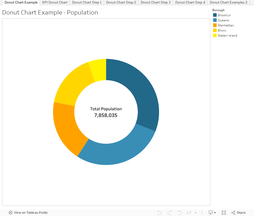
There are two main types of donut charts, and the use case differs for each type. For parts-of-a-whole donut chart (the one shown previously), I prefer this to a bar chart when I think the above comparison use cases are met. I also prefer this to a standard pie chart as I’m also able to label the total value of whatever metric is being displayed. With regular pie charts, this usually needs to be done awkwardly off to one side or somewhere in the title which may not be obvious. The alternatives would be standard pie charts, stacked bars, bullet charts, treemaps, etc.
Pie/donut charts have an implied contribution to a whole built in. When you show side-by-side bars, people don’t automatically try to calculate how much a bar contributes to some seemingly arbitrary total. In a pie chart, this is inferred by the user and often calculated, whether intentionally or not. In fact, it is this benefit alone that Stephen Few calls out in his blog post on the matter.
With a pie chart, this comparison feels natural due to the implied 100% nature of a pie chart. Two or three members in a pie chart can often easily be combined to compare to another larger slice (though this depends on placement). As a general rule, a donut chart is useful in nearly any scenario a pie chart is useful (and in, my opinion, more useful), but really only in those scenarios.
Perhaps the only exception is the KPI variant of a donut chart. In many executive dashboards that customers develop, I see lots of KPIs displayed in traffic light, bullet chart, text, or other formats. Whatever the chosen methodology, the underlying need is to display some % or absolute value as a standalone number, often without comparisons to another benchmark. In these scenarios, it would be nearly impossible to make the case for the below donut chart being a superior visualization to the ones I’ve just mentioned. I will merely suggest that it is a viable alternative.

Now that we’ve addressed the two types and learned a bit more about when they might be a good candidate, let’s build some. In this example, I’m going to focus on the standard donut chart, as the KPI one is simple enough once you’ve built the standard variant (there’s also an example for download in the workbook).
Step 1: Build a pie chart
Build a pie chart by selecting the pie chart type, taking your measure, and placing this on Angle, and placing the dimension on Color.

Remember, pie charts should almost always be sorted in a either ascending or descending order, with the standard sort being descending. This causes a largest-to-smallest, clockwise sort of slices. The sort is necessary because it is especially difficult to compare similarly-sized pie slices, so you can help out your user with a consistent sort they can rely on. (Best practices say only use donut charts or pie charts for three or fewer slices, but I’m a rebel and occasionally stretch this number to five.)
Step 2: Create a placeholder axis
The donut chart is a blank circle overlaid on a pie chart. Any time you hear the word “overlay” in Tableau, it is usually safe to assume this means either floating sheets or a dual-axis chart. As floating sheets are a particularly ugly solution which isn’t necessary in this example, we’ll be using a dual-axis chart. The obvious problem here is that we have no axes in a pie chart. In cases like this, use whatever is your favorite dummy/placeholder axis method. I use MIN(1) and place this field on columns twice.

Step 3: Create the donut hole
Next you’ll want to remove detail from the right donut chart, as this will be the center “hollow” portion of the donut. Just drag any measures and dimensions from detail. You should be left with a circle, which you should then size slightly smaller than your left pie chart. The difference in size between these two marks is how large/thick your donut chart will be.

Step 4: Leverage a dual axis
Finally, we will leverage a dual axis by right-clicking the second MIN(1) header and selecting Dual Axis. Shade the center circle the same color as the background sheet/dashboard color (in this case white). Then hide the headers and remove the irritating line down the center by navigating to Format > Lines > Columns > Grid Lines and selecting None. This should leave you with a chart like the below:

This one may not have the most attractive color scheme, but that’s what you get when you try to match RGB colors to things like chocolate, cream cheese, and Nutella. Hopefully this has helped provide you with an understanding of how and when to use donut charts, as well as a healthy skepticism of whether that use case you have in mind is the ideal scenario for one.
If you’re in the 50% that really likes radial charts like the donut chart and are looking for the next challenge, check out Bora Beran’s blog post on three more advanced variants of radial charts.
Related stories

5 Ways to Use Tableau Public to Achieve Your Goals
 11 January, 2025

World Mental Health Day: Elevating Awareness Through Data Visualization
 10 October, 2024

From TV Screens to Tableau: Visualize Your Favorite Shows with IMDb
 31 August, 2024