Using Tableau to Bring Sports Standings into the 21st Century


Note: This is a guest post from Ryan Sleeper, contributing author of the forthcoming book Sport Business Analytics, 2013 Iron Viz champion, and director of data visualization at Evolytics.
Read to the end for your chance to participate and receive a prize from Tableau!
For more than a century, football leagues around the world have used a table of data to communicate their league’s standings—the information that shows how teams are performing relative to each other. With the exception of sorting teams by their performance in descending order, there have been zero visual cues that would take advantage of the value of data visualization:
- Reduced time to insight
- Improved accuracy of insights
- Better audience engagement
Not only is the data presented in crosstab form, but these leagues even affectionately call their league standings "the table." As a lifelong sports fan and longtime data-visualization evangelist who has shared thoughts before on how a spreadsheet is not a data visualization, it pains me to analyze my team’s performance across every sport with nothing but a table of data.
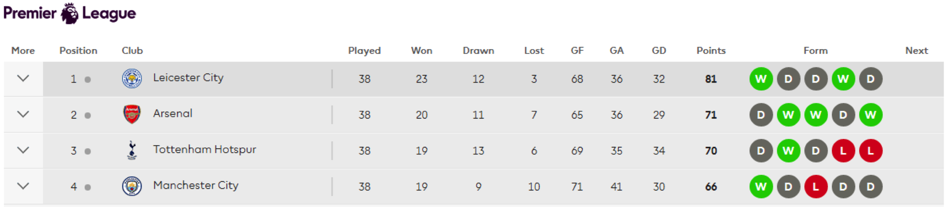
To be fair, some major football leagues have made small steps toward introducing data visualization, and that sport is leading the way among all major sports worldwide. For example, the English Premier League now shows the recent “form” of each team with a color-coded heatmap showing each team’s performance during the previous five matches. We’ll forgive the red and green for now—we have to start somewhere!
Major League Soccer also provides a “results map” with which you can see the match results visualized for every team and every week, albeit in a separate location from the traditional table and somewhat challenging to find:
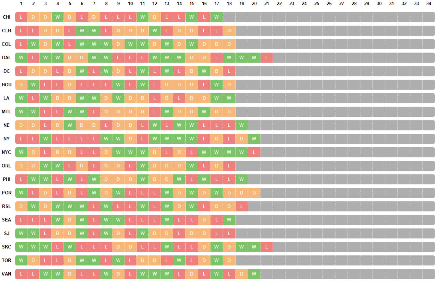
This is the most ambitious form of visualizing sports results among major leagues that I have found. But this has several limitations:
- The teams are listed in alphabetical order instead of a more helpful sort order and/or conference categorization
- By being disconnected from the traditional table as well as unsorted, it is extremely challenging to ascertain how teams are performing relative to each other
- There is little context which helps us avoid the dreaded data visualization question: So what? Most notably, without having a lot of knowledge about the sport such as how standings are calculated and which conference each team plays in, it’s impossible to answer the main question: Which teams are in playoff contention?
For this reason, I took my own shot at reinventing Major League Soccer standings two years ago. Here was my first attempt at visualizing sports standings:

Now, in addition to the traditional table, the end user can:
- Sort the standings by league or conference
- View the results map in context of the table
- Click a team to highlight the team throughout the entire visualization
- See a trended running total of points to better analyze how each team is doing in context of the rest of the league
- See additional context of what was required to make the playoffs in the previous year
Now It’s Your Turn!
We as the Tableau community have an opportunity to collectively leave a lifelong mark on how sports standings as we know them are created and consumed by sports fans all over the world. We know sports standings can be better, and we have the tool to make them better: Tableau. That’s why I’m inviting you to take a shot at visualizing sports standings and share your visualization on Twitter using the hashtag #standingsviz.
If you would like a head start with a data set, you can simply download the MLS Standings viz above. Or you can visualize the current standings of the league of your choice by creating your own data set.
What You Get
As if benefiting from visualized sports standings (if and when they are adopted by every league in the world) as well as being a part of a data-visualization revolution were not enough, there are prizes on the line just for participating!
If you share a link to your Tableau Public visualization of sports standings on Twitter using the #standingsviz hashtag before the end of Sports Month (July 2016), Tableau will send you a snazzy Data Hero T-shirt.
I can’t wait to see what you come up with!
Related stories

Iron Viz 2026: Read Between the Data
 28 May, 2026

Tableau's Iron Viz Winners

Explore the 2026 Iron Viz Entries
 15 December, 2025