Taking your data viz show on the road: Lessons from a non-linear career journey


This post originally appeared on Nightingale, a publication by The Data Visualization Society.
Sid’s artistic nature coupled with his unique perspective has given him the opportunity to present at Tableau Conference in both 2018 and 2019 (watch his TC19 presentation here). His advice and journey is inspiring, and he hopes it will help both novices and veterans in data visualization.

Innovating with visual analysis
Allen Hillery, Writer & Editor, Data Visualization Society: Hey Sid! Good catching up with you! Can you give me an elevator pitch on what your team does and how visual analytics helps Verizon’s call center operations?
Sid Dayama: I lead the visual analytics team in Customer Service Operations in Verizon where we build end-to-end business intelligence solutions that democratize and distribute data in an intuitive and visual form. In turn, this enables business experts to slice and dice millions of rows themselves without writing code, extract valuable and actionable insights at will, on a near real-time basis. Through our dashboards we leverage data-driven decision-making in the business to optimize operations, reduce costs, and enhance the customer experience.
AH: How have you been able to add insights to the business using data visualization?
SD: We’ve had tremendous success in the following areas:
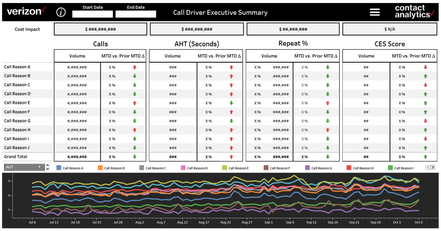
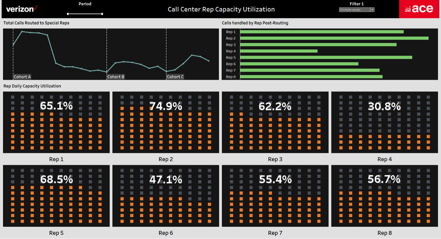
Optimizing Call Center Operations
We analyze key performance indicators (KPIs) such as call volume, handle time, call drivers, repeat rates, call sentiment, etc. to reduce the need for customers to call us repeatedly. Certain cohorts of customers are calling us 43% less after implementing the data driven solutions we’ve enabled. Our dashboards assist in workforce planning and call routing to get the right call to the right agent.
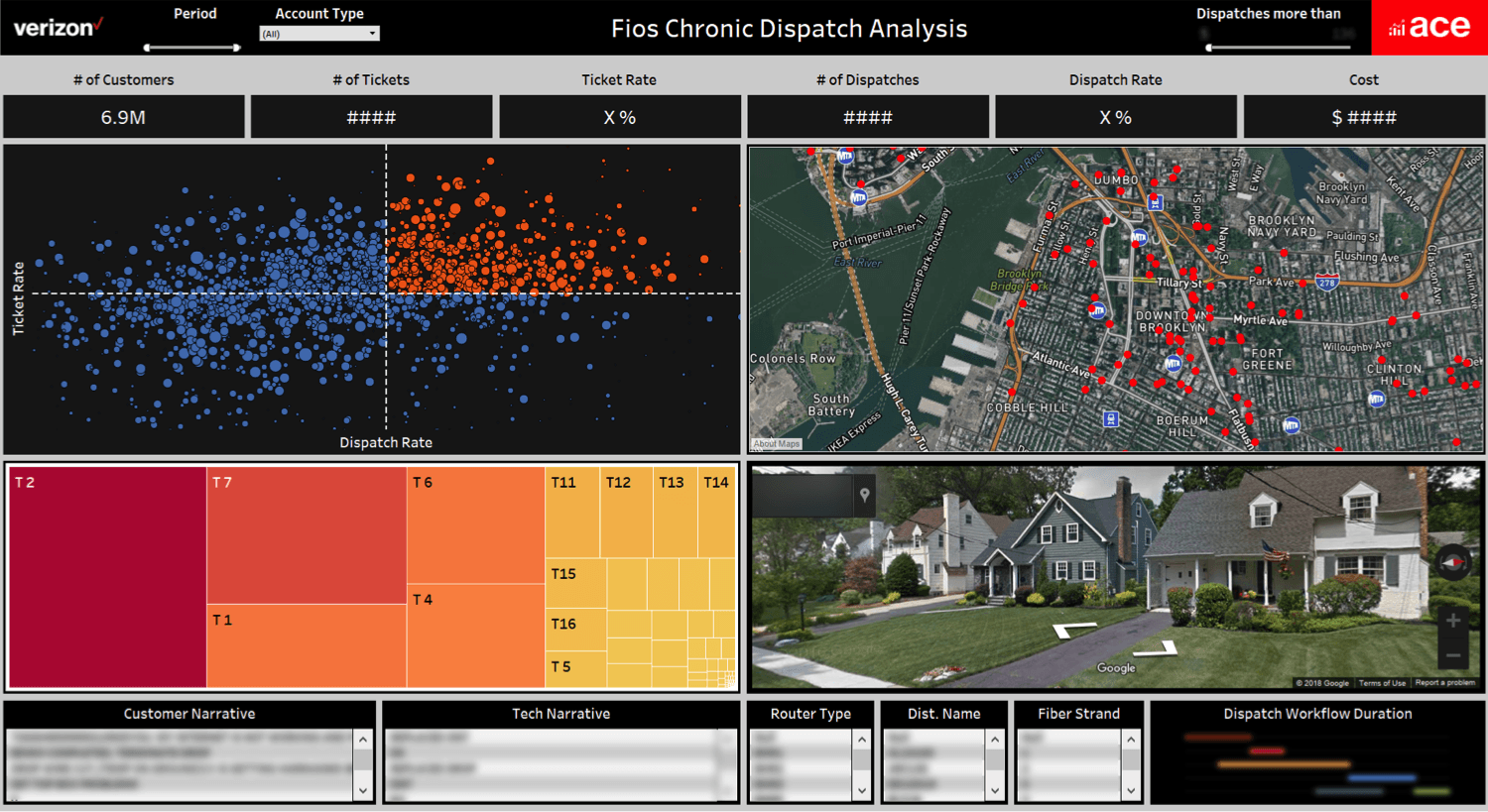
Optimizing Field Technician Dispatches
We have applied cutting-edge geospatial mapping techniques using Mapbox satellite maps and Google street view API’s from Google Developers to survey a geographical distribution of our dispatch rates. This has helped stakeholders in the Dispatch Research Center (DRC) to reduce dispatches by 62% for certain cohorts of customers.
Lessons from a career journey: From finance to data viz
AH: You’ve had an interesting career journey working for the Women’s Tennis Association (WTA), hedge funds and now Verizon? Can you step the audience through that journey and how they all tie in with forming your career today?
SD: Sure! My non-linear career path illustrates a gravitational pull towards working with numbers in one way or another.
I have an academic background in finance with a specialization and Masters in Entertainment Finance and Music Business from New York University. I learned the nuances of valuation of intellectual property, Hollywood accounting, copyrights & licensing, etc. During that time I was teaching financial accounting to undergrads at NYU-Stern. It helped me build a strong foundation of corporate finance principles with respect to analyzing business problems.
Fresh out of grad school, my first job was at a hedge fund analyzing securities in the media & entertainment space to identify suitable investment positions. After about a year at the hedge fund, I joined as a first year employee in a start-up that later grew and merged to form WTA Networks. We built mobile apps and generated exclusive behind-the-scenes content for some of the world’s best tennis players. As the Head of Finance & Analytics, I worked with some exclusive athletes & brands including Maria Sharapova, Novak Djokovic, WWE, Porsche and Nike on monetizing their fan base using Web & Mobile Analytics. I also led the acquisition due diligence of GamerDNA, the second largest gaming information network at the time.
AH: Sounds like you were exposed to a lot of amazing opportunities at WTA. What did you take away from that experience?
SD: It is during my work at WTA Networks that I truly understood the power of big-data and fell in love with analytics and data science. In an early growth stage environment, we employed a data-centric methodology to acquire users, increase subscribers and engagement on our apps. This experience ignited my mission to further develop skills in analytics and data science.
AH: Let’s dive into the next chapter post WTA.
SD: After the WTA merger, I was hungry for a company with a mature big-data tech stack and large amounts of data. When a recruiter reached out, about a job at Verizon, a tier 1 ISP powering a large amount of the world’s Internet traffic with 118M subscribers, I jumped on the opportunity.
I feel these collective experiences have culminated in my current adventures in data viz. My corporate finance background has equipped me with a lens to measure the impact of analytics projects. Sometimes, the impact is the top line, increasing revenues or the bottom line by reducing expenses.
AH: What commonalities and distinct differences do you see data-wise across these three distinct industries?
SD: Data analytics applications such as anomaly/outlier detections, A/B testing, classification and regression techniques etc. can be incorporated in each of these industries and one would use the same set of principles to perform the analysis.
"With respect to commonalities, at the end of the day statistical concepts and analytics techniques are sector agnostic."
The economics of supply and demand is ubiquitous. In financial securities, a trader would look at the ask and bid prices to analyze the pricing pressures on executed orders. Similarly in call centers, analyzing the incoming calls (demand) vs. calls being answered (supply) can be tremendously helpful for efficient and effective workforce planning.
"With respect to differences, I feel there is a stark contrast in workplace cultures across these industries."
In a tech start-up, there’s limited infrastructure and lean teams delivering at a fast pace of execution. In a Fortune 15 company we work with best-in-class infrastructure with teams that have a long chain of command. Driving change in this environment can be challenging.
Looking to the future
AH: How do you see data viz helping call center ops in the future?
SD: I am deeply fond of geospatial mapping and many times I think of solutions via spatial coordinates. Jokingly, if the matrix is real, the programmer is animating on a schema with X, Y and Z coordinates.
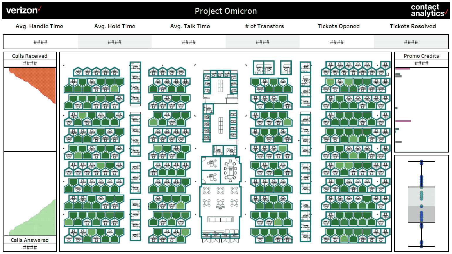
Spatial mapping need not always be geospatial mapping. It occurred to me that we could take spatial mapping indoors to monitor the customer service ops activity on the call center floor on a location by location basis. Enter Project Omicron! Imagine a dashboard showcasing a floor plan of a call center where you can view operational efficiency on a workstation-by workstation basis in real-time.
The dashboard will show in real-time how many calls are coming in, how many calls are getting answered, where they are getting answered and by which agent and also highlight the workstation on the floor if an agent is going beyond a threshold for any operational metric. Now imagine executives in the headquarters analyzing this information for any call center across the country anytime they want in real-time. It’s like a data driven ring or canary for the enterprise world!
Based on my understanding, future trends in BI are moving towards solutions that help identify bottlenecks and permute the root cause of issues faster to solve optimization problems. Visualizations that provide location specific insight and render almost real-time data will help drive this.
I envision some consolidation happening amongst companies in the BI space and the different layers in analytics tech-stack such as tagging, ingestion, ETL, storage, querying, analysis and visualization getting integrated as a one-stop-shop cloud based solution.
With respect to front-end I feel there would be more and more applications using Augmented/Mixed/Virtual Reality which would allow developers to visualize several dimensions of data in an integrated and intuitive way. This will lead to a much more immersive experience.
AH: Thanks Sid, it’s been my pleasure talking to you.
Learn more about how Sid's team uses Tableau at Verizon.
Related stories
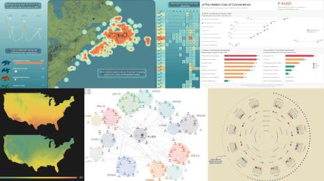
DataFam Roundup June 2026
DataFam Roundup May 2026

Iron Viz 2026: Read Between the Data
 28 May, 2026