5 tips on designing colour-blind-friendly visualizations
This is the first in a series of posts about some of the well-known “data viz rules". We often hear these rules, but the details behind them are often not examined in depth or are overlooked completely. I wanted to examine a few of them to better understand how they should be applied. For the first in the series, I examined the issue of using red and green together.


Note: The following is the first instalment in a series of guest posts by Tableau Zen Master Jeffrey Shaffer.
This is the first in a series of posts about some of the well-known “data viz rules". We often hear these rules, but the details behind them are often not examined in depth or are overlooked completely. I wanted to examine a few of them to better understand how they should be applied. For the first in the series, I examined the issue of using red and green together.
 The data-viz rule: “Don’t use red & green together.”
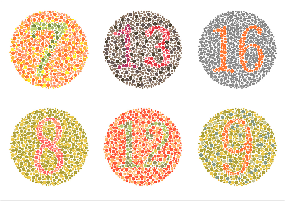
The issue: "Ten percent of men are colour-blind, mostly with red/green issues."
Reaction: "Don't use red and green together."
Studies have shown that around 8% of men and 0.5% of women have colour vision deficiency (CVD). This is more commonly referred to as colour-blindness, although colour-blindness is not the most accurate term.
Having CVD does not mean that a person can’t see colour, unless you are the very rare person (one in 33,000 people) with achromatopsia. For the more common person with CVD, the key problem is that colours most people see as different will look the same.
The two most common types of CVD are deuteranomaly and deuteranopia, which together count for about 6% of men, and protanomaly and protanopia, which account for another 2% (more information available at color-blindness.com). These conditions are also commonly referred to as “red weak” and “green weak” or “red-green colour-blindness”. (Note: I will not discuss blue/yellow CVD because it is far less common.)
Here are some tips for designing vizzes that are colour-blind-friendly.
1. Red and green together can be problematic, but they can sometimes be used together
So indeed, using red and green together is a common problem. People with strong CVD (strong meaning a more severe condition of CVD) would see both red and green as brown. People with weak CVD can see strong red and green colours as red and green. However, this can still be problematic when the colours are weak or blended together.
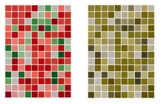
Keep in mind that being able to tell these colours apart is only an issue if colour is the only encoding method used to make a distinct comparison – for example, a good number vs a bad number in a table, or one line vs another line in the same line chart. For example, in the chart below, colour is needed to tell a good square from a bad square. Using deuteranope simulation, we can see how difficult this would be.
I’ve seen critiques regarding the use of red and green together in the same visualisation, but the colours weren’t being used in a way that required someone to tell the difference between them. If they stand alone – for example, two different charts, one red and one green – and they are labelled well, then it may not be an issue at all if they both appear brown in colour.
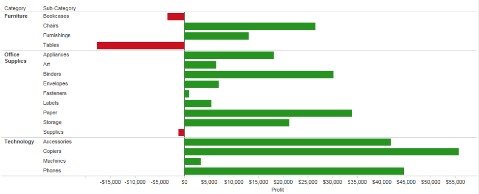
The chart below offers one example where it’s easy to see from the axis line that most numbers are positive and others are negative. Colour is a secondary feature simply encoding positive vs negative. While this may not be the best choice of colours, someone with CVD can interpret this chart without the use of colour to make the comparison.
2. Be aware that it’s not just red and green
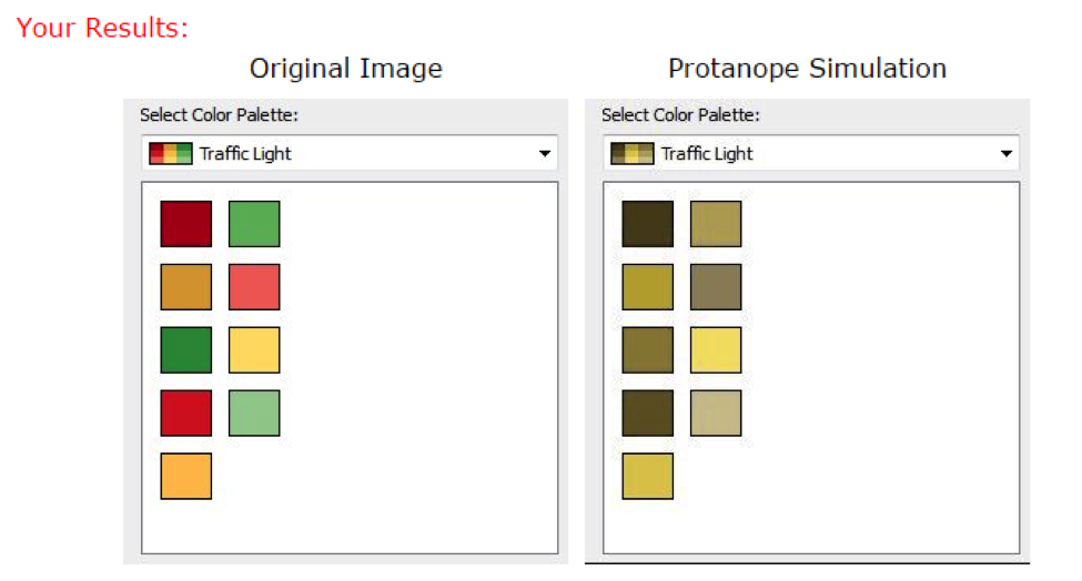
Many data visualisation tools have a “stoplight” palette built into them, and there are many companies (and clients and bosses) that still insist on using the stoplight palette. With all the talk of stoplight colours and the nicknames for the CVD conditions, it’s no wonder that the data visualisation rule has simply become “don’t use red and green”. Below is a simulation of Tableau’s stoplight colours using protanope simulation.
Notice that the problem here is much more complex than just simply red vs green. Since red, green and orange all appear to be brown for someone with strong CVD, it would be more accurate to say, “Don't use red/green/brown/orange together”. However, it doesn’t end there. When colours are mixed, they can also be problematic.
One colour combination that is frequently overlooked is using blue and purple together. In an RGB colour model, purple is achieved by using blue and red together. If someone has issues with red, then the person may also have issues with purple, which would look like blue.
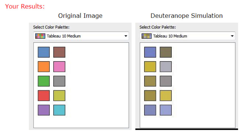
Also, pink and grey together, or grey and brown together, can be problematic. Below is the Tableau 10 colour palette using a deuteranope simulation. Not only are red, green and brown problematic, but so are blue and purple, pink and grey, and grey and brown.
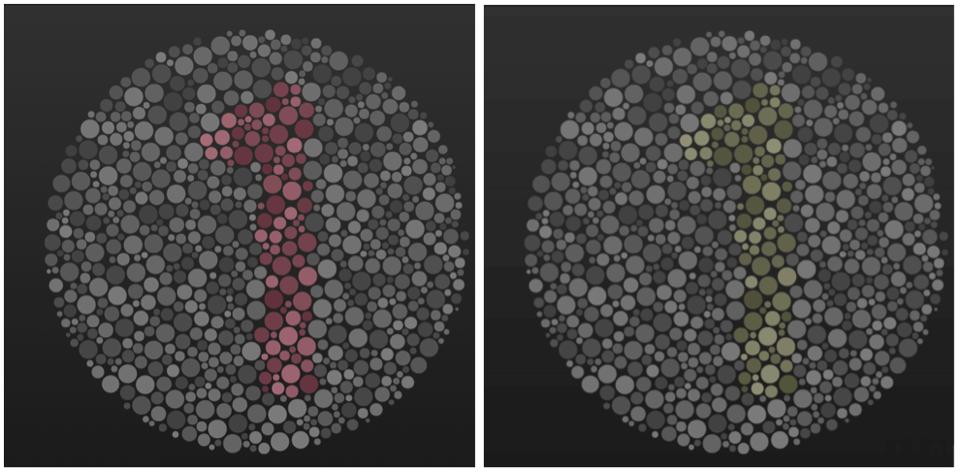
My brother-in-law has CVD, so he is frequently the guinea pig for my colour experiments. Of all the things I’ve tested on him, the combination of colours on the image below (left) was the hardest for him to distinguish. He seems to suffer from protanopia, which is simulated below on the right.
So now that we know there are many more combinations of colour that can be problematic, what should we do?
3. Use a colour-blind-friendly palette when appropriate
One colour used together in combination with another colour is generally fine when one of them is not usually associated with CVD. For example, blue/orange is a common colour-blind-friendly palette. Blue/red or blue/brown would also work. For the most common conditions of CVD, all of these work well, since blue would generally look blue to someone with CVD.
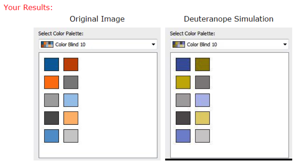
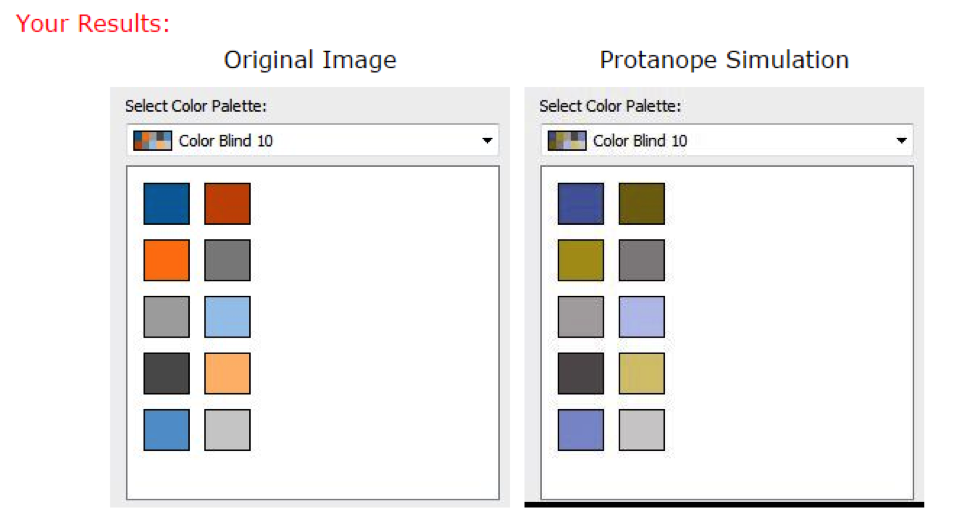
Tableau has a built-in colour-blind-friendly palette designed by Maureen Stone. This palette works very well for the common cases of CVD. Below is the Tableau colour-blind-friendly palette under both deuteranope and protanope simulation. Notice how well this colour palette works for the various comparisons of colour.
Maybe it’s the boss, the client, or even the company colours or style guide that requires you to use red and green. So now what can we do?
4. If you must use red and green together, make use of light vs dark
For someone with CVD, the problem is primarily with colour hue (e.g. red vs green) and not with the colour value (light vs dark).
Almost anyone can tell the difference between a very light colour and a very dark colour, so another option when using red and green together is to use a really light green, a medium yellow and a very dark red. This would appear to be more of a sequential colour scheme to someone who has strong CVD, but the person would at least be able to distinguish red from green based on light vs dark.
5. If you must use red and green together, offer alternative methods of distinguishing data
Along those same lines, if using red and green, you can also add icons, directional arrows, labels, annotations or other indicators that would allow a person with CVD to see that something is bad (red) vs good (green).
Another option might be a tick box for a user to switch the colour palette for the entire viz to a colour-blind-friendly palette. This allows the red/green pairing for the majority of the audience while offering a way for someone with CVD to change the palette entirely.
Unfortunately, there isn’t an easy way to do this in Tableau. However, it can certainly be done. Below are two examples, one using a parameter to change the colour palette (using both a sequential and categorical colour scheme with transparency) and the other using a dashboard action, similar to what Tableau Zen Master Robert Rouse used in his hidden-menu technique.

Want to make sure the viz you’ve designed is colour-blind-friendly? In addition to a number of online colour-blind simulators, there’s also a plugin for that. The Chrome plug-in “NoCoffee” will simulate all types of CVD right in your browser, including your visualisations hosted on Tableau Public or Tableau Server.
Try using the NoCoffee browser plugin for an entire day and you’ll be amazed at what the world looks like to someone with CVD. For images of your visualisation without a browser, try this chromatic vision simulator.
I would like to thank Maureen Stone for the valuable review, input and suggestions for this post.
For more tips, ideas and vizzes by Jeffrey Shaffer, check out his Tableau Public page and his blog. You can also connect with him on Twitter @HighVizAbility.
Related stories

9 Tips to Succeed in a Tableau DataDev Hackathon
 8 January, 2025

A Guide to Mapping and Geographical Analysis in Tableau
 15 November, 2024

Making Tables Smarter: Key Features of the Tableau Table Viz Extension
 14 November, 2024