How To Make a Gantt Chart in Tableau, Excel, and Google Sheets
Gantt charts are primarily used in project management to visualize time duration for events or activities. As a project management tool, gantt charts make the interdependencies between tasks visually apparent and illuminate the work flow schedule. They can also be used to creatively display time being spent doing an activity, whether for a business’s product delivery times or maybe how much time you spend watching tv!
This guide explains how to make a gantt chart visualization in Tableau, Excel, or Google Sheets. Since Excel and Google Sheets do not come with predefined gantt charts, consider using Tableau Desktop for free.
Download the example Excel data to follow along.
To make a gantt chart, follow the steps below.
1. Select/Connect to your data
For Tableau users, this means connecting to your Excel spreadsheet file or the server database in the Connect pane.
The data for a gantt chart in Tableau requires:
- A dimensionA dimension is a column of qualitative data that is in text format and non-numerici (a task, event, or activity)
- The start date
- A measureA measure is a term used in Tableau to describe a numeric metrici for time duration of the chosen dimension ( days, weeks, months, etc.)
The data you choose needs to have a durational measure that describes at least one dimension’s time period from start to finish. If not, you can create a calculation to define time periods between two dates in relation to one or more dimensions. This can be tricky for beginners, but a good starting point in learning how to manipulate data.
You can learn more about creating a calculated field to define the gap between time periods for gantt charts on our help site at the building gantt charts for Tableau tutorial.
In Excel or Google Sheets, select the cells containing the data for the dimensions and time durational metrics.
The data for a gantt chart in Excel and Google sheets will require the following:
- A dimensionA dimension is a column of qualitative data that is in text format and non-numerici (A task, event, or activity)
- A metricA metric is a column of numerical datai for the days since the start
- A metric for the duration of days
Due to the tool’s limitations, the stacked bar chart must start at 0, requiring whole numbers for days from the start of the time period, instead of using a start date in date format.
If your metrics are start date and end date, use the formulas below to create data columns for the tasks start day and duration of days.
- Days since start - This formula uses the beginning date of the first task (First Start Date) and the start date of any of the tasks (Selected Start Date).
- =INT(Selected Task’s Start Date Cell)-INT(First Task’s Start Date Cell)
- Duration of Days - This formula uses the selected task’s start date and end date.
- =INT(Task’s End Date Cell)-INT(Task’s Start Date Cell)
There are alternatives to using a stacked bar chart, where you can use a start date and end date in your data. However, this requires more advanced techniques of using either formula calculations or creating a sparkline bar chart, which is not covered in this tutorial.
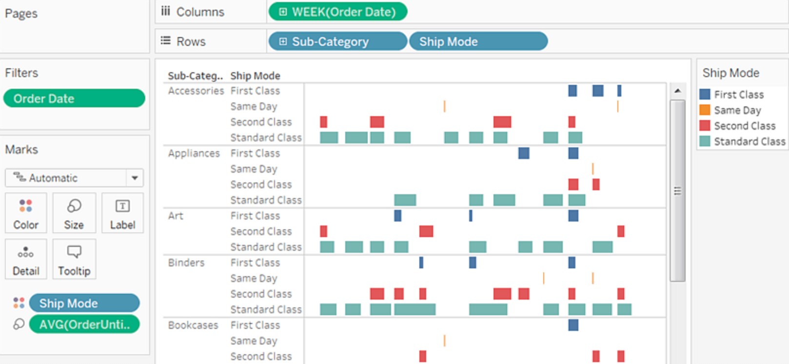
2. Configure the gantt chart
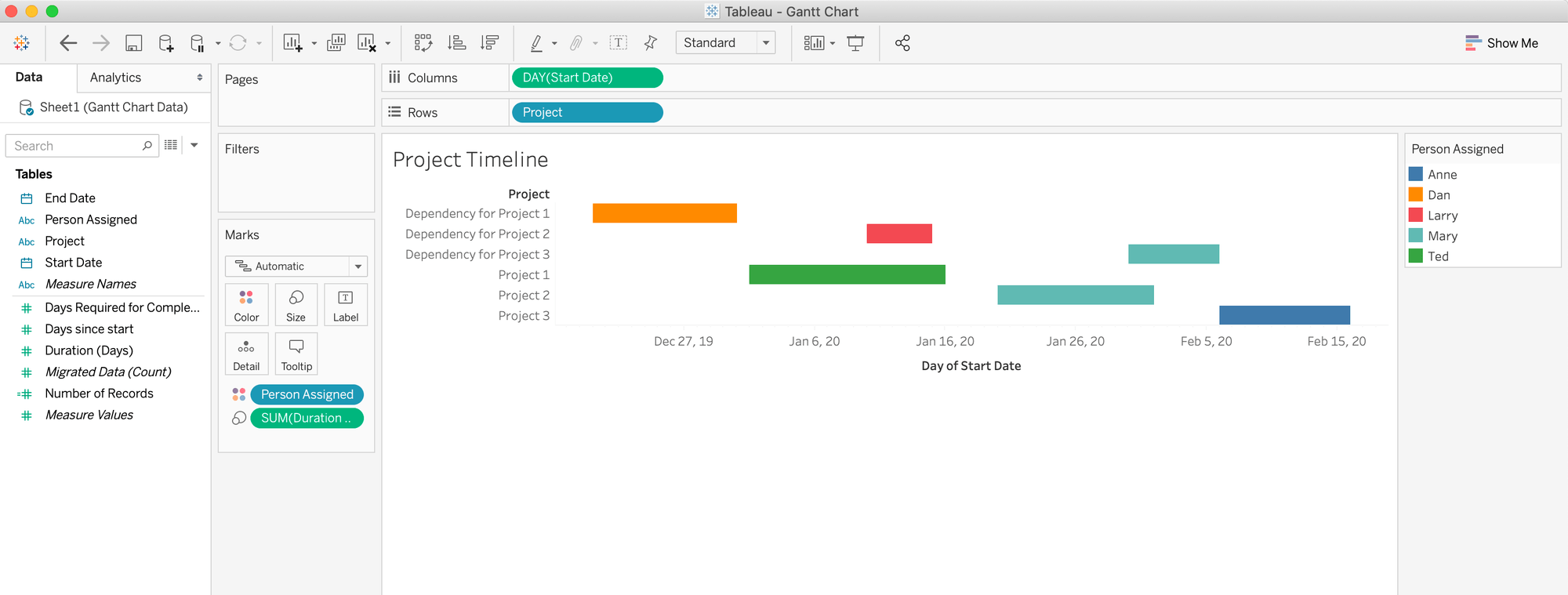
- Drag Start Date to Columns.
- Click on the pillA pill is the capsule that appears in the rows or columns field as a label for a dimension or measurei to select the continuous date value of Month or Day. The pill should be green, signifying the date as a continuous dimension.
- Drag the dimension for the Task/Project to Rows.
- Drag the measure for Duration of time to Size in the Marks Card.
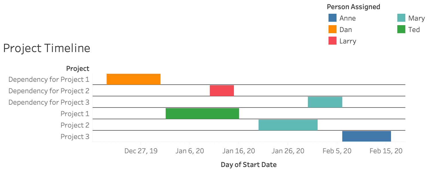
- *Optional* Use Color in the Marks Card by dragging in another dimension to add further depth. Below is an example where we used the dimension “Person Assigned”.
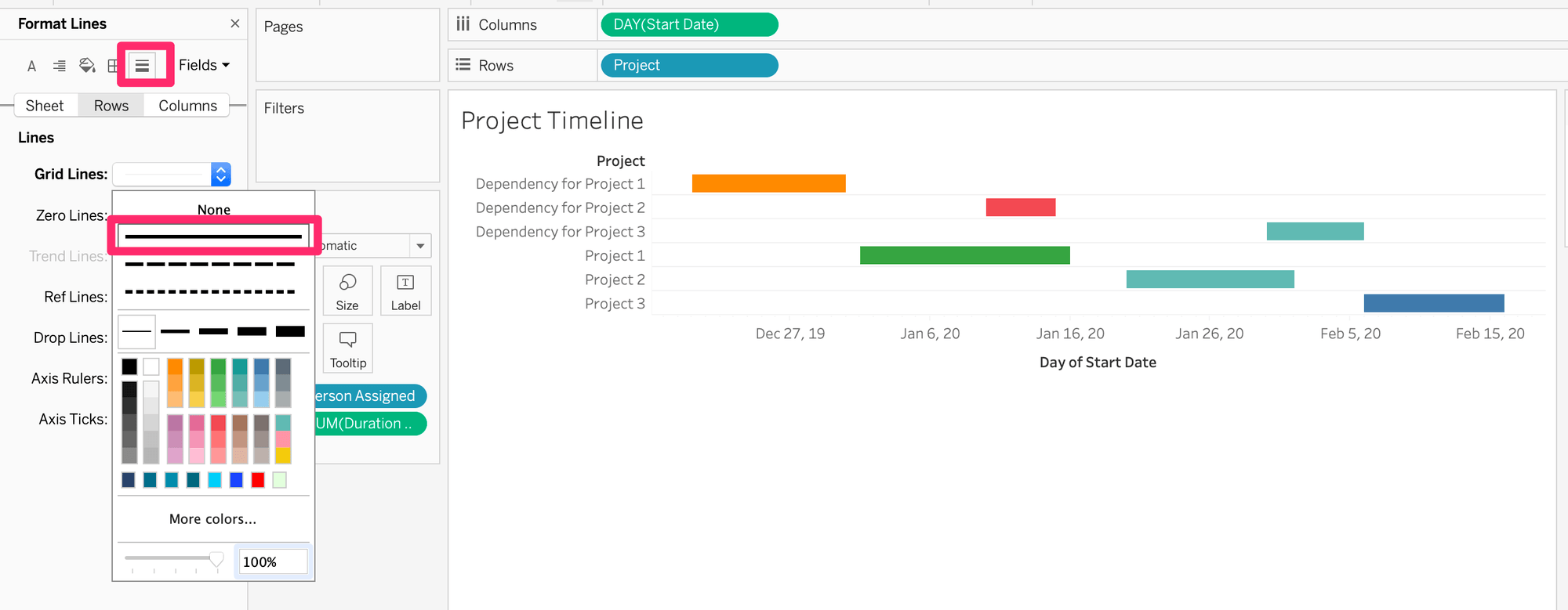
To add horizontal grid lines to your gantt chart for easier readability, follow these steps:
- Enter the formatting pane by right-clicking anywhere on the chart or Format > Borders in the top main menu.
- Once in the formatting pane, select the Rows tab > then click the horizontal Lines icon located 5th from the left of the A icon > Grid Lines
- Change Grid Lines from None to the first solid line.
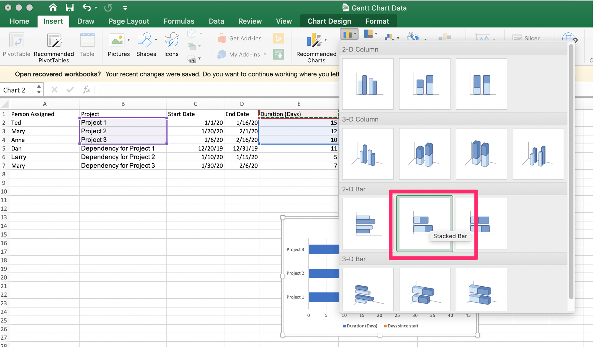
Select only the data in your excel sheet you want for the chart. If the data is located in separate columns of cells, hold down on the command key while dragging the mouse across each chosen range of cells.
- With the data selected, click Insert > Column > Stacked Bar Chart
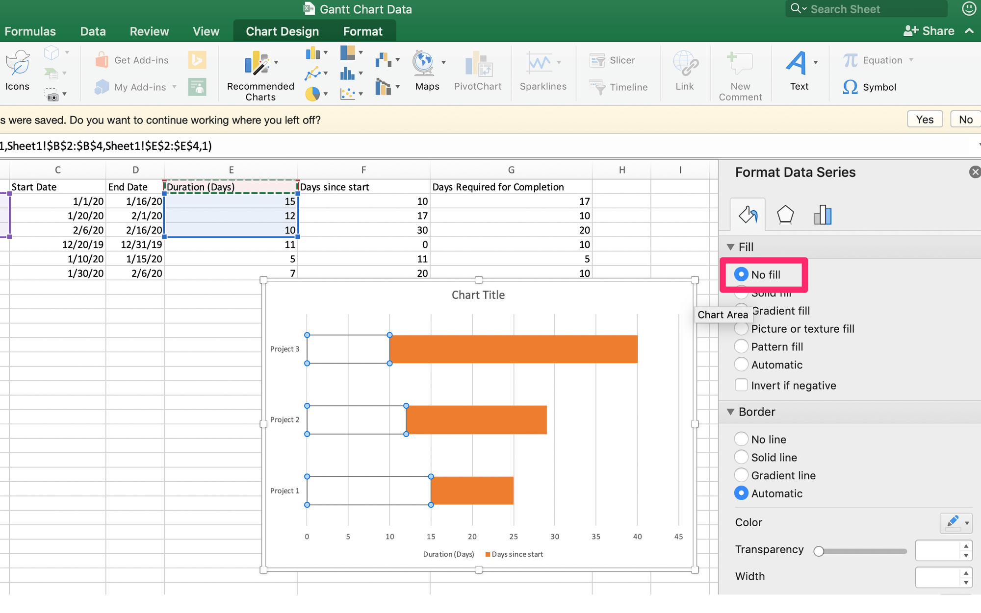
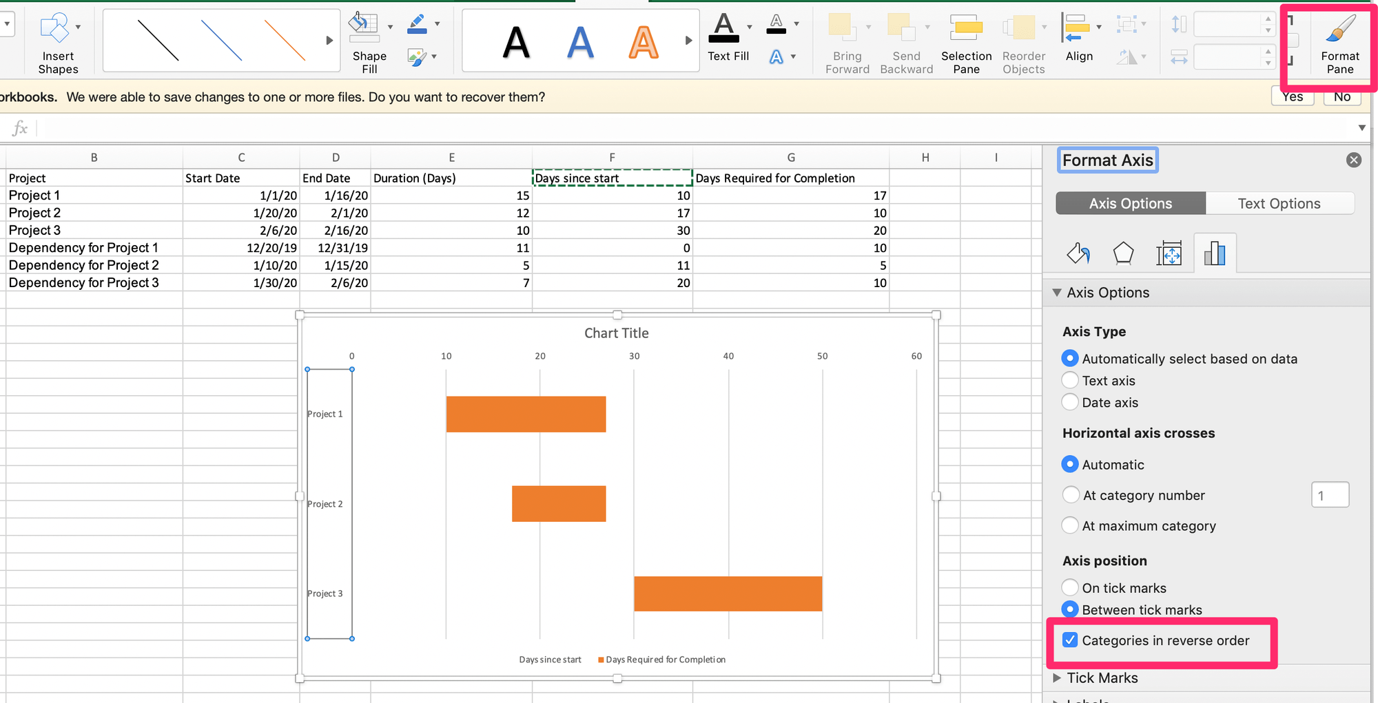
- In the chart, right click on ‘days since start’ series bar by clicking onto the left half of the stacked bar.
- Then click Format Data Series in the drop-down menu, opening the side bar menu.
- Select No Fill under the Fill and Line tab.
- In order to see the project/task in order from the start, select the y-axis dimension projects.
- Then, in the Format Pane under Format Axis check the box Categories in Reverse Order under Axis Position.
For adding horizontal grid lines to make this gantt chart easier to read, do the following in Excel:
- Select the Plot Area
- In the Chart Design tab > Add Chart Element > Grid lines > Primary Major Horizontal
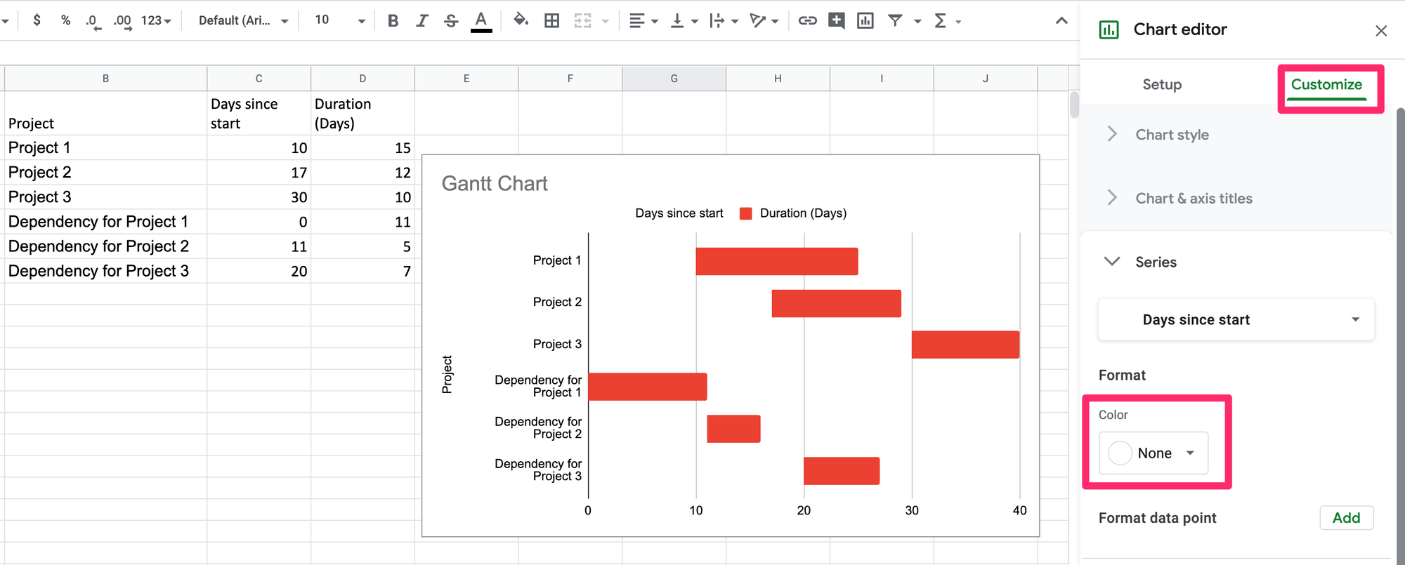
- With the data selected create the chart by clicking Insert > Chart Type > Bar > Stacked Bar Chart.
- In the chart, select the ‘days since start’ series that makes up the left stacked bar.
- In the chart editor under Customize, select the series format color and change color to None.
Tips for Formatting Gantt Charts:
- Add horizontal borders between rows to make gantt charts easier to read.
- Use color to differentiate between tasks or other dimension break-downs.
- Format bars to fill the width of the row to make the relationship between tasks easier to view.
Create beautiful visualizations with your data.

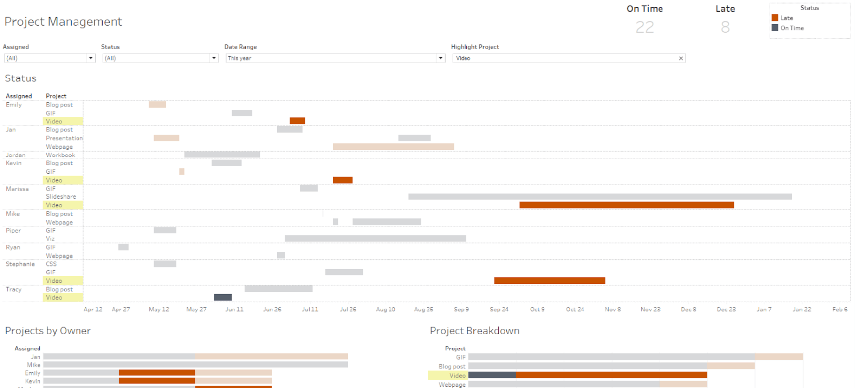
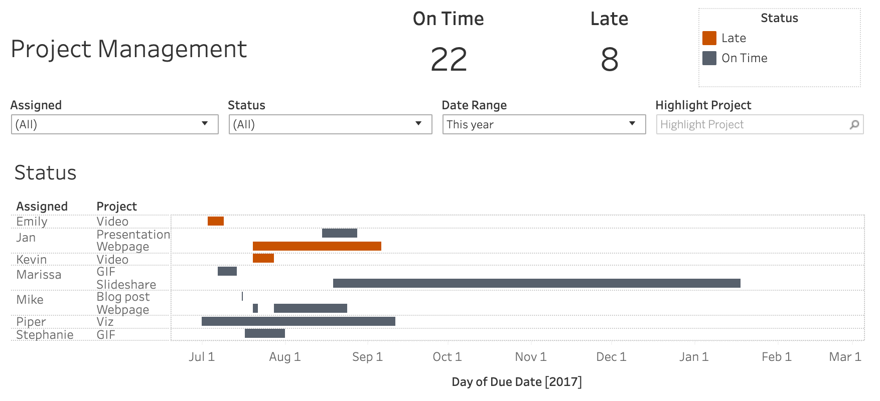
3. Analyzing the chart
Where are we seeing overlap in projects? Is there someone assigned to multiple tasks at the same time? Are there large gaps of time that could be used for other activities?
All answers and discoveries depend on the dimensions you’ve added to the data.
Here are some further breakdowns you might consider adding to the data and chart for analyzing more relationships.
- Project/Task Hierarchy - Projects can be broken down into tasks and tasks can be broken down into sub-tasks. This helps to analyze if there are any prerequisites that have been overlooked.
- Project Dependencies - Add outside dependencies that could push the timing of certain projects farther out.
- Project Status - Keep track of projects that have been completed, removed, put on hold, or are in progress.
There’s really no rules for the purpose of creating a gantt chart. While this article follows the typical project management fundamentals for gantt charts, there are many types of activities you could chart and analyze.