Wildflower Long Course 2008: Using Tableau to Analyze the Results of a Half-Ironman Triathlon


The Wildflower Long Course Triathlon is a half-ironman triathlon (1.2M swim, 56M bike, 13.1M run) held each year in Lake San Antonio, CA. The 2008 race had 1637 finishers (1226 male - including me, 411 female) broken down in the following age groups:
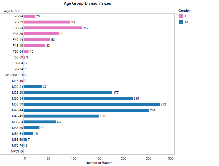
The spread of men vs. women and their age group break down is typical of a triathlon.
I downloaded a full spreadsheet of race results from the race website. This spreadsheet includes every racer's finishing time, gender, age group, swim time, t1 time, bike time, t2 time, and run time. I then used Tableau to generate additional results and put everything into this packaged workbook. You'll need Tableau Desktop 4.0 or higher, or the free Tableau Reader if you would like to play with the data yourself.
The Field's Performance at a Glance
The first question to ask about the race is how did the field do in each leg of the race compared to how they did overall? This question is answered below in a stacked bar chart.
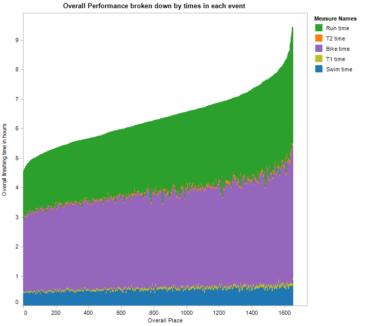
The view is made up of 1600+ colums, where the height of each column represents the finishing time of each racer. Additionally, the column's color shows how much of their race they spent swimming, biking, running and transitioning. What immediately jumps out is that swim performance has such little bearing on overall performance. It would be interesting to see a similar graph for a full ironman or an olympic distance event to see how much the swim portion matters in those races.
Notice also the occassional bars of green that shoot down into blue. That is a racer who went relatively much faster on their bike leg versus their run compared to the average time of the rest of the field. Or said another way, it's a racer who went too hard on the bike and blew up on the run.
Now let's look at a different view of the same data.
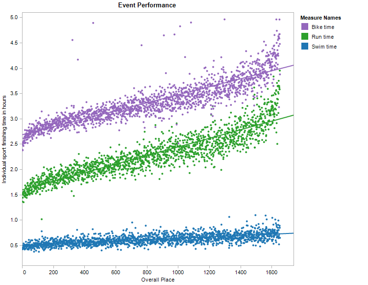
Each mark in the view is a racer's time in a particular leg given their overall finishing place. Each racer is represented by three marks showing their time in each leg, which line up vertically depending on their finishing place. Trend lines are enabled (per color) to show average expected performance given final overall place. This view works because the range of expected finishing times for each sport is disjoint.
The conclusion I draw form this view is that the cluster of times of each sport is tighter the higher your overall place, which means that as you get faster in the sport, you must be fast in all three events to place high overall.
Individual Racer Performace at a Glance
The next interesting question is to ask is how did an individual racer do in each leg given their overall finishing place? For example, was their swim extremely fast compared to their run? We can answer that question by using the same view that we used above, but this time, we'll highlight the performance of myself and five members of my triathlon team. If a time in an event is below the trend line, then that time is fast compared to the expected finish, and vice versa. The goal of every racer would be to have their leg time exactly on the trend line, which would mean that they did equally well in all three sports.
Notice that I scaled the y-axis on all five plots to encompass the range of times for that event.
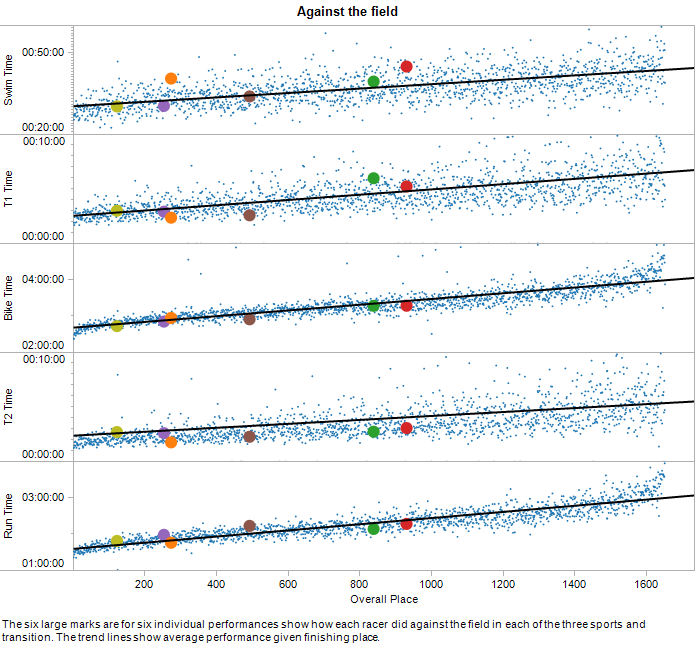
The first thing to notice is that bike leg performance is a very good indicator of overall performance, which makes sense given that the bike leg is the longest. Look at the orange mark, a teammate who finished about 280th overall. It is obvious from the graph that his swim time is very slow compared to his bike and run times, although his bike and run times aren't that much faster than the average given his place, which reinforces the idea that swim performance has the least effect on overall performance. This visualization gives the viewer an instananeous assessment of relative performance of each leg.
Finally, our coach can be happy with our team's performance in transition. Besides a slow T1 for my teammate represented by the green mark, we all have average to very fast transition times, which many coaches see as "free speed."
Relative Gender Performance
Next we ask the question, how do male overall finishing times compare against female finishing times? To show this, I plotted overall finish times versus percentage of gender place so we could compare, for example, the time difference between the 50th percentile male and 50th percentile female finishers. This is below.
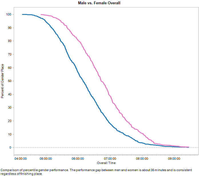
Males are consistently about 35 minutes faster than the corresponding female finisher, regardless of their finishing place. Next, I plotted how the genders did in each leg and put the results into a Tableau dashboard.
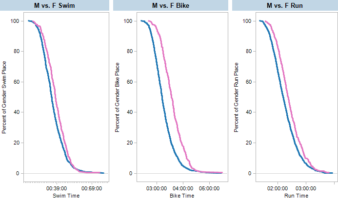
The dashboard demonstrates that men and women are most closely matched in the swim and farthest apart on the bike. This result is intuitive, but the view shows it explicitly. Even though the time scales are different for each leg, since the time axis covers the same percentage range, it's accurate to compare the distance between the gender curves for the different sports.
Relative Age Group Performance
The last question I asked is how does age effect race performance. The conventional wisdom is that once a triathlete turns 45, their performance severely degrades. Is that true? Let's see. Graphs for male and female race preformance broken down by age group are below.
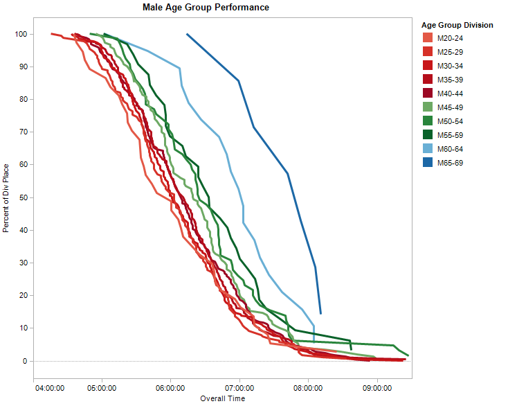
For males, it's good to be young. Males 20-24 are the fastest age group. Then there is a tight clustering of males between 25 and 44 although performance does degrade slightly with age. Then performance drops off steadily between the ages of 45 and 60, but doesn't really fall off of a cliff until age 60 and above. It's good news to know that you can be fast until relatively late in life.
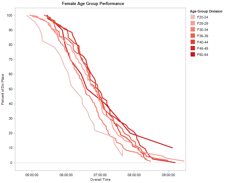
For females, it's really good to be young. There is a big gap in performance between females 20-24 and everyone else. Starting at age 25 until 54, there is a steady drop in performance, but no performance cliff. Not enough women over 54 competed to add their results to the graph.
Conclusion
I hope you have found looking at triathlon results in Tableau as much fun as I have. Each one of the views showed a different aspect of an entire database full of results in a single picture. That's what visual analysis is all about.
If you have any ideas of other ways to look at the results, I'd love to hear them. Please leave me a comment below. Happy triathloning!