Viz Roundup: Volcanic Eruptions, Climate Change, and Tableau Sushi


Do you follow the Viz of the Day feed? It showcases insightful and inspiring visualizations by you, our community.
Here are a few of our recent favorites (though it's tough to pick just a few). These vizzes show a brief history of volcanic eruptions, a sushi calorie counter, and a seismic risk-assessment of the neighborhoods of Tokyo.
Tokyo Earthquake Risks
Property Systems KK created this bilingual viz to help people evaluate the seismic risk of their area in the event of an earthquake. The viz compares two primary risks, building collapse and fire. Hover over individual neighborhoods to see where they fall in each category.

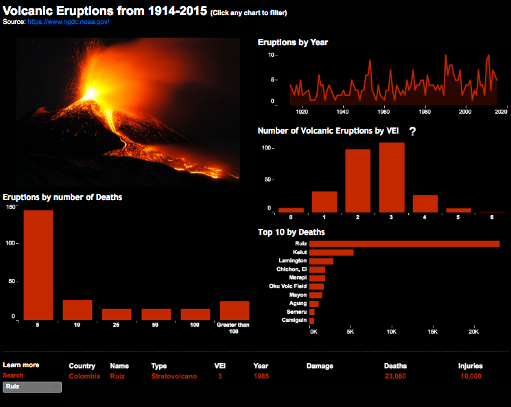
Volcanic Eruptions: 1914-2015
Self-described data nerd Rody Zakovick examined the frequency of volcanic eruptions in the past century, focusing on the deadliest eruptions. Check out his color scheme, which is quite appropriate for the subject of the viz.

Global Temperature Change: 1850-2016
Neil Richards took #MakeoverMonday by storm with his viz documenting the median monthly global temperature change from 1850 to today. Using the baseline average temperature as the center point of the color scheme is an effective way to show when the planet starts warming at an accelerated rate. Well done!
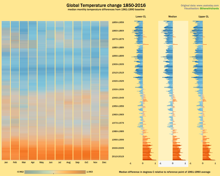
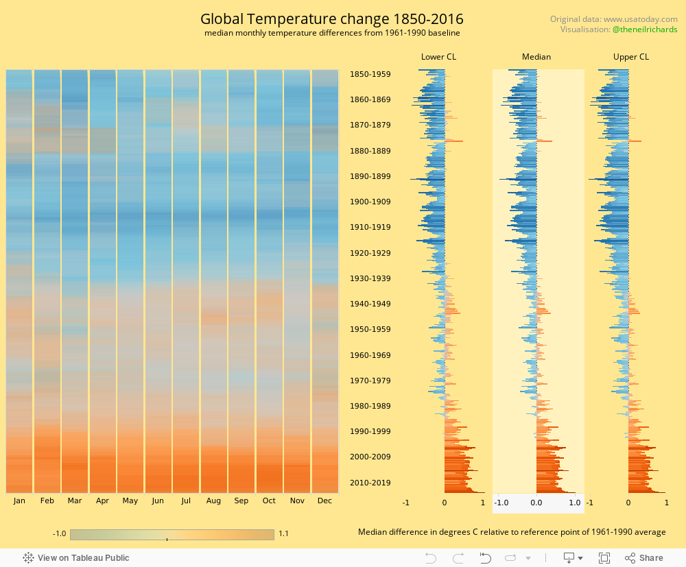
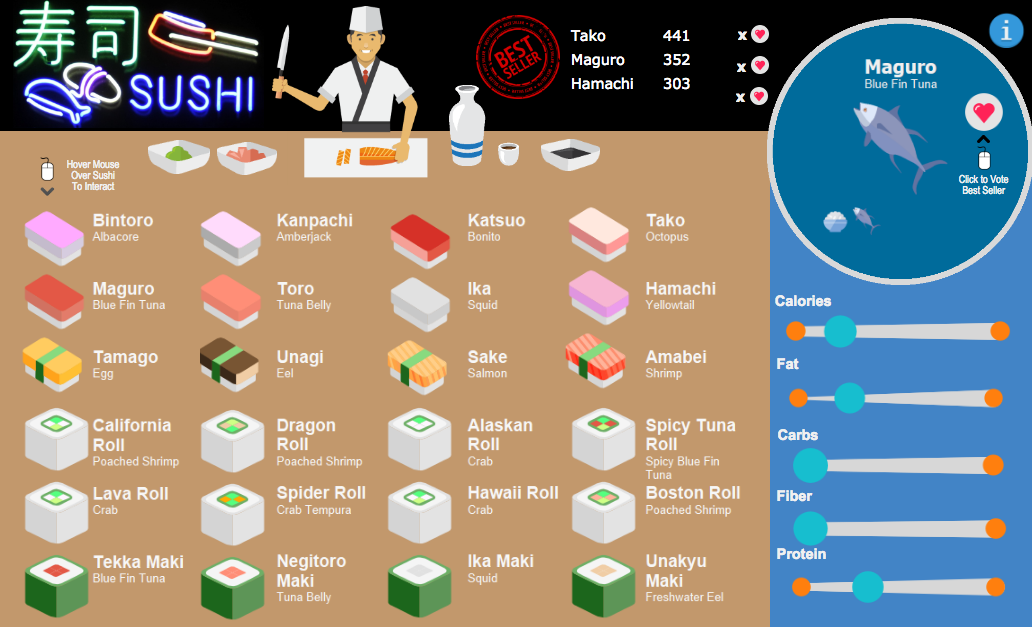
Tableau Sushi
Russell Spangler won our Food Fight Viz contest with this beauty. The viz explores the nutritional content of all your favorite ingredients in sushi. Hover over the individual ingredients to see the nutritional details. You can also vote for your favorite sushi and see a running total of "best seller" votes!

As always, thank you for creating and sharing your creations with the rest of us. Viz on!