Viz Gallery Contest winners prove that visual analytics is an art


Zen Masters and Tableau Ambassadors are some of our most esteemed, Tableau-loving community members. To show our appreciation, test their Tableau chops, and introduce a friendly competition, we decided to—you guessed it—run a viz contest to discover the best of the best when it comes to creating beautiful, inspiring vizzes.
About the contest
Competitors weren’t in it for just bragging rights: They competed for the opportunity to be featured on our website’s official Viz Gallery. Originally built to show the power of Tableau, the Viz Gallery inspires creativity and demonstrates what visual analytics makes possible.
We gave participants free reign over what data to use, and what to viz about. Our only ask for them was to keep their analyses straightforward, so that even a Tableau beginner could take the resulting viz, reverse-engineer it, and improve their skills by learning how it was made.
We received over 20 submissions within a week of announcing the contest. Judges focused on visual appeal, creativity of chart types, and data analysis techniques used to discover compelling insights. Many submissions were excellent, and it was impossible to pick just 5 winners… so we picked 7.
The winners are…
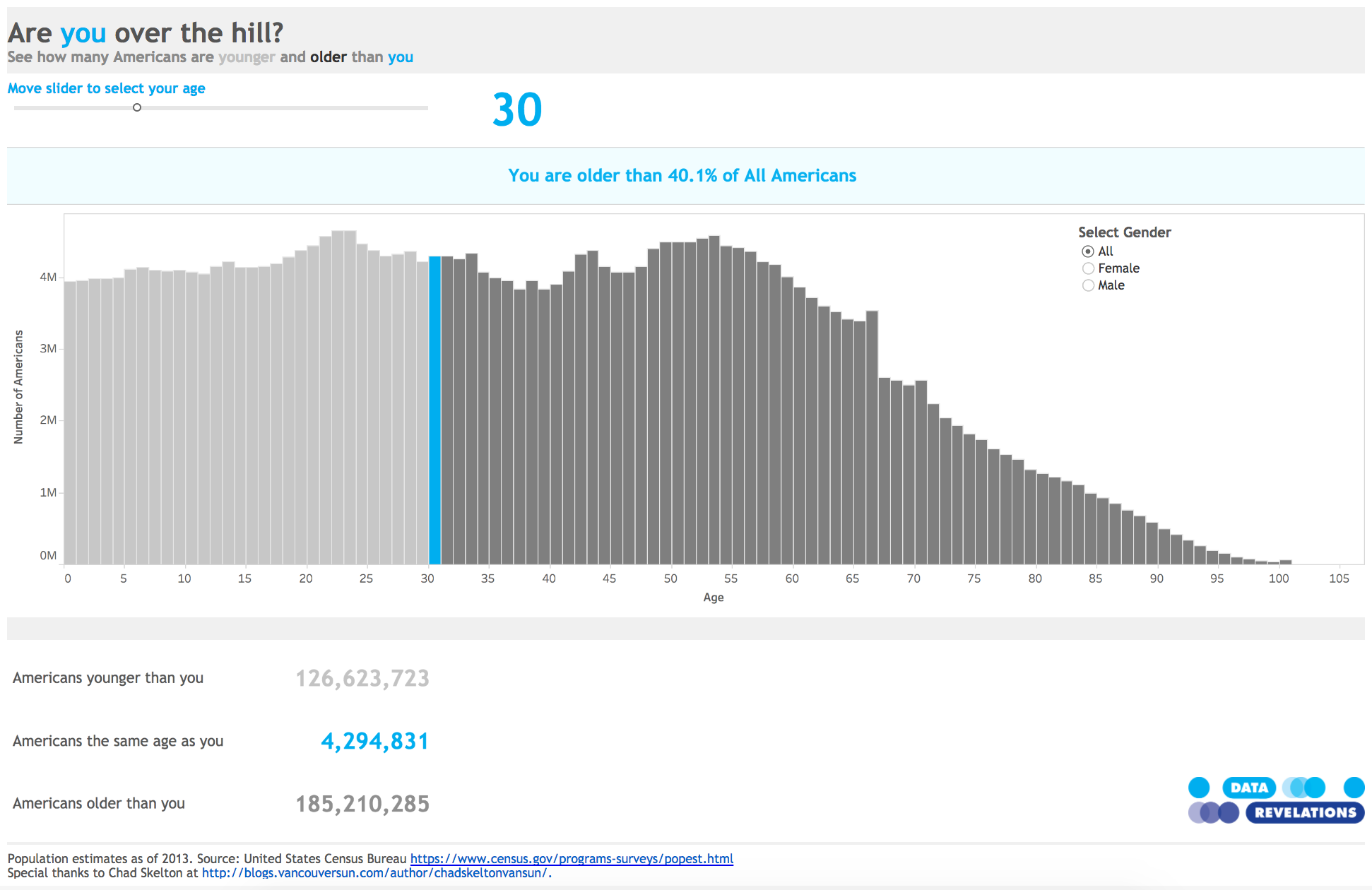
“Are you over the hill?” by Steve Wexler
This viz is the perfect example of making analytics simple, but not simplistic. Explore to see how your demographics compare with American ages and genders.
“Race to Alaska” by Anthony Gould
Anthony Gould visualizes race results of the top 5 teams in the Race to Alaska, a 750-mile boat race starting in Washington state. Follow the teams’ journeys to the finish line with this viz, which analyzes exact routes, distances traveled, and how elements like wind and water currents affected a boat’s progress.

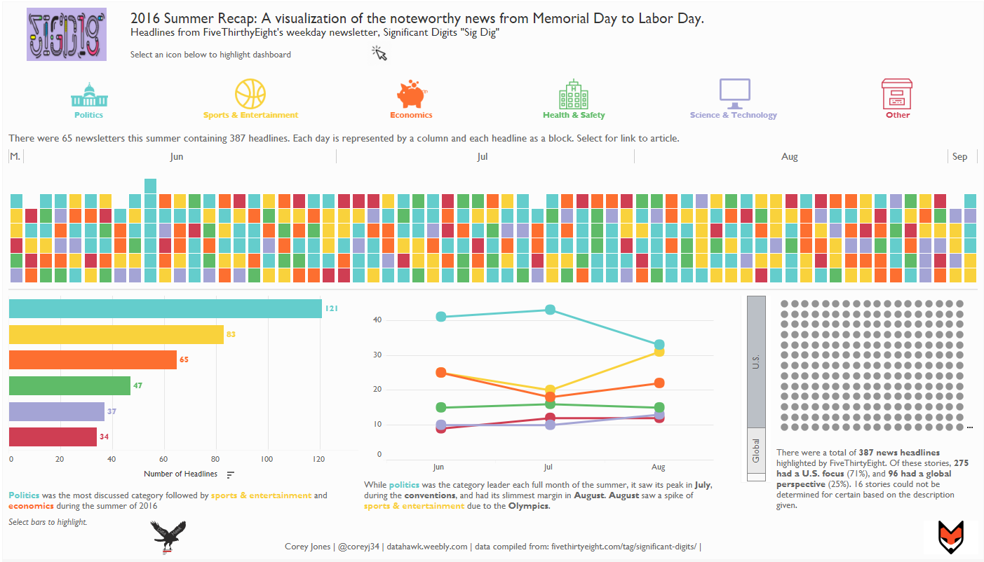
“2016 Summer News Recap” by Corey Jones
This viz provides a recap of the most notable news stories from the summer of 2016. Basic Tableau features, including line charts, bar charts, and custom shapes, are expertly combined to create a detailed narrative of headlines from all over the world.
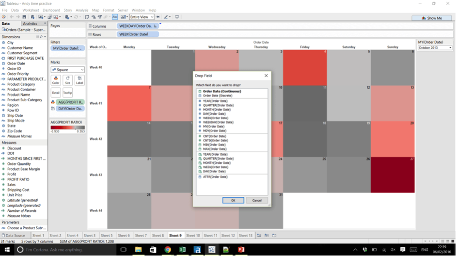
“Interactive Fiscal Calendar” by Shinichiro Murakami
Shinichiro Murakami created a customizable Fiscal Year Calendar in this viz, bringing interactivity into a typically static document. Parameters allow you to establish characteristics such as the first month of the fiscal year, or first day of the week, to suit your needs.
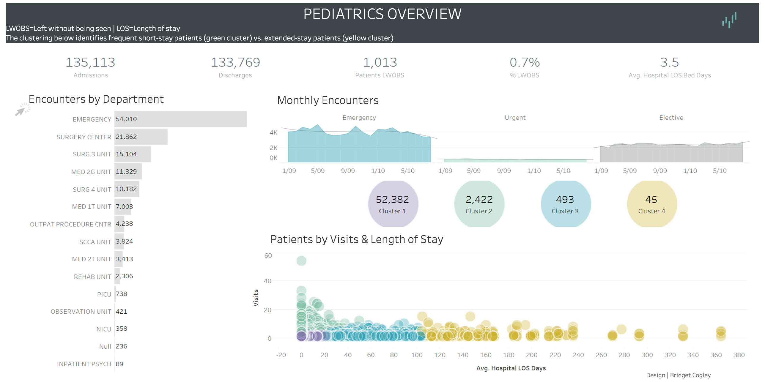
“Pediatrics Overview” by Bridget Cogley
Tableau’s clustering feature and a clean dashboard design make this viz shine. Clustering is used here to uncover insights in hospital data and provide an overview of pediatrics. Explore this viz to discover patient demographics and trends.
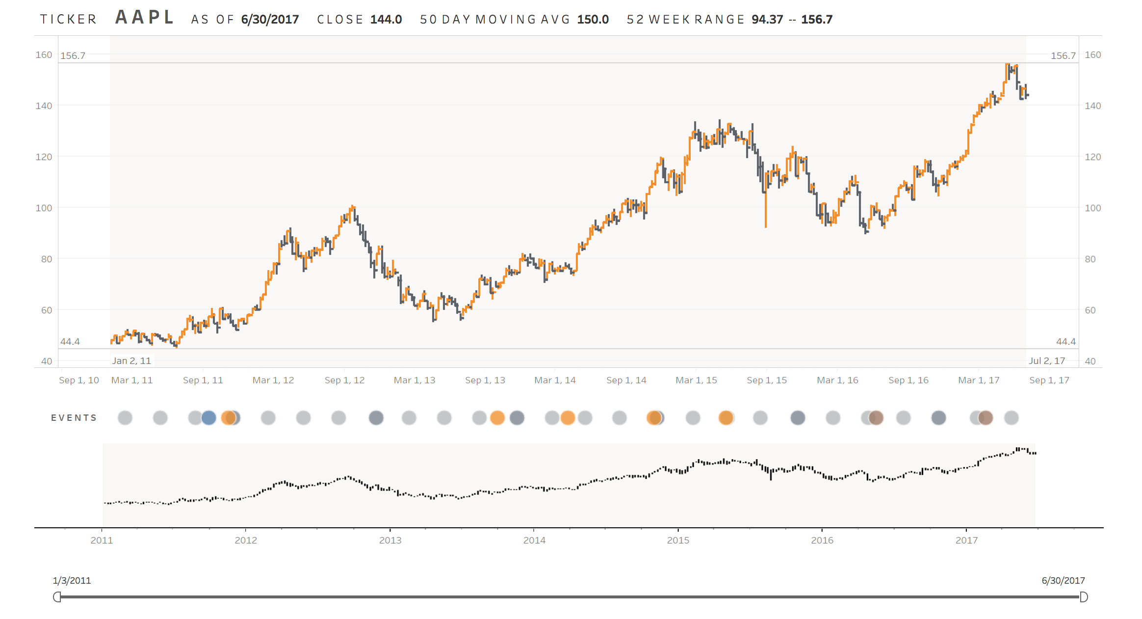
“AAPL Ticker” by Yuri Fal
This viz does an excellent job of visualizing the past 7 years of Apple’s stock data. Explore the relationship between high impact events, and see how stock prices rose and fell over time. We love how clicking on an event bubble highlights the time frame above as a clear visual reference.
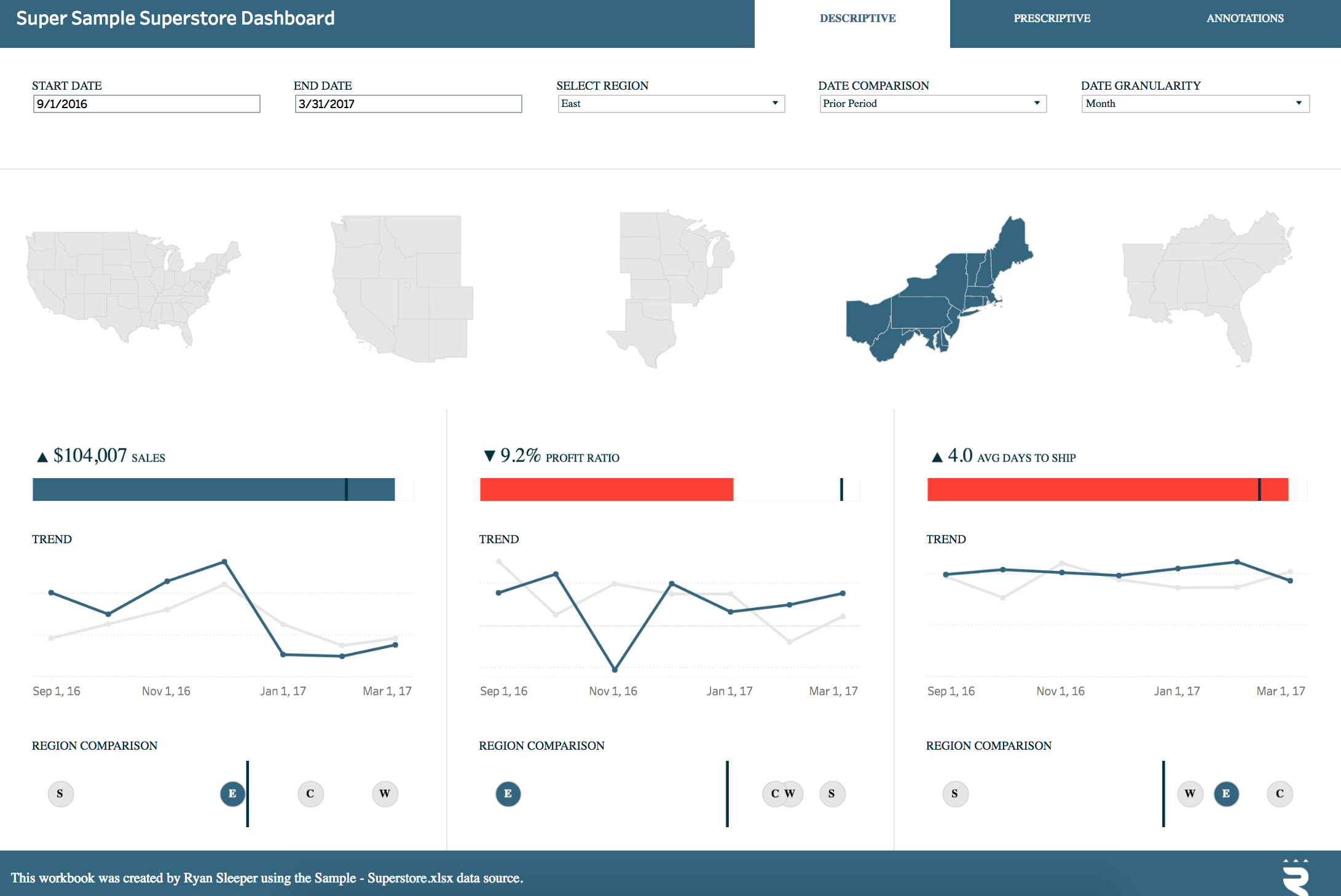
“Super Sample Superstore” by Ryan Sleeper
This corporate-style viz is a different take on the classic Tableau Superstore data set. Quickly spot increases or decreases in sales, profit ratio, and shipping time, and switch to the Prescriptive tab to pinpoint root causes. This dashboard is a perfect example of how to get the most out of any data set.
Stoke your imagination
We wanted to say thank you to all of the Zen Masters and Tableau Ambassadors who participated in this contest. It’s having a community like ours that makes investigating data and sharing analytical stories so fun and impactful.
Check out all of the winning vizzes—and more—on our Viz Gallery, here. And, once again, congratulations to our winners!
To get involved with our viz-happy community yourself, and to learn more about visual analytics best practices, check out these resources:
- Tableau Community: Sign up to connect with and learn from your peers.
- Makeover Monday: Join the recurring viz contest and get viz-spired.
- Check out your local Tableau User Group.
- Read 10 Best Practices for Building Effective Dashboards.
相關文章

5 Ways to Use Tableau Public to Achieve Your Goals
 2025/01/11

World Mental Health Day: Elevating Awareness Through Data Visualization
 2024/10/10

From TV Screens to Tableau: Visualize Your Favorite Shows with IMDb
 2024/08/31