3 financial services dashboards for COVID-19 risk management


Years from now, historians will study the long-lasting impacts of the COVID-19 pandemic to understand how businesses and institutions adapted to a very changed world. As an industry that relies heavily on analytics for risk analysis and decision-making, financial services organizations are in a good position to recover, by leveraging vast amounts of data to navigate what is being called “the next normal.”
But today, while the crisis is still unfolding, forward-thinking financial organizations also need data to understand the present, and lay a foundation for the future. By analyzing key business metrics, such as liquidity, volatility, and risk in the context of COVID-19, it’s possible to gain deeper insights, and use these insights to develop strategic priorities in real time.
Tableau has developed a number of financial services dashboards to help you begin exploring key metrics and impacts using your own data. Leverage the following dashboards or access the Tableau COVID-19 Data Hub to download a customizable jumpstart workbook and get started building your own dashboards.
Dashboard 1: Visualize credit risks
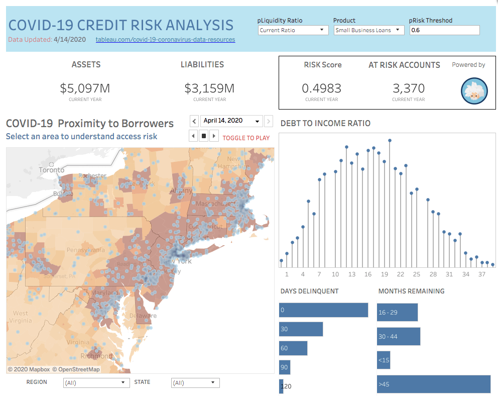
The dashboard above highlights the spread of COVID-19 within the Northeastern United States, and how the spread relates to the number of loan customers in the region. This dashboard can scale to smaller sub-regions, allowing you to gain a granular, detailed view of assets and liabilities, and assess risk scores. Use the filters to view data by product or liquidity ratio to analyze different risk scenarios.
Debt-to-income ratio is another metric that can be surfaced using this dashboard. In a COVID-19 hot zone, for example, there may be a correlation between disease incidence and loan defaults. With this information, your organization can determine where preemptive actions may be required.
Dashboard 2: Visualize cash on hand
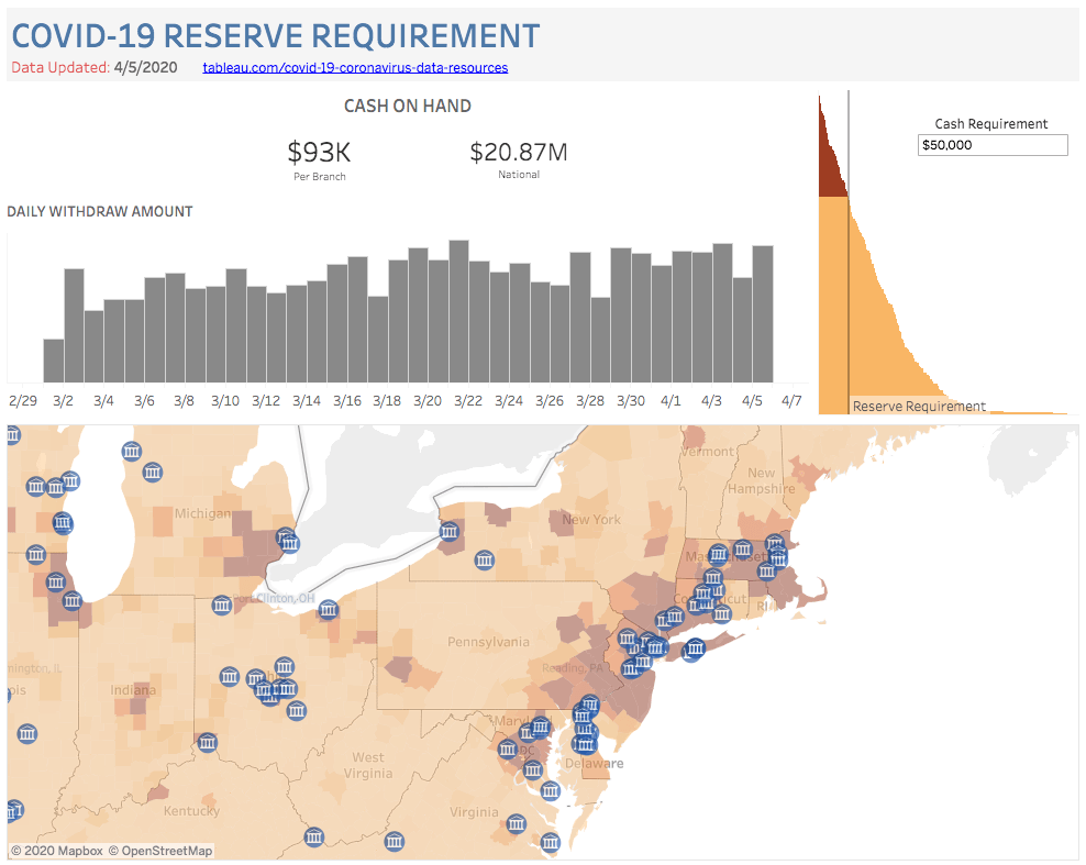
Knowing your cash reserves is a fundamental metric for retail banks. This dashboard provides an at-a-glance look into where cash reserves might be low, based on daily withdrawal data from ATMs and branch locations. With this dashboard, it’s possible to analyze cash reserves compared to locations where there’s a large spread of disease—an important factor should there be more withdrawal activity in areas where COVID-19 is prevalent. Conversely, this dashboard could be used to surface where there may be too much cash on hand, determine if it’s related to disease spread, branch closures, and other factors related to the epidemic, and transfer cash as needed to other locations.
Dashboard 3: Visualize employee impacts
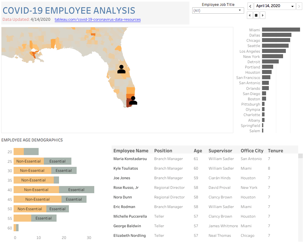
Operational metrics are extremely valuable for financial analysis and planning, but it’s also important to look at data that will help you mitigate employee risk. In the midst of this global pandemic, your employees are relying on you to understand the big picture, and to deploy them safely as demand or circumstances change. This dashboard captures disease spread and employee demographics including age, role, and location to help management make resourcing decisions in an informed way.
Learn more
Ready to try it yourself? Watch the on-demand webinar to learn more about how to leverage and adapt these dashboards for your own analyses. For more information about how Tableau can help your organization lead and manage risk during times of change, visit the Banking and Wealth Management solutions page.
相關文章
What we can learn from open data: COVID-19 in the Netherlands
 2021/04/29

After a year of COVID-19 charts, eight data communication lessons learned
 2021/04/19
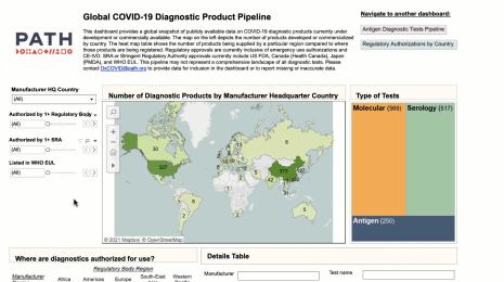
Data innovations in public health: PATH creates COVID-19 diagnostic test dashboard
2021/04/02