Supporting advanced spatial analytics with changes to lines and polygon edges in Tableau


In the newest version of Tableau (2018.2) we introduced a new spatial intersection join type. To support this feature and to lay groundwork for more advanced spatial analytics in Tableau, we are making a change in the way that Tableau draws lines and polygons.
You may not have even noticed this difference when you open your workbooks in Tableau 2018.2, but this change makes a big difference for everyone working with maps—so much so that we wanted to share a little more about what we’re doing under the hood.
Spatial lines and polygons now match the semantics of the data source
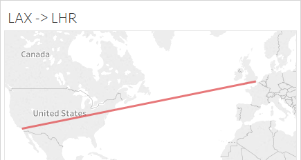
Until this release, Tableau (and most other software working with spatial files) treated all connections between points as straight lines on a map. To show the differences, consider the path between LAX airport and the London-Heathrow airport.
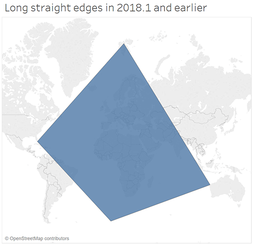
This is how the path would appear in Tableau 2018.1 and earlier:
As of Tableau 2018.2, we’re rendering spatial lines and polygons to match the semantics of the data source! What does that mean? It means that if you’re working with one of the data sources that thinks that a line connecting two points on the map should be a great circle route, we’re going to render a great circle route (the shortest path connecting these points on the sphere)!
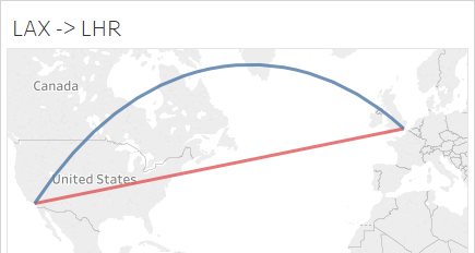
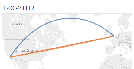
If you’re working with a data source that thinks that a line connecting two points is just a straight line on the simplest rectangular projection, we’re going to render that line, but we’ll show it as it would appear on the Web Mercator map projection of our base map. That usually means at least some curvature, but as you can see from this image of the flight path between LAX and London-Heathrow, it’s hard to see difference unless you zoom in closely.

Addressing practical needs for spatial analyses
Besides the fact that it’s pretty cool to be able to quickly create great circle routes on a map, this change also addresses some practical needs for performing proper spatial analyses.
- The earth isn’t flat, but maps are: Unfortunately, we can’t take coordinates from the earth and flatten them out onto the map without introducing distortion to area, angles, and/or distances. These distortions can make a significant difference in spatial analysis, so it’s better to do spatial analysis on the sphere (or ellipsoid, if you want to really geek out about things) and not on the flat map. Unfortunately, many spatial analytic software packages make it hard to do analysis on the sphere. We’re making it easy for you to do the right thing with analyzing your spatial data!
- Spatial file types all have different semantics for how they treat data: Tableau keeps expanding the type of spatial files that you can connect to and all these spatial file types all have different semantics for how they treat the data (e.g., some see a line connecting two points as a straight line on a particular flat map, and some see it as a great circle route). We want to make sure that the lines and polygons are being treated the same and play nice in all of the fun spatial analyses that you're working on.
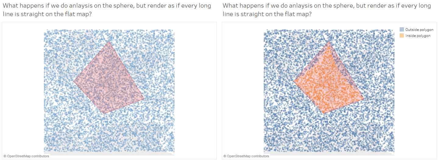
- Data you can see on the map should match up with the analyses: No one likes a spatial intersection result like the example below. A polygon and a large number of points are shown on the map on the left, and the resulting spatial intersection is on the right. What’s going on? That’s what happens if you do the analyses properly (on the sphere) but don’t render the polygon to match!
So, what does this mean for you?
You may not even notice a difference when you open your files in Tableau 2018.2. Most spatial data files don’t have line segments or polygon edges that are long enough to show a difference between a straight line on the map and a great circle route, but if you have datasets with long lines or polygon edges in them, you may notice that they are no longer ‘straight’ on our map.
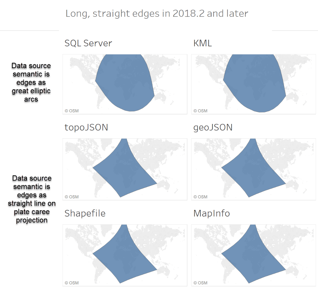
Since we’re treating lines and polygon edges based on the semantics of the data source, that means that you’ll either see the lines and edges as:
- Great elliptic arcs (SQL Server geography, KML), OR
- Straight lines on the plate carrée projection, the simplest rectangular projection (Shapefile, MapInfo, GeoJSON, TopoJSON)
Note that we are rendering the lines and edges as great elliptic arcs and not great circle arcs. A great circle arc is the shortest path connecting two points on a sphere; a great elliptic is the shortest path on a spheroid. For lines that are less than ~10,000 km in length, the great circle and elliptic arcs are mostly indistinguishable.
Here is what a gigantic straight edged polygon will look like in Tableau 2018.2 with different data source types and the new line and polygon edge rendering, and what the same files would have looked like in Tableau 2018.1 and earlier:
What if you really want long straight lines on the map?
Sometimes you really do just want long, straight lines connecting points on the map—for instance, to simply delineate a large square area of interest on the map, or just show connection between two locations without needing the shortest path on the sphere. If that is the polygon or line that you need for your dataset, you just need to do a little pre-processing on your spatial file. The trick is to just add some new points on the long line segments so that they are straight in Web Mercator. All you have to do is open your dataset in a GIS, like QGIS, change the map projection to Web Mercator, and use the vector tools to densify the geometry. That will add a bunch of new points along the line in the Web Mercator coordinate system, so then when we render it in Tableau it’ll be straight lines on our base map!
We hope that you enjoy the new spatial functionality–and spatial accuracy–that we’re introducing in Tableau 2018.2 (and beyond)! Get the newest version of Tableau today.
相关故事

VizQL Data Service from Tableau: Use Your Data, Your Way
 2024/08/08

When and How to Use Multi-fact Relationships in Tableau
 2024/08/01
Top data books of 2021
 2021/12/12