OSCAR: Creating More Meaningful Bin Breaks


Binning is a technique applied to categorize data values or to see distributions of data. It is often used to reduce continuous data into more manageable discrete categories, preserve data privacy through aggregation, generate histograms, or create breaks for ordinal color scales. Selecting the correct number of bins for a chart or map is often portrayed as a tradeoff. Too few bins and the nuances of the data, such as the data distribution may be lost; too many bins result could result in a noisy histogram making the shape information difficult to recover.
There are a multitude of ways to break up your data and each will likely give the reader a different visual impression. Choosing the best binning approach is often one that supports the story the author wants to tell their audience or to support data exploration. For example, the three maps below all show the same underlying data: the percent population of each U.S. county in poverty.
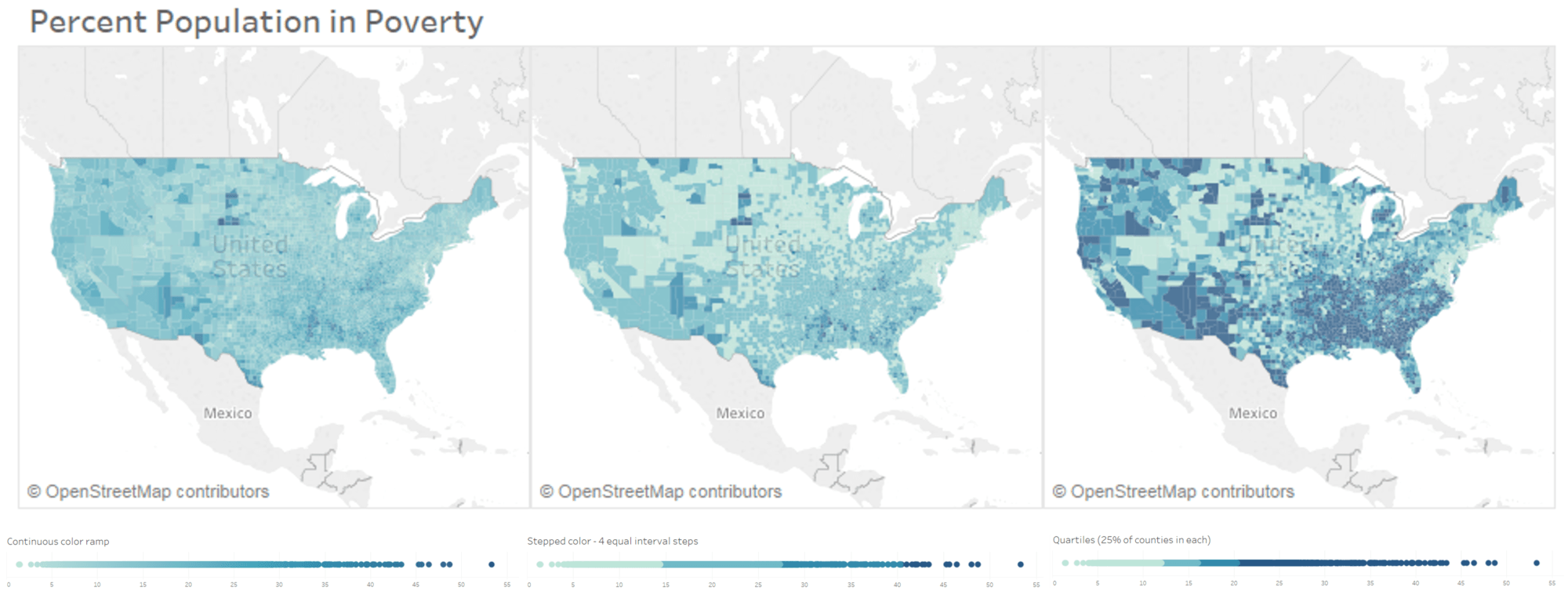
Figure 1. How different bin breaks affect the patterns perceived in the data.
The left map in Figure 1 shows a continuous color ramp—where each of the ~3000 counties is represented by a shade unique to its data value. The map in the middle shows four bin breaks determined by equal intervals on the number line. Finally, on the map on the right, we have bin breaks based on quantiles represented by four color shades, where each color represents approximately the same number of counties. So as we see here, it’s the same underlying data, but the patterns could be interpreted quite differently.
While there have been various binning techniques used based on the statistical properties such as equal intervals, quantile, and Jenks natural breaks classification, these techniques often ignore what might be the most crucial property of a binning scheme meant for use in visualization: the legibility and semantic coherence of the bins.
Using semantics from surveys and Tableau Public worksbooks
Our research specifically explores how semantics of known, commonly defined attributes such as age, population, salary, etc., could be used to create meaningful breaks in the data. It is inspired by some previous color naming research done at Tableau that automatically generates semantically resonant color palettes for known colorable data values (e.g., fruits, vegetables, company logos) using a semantic lookup of color names and their corresponding color values.
This blog post discusses a novel binning technique called OSCAR, a human-centered binning technique that leverages data semantics and legibility constraints to suggest bins for quantitative data for use in histograms, maps, and other charts.
Here is the flow of how the semantic bin lookup table is created.
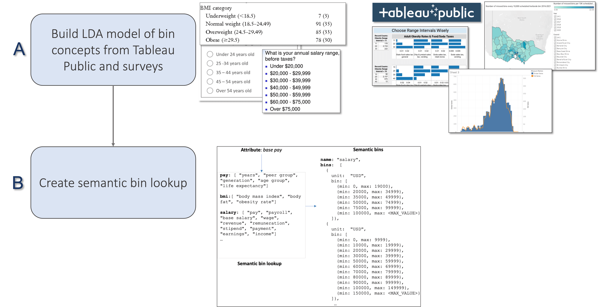
Figure 2: Construction of the semantic bin lookup table.
To generate a lookup of semantic categories, we employ a data-driven approach of mining a public corpus of survey questionnaires containing questions that categorize information such as demographic, health, and informational questions such as “Indicate your age group” or “What is your salary range?”. We also include Tableau Public visualizations containing binned fields in the workbooks as part of our binned field dataset. This process is shown in Figure 2A.
To create a lookup of bin strings and their associated bin sizes, we use Latent Dirichlet Allocation (LDA), a popular form of statistical topic modeling. In LDA, documents are represented as a mixture of topics and a topic is a bunch of words. For each bin concept, we have a label name and a set of related concepts, such as synonyms, along with sets of possible bin breaks, as shown in Figure 2B.
Recommending bin breaks
Now, let’s walk through an example of how bins are generated by OSCAR for a given data attribute, say, “passenger_age,” illustrated in Figure 3.
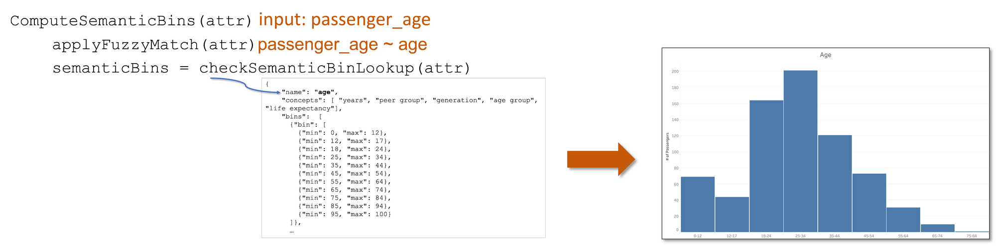
Figure 3: Semantic binning process.
We apply fuzzy matching and lemmatization to match the attribute to a bin concept, “Age” in the semantic bin lookup table that was generated in the process shown in Figure 2. If there is a match, these bins are applied to the attribute to generate a histogram.
In the absence of semantic bins, say for an attribute like “numOfLiters”, OSCAR computes default bins by applying some smart defaults to select human-legible bins, as shown in Figure 4. For generating default bins, OSCAR constrains the number of bins to a manageable size (maximum of 20 bins) to avoid too many bins (Figure 4a), rounds the bin extents to avoid inappropriate bin precision (Figure 4b), and rounds the bin extents to appropriate power of 5 or 10 to avoid arbitrary breaks in the data (Figure 4c) to create a final binning scheme shown in Figure 4d.
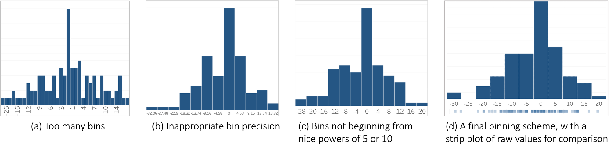
Figure 4. Default binning process.
Evaluating the semantic bins generated by OSCAR found that participants preferred semantically binned charts as the breaks felt more familiar and natural and preferred fine-grained semantic bins over coarser ones so they could see the distribution of values in the various bins more clearly. We envision OSCAR being employed in visual analysis tools where bins can be recommended for numerical attributes with the opportunity to repair and refine those system defaults. Future work should look at further evaluating OSCAR’s semantic bin quality during users’ analytical workflows in these tools.
A paper describing this work was recently presented at the IEEE Visualization Conference based on research by Vidya Setlur, Michael Correll, and Sarah Battersby.
1 The name OSCAR is inspired by the beloved Sesame Street character who embraces his life living out of a trash bin.
相关故事
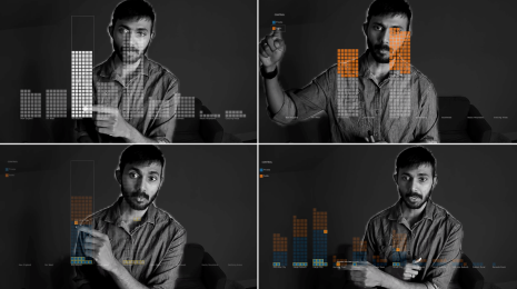
Adding Speech Interaction to Tableau Gestures
 2023/11/17
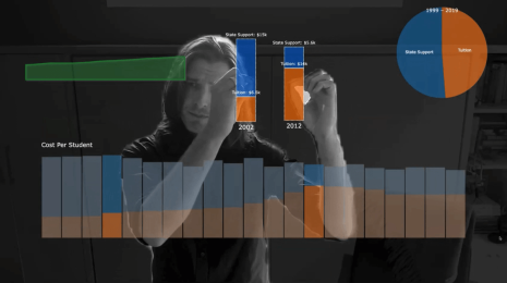
Using Augmented Reality for Touchless Interaction with Visualizations
2022/10/12