A conversation with an Epidemiologist: 5 things to keep in mind when you look at the numbers on COVID-19


Viz credit: Ben Tzannes, Tableau Public
Editors note: Amanda Makulec is the Senior Data Visualization Lead at Excella and holds a Masters of Public Health from the Boston University School of Public Health. She’s serving as an advisor on Tableau’s COVID-19 Data Resource Hub project.
Epidemiology is probably a term you’re hearing a lot these days. Whether it’s on mainstream media, from public health experts, or even your own HR companies, the study of disease and its determinants—which is what epidemiology is—is on everyone's minds. The data that they work with on a daily basis is what we're looking to for answers: We want to see the latest numbers, know how quickly case counts are increasing, and make sense of what feels like an uncertain future.
Understanding the COVID-19 numbers is much more complicated than it might seem on the surface. To many of us, data means facts—a direct line to the truth. Amid an outbreak of a new virus, what it represents is the beginning of our collective understanding that will change and develop significantly over time. In other words, the data we have right now requires a lot of asterisks and caveats.
I chatted with Dr. Ellie Murray, Assistant Professor of Epidemiology at the Boston University School of Public Health, about why data on COVID-19—and all developing pandemics—is so complicated, and what we need to understand before we start analyzing it. Here are the main takeaways, and you can watch our full conversation (over Zoom) below:
1. Case data is not as straightforward as it sounds
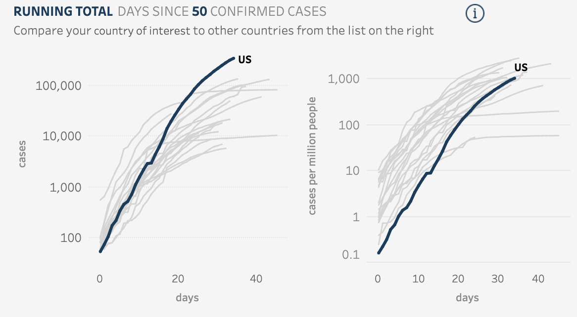
The data that we’re seeing right now in daily reports, Murray says, is typically confirmed cases. “A confirmed case is someone who has a positive COVID-19 test—those are the cases we’re pretty confident about,” she says. We are also seeing data on hospitalizations rates due COVID-19, which typically represent a subset of cases in which symptoms are most severe. Hospitalization data mostly covers confirmed cases, but in some cases—because testing is still very limited—presumed or suspected COVID-19 cases will be counted as well.
That gets at what makes case data so complex. Without robust testing, we can’t confirm every COVID-19 infection that exists. Many people who have symptoms that sound like COVID-19 can’t get a test, or feel that their symptoms are manageable with self-treatment. Those cases—and they are cases—don’t really have a way of making it into the data. Neither do asymptomatic cases. So when you look at case data on COVID-19, Murray says, be aware that you are only looking at what is likely a fraction of the total cases out there.
2. Until the case data is complete, fatality rates will not be accurate
All the complexities of case data make trying to figure out the case fatality rate of COVID-19 an inadvisable effort at the moment, Murray says. Right now, we are counting deaths from COVID-19 by tallying up the number of people with confirmed—but sometimes also suspected or probable—cases who have died. Right now, at least in the U.S., these are mostly deaths that happen in the hospital. “Something that we’re seeing happen in places like Italy and China now, as they’ve gotten their outbreaks under control, is the death counts are going way up as they try to account for deaths that may have happened in the home,” Murray says.
And calculating the case fatality rate is extremely complex for a number of reasons. “It sounds really simple—like you just take the number of deaths and divide by the number of cases,” Murray says. But as she already pointed out, what we mean by cases is not always clear—it could be only confirmed cases, or confirmed plus symptomatic, or all infections including asymptomatic ones. “We don’t know what these numbers are, and we don’t know how badly we don’t know the numbers,” she says.
Until we have better quality case data, the case fatality rates are, at best, estimates by epidemiologists who can account for the complexity of the calculation—Murray joked that she could spend an hour talking about only case fatality rates calculations.
3. Geo-political context: Another layer of complication
In a pandemic, we’re looking at data from different countries to draw conclusions and conduct analyses. But different countries can mean inconsistencies by design in everything from the way data is collected, to access and quality of care, to the tests themselves. “It’s important to remember that most countries are using their own tests, and every test has its own sensitivity and specificity,” Murray says. That means that different tests may vary in their ability to determine if someone actually has the virus. That—layered with demographic factors ranging from average population age to prevalence of smoking—means that cross-country comparison of case data can be misleading.
4. Disease modeling and forecasting is not a crystal ball
Whenever we’re confronted with incomplete data or an unknown outlook for a situation, it’s tempting to try to model it, or create a forecast for the future from the data we have. But in the case of COVID-19, we’d be wise not to put too much faith in models. “Models are only as good as the assumptions we put into them,” Murray says. “They’re just another way of visualizing what our current state of knowledge tells us could happen. They’re not a crystal ball.”
5. When reading charts on COVID-19, come armed with your skepticism
Given everything you now know about how complex the data is on COVID-19, there are some things you can keep in mind when you look at any data or chart on the virus.
The most legitimate models and graphs are going to be explicit,” Murray says. “They’ll tell you: This is reported cases from the States, or this is hospitalizations, and this is the timeframe. If that information isn't there, just don't look at it.” The other thing the chart should tell you is the process behind the way the data is calculated and depicted. And lastly, you need to ask yourself: “Do they seem aware of the limitations of what they’ve done? Are they conveying to you what things need to be true for you to believe the information they’re showing you?” Murray says.
While we are all keen to find ways to make sense of what is happening with COVID-19, having these five considerations in mind when reading charts of case data can help you be a more informed data consumer. And if you venture into analyzing and visualizing the case data yourself, the recommendations from Murray can help you better understand the nuances of the data.
相关故事
What we can learn from open data: COVID-19 in the Netherlands
 2021/04/29

After a year of COVID-19 charts, eight data communication lessons learned
 2021/04/19
Data innovations in public health: PATH creates COVID-19 diagnostic test dashboard
2021/04/02