9.0 Zen - Flowing Analytics Pane


Analytics in the Flow – no it’s not a new yoga style; it’s actually a group of fantastic new features in 9.0. One of these features is the new ‘Analytics Tab’ that lets you quickly drag and drop common analysis functions like trend lines, reference lines, forecasts models and averages right onto your data. So how can the new analytics pane help you align your inner viz chakra?
Drag and Drop Analytical Functions
In 9.0 it’s much easier to find and use analytics functions. For starters the analytics functions are no longer hidden away, now they are easy to find, right next to the Data sidebar.

Here it is!
It’s also easier to add the functions onto you data – simply drag and drop!
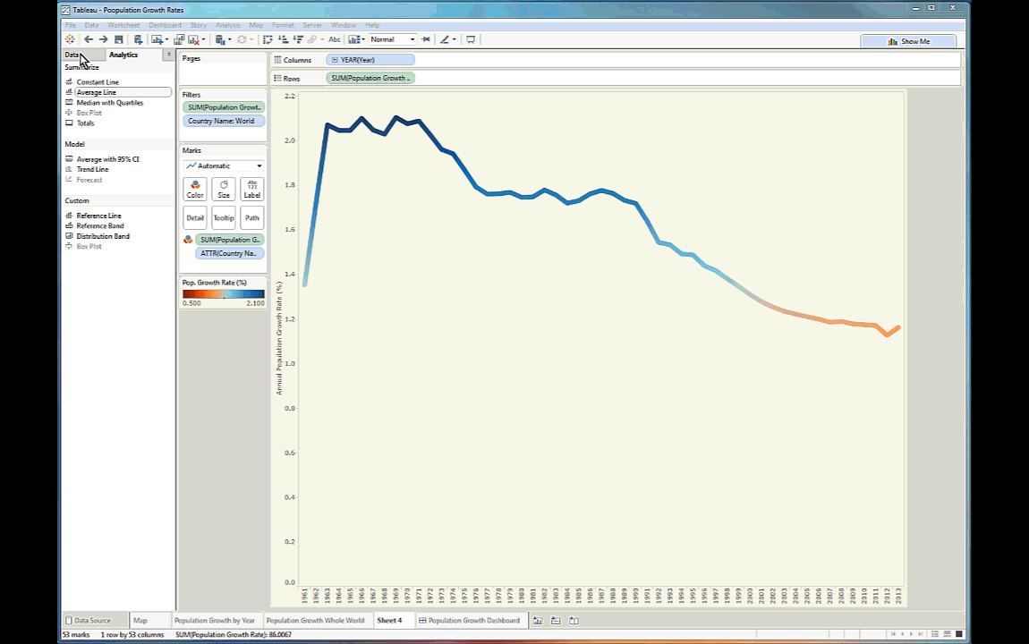
Drag and Drop an average line
Instant Analytics
Want to compare a small group of data points to the whole? Easy! Just select the points that you’re interested in and 9.0 does the rest. (this works for reference lines, totals, averages, trend lines, and other analytical tools as well!).

The new instant analytics capability - select marks to compare
Improved Trend Line and Forecasting Models
It’s not often that your data linear, so a linear trend line often isn’t the best fit. In 9.0 you can customise linear, exponential, logarithmic and polynomial trend lines. Tableau has also improved its forecasting models.
Data not linear? No problem with polynomial trend lines
Analytics in the Flow in Action
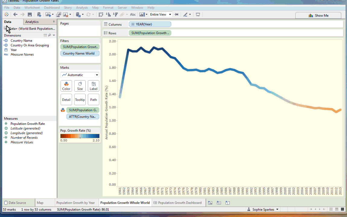
I had great fun using the improved trend line function to explore the the World Bank Population Annual Growth dataset. The polynomial trend line gave a far better fit to the fluctuating data. It was also really helpful to be able to compare various combinations of years in different countries just by clicking on the countries then highlighting the years I wanted. Look at how the global economic downturn looked in the UK and France. Even with the slowing GDP in the UK during this period population growth rates still increased, indicating that there was an influx in people immigrating to the UK as the pound was still stronger than the Euro. You see the opposite pattern in France.

Check out how the average growth rate changes when you highlight a subset of your data
Explore global population growth rates yourself!

Namaste
相关故事

Iron Viz 2026: Read Between the Data
 2026/05/28

Tableau's Iron Viz Winners

Explore the 2026 Iron Viz Entries
 2025/12/15