Meet the Tableau scientists using AI to help people uncover data insights


At Tableau, we’re using artificial intelligence (AI) to help customers get faster, smarter answers from their data. We launched Tableau Business Science, a new category of analytics that puts data science capabilities into the hands of business people. We also released new augmented analytics features in Tableau, including natural language processing and AI-driven insights.
Recently, I spoke with Principal Research Scientist, Vidya Setlur, and data scientist and Product Management Director, Rachel Kalmar, about their work on Tableau’s natural language features—Ask Data and Explain Data—and how they’re using AI to help people uncover insights.

Molly: How do your unique backgrounds contribute to your work at Tableau?
Vidya: I started in an AI lab at Northwestern University. Halfway through the program, I switched to the computer graphics group. I was able to bring some learnings and research from the AI lab to graphics and carve out a niche around using AI and information retrieval, natural language techniques to better understand semantics of information, and how we effectively depict information visually. The thesis research, which focused on how to depict imagery on small mobile screens, led to a role at Nokia when smartphones were a big deal.
Fast forward to my time at Tableau. My visual representation and semantics skills fit well with Tableau’s mission of helping people see and understand data.
Rachel: I studied neuroscience in grad school, collecting noisy data in an electrophysiology lab to better understand, predict, and model behavior so people could understand complex brain processes. My experiments weren’t going well and I needed to try something different, so I started taking classes in the Stanford d.school to learn about different approaches to building prostheses. I worked with brain-computer interfaces in the lab, and one project involved designing and building a prosthetic knee joint for above-knee amputees.
That class was the first time I saw somebody using something I had built. Seeing people walking on this knee joint we built was transformative. I realized academia would limit me to research papers, but I wanted to build things people would use. I was excited to understand people’s needs and translate them into people-centered design.
Later, mentors recruited me to work as a data scientist at their startup, Misfit Wearables, where I worked on everything from designing algorithms for our wearable device to connecting research with customers and developing the schema for databases. I was interested in comparing data from other devices, so I started wearing a bunch of them: my peak was 38 devices every day. In addition to collecting A LOT of data, I set a world record for the number of wearable devices worn continuously! That experience led me to my current focus of using data to understand people’s needs and perspectives to build things that solve their problems.

Tableau data scientist Rachel Kalmar is a world record holder for number of wearable sensors worn continuously.
Molly: Tell us more about your augmented analytics work at Tableau.
Vidya: I was part of Tableau Research when we weren’t yet talking about natural language at Tableau. In those early days, I collaborated with various research scientists to develop a prototype called Eviza, that demonstrated how natural language can help people converse with data. I presented it to Tableau’s founders, and they decided to invest in natural language processing.
In 2017, I worked on the early Ask Data releases before returning to research. Now I work closely with the Search Team to help develop their vision and roadmap, while staying engaged with research relevant to the Ask Data feature.
Rachel: Tableau is really good at helping people ask questions about what happened, but we wanted to enable “Why?” questions, like “Why are sales higher in August?” The goal of Explain Data is to surface possible explanations—not to give answers, but to offer suggestions for the next best step.
We received strong feedback from authors who wanted more control over the experiences they provided for other people, so we’ve added more customization to the Explain Data authoring experience since launch, including which explanations to show and which fields to include. For our latest release, we reimagined the overall experience and interface to make it more accessible for broader audiences.
Molly: How did the initial Ask Data and Explain Data launches contribute to later improvements?
Vidya: We initially underestimated the importance of curating the experience for our customers. Often managing, curating, shaping, and publishing data so that other people can use it is a one-person show. But other organizations have a set of data curators who take the data source and try to consume it in their own analytical processes.
The feature needs to provide suggestions to guide people through what questions they can ask in natural language. To do so, it needs semantics built in behind the scenes: synonyms, related words, and human-related labels. The newest release of Ask Data supports better experiences around data curation and a more centralized way to curate the data sources for an end-stream Ask Data experience.
Secondly, when people interact with a natural language interface, even Google Home or Alexa, there’s a cold-start problem: What can I ask and what usefulness can I get? We humans don’t like to fail, or think that this thing won’t understand us. Initial versions had default suggestions that appeared as people typed. The most recent updates give users more control over how their questions are interpreted and guidance on what questions can be asked—making it easier to adjust their inputs so they can get to the result they’re looking for.
Rachel: The goal is to use Explain Data as part of the analysis process in the flow. We moved the interface to the side pane so people can look at explanations while continuing to analyze their data.
One of the things we learned along the way, but still don’t have a perfect answer for, is how to communicate technically sophisticated information to people with all levels of data and stats literacy. We’ve added more contextual help and tool tips to help people understand what they’re looking at. We want it to be a powerful feature that’s also useful to broad audiences.
Vidya: These features are a work in progress. The algorithms are getting better, and we are moving toward a better understanding of how these systems can be designed to help people get the most value. We’ve shifted from, “let’s get it right all the time with the perfect answer,” to, “let’s come up with something reasonable so people can react and refine the system’s response.”
We need to create simple, intuitive experiences, but we don’t want to make the experiences simplistic.
Molly: Did you want to work in science as a child?
Vidya: I liked writing and thought I’d be a journalist, but once I took computer programming in twelfth grade there was no looking back. The satisfaction of building something felt really good. I have the opportunity to write papers, but I’m also able to code and build stuff.
I’m working on a book with Tableau Zen Master, Bridget Cogley, that’s coming out next year. Functional Aesthetics for Data Visualization draws on various topics from perception, design, semantics, and user intent for creating beautiful yet functional charts and dashboards. I bring a researcher’s perspective; she brings the practitioner perspective. It’s been fun to see how our processes interact.
Rachel: I was always interested in science and wanted to be a doctor or engineer. It wasn’t until my first year of undergrad that I realized medical school isn’t where you learn how things work—that’s grad work—so I decided med school was not the right path.
I started working in the lab my sophomore year, and I loved the process of learning how things work and building things. Right now, I’m interested in data literacy and how to build better tools to support it.
About the experts
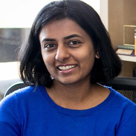
Tableau Principal Research Scientist
Vidya Setlur, Tableau Principal Research Scientist, focuses on natural language processing and computer graphics. She develops new computer algorithms and user interfaces that enhance visual communication and understanding semantics of underlying data. Vidya has a doctorate in computer graphics from Northwestern University and worked as principal research scientist at Nokia Research Center before coming to Tableau.
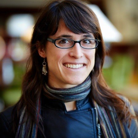
Tableau Product Management Director
Rachel Kalmar is a data scientist and Product Management Director at Tableau where she works at the intersection of engineering and user research to design AI- and ML-based features. A Stanford neuroscience PhD, Rachel has spent over two decades wrangling noisy data to explain, predict, and understand behavior. She worked at Empirical Systems, where they built probabilistic models of data and developed the features that became Explain Data, when Tableau acquired the company in 2018.
相关故事
How I TC: A behind-the-scenes look at how Tableau leaders prepare for the biggest data event of the year
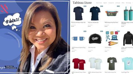
Events manager talks Tableau Store, TC conference gear, and event planning for employees