When Visualizing Data, Ask Yourself: Where Are Your Eyes Drawn?


Note: The following is a guest post by Cole Nussbaumer Knaflic.
When it comes to communicating data, I am a big proponent of using preattentive attributes—elements like color, size, and position on page—to focus your audience’s attention on the most important parts of your data. These are visual cues that ease the processing of the information. When done well, there should be no question on the part of your audience when it comes to what is important or where they should focus their attention—it is obvious.
There is a test I like to employ to determine whether I’m using preattentive attributes well to direct attention. I call this the “Where are your eyes drawn?” test. To perform it, you look away or close your eyes and then look at the visual you’ve created (typically, a graph, or the page of the communication that contains your graph or graphs), taking note of where your eyes are drawn first.
My latest blog post on storytellingwithdata.com is on this same topic. In it, I illustrate the “Where are your eyes drawn?” test using several images and discuss considerations with each that are relevant to communicating with data. Here, I’d like to focus on how you can leverage this test when it comes to visualizing data through an excerpt and before-and-after example from my new book, storytelling with data: a data visualization guide for business professionals (modified slightly to incorporate and illustrate the “Where are your eyes drawn?” test).
Imagine you work for a US retailer and want to understand how your customers feel about various dimensions of their shopping experience in your store compared to your competitors. You have conducted a survey to collect this information and are now trying to understand what it tells you. You have created a weighted performance index to summarize each category of interest (the higher the index, the better the performance, and vice versa). The following graph shows the weighted performance index across categories for your company and five competitors.
Let’s practice the “Where are your eyes drawn?” test with this example. Take a look at the graph below. Where do your eyes go first?
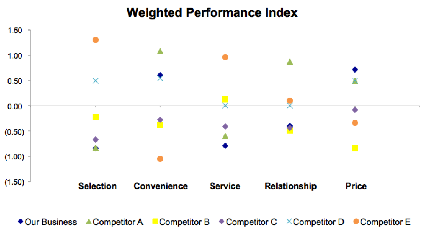
Knaflic, Cole. Storytelling With Data: A Data Visualization Guide for Business Professionals, Wiley, © 2015.
If you’re like me, your eyes are pulled everywhere and yet directed nowhere all at the same time. There are no clear visual signals indicating where we should focus our attention. This graph has failed the “Where are your eyes drawn?” test—we are not using preattentive attributes strategically.
If you had to describe the preceding graph in a single word, what would that word be? Words like busy, confusing, and perhaps exhausting come to mind. There is a lot going on in this graph. So much is competing for our attention that it is hard to know where to look.
Let’s review exactly what we’re looking at. As I mentioned, the data graphed is a weighted performance index. You don’t need to worry about the details of how this is calculated, but rather understand that this is a summary performance metric that we’d like to compare across various categories (shown across the horizontal x-axis): Selection, Convenience, Service, Relationship, and Price) for “Our Business” (depicted by the blue diamond) compared to a number of competitors (the other colored shapes). A higher index represents better performance, and a lower index means lower performance.
Taking in this information is a slow process, with a lot of back and forth between the legend at the bottom and the data in the graph to decipher what is being conveyed. Even if we are very patient and really want to get information out of this visual, it is nearly impossible because “Our Business” (the blue diamond) is sometimes obscured by other data points, making it so we can’t even see the comparison that is most important to make!
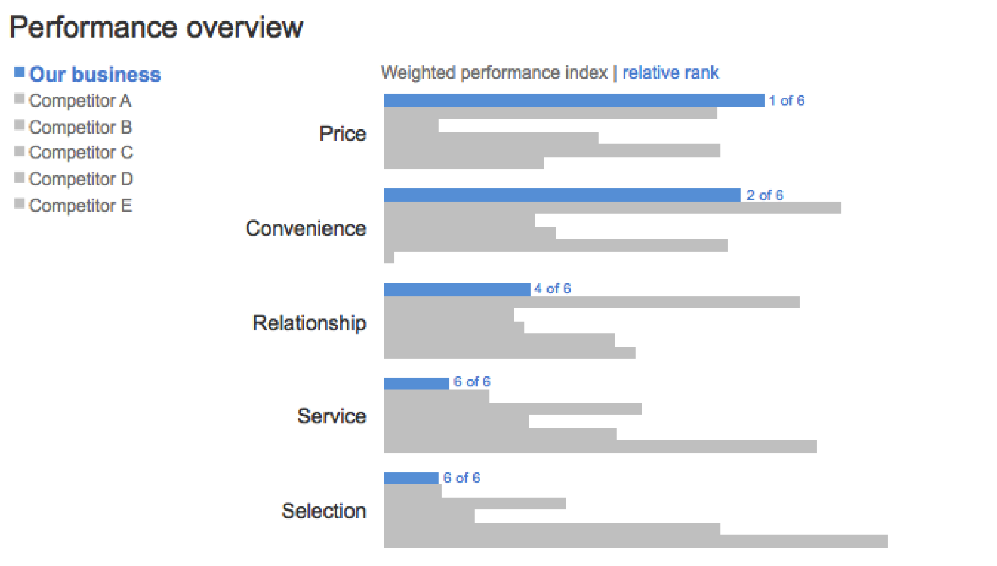
Consider the following graph, where we’ve given thought to where we want to direct our audience’s attention and used preattentive attributes (color and position) to make that visually clear.
Knaflic, Cole. Storytelling With Data: A Data Visualization Guide for Business Professionals, Wiley, © 2015.
In the revised graph, I’ve made a number of changes. First, I chose a horizontal bar chart to depict the information. In doing so, I rescaled all the numbers to be on a positive scale—in the original scatterplot, there were some negative values that complicated the visualization challenge. This change works here since we’re more interested in relative differences than absolute values. In this remake, the categories that were previously along the horizontal x-axis now run down the vertical y-axis. Within each category, the length of the bar shows the summary metric across “Our business” (blue) and the various competitors (grey), with longer bars representing better performance. The decision not to show the actual x-axis scale in this case was a deliberate one, which forces that audience to focus on relative differences rather than get caught up in the minutiae of the specific numbers.
Let’s try the test again. Where do your eyes go first here? Mine go directly to the blue bars.
With this design, it is easy to see two things quickly:
1. We can let our eyes scan across the blue bars to get a relative sense of how “Our business” is doing across the various categories: we score high on Price and Convenience and lower on Relationship, possibly because we’re struggling when it comes to Service and Selection, as evidenced by low scores in these areas.
2. Within a given category, we can compare the blue bar to the grey bars to see how our business is faring relative to competitors: winning compared to the competition on Price, losing on Service and Selection.
Competitors are distinguished from each other based on the order in which they appear (Competitor A always appears directly after the blue bar, Competitor B after that, and so on), which is outlined in the legend at the left. If it were important to be able to quickly identify each competitor, this design doesn’t immediately allow for that. But if that is a second- or third-order comparison in terms of priority and isn’t the most critical thing, this approach can work well. In the makeover, I’ve also organized the categories in order of decreasing weighted performance index for “Our business,” which provides a construct for our audience to use as they take in the information, and added a summary metric (relative rank) so it’s easy to know quickly how “Our business” ranks in each category in relation to our competition.
Where are your eyes drawn in the latter graph? Exactly where I want them to be. That is the power of preattentive attributes used well. Try this test on your own visuals to see if you’re drawing your audience’s attention where you want it.
For much more on communicating effectively with data, check out my new book, storytelling with data: a data visualization guide for business professionals.
Parts of this post were excerpted from: Knaflic, Cole. Storytelling With Data: A Data Visualization Guide for Business Professionals, Wiley, © 2015.