Tips for designing device-specific dashboards that make everyone happy


Update: Tableau 10 is here! Download now to try out the feature outlined below.
You’ve connected to data, created some views, placed them on a dashboard, and now it’s time to share. Before you do, have you considered who you are sharing your dashboard with? Is she using her phone on the go? Maybe she’s more of a tablet-on-the-couch kind of a person. Or, most likely, she’ll want to ask questions with your dashboard on any device, at any time. After all, it’s the data that matters.
Before diving in, consider your end user’s needs. Dashboards can answer many questions and allow for further exploration, so take a moment to guarantee that your viz is digestible.
Imagine you need to report sales trends by quarter to your boss. Your default dashboard (the first one you make) might include two views: a bar chart called Sales Trend by Quarter, and a line graph called Accumulated Sales by Week of the Quarter. Objectively, the second view helps contextualize today’s sales trends.
But put yourself in your boss’s shoes: That line graph might not be necessary on her phone, when she’s really just looking for trends on the go—one bar chart, in and out. With device designer, you can get rid of the redundant view on phones specifically, and you’ve got space for the bar chart your boss really wants.
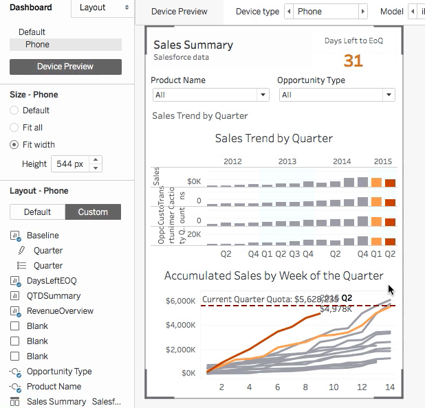
Tableau makes it easy to optimize dashboards for viewing on any device. Check out these tips and tricks for using device designer (new in Tableau 10!) to let your data shine on phone, tablet, and more.
1. Start with a device preview
In many cases, your dashboard will automatically look and feel great across devices. Click "device preview" to see whether this is the case for you.
The grey bounding box gives you a good idea of how your dashboard will appear on the selected device (Device type).
You’ll want to customize your dashboard for different devices when:
- Your dashboard content doesn’t fit naturally on small screen sizes.
- There are many objects on your dashboard.
- You’re picky and have heightened design sensibilities.
2. Avoid object overload
For small tablet or phone screens, limit the number of objects on your dashboard to just those you really need. Ask yourself: What is the essential information I want to convey?
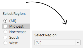
Begin by removing unnecessary views, filters, titles, and legends. Then replace spacious filters, like "single value (list)," with more compact ones, like "single value (dropdown)." This saves precious screen space for your data!
With optimized content, it will be easier to give your dashboard a small-screen facelift.
3. Arrange your dashboard
You’ve considered your audience, and you’ve optimized your dashboard’s content. What next?
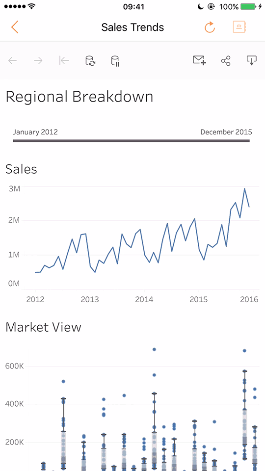
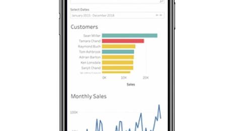
Stack content vertically for small tablet or phone screens. Most people use their phones in portrait mode. Unless you need to show a wide map view or timeline, prioritize optimizing your dashboard for phones vertically. This hierarchy works well in most cases:
- Title and/or key metric
- Filters (Even if they fit side by side, stack filters vertically to make them easier to tap.)
- View
- Associated view legend, if necessary
- Additional views, if necessary
Take advantage of size controls. Device designer includes three sizing options: Default, fit all, and fit width. Selecting "fit all" automatically fits dashboard objects to the height and width of the device.
If you need to include many views for small tablet or phone screens, "fit width" is a better option. It allows the user to scroll vertically to view multiple dashboard objects—automatically fitting them to the device width and a set height.
Pro tip: Check the “Tableau Mobile app” box to size your dashboard for optimal viewing in Tableau Mobile.
Use a “peek” to indicate when more content is available by scrolling. If you create a scrollable dashboard, indicate to your user that there is more content below the fold. The best way to do this is with a “peek," content that disappears off the bottom of your dashboard.
Bonus: Pin maps and turn off pan and zoom. For scrollable dashboards with map views, pin your map, and disable pan and zoom. This prevents accidental map interactions while navigating on tablet or phone.
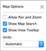
In Tableau, select Map > Map Options to open this dialog.
TL;DR
What have we learned? Here are the key takeaways:
- Ask yourself: What key information does my end user need from my dashboard?
- Click "device preview" to confirm how your dashboard looks across different devices.
- (For small screens) Remove unnecessary views, filters, titles, and legends.
- (For small screens) Determine if you need a scrollable dashboard (fit width). If so, stack dashboard objects and use a “peek.”
- (On touch devices) On scrollable dashboards, pin your maps, and disable pan and zoom.
With device designer, you’ll rest assured knowing your data stands out with optimized dashboards on any device!
For an in-depth look, watch Device Designer. You can also check out the following Online Help guides: Dashboards and Try It: Create Dashboard Device Layouts.
Learn more about Tableau 10
Tableau 10 includes a brand new look and feel, and a host of new features to help you prep, analyze, and share your insights even faster. Check out our Coming Soon page for details.
- Uncover patterns in your data with Tableau 10’s clustering feature
- Quickly find marks in context with Tableau 10's new highlighter
- Build your own custom territories in Tableau 10
- Do more with bar charts in Tableau 10
- Tableau 10 includes more maps data, multilingual auto detection
Answers through analytics
- Integrate your data with cross-database joins in Tableau 10
- As requested, you can filter across data sources in Tableau 10
- Do more with APIs in Tableau 10
- Tableau 10 includes even more data-source options
- Connect directly to Google Sheets in Tableau 10
- (Finally!) see and understand your IoT data with our Google Sheets connector
- Connect directly to your QuickBooks online data in Tableau 10
- Favorite your data sources in Tableau 10
- Tableau 10 includes even more data-source options
Data breakthroughs
- Check out the beautiful look and feel of Tableau 10
- Format your workbook with just a few clicks in Tableau 10
- How we designed the new color palettes
- Tableau 10 includes a new typeface designed for data
Beautiful by design
- Design dashboards that shine on any device in Tableau 10
- Manage your Tableau Mobile deployment with AirWatch or MobileIron
Delightfully mobile
- Author dashboards from scratch on the web in Tableau 10
- Do more while publishing workbooks in Tableau 10
- See a history of your revisions in Tableau 10
- What's new in Tableau Online
Do more on the web
Storie correlate
How to Improve Business Productivity with Tableau Mobile
 31 Agosto, 2022
Introducing improved online/offline flows in Tableau Mobile
 17 Novembre, 2020
Metrics, headlines for your data
 28 Maggio, 2020
Learn about Metrics for Tableau—Optimized for mobile, track all your KPIs from various dashboards at a glance, all in one place—anytime, anywhere.