How To Make a Histogram in Tableau, Excel, and Google Sheets
A histogram is a type of chart that uses bars to visualize the distribution of data for how many things, people, or occurrences happened between a range of values on an axis. While histograms look like bar charts, they are different in that each bar is an interval of values of a metric. These bars are called bins or buckets, and together they represent what is called a frequency distribution. A frequency distribution is the display of how often something occurred in a graph, table, or diagram. Histograms are graphs and are one way to visualize frequency distributions.
You’ve probably seen a histogram searching for the best time to visit a restaurant on Google!
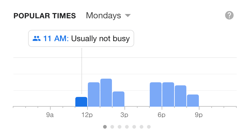
This histogram shows the frequency of visitors to a restaurant in one hour bins within the range of a time frame. However, not all histograms need to use a time period as the given range.
Histograms in statistics
Histograms are useful for analyzing numerical data sets. Analysts and statisticians use them to analyze patterns of frequency, and visualize a numerical breakdown of what is being collected in the data.
In statistics, histograms are used to graph the probability distribution of the data. This represents the percentage rate chance of any particular data point falling within each range. A probability histogram showcases the data point values that are most likely to occur. A common example is a dice roll, by calculating and displaying the predicted frequency distribution of the different numbers that the dice may land on.
A quick breakdown of histogram data
The bars in a histogram represent numeric bins (Ex. 0-19, 20 - 39, 40- 59, etc.) with data bucketed into a given range (Ex. 0 -100). The distribution that is displayed in the visualization is based on how the bins are divided. For example, you could divide the range 0 - 100 by 5 bins or by 4 bins, making the bin interval either 20 or 25 units.
This guide explains how to make a histogram in Tableau (version 2020.2), Excel 2016 + (version 16.XX), or Google Sheets. Consider using Tableau Desktop for free.
Download the example Excel data to follow along in any tool.
To make a histogram, follow these steps.
1. Select/Connect to your data
For Tableau users, connect to your data in the Connect pane where you can choose a file such as an Excel spreadsheet or a server database.
The data for a histogram in Tableau requires:
- One measureA measure is a term used in Tableau to describe a numeric metrici of numerical data
Tableau will automatically create bins from the range of numbers given in the measure. Editing the size of the bins will be explained in the next section for configuring the chart. It is preferred that you customize the size of the bins since this can affect the granularity in which the chart can be analyzed for distribution.
In Excel or Google Sheets, select the cells containing the data for the metric that will be used to create the bin distribution visualization.
The data for a histogram in Excel or Google sheets requires:
- One metric - A column of numerical data
Both tools will automatically create bins from the range of numbers given in the metric when building from the default charts.
2. Configure the histogram
Creating a histogram in Tableau can be achieved quite easily by using the Show Me function. The following steps are based on Tableau version 2020.2.
To create the histogram with Show Me, follow these steps:
- Drag the chosen Measure to Columns. This will result in an automatic horizontal bar graph showing the sum of the measure.
- Choose the Histogram chart in Show Me.
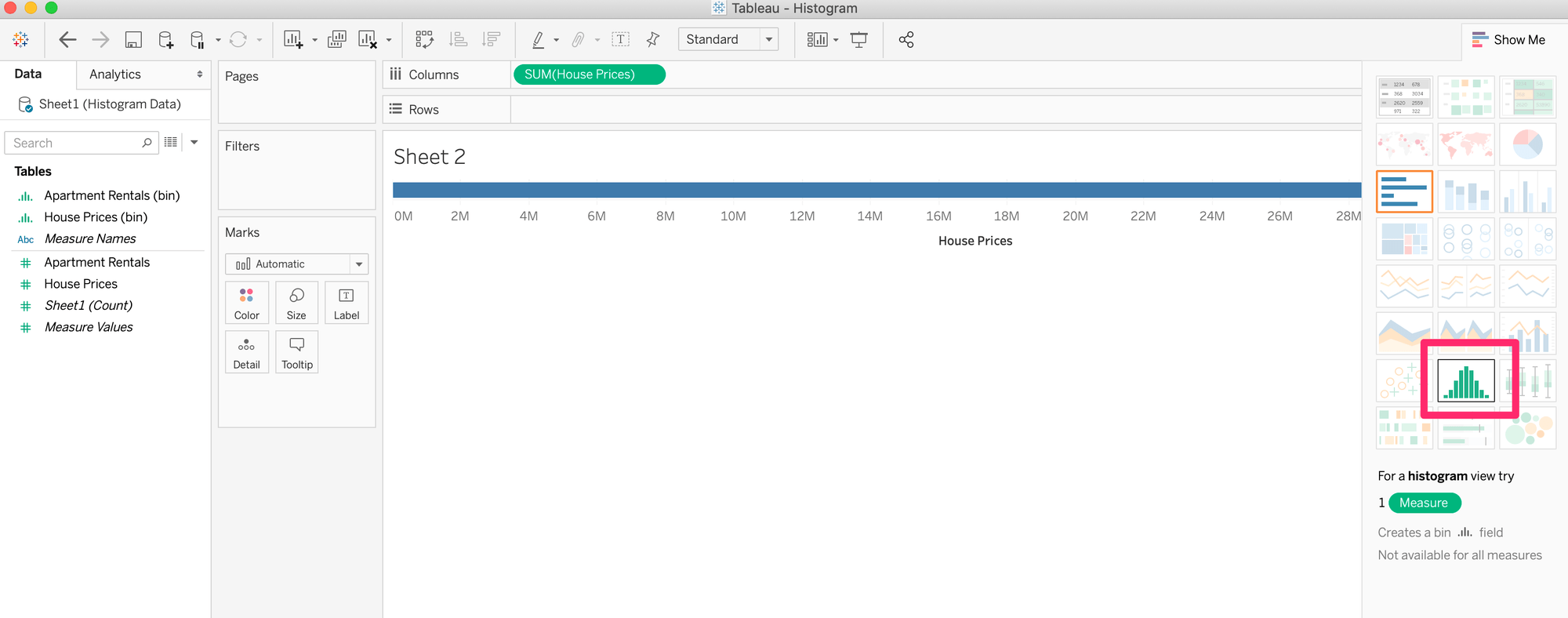
You will notice that Tableau has created a bin for the measure, which is now placed in the Columns field. It has also changed the measure from Sum to Count and moved it to Rows.
You might wish to understand better what is going on with the data in your chart. In this case, you can still manually create the chart.
Create a histogram without using Show Me by following the steps below:
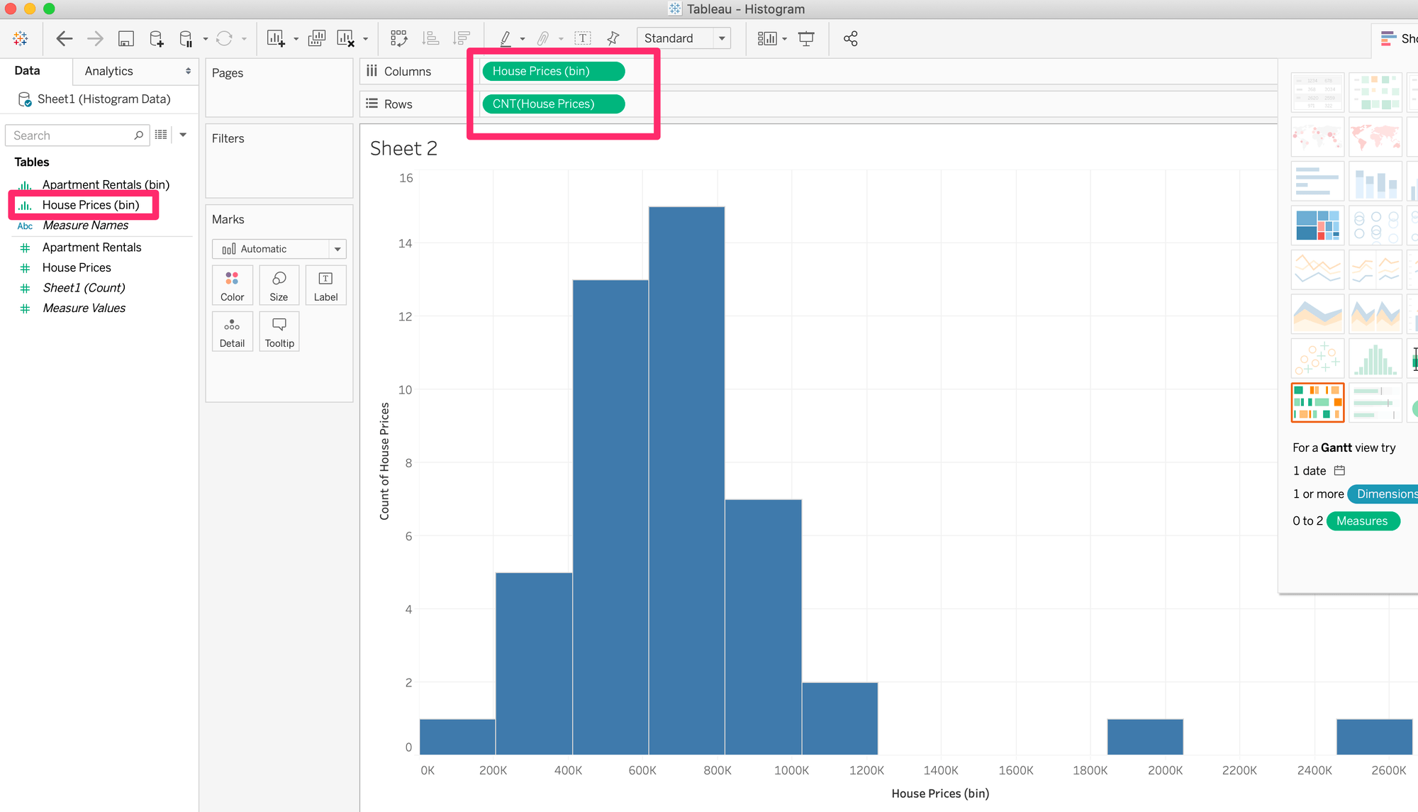
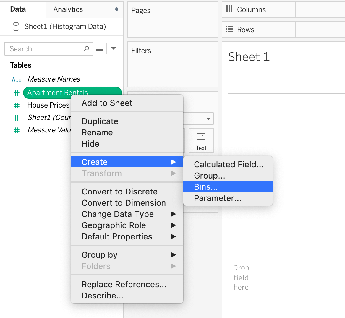
- Right click on the Measure you want to graph in the histogram. In this example, we will use Apartment Prices.
- Click Create > Bins
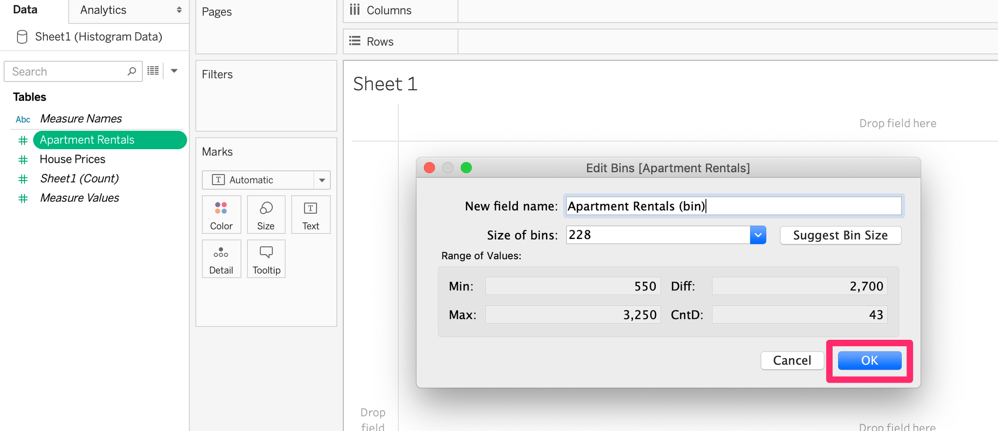
- A pop-up window to edit bins will appear, click OK. Instructions on editing the bin size is explained in the next section.
- Drag the new bin to Columns
- Right click on the pillA pill is the capsule that appears in the rows or columns field as a label for a dimension or measure.i for the bin and select Continuous
- Drag the corresponding Measure of the bin to Rows. For example, the Apartment Rentals measure, not the bin.
- Right click on the pill for the Measure and select Count
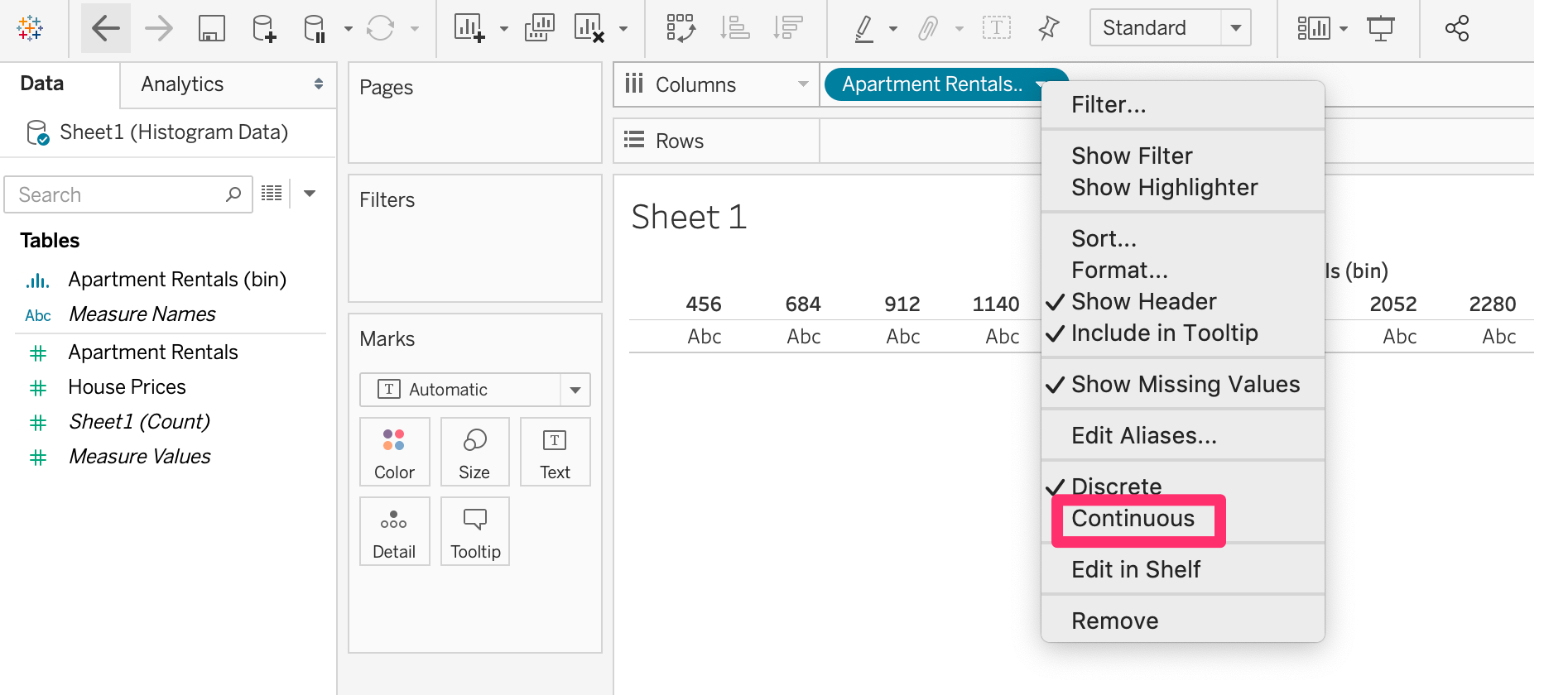
You’ve now achieved the same chart manually!
How to edit histogram bin size in Tableau
To edit the size of the histogram bins follow these steps:
- Right click on the bin in the left hand data pane. In this example, we will use the House Prices (bin).
- Select Edit
- This will prompt the editing window where you will see Size of bins. Clicking onto the drop-down will show you different choices such as creating a parameter or entering a value. Creating a parameter will allow you to customize the minimum and maximum range of values and step size of bins according to specific questions the user has for the data. However, for this tutorial we will just be adjusting the size of bins.
- Enter the value for the size of the bin here.
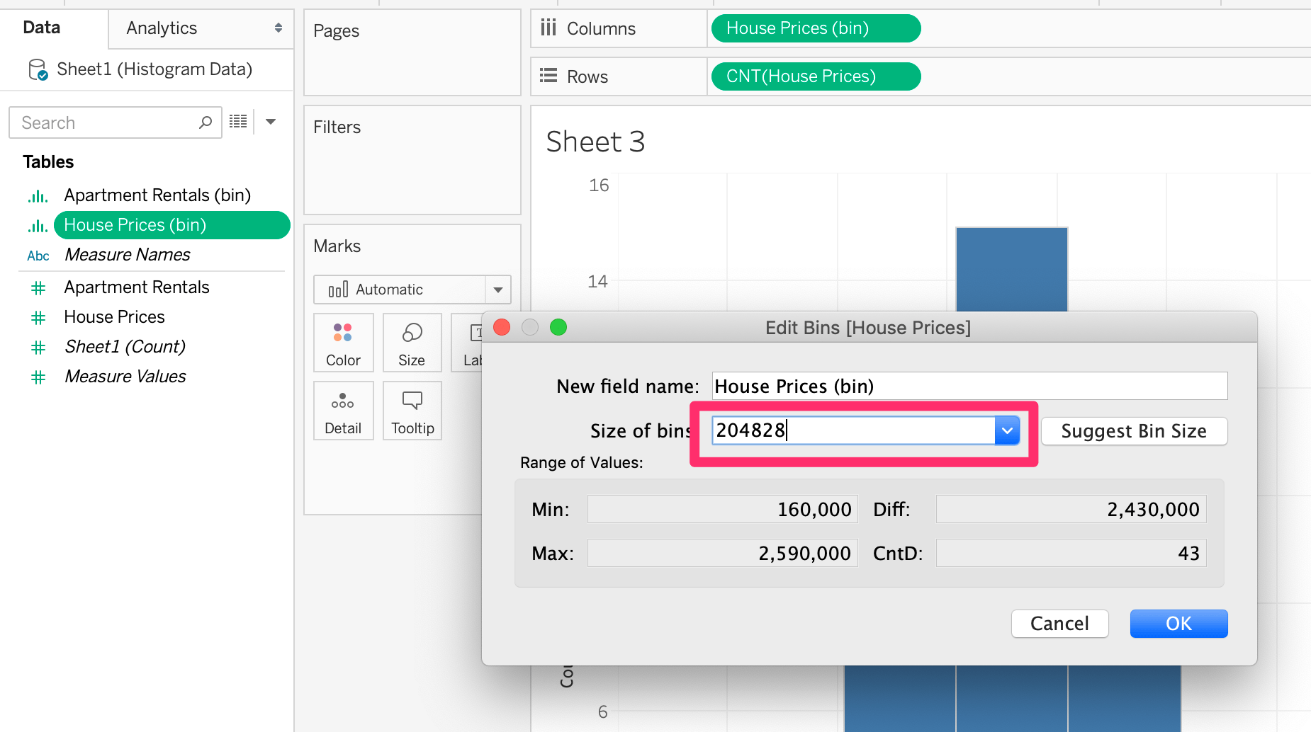
Your bins are now adjusted to a customized size!
The following steps are based on Excel version 2016 + .
- Choose a numerical column of data that you want to analyze for the histogram, then select the column by highlighting all the cells.
- Once the numerical data column is selected, click on the Insert tab.
- Then click on the Statistical chart.
- Select histogram chart.
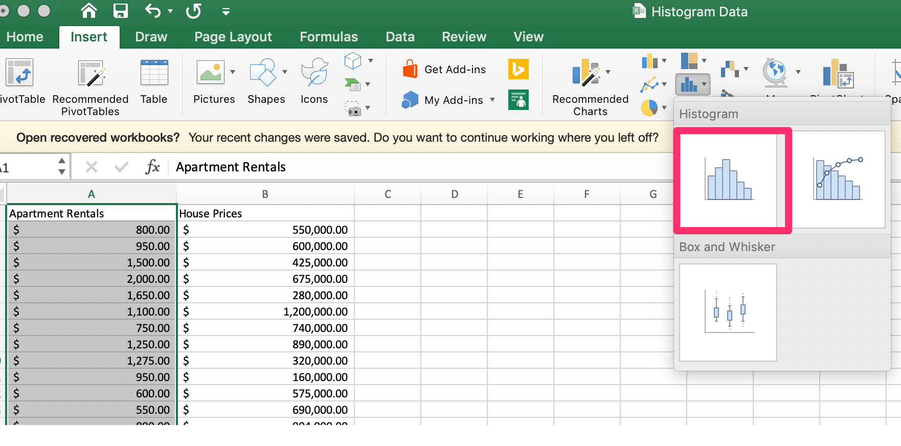
Excel will automatically create bins from the data.
Follow the steps below to adjust the bin size:
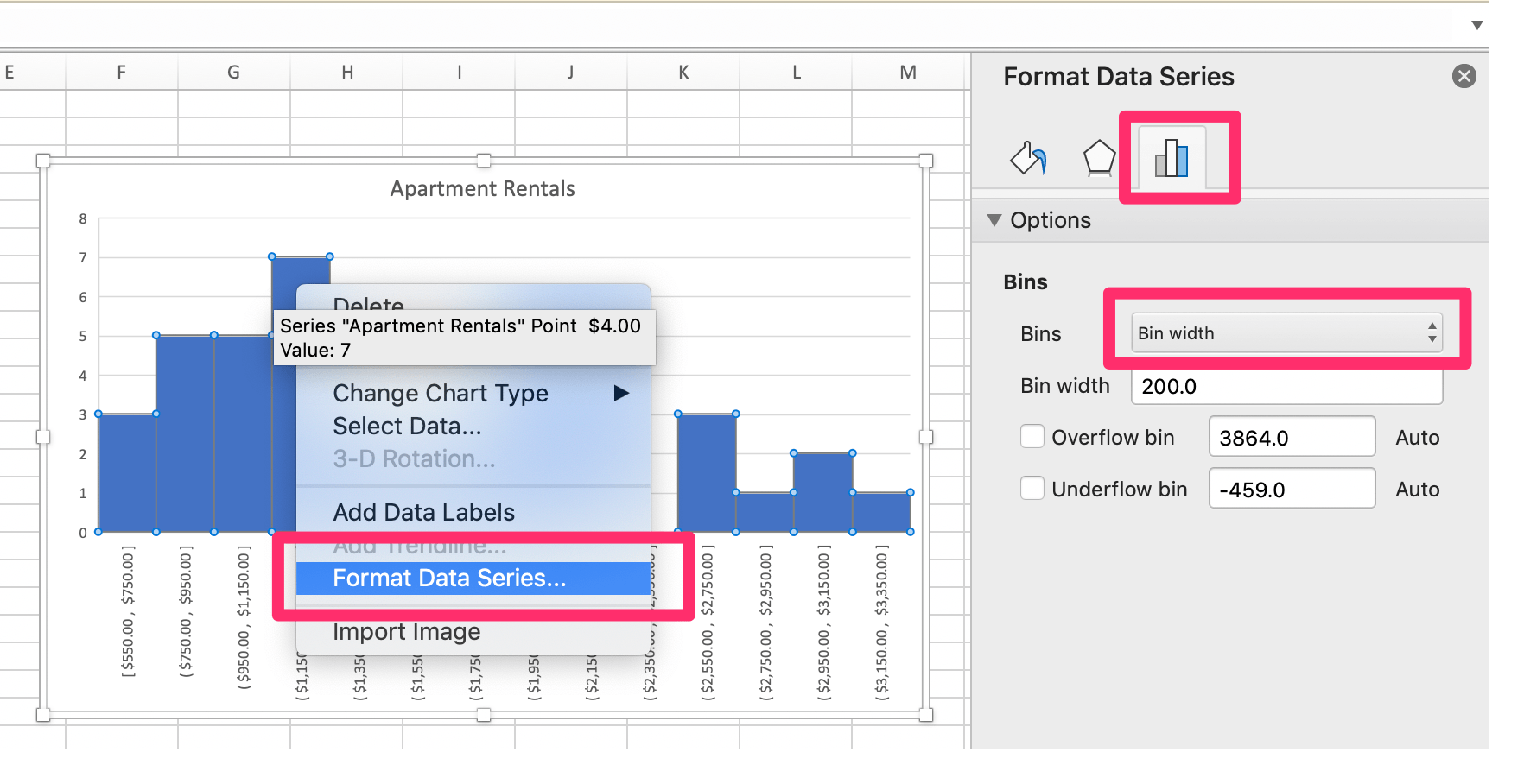
- Right click on the bin data series and select Format Data Series.
- Click the Bins dropdown menu and select Bin width.
- In the Bin width field, type the value number you would like the bin size to display as. Alternatively, the drop-down menu allows you to choose the number of bins as well.
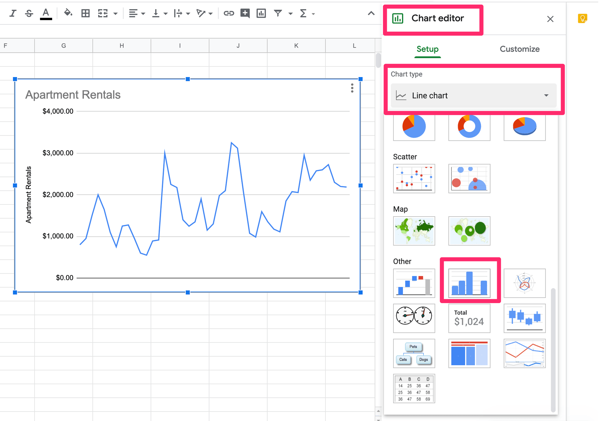
- Once the numerical data column is selected, click Insert > Chart.
- An automatic chart will appear, then navigate to the Chart Editor and select the drop-down menu under Chart Type.
- Scroll down to Other > click Histogram chart.
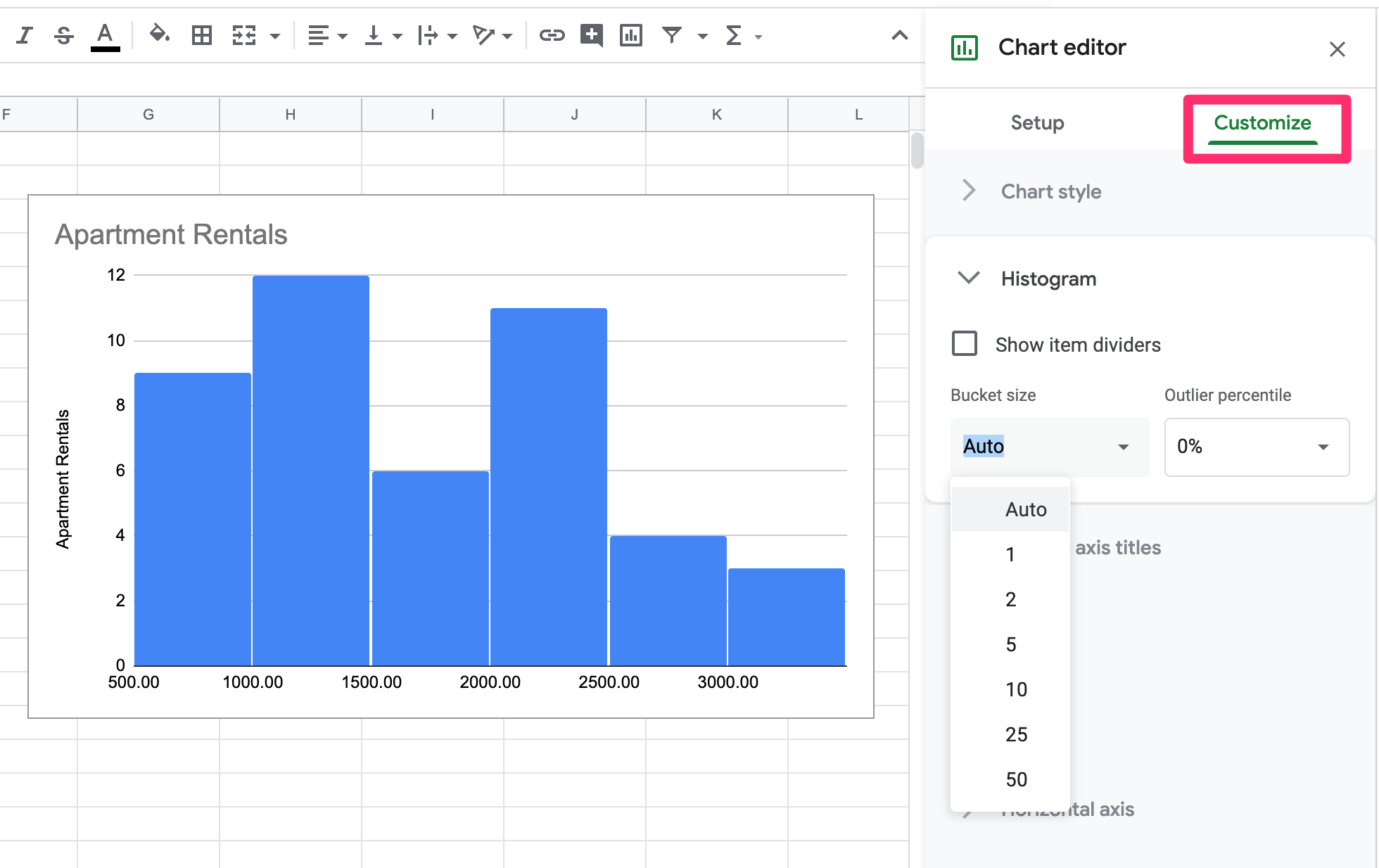
To edit the histogram bins in Google Sheets, follow the steps below:
- Click on the Customize tab > Histogram
- Click into the field under Bucket size.
- Type into the field the number for the bucket size that you would like represented in the histogram. There are preset bucket sizes but these are too small for the example excel sheet data. Try typing in 200 for the bucket size for Apartment Rentals data.
3. Analyze the chart
Histograms allow you to quickly understand the distribution of data. Depending on the data itself, where the frequency of distribution peaks and drops will tell you valuable information.
For instance, the Google Popular Times histogram mentioned earlier in this post displays a restaurant’s peak hours, where it is the most busy. This information means you know what to expect and can decide if you would still like to visit or come back at a more convenient time, or go at a more convenient time.
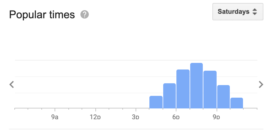
The above histogram for restaurant times shows a normal distribution. This kind of distribution looks like a bell-shaped curve where there is only one peak in the data. Meaning that most of the frequencies are evenly distributed on either side of the peak.
Create beautiful visualizations with your data.

Histogram Frequency Distributions
Histograms can have various kinds of frequency distributions. Here a few common distributions:
- Normal - A bell-shaped curve (one peak)
- Bimodal - Two peaks
- Uniform - Every bar is approximately the same height
- Skewed - Bell-shaped, but skewed to the right or left of the peak
- Half-normal - Only one-half of the peak on one side is represented
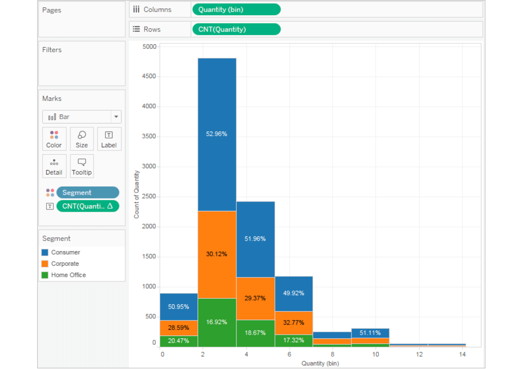
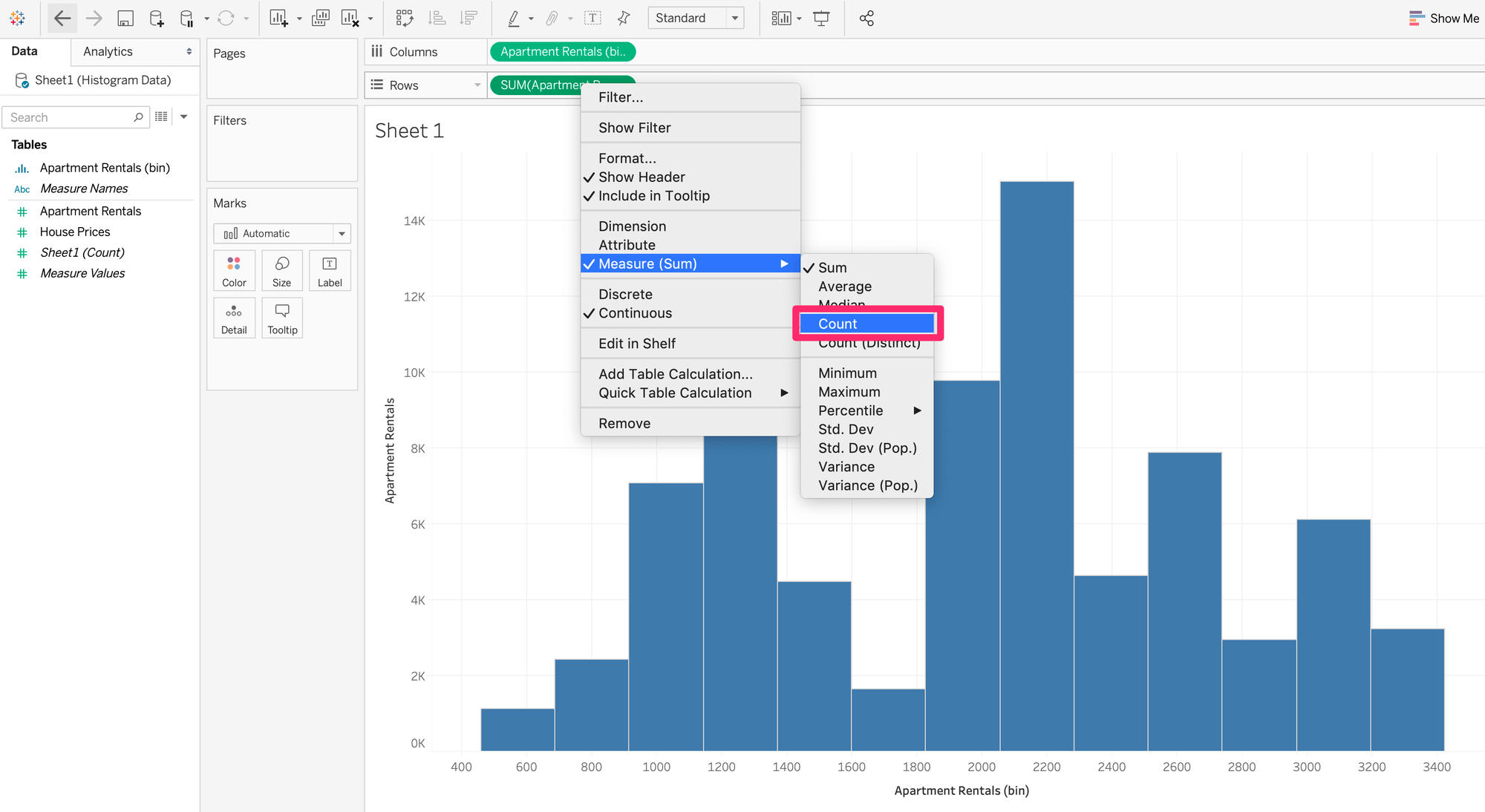
In our example of apartment prices, the histogram shows a bimodal distribution with two different peaks, most apartments costing between $800 - $1,400 or $2,000 - $2,400 per month. There are several outliers on the right side of the graph for prices above $2,400.
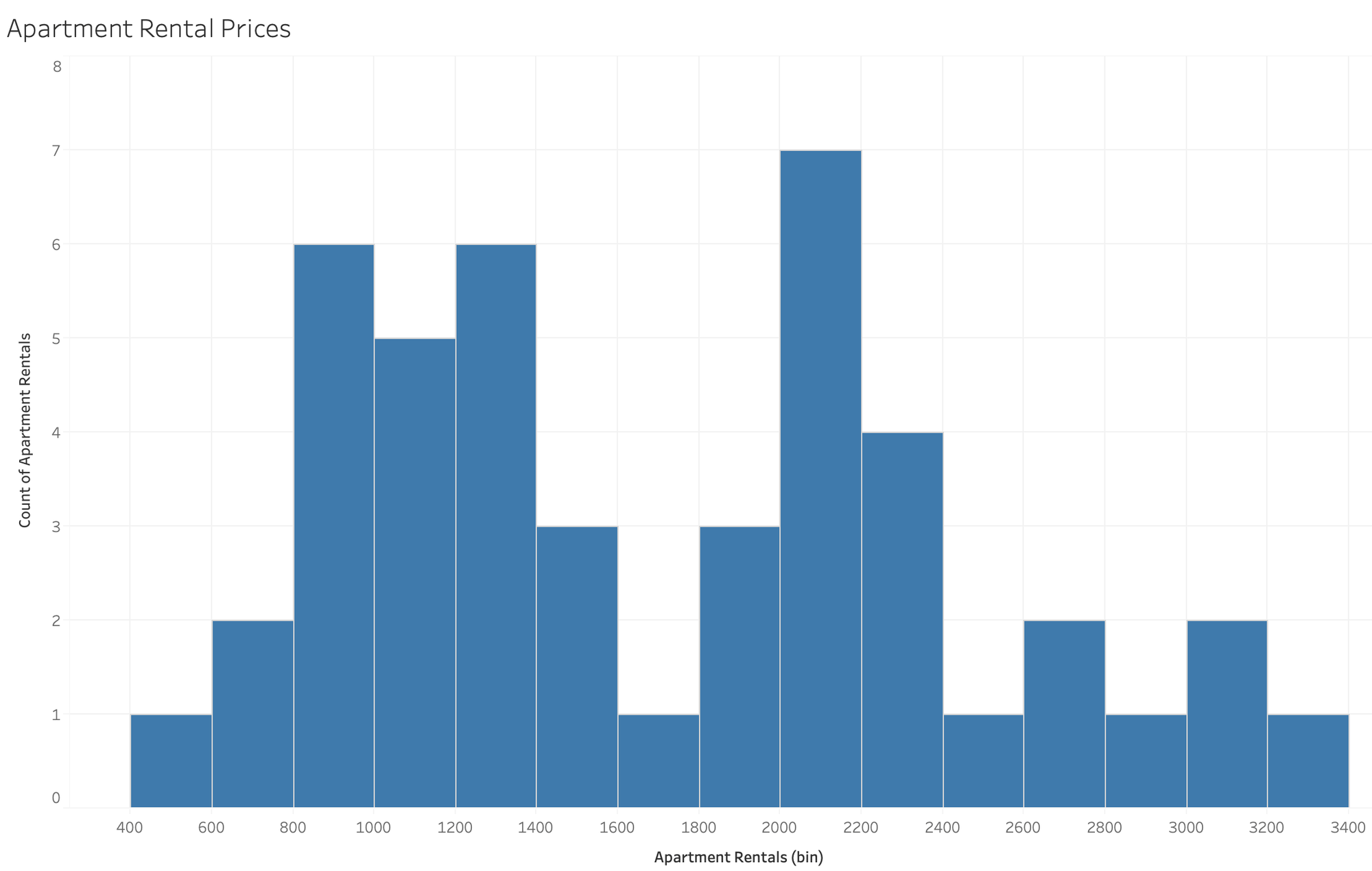
This is common in bimodal distribution, where there are actually two factors at play. If we had more data on the apartments, we might add a dimension broken down by color for the number of bedrooms or average square footage. This would allow us to see if there are actually two bell-shaped curves for 1 and 2 bedroom apartment prices.
Histograms can be complex or simple. While this article covers most of the important aspects in creating a histogram and analysis basics, there are many topics that you can dive deeper into from here.