Symbol Maps
Understanding and Using Symbol Maps
How do I read it?
The map contains symbols that represent values in a data set. These symbols can be of consistent size, shape and color or they can differ (in size, shape, or color) to represent variation of the data.
Reading a proportional symbol map can be intuitive and is often accompanied by a legend. Meaning can be derived from the placement of symbols as well as the lack of placement. The use of multiple symbols on a symbol map is possible,. However, the overuse of symbols (and mixing color, size and shape in one) can create unnecessary visual complexity and unnecessary confusion.
Because some symbol maps use proportional symbols that represent the variable, the location may not be exact and overlapping can be seen. Introducing different types of symbols or colors can provide alternatives to proportional symbol maps and may be better suited for driving readers to the correct insights.
What type of analysis does this support?
A symbol map can be used to show location or another form of data that can be applied to geographical locations. For example a symbol map to point out the cities that have been hit by hurricanes throughout a period of time with each symbol sized (scaled) to indicate the total number of hurricanes. Someone might use this map to move to a location where there are no hurricanes, or a scientist might benefit from having this map to show the effects of climate change on coastal cities.
These maps not only show numerical data, but they can also show ordered categorical data, like degrees of risk (low, medium, high) or ranges of percentages. For example, a map of the midwest can use proportional symbols to show the likelihood of a tornado between April and October in certain places in ranges of 10-30% (small symbols), 30-70% (medium symbols), and 70-100% (large symbols).
When and how to use Symbol Maps for Visual Analysis
Symbol maps make for good presentations of simple data studies, risks or chances of something happening to a geographical area, or to compare limited sets of data across a geographical area. A good symbol map can include multiple data variables into a symbol. When utilized well, adding things like size, transparency, color, and layer order can substantially improve your audience's ability to interpret a map.
It is important to remember that when you include variables on a map to make sure they have some relation. However, these can also get complicated. Proportional symbol maps take the simple symbols and scale them to size in proportion to the measure at that specific location. If you’re trying to determine which locations have more or less of a measure, the bigger symbols and the smaller symbols can tell the story. The danger with these proportional symbols is that viewers might confuse the symbols with the location’s size.
A good symbol map will:
- Avoid overlapping symbols that prevent analysis
- Use the area of the symbol to represent the data
- Not mix multiple dimensions, causing confusion
- Provide context for scale between big symbols and the small symbols. Most readers struggle to tell the exact difference between a small circle and a circle that is 36 times bigger
Example of a symbol map used well
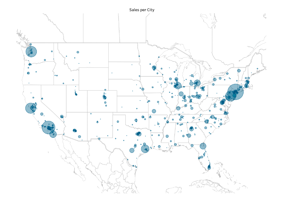
This symbol map uses proportional symbols to look at the number of sales per city in the United States. In a way, it can also help viewers understand population: the Eastern cities like New York City, Philadelphia, and Washington D.C. almost connect, showing that more people live there than in the Midwest region.
- The symbols do not overlap, nor do they confuse the viewer
- Only one shape is used for continuity
- Only one measure is shown