How to use area calculation and map layer control in spatial data analysis


Once again, Tableau is upping the game for spatial analytics. With the Tableau 2021.2 release, we’re excited to introduce two new mapping features to make it easier to analyze your data and to give map readers more control in spatial data exploration and presentation. Let’s take a look at these new capabilities: area calculation and map layer control.
Area calculation answers “How big is that polygon?”
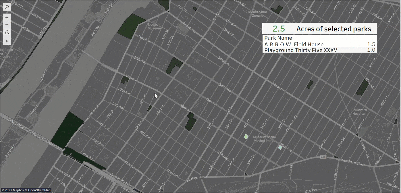
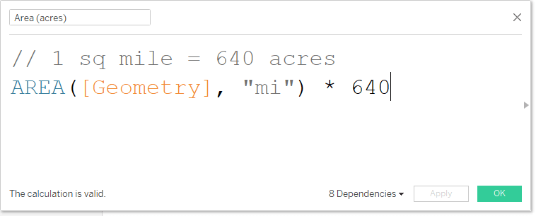
Tableau 2021.2 introduces a new area calculation to our suite of spatial operations. While spatial files often come with great attributes to use in your visualizations, they don’t always include an area calculation. But, knowing the area is critical in many visualizations—like figuring out the population density (count of people / area) or to find the total acreage of parks in a selected region. Now it’s easy to include these calculations in your flow of analytics, like the following example with New York City parks.
How does this magic work? All you need is a spatial file with polygon data and a quick calculated field.
The new area calculation works with any polygon geometry—even geometries from other calculated fields, like buffers! Want to know how many acres of parks are within 0.25 mile of any New York subway station? Or which subway station had the largest percent of park coverage nearby? That’s easy with a spatial join, a buffer, and the new area calculation!

Layer control offers the right context—at everyone’s fingertips
In Tableau 2020.4, we added a feature for creating multiple map layers, but the layers could only be controlled on the worksheet in Tableau Desktop or in editing mode on the web. The new layer control feature in 2021.2 puts the control in the map reader’s hands, while also opening new doors for interaction with dashboards and in published workbooks! Let’s take a look at what’s possible.
Customize the map
I think one of the best applications for layer control is to give every map reader control over a map to tailor the layers and interactivity to the reader’s specific needs. For instance, take this great Tableau Public visualization of Singapore population, housing, and infrastructure by Thi Ho. There is so much detail in the map and layer control allows anyone to customize exactly how much, and what, spatial detail is included so that the map is just right for answering the map reader’s specific question.
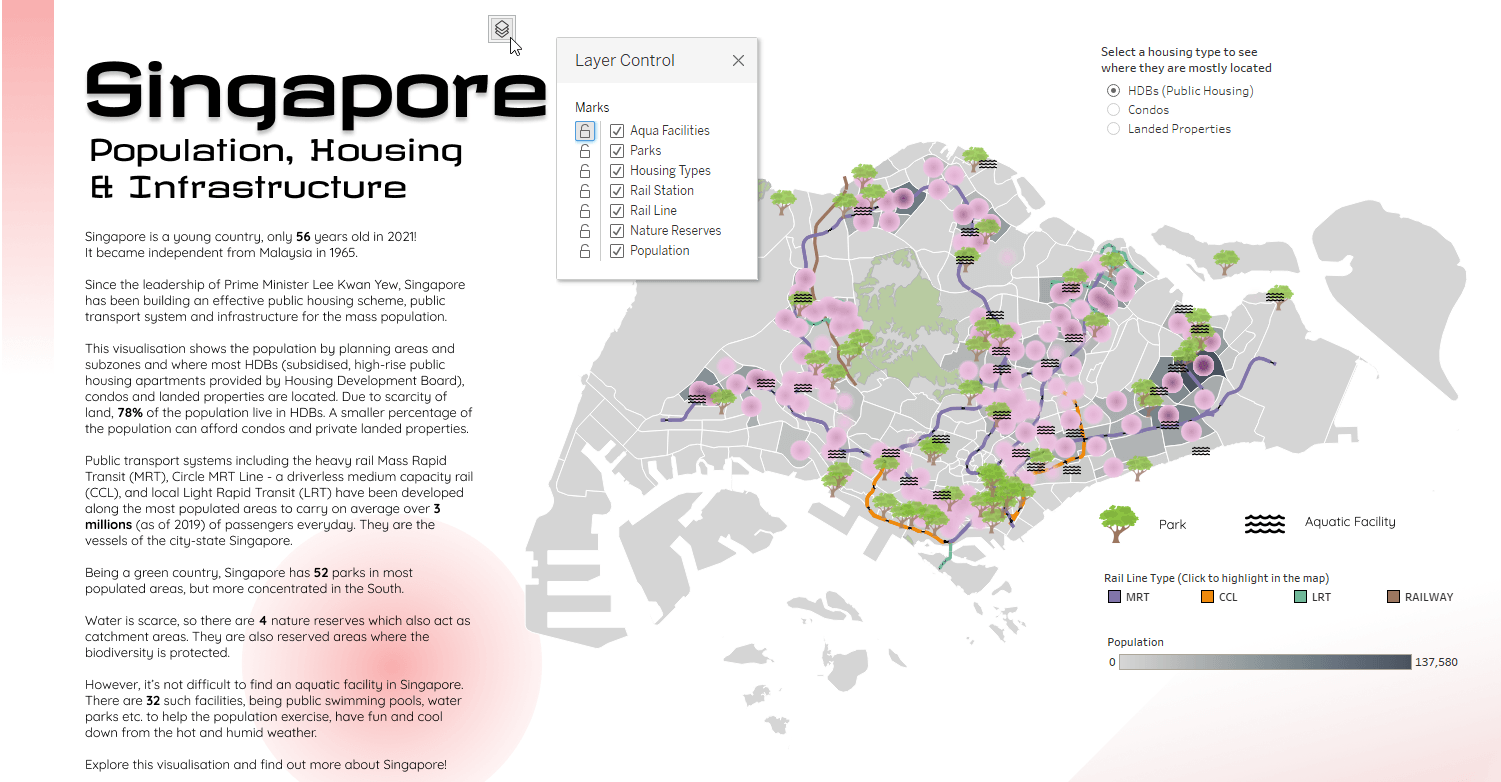
Tableau Public visualization of Singapore population, housing, and infrastructure by Thi Ho.
Starting in Tableau 2021.2, a map reader can just add the layer control widget to add a free-floating control—you can drag it anywhere you want on the worksheet or dashboard! This gives the map reader full control over visibility of layers on the map, as well as allowing them to lock layers to turn off tooltips or stop the layer from being included in selections.
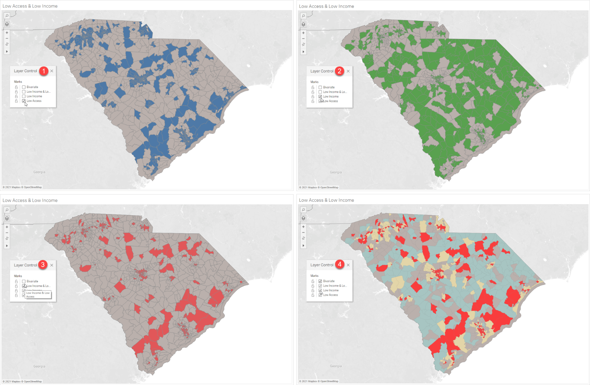
Another great use for layers is for “progressive reveal” in storytelling in a presentation. I use this a lot to show relationships between different datasets. For instance, when talking about food deserts and food access issues, I can tell a story by slowly revealing the different layers in the map to show the relationship between low income census tracts, low access census tracts, and the relationships between the two attributes.
Get started with these new spatial analysis capabilities today
These are just a few examples of how the new layer control and area calculation functionality introduced in Tableau 2021.2 can help you discover and share new insights with your spatial data in Tableau. We are looking forward to seeing what you create with these new features, and how you take your mapping to the next level!
Get the latest version of Tableau to start using area calculations and layer control. For more detail on how to use these new features, check out the following resources: