Bar Charts
Understanding and using Bar Charts
How to read Bar Charts
Bar charts can represent quantitative measures vertically, on the y-axis, or horizontally, on the x-axis. The style depends on the data and on the questions the visualization addresses. The qualitative dimension will go along the opposite axis of the quantitative measure. Bar charts typically have a baseline of zero. If another starting point is used, the axis should be clearly labeled to avoid misleading the viewer.
Many other variations of bar charts exist. Stacked bar charts, side-by-side bar charts, clustered bar charts, and diverging bar charts are representative examples. Labels and legends help the viewer determine the details included in these charts.
What type of analysis do bar charts support?
Bar charts show a comparison of different values in subcategories. For example, bar charts can show how much money a small business spends by expense type. They can also show how many different items each department sold within a store across a consistent interval of time.
Bar charts can also show the effectiveness of different strategies or methods to achieve a goal. If you partition a view to show four or five different strategies or methods applied to the exact same subcategories then you can compare the results for each method. This approach can apply to sales, stock portfolios, budgeting, or medical studies.
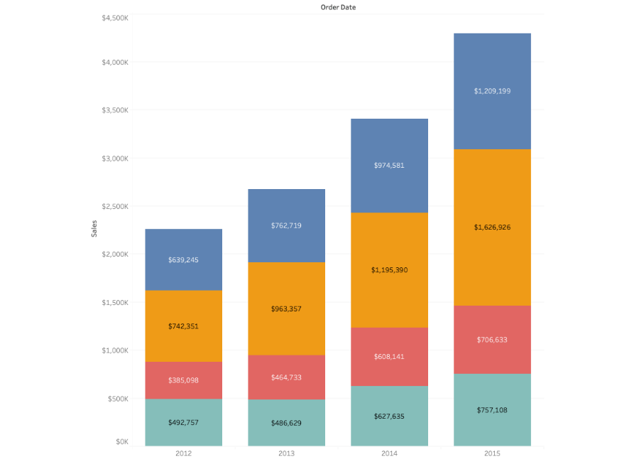
A stacked bar chart can show extra detail within the overall measure. Take an office supplies store as an example. Different colored blocks in a bar representing revenue can represent types of sales opportunities. A red block might represent the contribution from office furniture while a yellow block might represent computer supplies.
Bar charts can also show measures over a specific (discrete) length of time, while other chart types can show a continuous amount of time.
When and how to use Bar Charts for Visual Analysis
Bar charts are versatile and can answer many questions in visual analysis. They can highlight the largest or smallest number in a set of data or to show relationships between values.
A good bar chart will follow these rules:
- The base starts at zero
- The axes are labeled clearly
- Colors are consistent and defined
- The bar chart does not display too many bars
When creating a bar chart, do not:
- Make each bar a different width
- Cram too many bars into subcategories
- Leave the axes unlabeled
Great examples of Bar Charts
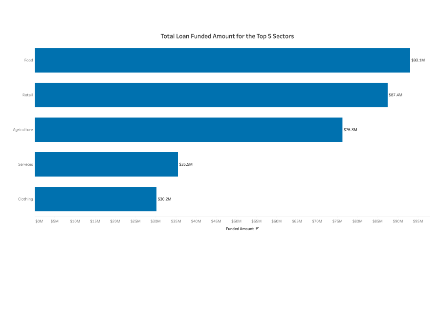
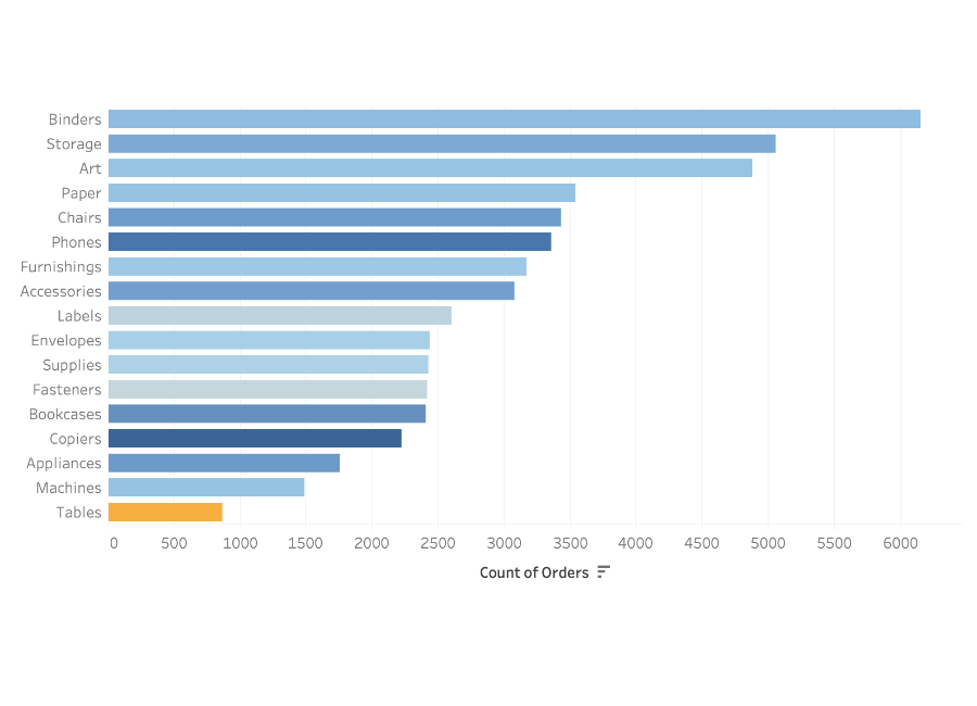
This bar chart measures the number of loans received in each sector of business.
- A single color is used
- Data is sorted from highest to lowest
- Labels are readable
- The axis starts at zero
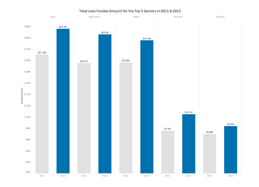
This bar chart is called a side-by-side bar chart.
- It highlights the dominant set of data with a dark color, and the other set with a neutral color
- Sorted from earliest to latest year
- Not too many dimensions compared