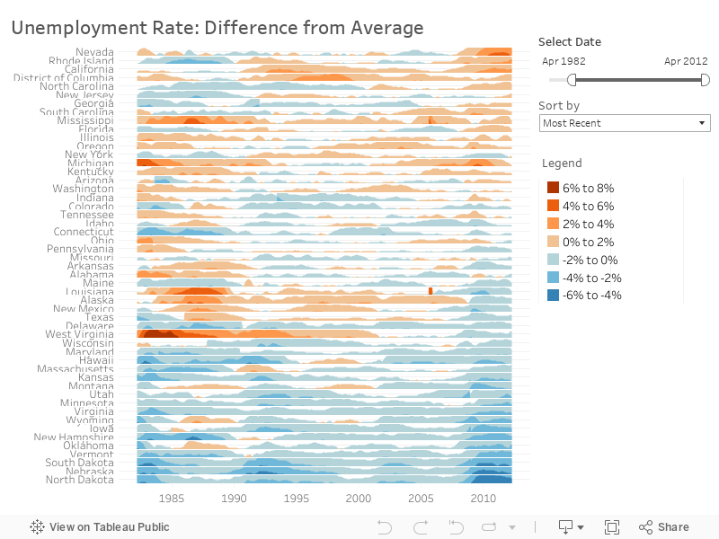
Measure states' unemployment rates against the national average
The unemployment rate is one of the most fundamental economic measures, but its can be hard to show in context at quick glance. Tableau simplifies the task, as seen in this elegant visualization by Tableau Visionary Joe Mako. Orange lines indicate a state where unemployment rates exceeded the national average. Blue lines indicate states with rates that were below the national average.