Lessons from Crowdsourcing a Data Set on the Women's March


I spend most of my days visualizing data that folks share with me. But sometimes the world has different plans. Sometimes, without any warning, we’re flooded with raw data and need to make sense of it quickly. Or we know there’s data out there but no single data set that pulls it all together. How do you approach this as an individual when there are hundreds (or maybe thousands or even millions) of pieces of data to collect before you can even start exploring and visualizing? By crowdsourcing a data set, of course.
Back up a minute. What does it mean to crowdsource a data set? Building the data set is a group effort. Participants help build your data set by contributing their own data points.
I tried my hand at crowdsourcing a data set over the weekend. With all the buzz around the Women's March taking place all over the world, I wondered: What are the core issues motivating people to march? To find out, I created a survey, which is one of two ways to crowdsource your data.
Method #1: Surveys
If you think about it, a survey is a tool used to collect data from individuals, each who offer a piece of a larger story. Scientists and academics have been using survey data for hundreds of years, John Snow being one of the first to give us a clearer picture of cholera epidemics through a field survey in London. He personally interviewed residents in an affected area, and in turn collected the data they shared: how many ill in a home, how many sick, for how long—data, pure and simple.

Rigorous scientific studies require surveys be vetted carefully to eliminate bias, but that doesn’t mean that a quick informal survey doesn’t provide value. Polling data is a survey, after all. And while surveys are generalized data, those generalizations can provide some insight.
Online tools such as Google forms and Survey Monkey allow us to build and to distribute surveys quickly and cheaply, but there are some gotchas. Last weekend, I built a quick six-question survey in Google forms. I wanted to build a viz that would update as responses rolled in, so I kept the questions short, the answers concise. I thought I had constructed a survey that would result in a clean, easy-to-viz data set. I was wrong.
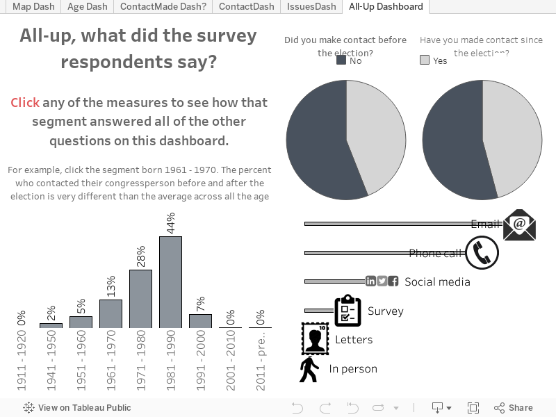
The construction of the questions—and the survey options at my disposal—were my downfall. I asked the following six questions to the participants in the Women's March across the world:
- Identify your top three concerns for marching. (Select no more than three options from a list, with "other" as an option)
- Have you contacted your congressperson since the election? (Yes/No)
- If you have contacted your congressperson, what methods did you use to contact them? (Select as many as you want from a list, with "other" as an option)
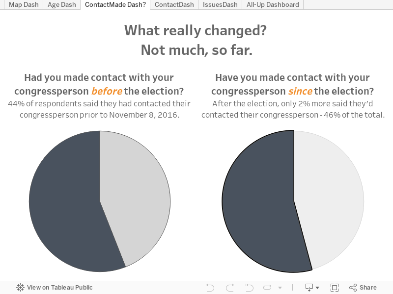
- Had you contacted your congressperson prior to the election? (Yes/No)
- What decade were you born? (select one from a list of options)
- What is your zip code?
When I opened the spreadsheet with the results, I got a bit of a surprise.
My data needed cleaning—and a lot of it. Why? Questions 1 and 3 were the problems, and of course they were the data I was most interested in. What had I done wrong?
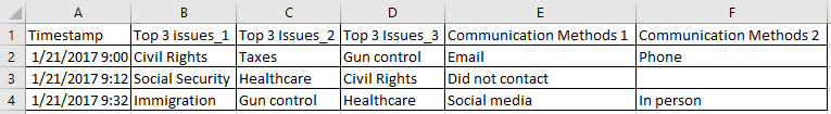
- Multiple-selection questions (pick all, pick as many, etc.) create a single column with comma- or semi-colon-separated responses. That means that before I could ever viz those two questions I had to first separate those responses into different columns. And that meant my vizzes for those questions wouldn’t update automatically. (The yes/no questions, on the other hand, worked without a hitch, as did the zip codes and birth years.)
- Separating the responses into multiple columns also creates a problem. It suggests there’s a sequence to the selection (i.e., this item was selected first, then this second, and finally this third). It means that each respondent’s path (A, B, C is not the same as B, C, A) is unique and therefore I couldn’t group them into the most common selections across all respondents.
- I wanted the bar to be as low as possible for folks to fill in my survey, so "other" was a natural option too. However, as a data person, "other" is a bad idea. Allowing "other" as a write-in choice meant I needed to reconcile that data too.
Oh, sweet yes/no questions!
The solution for multiple choice questions? I had to pivot my data. That means that instead of the data being wide, with each response in a single column, I needed to make the data tall and keep "like" data in the same column.
Instead of this:
I needed this:
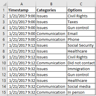
Steve Wexler has a terrific post on pivoting your data in Tableau, and it’s worth a read here.
Because of the way I’d built the survey, each question with multiple choices needed a pivot and Tableau had a tough time pivoting two separate questions (in my case, seven or eight columns worth of data). Remember, I had Google sheets collecting data at the same time I’m trying to pivot and analyze. Ultimately, I divorced myself from the survey and captured the data in Excel, pivoted manually (it took about four hours of copy/paste), and vizzed the data.
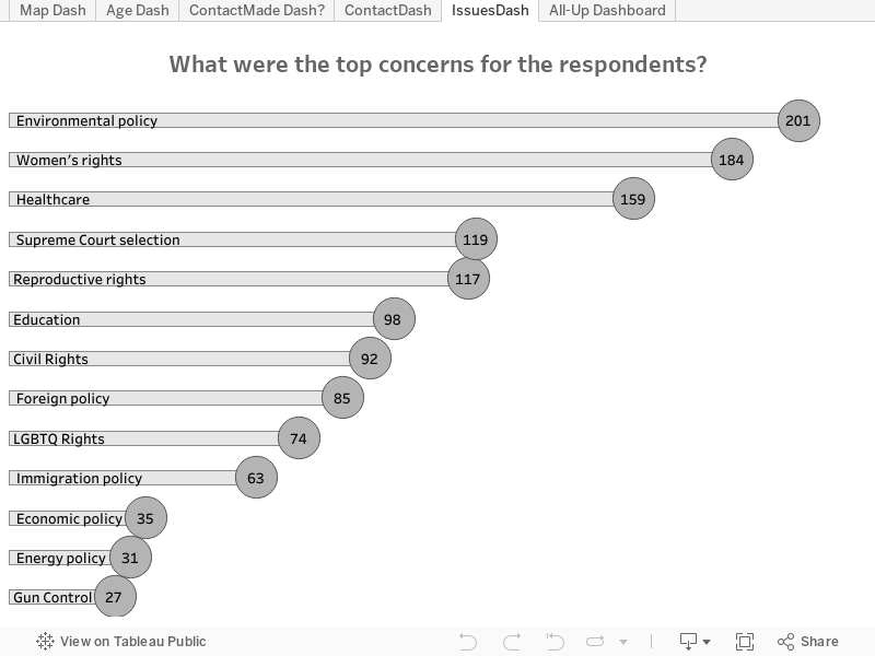
By late last night, I had 456 responses to the survey (it's grown since, alas). I filtered out single-response issues (these were often the "other" items), and I was a little surprised that environmental policy tipped the scale as the issue that was most pressing among the respondents. That might have everything to do with the largest segment of responses coming from the Pacific Northwest, my home.
My vizzes are now completely separated from the survey which is still collecting data. I’m not happy about this, but I learned an important lesson about how to structure the questions in a survey. Next time, I’ll simplify even more, or I’ll use the next method.
Method #2: Shared Spreadsheets
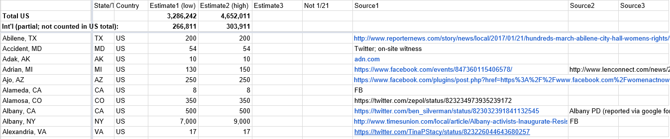
The second method for crowdsourced data sets involves spreadsheet sharing. We’ve done this since the beginning of the internet, but it's only really taken off in the last few years. At the same time as I was collecting data in my survey, Erica Chenoweth (@EricaChenoweth) and Jeremy Pressman (@djpressman) created a shared Google Sheet with some very simple instructions. They asked for crowd estimates for the marches on January 21, 2017. There were simple instructions: include numbers along with city, state (if applicable), country, and verifiable source of the data. They offered up the spreadsheet via social media, and it took off. People from all over the world added data and in under 24 hours they had a data set for everyone to use.
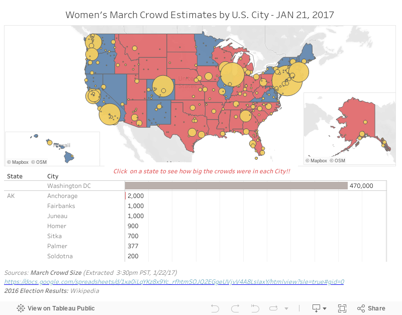
Was it perfect for visualizing? No, but it was quick and dirty, and fit the immediate need. In under 24 hours, I’d already seen someone from Tableau Public who had cleaned enough of the data to visualize it with election results underneath. I haven’t seen the media pick data up this fast, but folks playing with data have.
One of the biggest advantages to crowdsourcing data is that you generate interest because everyone becomes a collaborator of sorts. In addition to using shared spreadsheets and surveys to collect data, I’ve also seen some terrific work from the folks at data.world. They host data sets that subject-matter experts and data scientists help clean so that people like me can visualize more quickly. Many of their data sets come from open-data organizations, but through their platform interested parties can suggest improvements to the data. They are crowdsourcing data improvements, which is really the next step.
What kind of data have you seen that’s best built through crowdsourcing? What are some of the advantages and disadvantages with this type of data? I’m already working on my next crowdsourced data set. Let’s continue the conversation!
相關文章

Iron Viz 2026: Read Between the Data
 2026/05/28

Tableau's Iron Viz Winners

Explore the 2026 Iron Viz Entries
 2025/12/15