MainPower: From spreadsheets to speed and agility with Tableau
While MainPower brought power to the people, its data analysis needed an extra spark. Data was siloed and team members spent time determining the true numbers rather than making decisions. Identifying that its previous data analysis system was time-consuming, slow, and cumbersome, MainPower turned to Tableau for a centralised solution to increase business efficiency and clarity of information.
Today with Tableau MainPower has:
- Improved efficiencies with better insight into maintenance scheduling
- Cut hours from data analysis timelines
- Provided self-service, intuitive data analysis that employees have embraced.

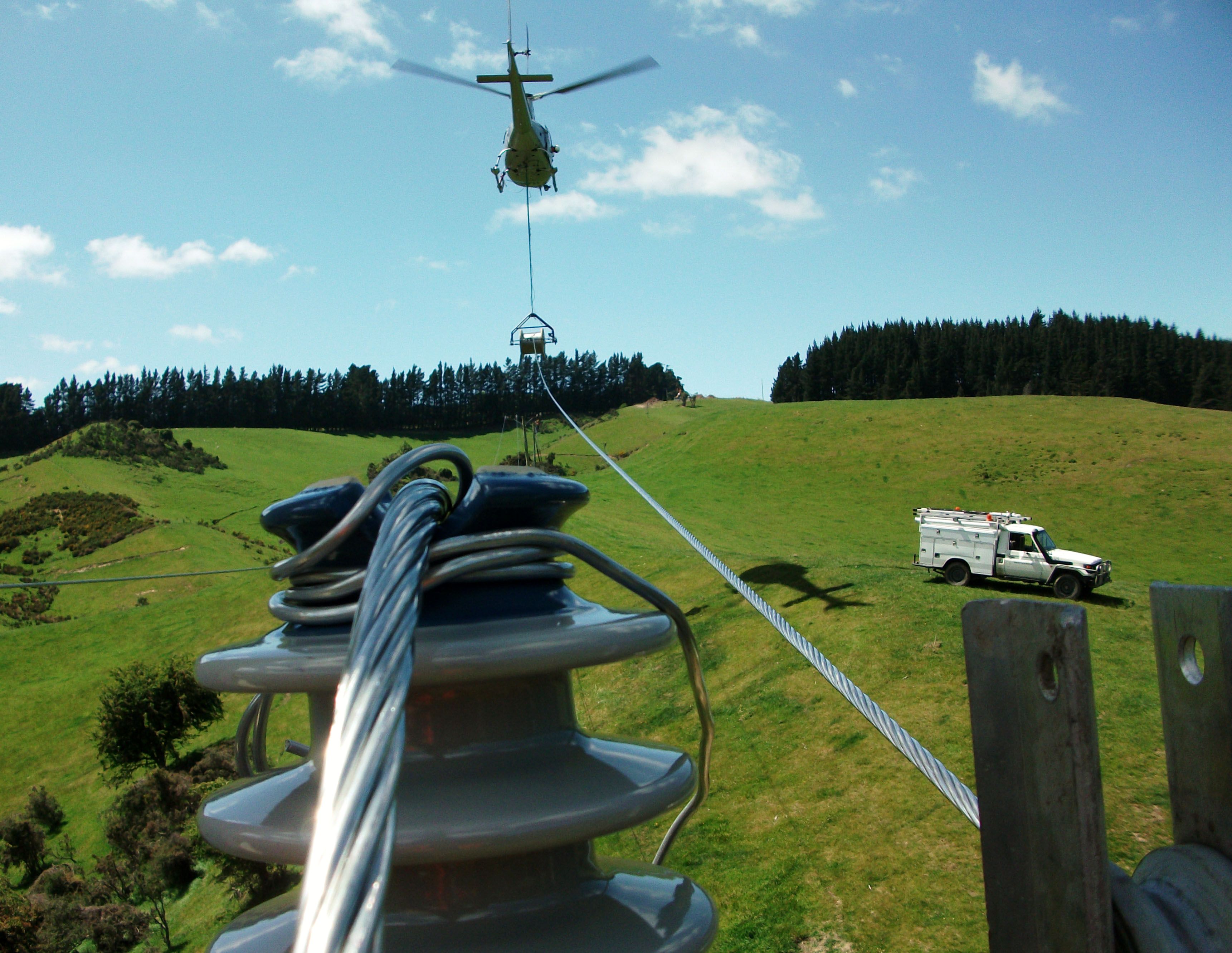
MainPower provides power to over 37,000 customers in a 4,873 kilometre-long network of overhead lines and underground cables.
For nearly 100 years, MainPower has been distributing electricity to homes and businesses across the North Canterbury region in New Zealand. It distributes electricity to over 37,000 customers via 4,873 kilometres of overhead lines and underground cables across an area of almost 12,000 square kilometers. The company continually strives to provide a safe, secure and reliable service, recognised by its community as a leading regional electricity distribution company.
One of 29 electricity distribution companies in New Zealand, MainPower is a community-owned company that owns and manages a regional and urban electricity distribution network. The company is also responsible for overseeing, on behalf of electricity retailers, the supply of electricity for customers. MainPower ensures the safety, reliability and security of these networks.
Sustainability-savvy, MainPower constantly seeks opportunities to take advantage of renewable resources. The organisation focuses on expanding and upgrading its distribution network to keep up with the demand for electricity supply while preserving the existing network.
“We’re relatively small but like to think we’re powerful,” says Sean Fahey, MainPower Database Administrator (DBA). “We’ve got around 180 employees including the field staff out on the road servicing the poles and wires.”
Difficulty deciphering data
To maintain its standards for excellence in customer service, MainPower analyses a wide scope of data from varying sources. Most information is sourced through a GIS system to map all assets with coordinates. The organisation also employs Tech One, an ERP system.
The electricity provider began to see limitations in the way it collected, viewed and understood data, as monitoring extensive data sets manually can be cumbersome and time-consuming.
“We were using numerous huge spreadsheets on seemingly endless sheets of paper in tiny font. You can imagine exactly why that was an issue,” says Fahey with a laugh. “Exporting and analysing spreadsheets was slow and tedious with the methodology offering little flexibility.”
Fahey reports each unique data set could include up to 40 attributes.
The type of information collected is crucial to operations. MainPower collected data spanning from maintenance history and reports to power ratings, outages and voltages, and customer records. Even New Zealand’s flora and fauna have their place in MainPower’s knowledge banks—trees are often responsible for power outages, falling on lines during storms or strong winds.
“We were experiencing an influx of data from each source. Our analysis method simply couldn’t keep up,” says Fahey.
MainPower’s data was often siloed—it didn’t have the chance to ‘speak’ to other sets.
“The information we were gathering tended to be quite scattered,” says Stuart Wilson, MainPower’s Network Manager of Development.
“We wanted to reduce conflicts within the organisation because at that stage we had everyone looking at data sets from different perspectives; there was no unity of information, methodology or centralised depository.”
“We also feared that important connections between sets were being overlooked. We simply had no way of compiling and easily viewing data sets collected across different departments and maintenance history.”
Double-handling specific sets of data also hindered business efficiency and diluted employees’ capacity to concentrate on other tasks, with several sets of eyes viewing the same spreadsheets but interpreting them to suit individual needs.

According to Mainpower's website, "one third of MainPower’s fault call outs are caused by trees and branches, particularly in times of high wind and snow."
From spreadsheets to speed and agility
While spreadsheets certainly capture a wealth of information, MainPower soon learned they are less than optimal for presenting and understanding trends and patterns. The system was leaving information static and siloed while data analysis was slow and impacted business efficiency.
MainPower started to build a data warehouse to make the data held in multiple systems centralised, useful and accessible.
“We attended a series of seminars held by independent consultancy Montage to look into business intelligence solutions,” explains Fahey. “At one of these events Montage presented six BI solutions and the standout was certainly Tableau.”
“We entered into discussions with Montage that very night, keen to learn whether Tableau could improve our operations.”
In further meetings, the Montage team explained that Tableau was renowned for its visualisations and analytics offerings, mentioning the software would allow MainPower employees to compile and share data visualisations and dashboards in an easy-to-understand environment.
“Tableau seemed to tick all the boxes and we were optimistic it could assist with some of the challenges we had been facing. We were excited to give it a go,” says Fahey.
Progressing with Tableau Desktop, Montage worked with MainPower to create a pilot program in order to ensure the solution was able to meet the company’s needs. This was then complemented by a further targeted statement of work, using best-of-breed solutions (which could be built on later), to present to MainPower’s executives.
“The use of MainPower’s real-time data in that initial presentation opened our eyes to the true power of the software,” says Fahey.
After successful trials, Tableau indeed proved to be the optimum solution for MainPower. Over the next few weeks, Montage worked closely with internal teams to integrate the software into the organisation’s pre-existing environment.
The setup and installation process was streamlined and easy, with a representative from Montage available every step of the journey.
“Chip Felton from Montage has been great. The deployment was easy and he comes in a few days a month to answer our questions and ensure everything is running smoothly. He’s available for support when we’re trying to get our head around new aspects of the software,” says Wilson.
“Although we haven’t had to call upon it yet, it’s also nice to know we can contact Tableau’s internal support team at any time.”
Once the initial process of connecting existing data collection points to flow through Tableau was complete, staff showed enthusiasm for sinking their teeth into the program.
“We found that no matter what the department, our employees are able to pick up Tableau quickly and effectively, with a little assistance from Montage. We now have four or five staff regularly using the software.”
A powerful perception: saving time and money
After the first 12 months of MainPower’s journey with Tableau, the company can see the value of a cohesive solution. Improved speed-to-insight is one significant benefit.
“We’ve been able to cut down on the hours spent analysing data; our employees are no longer doubling up to look at the same information because it’s centralised.”
Compiling exhaustive quantities of data has also become more efficient.
“The input doesn’t seem so much like an avalanche anymore. It’s certainly a refreshing change that several sets of eyes can easily explore data sets that relate to them,” Wilson says.
“Previously, I might have been the only one looking at a data set, because I put it together and was probably better equipped to understand it. Now we have four or five other team members who can get more involved and view and understand information that relates to them,” Wilson says.
Also, now that data sets from different teams can be blended in a single view, employees have developed a new perspective on their data.
“We’ve uncovered some unexpected insights through the new software, simply because now we’re able to join data from different sources, linking it together to ask questions we weren’t previously able to,” says Fahey.
These new connections especially highlight where data collection is lacking or of poor quality. Another key observation has been mapping maintenance issues. Information can now be displayed on a geographical map, allowing MainPower to reorganise and optimise its maintenance schedules for improved physical infrastructure.

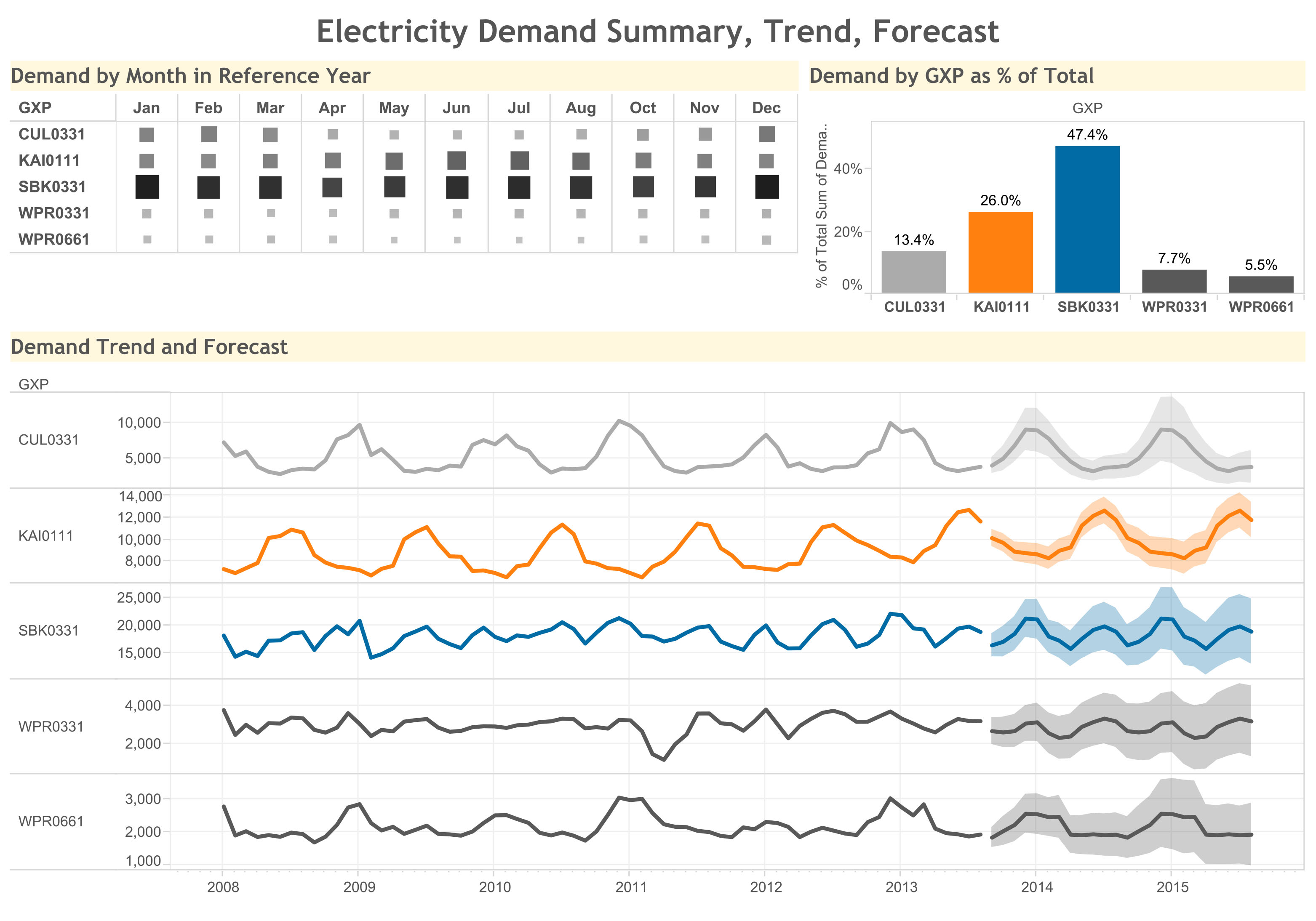
An example of a Mainpower visualisation. Mainpower has benefited from having their data all in one place, leading to faster insights.
“Through this, we were able to see problem areas on a map and prioritise which jobs need to be attended first,” says Wilson. “It also meant we could group work in one particular area to make sure it all happens in the same work package in the same year. This saw us save time and money as well being much more efficient.”
Finally, Fahey applauds the user experience and ease of implementation Tableau has provided. “One thing that stands out for me is Tableau’s not an engineering tool, it’s not a financial tool and it’s not even an IT tool.”
“It’s something that is easily understood, everyone can implement it in their work. Rather than buying separate tools we’re able to use software that works for all employees within the company. Tableau has been more helpful than we could have imagined.”