
Picture This: Do No Harm Guide
This video provides a quick overview of the 10 recommendations from the Do No Harm Guide to help you understand how to collect and present data through a more diverse, equitable, and inclusive lens.
Watch the video
We live in a world that is increasingly defined by data. But how we portray this data impacts the meaning.
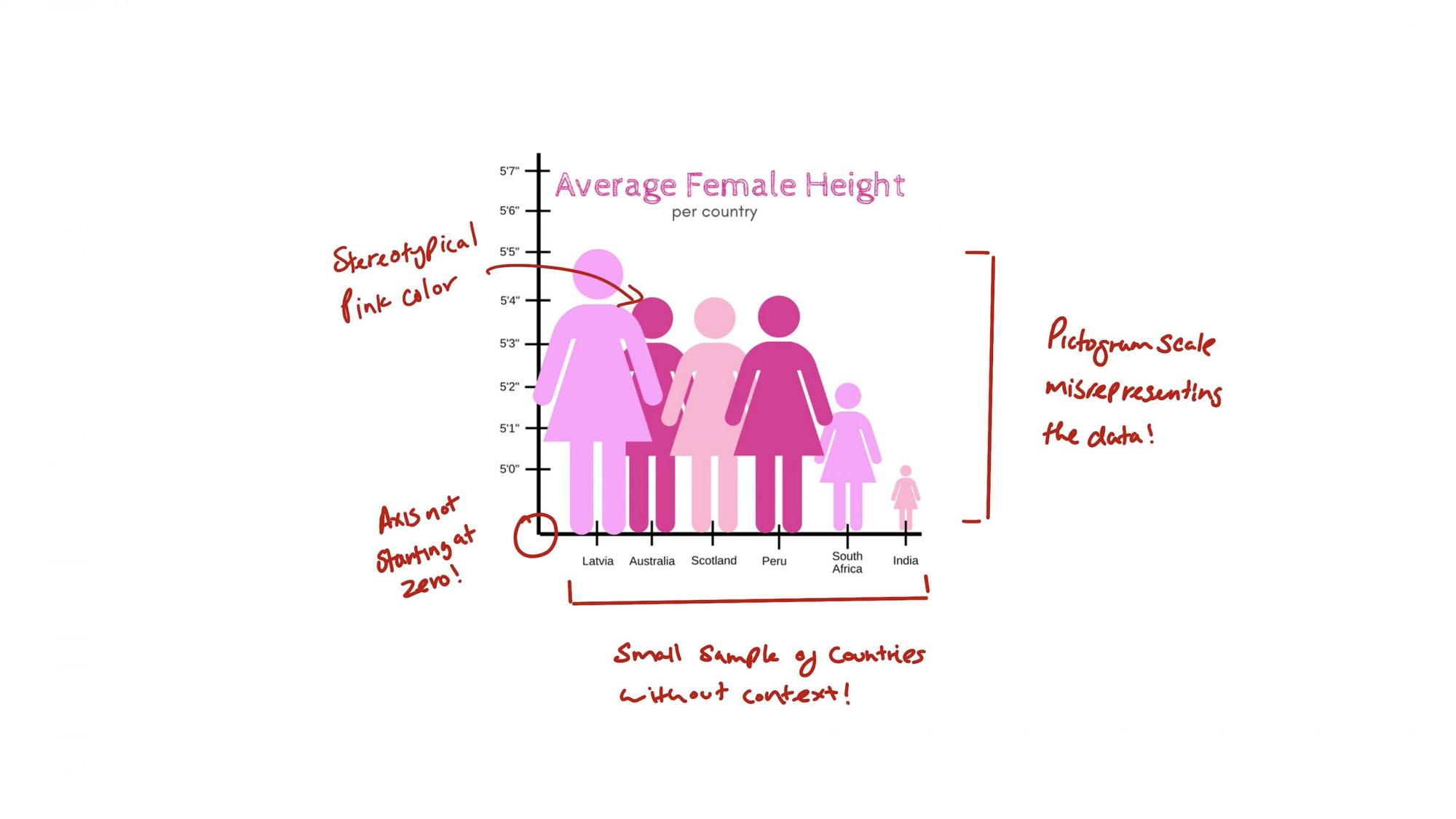
How would you feel if you were one of the data points in this visualization? The colors, labels, icons, and words we use are critical elements of our data stories.
We need to take a closer look to ensure that our data stories consider the context of the incredibly diverse world that we live in.
To be fair, to be credible, we must have sensitivity for our subject matter, and our audience. We must be intentional, and empathetic, guided by the most fundamental principle of all: that data points represent real people.
Picture This: Doing good data means doing no harm.
As data storytellers in a data-driven world, we have a unique set of responsibilities. To ensure that our analyses are trustworthy, we need to hold data up to close scrutiny.
We need to ask hard questions as we gather information, and apply rigor in our analyses.
The Do No Harm Guide from The Urban Institute addresses the responsibilities we all share in using data with sensitivity and care, in order to further the cause of equity in our society.
Let’s take a deep dive into these 10 recommendations from the Do No Harm Guide, and learn how to present data through a more diverse, equitable, and inclusive lens.
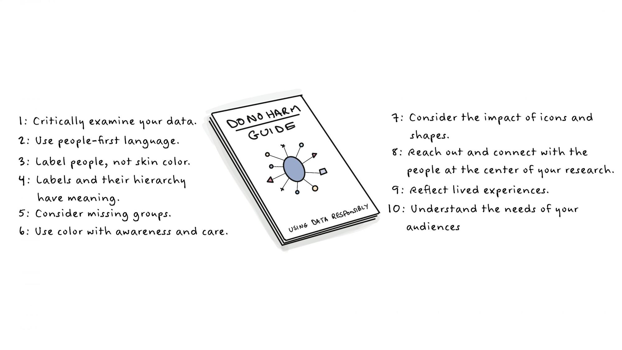
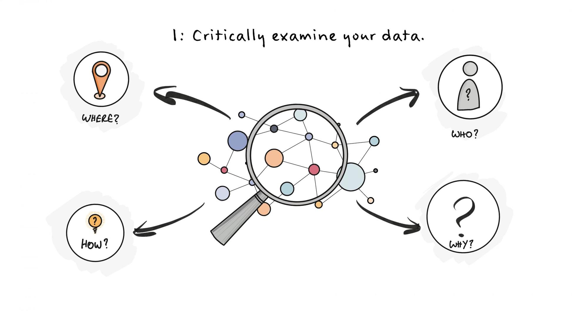
1. Critically examine your data
Before you begin your analyses, consider the context of your data. Equity awareness begins with gaining a holistic understanding of the story behind the data. Where does your data come from? Who is included and excluded from it? How was it collected? Why was it collected? And who benefits or is harmed by this data?
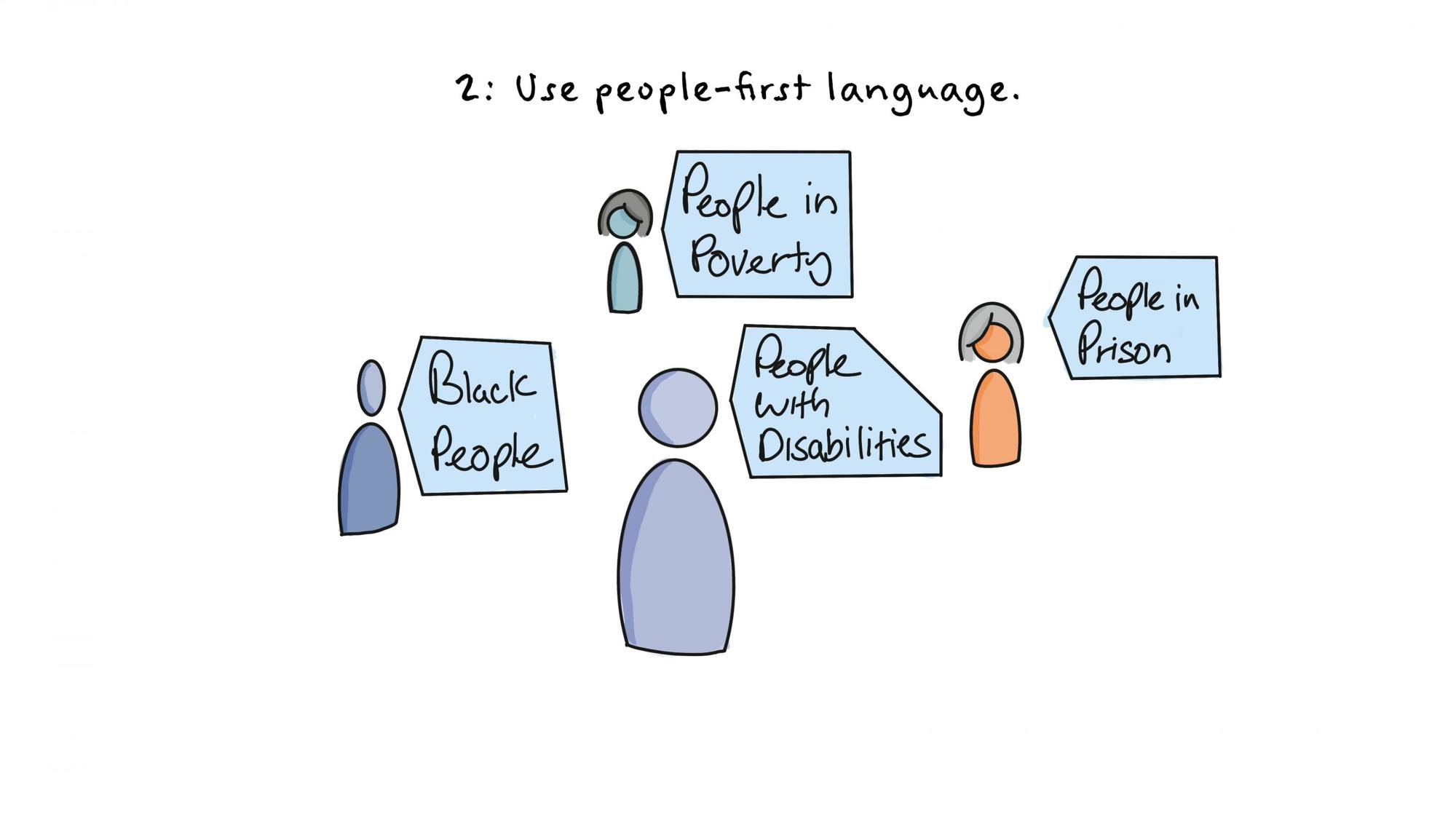
2. Use people-first language
If your data is about people, make it extremely clear who they are. Remember that the data shown reflect the lives and experiences of real people, and lead with the person, not the characteristic. In visualizations, labels matter. You should strive to use people-first language. Consider “People with disabilities” instead of “disabled people.” Or, “people in prison” instead of “inmate.”
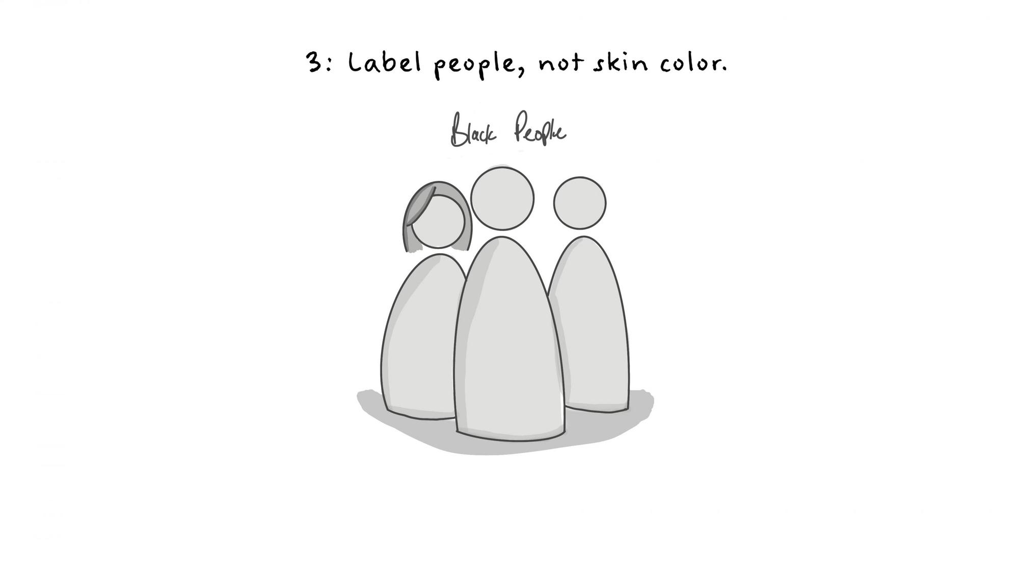
3. Label people, not skin color.
Language is living, breathing, and ever-changing. It’s only logical that certain labels that may have been used in the past are no longer acceptable - and may in fact, be offensive. In your data analyses, the best approach is to use full labels such as “Black people,” not “Blacks.”
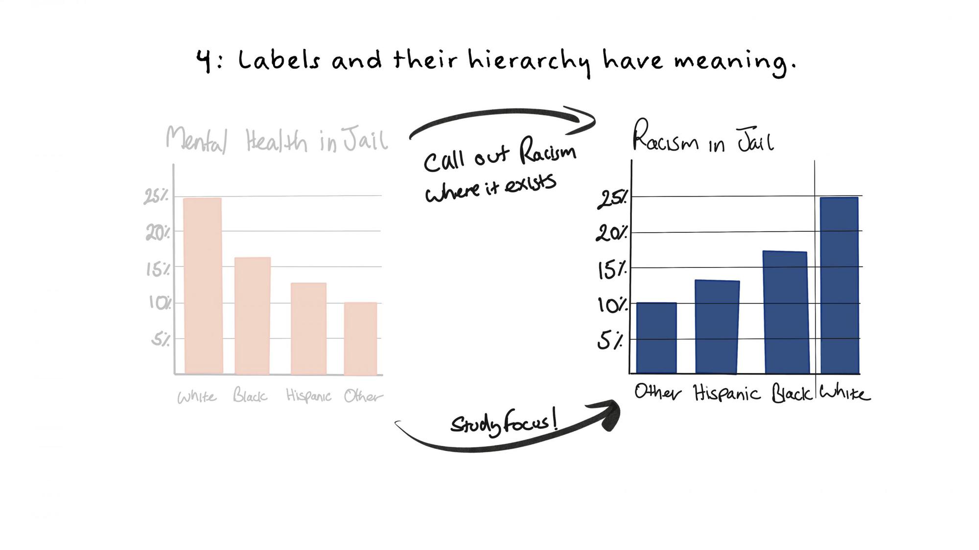
4. Order labels in purposeful ways.
Who is shown first in a table, graph, or visualization? Order conveys a hierarchy, and can influence the way your audience interprets the data. To avoid perpetuating historical biases in the way data is presented, consider alternative sorting techniques such as study focus, specific story or argument, quantitative relationship. Alphabetical order or sample size works, too.
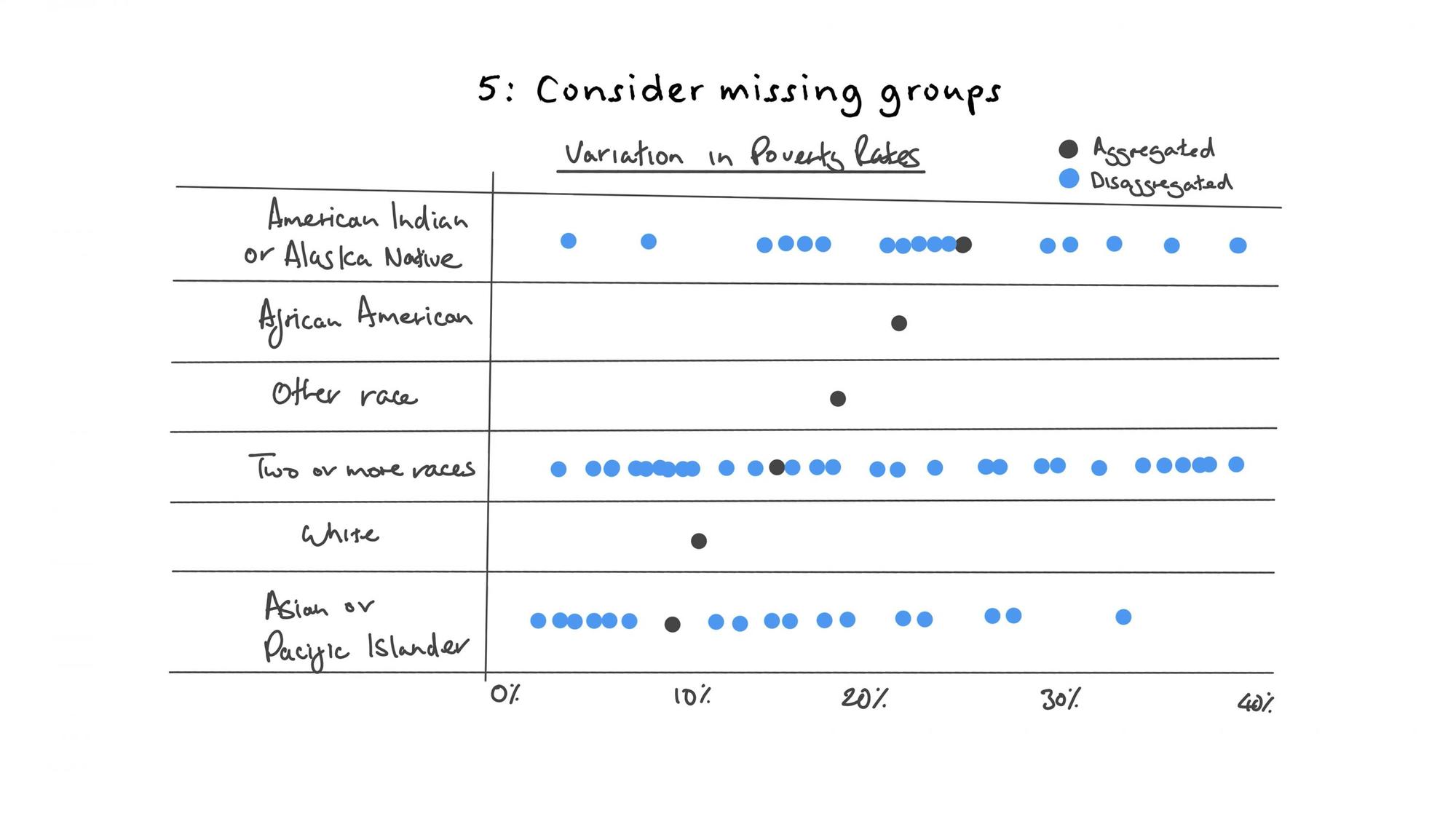
5. Consider missing groups.
It’s important to acknowledge who is and is not included in our data and charts. For example, in the United States, many charts on race and ethnicity only show white people, Black people, and Hispanic or Latino people but not other racial or ethnic groups. Charts sometimes only show data in these broader racial groupings, rather than at a more disaggregated level where nuances are more readily understood. Consider adding notes that explain why the data are not inclusive or representative.
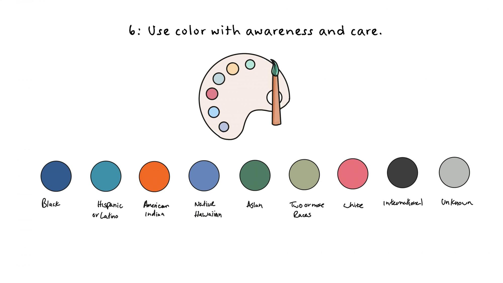
6. Use color with awareness and care.
The way we use color can inadvertently reinforce stereotypes and perpetuate inaccurate depictions of individuals and groups. To use color with the best intent, check your choices. Avoid using colors associated with stereotypical gender labels - pink for women, blue for men, for example. Colors associated with skin tones or race should also be avoided, such as light-to-dark, or incremental color palettes used to indicate different demographic groups. When used appropriately, color is a powerful aid in data visualization. Lacking awareness, we risk creating misperceptions and offending our audiences.
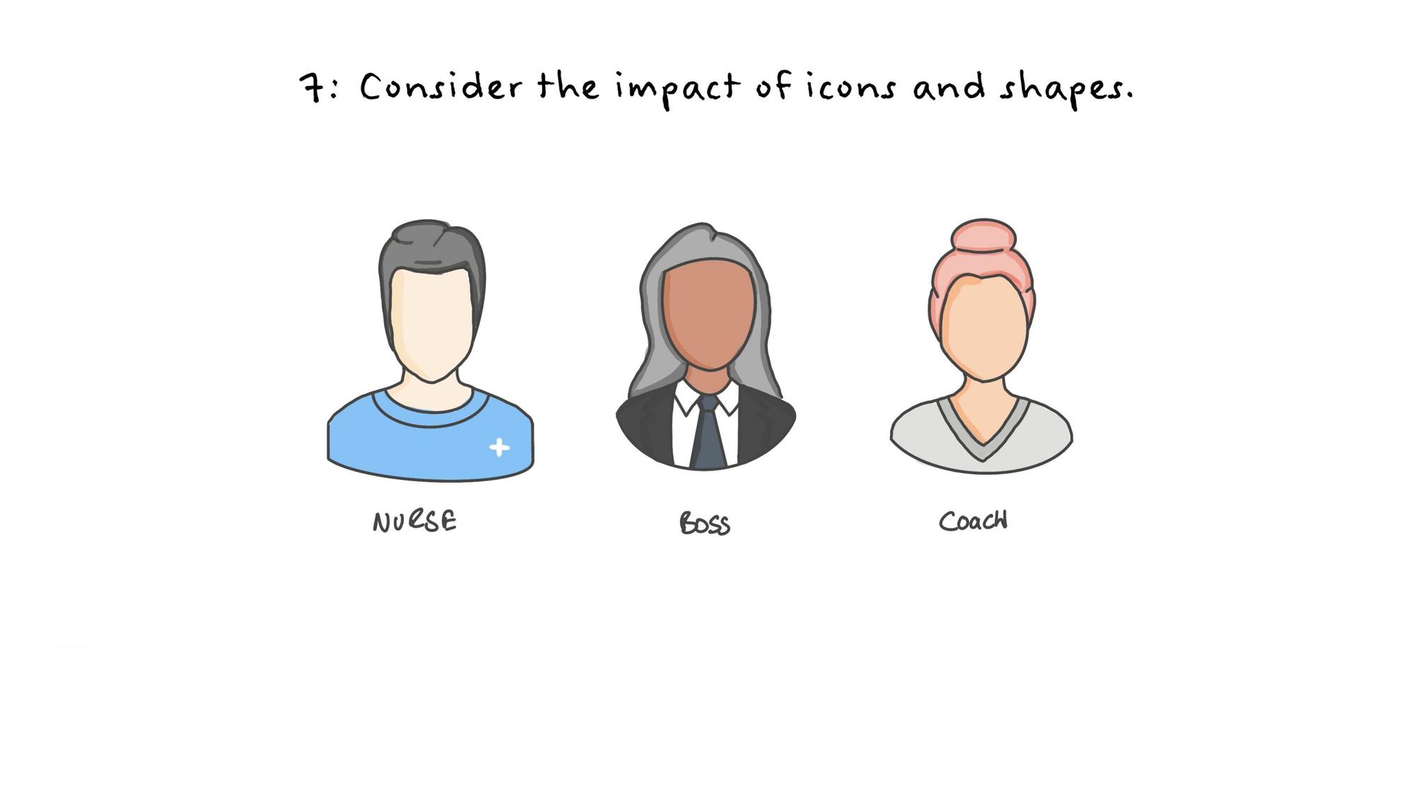
7. Consider the impact of icons and shapes.
Icons, by their very nature, are intended to convey broad meanings - but they can perpetuate harmful and offensive stereotypes if used carelessly. These elements must be chosen with care. It’s essential that any and all stereotypical, discriminatory, and racist imagery is avoided. It’s also important that images depict people as empowered and dignified. It’s never acceptable to use imagery that depicts people as helpless victims.
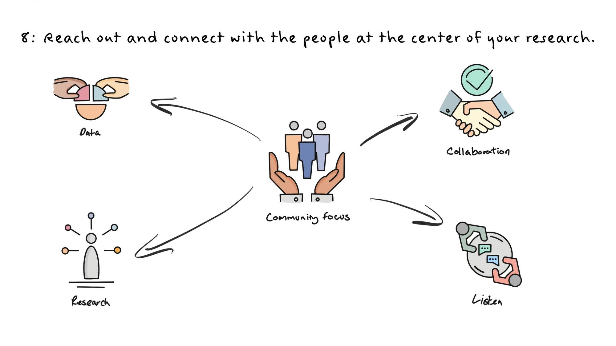
8. Reach out and connect with the people at the center of your research.
To tell relevant and impactful data stories, data communicators need to be empathetic. Building relationships with the people and communities that you’re researching is fundamental - and maintaining these relationships is just as important. Data storytellers should always do their research and analysis with communities, not on behalf of them. Buy-in from members of the community, policymakers, and other stakeholders helps research be more impactful, relevant, and embraced by a wider audience.
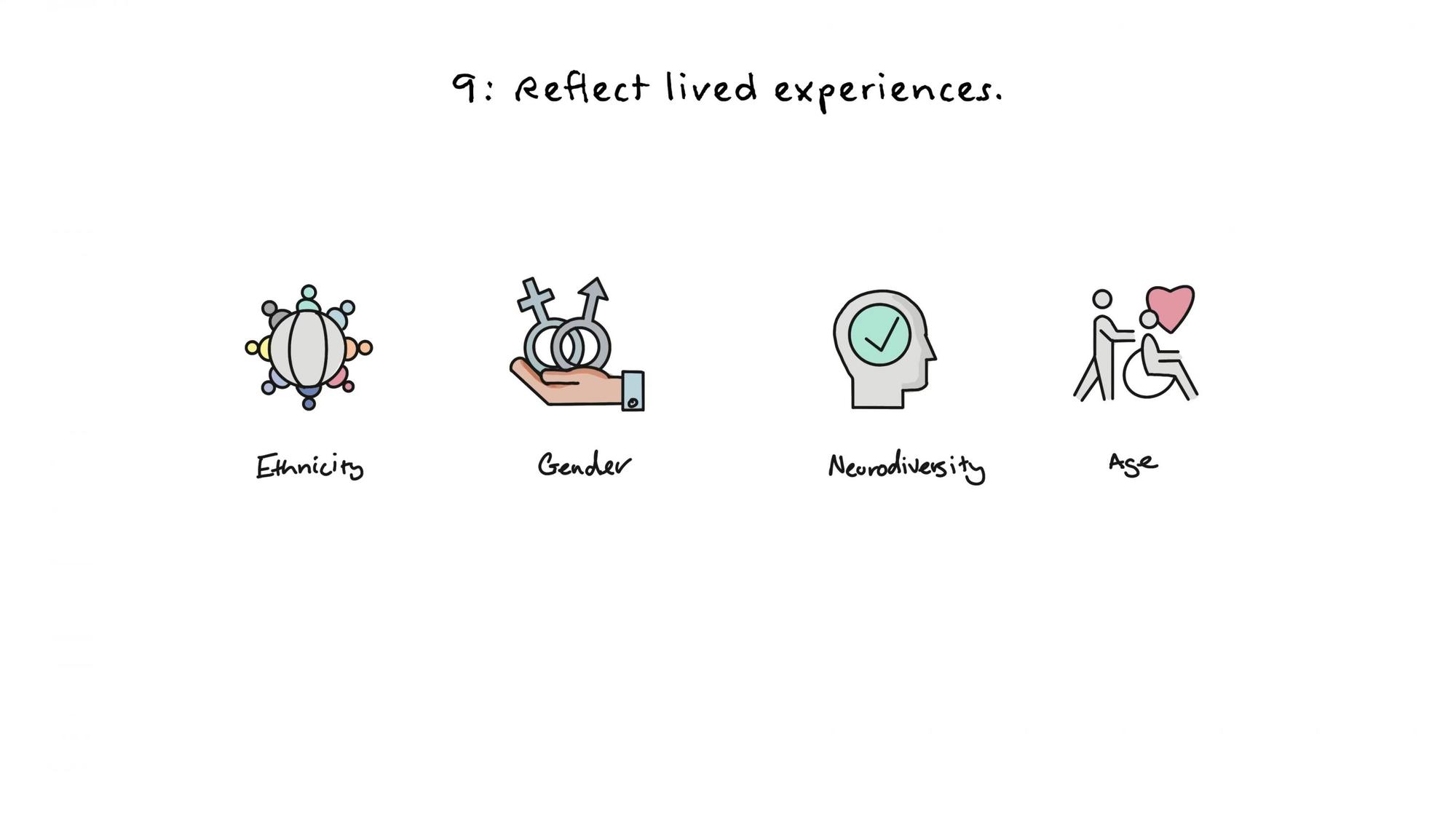
9. Reflect lived experiences.
Not everyone has the same life experience. Our individual characteristics such as ethnicity, gender, neurodiversity, and age deeply impact the way our research takes shape and form. Consider what your work may be missing and seek out colleagues and communities to help identify them.
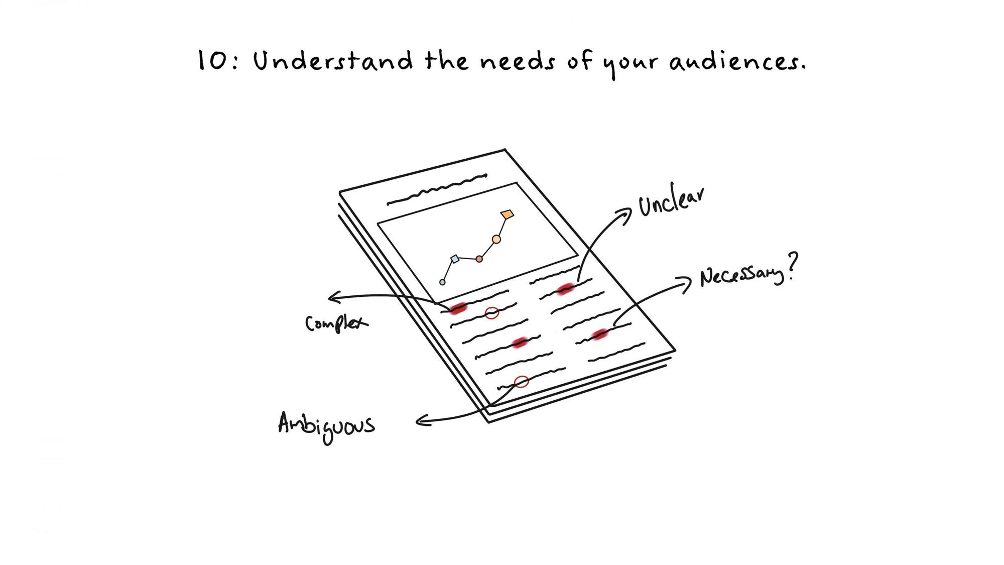
10. Understand the needs of your audiences.
The value of your data lies in how well it can be used, shared, and understood by your intended audiences. As a data communicator, you’re responsible for ensuring that your content is clear, unambiguous, and useful to your readers. This requires due diligence across every aspect of your work, striving to ensure that word choices, terminology, and even the languages that you publish in are fully optimized for your audiences, and mindful of their needs.
As people who are experts in the fields of data science and data communication, we’re in a position to improve how people view and understand race, ethnicity, and other aspects of identity, and make positive contributions to every aspect of society and culture - from how policies are created, to how products are designed and built. We must lead by example, and we must do no harm in our data storytelling. Our point of view should be grounded in principles of equity and fairness. If we fail to do so, we will reinforce damaging stereotypes and mischaracterizations. Or worse, we contribute to the narratives that lead to deeper stigmas and cultural divides.
To learn more from leading experts at the intersection of data and equity issues, and to download the complete Do No Harm Guide from the Urban Institute, visit the Racial Equity Data Hub.