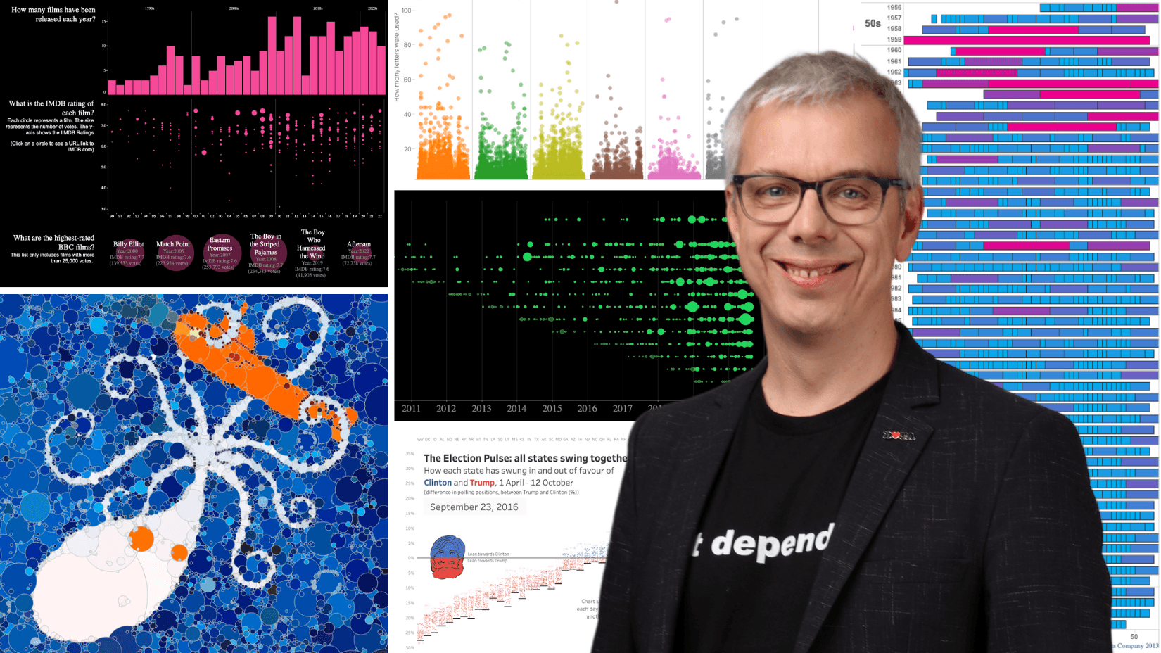
My Tableau Story: Andy Cotgreave


When I downloaded Tableau Desktop in 2007—I was a data analyst at the University of Oxford then—little did I suspect the impact it would have on my career. That first download led to so many amazing experiences, including starting work at Tableau in 2011. I was lucky to be there at the start of many key moments in Tableau’s history.
Join me as I look at highlights and lessons anyone can take along on their own data journey.
Grow data skills with User Groups
In 2009, I was running a team of analysts and wanted to get them excited about Tableau. What I didn’t have was a training budget. “I should invite other Tableau users to Oxford,” I thought, so I started the first UK Tableau User Group. About 60 people gathered for that first meeting. We even had Tableau co-founder Pat Hanrahan speak (check out this post about his impact).
On that day, I experienced the joy of sharing ideas and meeting others who love Tableau. If you’ve not been to a Tableau User Group yet, there’s no better time than now to join a User Group, connect with others in-person or virtually, and grow your data skills.
Innovate and build your portfolio
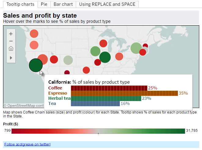
Example of a bar chart embedded in a tooltip.
Tableau has so many great features, and Viz in Tooltip is one of them. Tableau introduced this feature in 2017, but guess what? I started creating vizzes in tooltips way back in 2010. In a moment of inspiration, I realised I could use calculations and ASCII text blocks to build bar charts in a tooltip. It wasn’t long after this that I got my job at Tableau.
The lesson: I was building a portfolio of work on Tableau Public and on a blog. When it came to finding a specific Tableau job, I had something I could show any recruiter as evidence of my skill and passion. Today, Tableau Public even has a Hire Me button you can add to your profile.
Grow with the community
One of the first things I did upon joining Tableau was propose a “Tableau MVP” program to recognise community members. The MVP idea became Tableau Zen Masters—a program now known as Tableau Visionaries. Every year I am inspired by this group, and the Tableau Ambassadors, as they help promote growth of the data visualization and Tableau Community.
I also realised early on that Tableau bloggers were sharing amazing content every single month. I wanted to celebrate and amplify that, and so the Best of the Tableau Web series came to be. The first post was in November 2012. I’ve loved seeing how content has evolved from blogs to now include podcasts, videos, and more. Today, you can keep up with Community content via the weekly DataFam Roundup.
Find the fun (The Kraken)
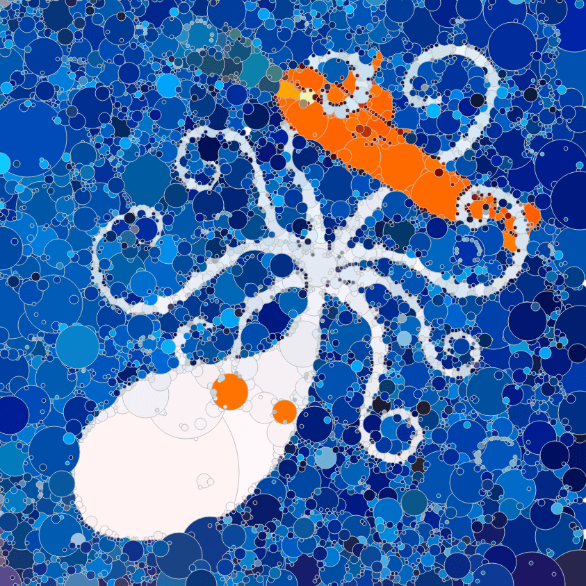
Effective data communication is a mix of art, science, and creativity. Two moments I’m incredibly proud of were winning an internal “Make Art From Tableau” competition with a scatterplot picture, which was based on The Kraken by artist Chris Bonnette. The story of how I built this chart involved experimentation, collaboration, some hacking, and lots of work in Tableau—read all about it here. This was one of the most fun projects I've ever worked in Tableau.
What’s a wacky scatterplot got to do with our day job as data analysts? When you step outside of your day job and have fun—you learn a huge amount about the platform you’re using.
You can have a go at this with the Data Plus Movies challenge.
Data is both art and science
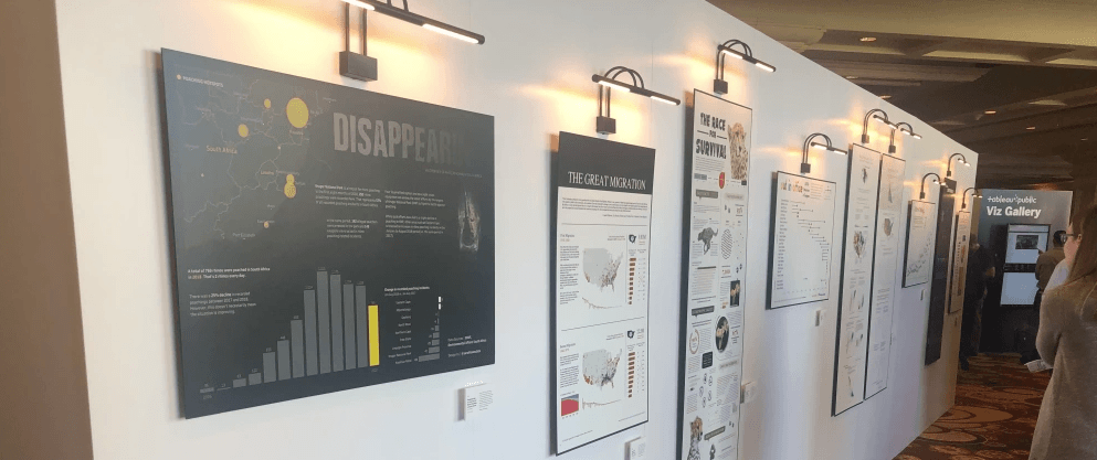
Tableau Public Viz Gallery from Tableau Conference 2019. Sophie Sparkes and I started the galleries in 2017.
In 2017, I had the idea to build a Viz Gallery at Tableau Conference and worked on it with Sophie Sparkes I suspected that seeing beautiful visualisations, hung like pieces of art, would create a different type of engagement with data. This has now become a permanent feature at the annual Tableau Conference, both live and virtual. I love seeing people linger in the gallery, digesting the insights in ways they otherwise wouldn’t if they were looking at the same view on a laptop or cell phone.
This is why I also thoroughly enjoy hosting Iron Viz—a chance to celebrate not only technical skills, but also the creative and storytelling abilities of our community. Be sure to join us at Iron Viz at Tableau Conference.
Improve your work through collaboration
A collection of data vizzes from Makeover Monday community challenge project, started in 2016 by Andy Cotgreave and Andy Kriebel.
Working with data should not be a lonely pursuit. Collaborating with others brings learning experiences, empathy, and personal growth.
One day in November 2015, I phoned Andy Kriebel, who had been blogging his own makeovers for years, and suggested we do makeovers together every Monday in 2016. We’d share our work, “and see what happens.” Makeover Mondays—weekly sessions aimed at helping people hone their data skills and view their visualisations with a critical eye—were born. We had no idea the impact that conversation would have.
Today, there are many other collaboration programs you can join. Whether you’re a beginner or expert, I recommend you get involved.
Data and inspiration are everywhere

Data impacts all parts of our lives. I enjoy finding tangential connections between things I watch or read and the world of data. That’s why I started the Sweet Spot newsletter, a curated list of 3–4 data-influenced stories. You can look at past issues and subscribe here. Topics might include movies, magic, board games, philosophy, biology, or anything I find that involves lessons for data communication.
I’ve also enjoyed diverse conversations on my two video series: Check out Chart Chat for a monthly, lively conversation about the charts we see in the news, or If Data Could Talk for discussions about data culture.
There are so many other highlights. I got to spend a week on the Guardian news desk working on their Datablog. I wrote the Big Book of Dashboards. I get to host Iron Viz and celebrate our DataFam.
I know many people beginning their Tableau journey sometimes feel intimidated by the skills of others they encounter along the way. To them I say: Never forget that every expert started out as a beginner. Don’t believe me? Go check out my first ever Tableau Public workbook: it looks very basic now, but I was thrilled with it then.
That wraps up this peek into some of my Tableau career highlights. It has, and continues to be, an honour to help people see and understand data. I am thrilled to be able to use my passion to lead people to the Tableau platform.
My personal mantra is to inform, educate and entertain. For more on Tableau and data storytelling, connect with me on LinkedIn, and I hope to see you at Tableau Conference!
Histórias relacionadas
How Tableau is Expanding Access to Agentic Analytics Across the Enterprise
 22 Julho, 2026
Top New Tableau Pulse Feature Releases to Know
How Tableau Features the Power of Data and Generative AI at Gartner BI Bake-Off
 12 Março, 2024