An Education Viz Roundup


September was Back-to-School Month on the Tableau Public blog. As students and teachers streamed back into classrooms and hallways across the globe, we took time to consider how data visualization is being applied to the venerable and age-old act of learning.
In this blog, I've selected seven visualizations that show different aspects of education: return on investment, graduation rates, financial aid, new student surveys, enrollment populations, gender statistics, and university rankings. These visualizations were created by different types of Tableau Public authors, from bloggers, to companies, to the schools themselves.
For even more schools and sites that feature education-related visualizations, see the list complied by Cornell here: http://irp.dpb.cornell.edu/viz-in-the-wild-public
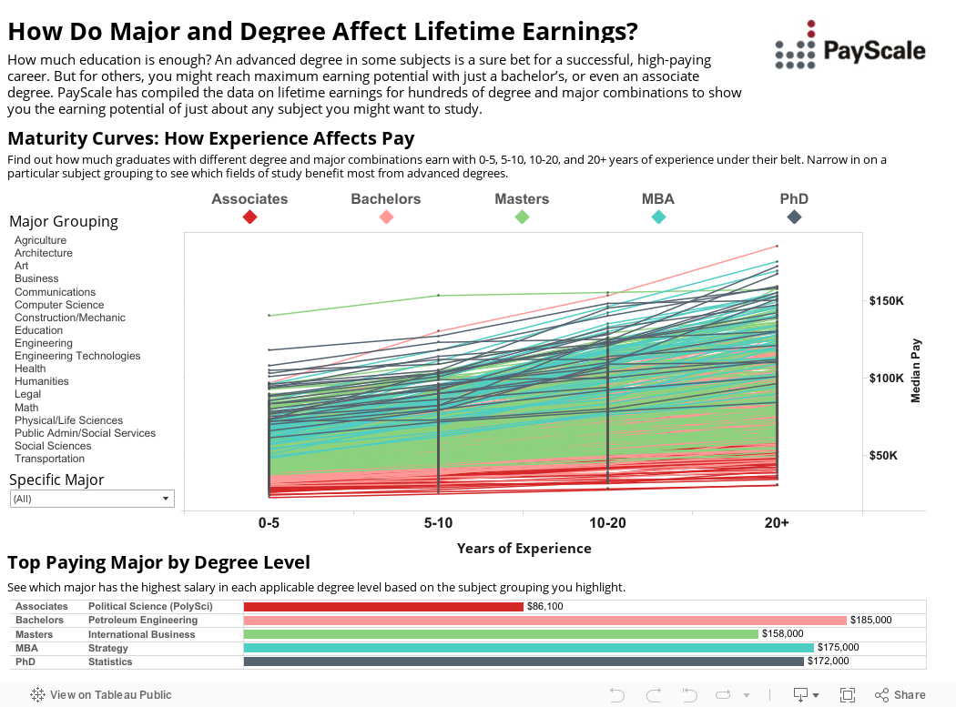
1. Return On Investment
PayScale's 2015-16 College Salary Report
Originally published on: http://www.payscale.com/college-salary-report/degrees-and-majors-lifeti…
2. Graduation Rates
UNM Center for Education Policy Research, New Mexico, U.S.
Originally published on: http://cepr.unm.edu/tools/missiongraduate.html

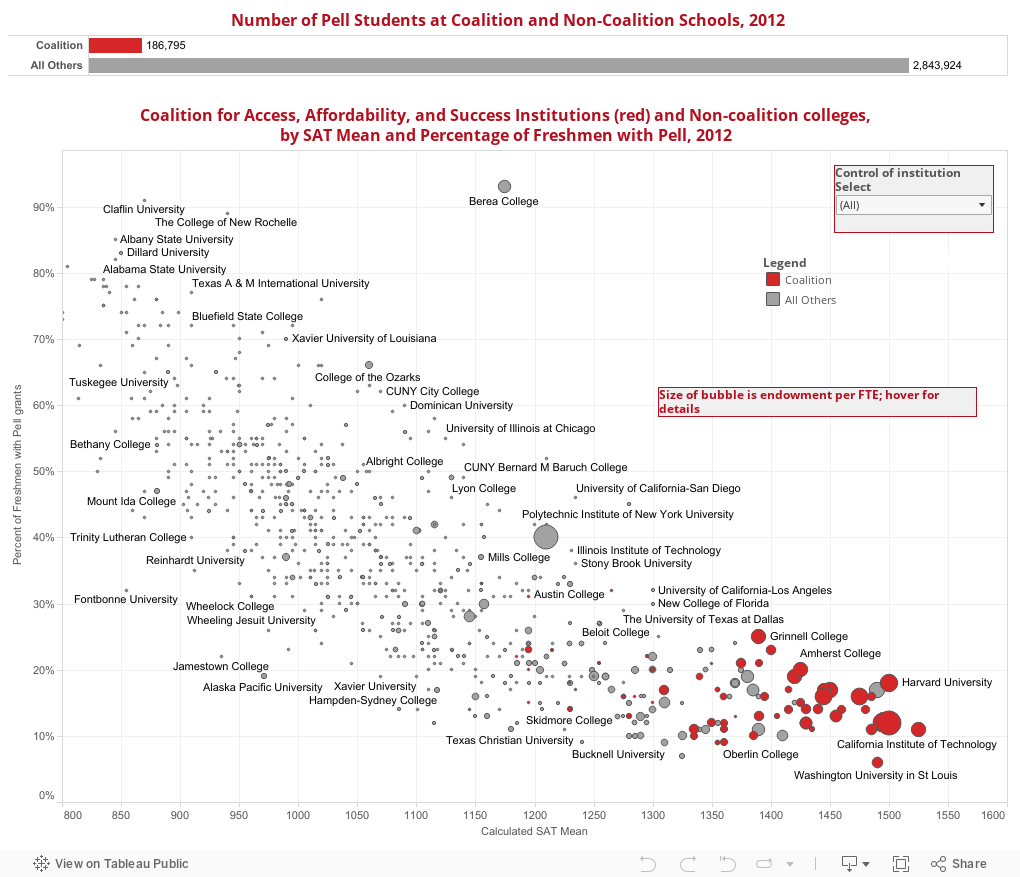
3. Financial Aid
Higher Ed Data Stories, Jon Boeckenstedt
Originally published on: http://highereddatastories.blogspot.com/
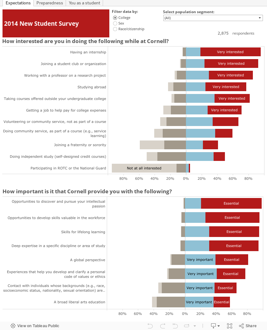
4. New Student Surveys
Cornell University Institutional Research and Planning, New York, U.S.
Originally published on: http://irp.dpb.cornell.edu/tableau_visual/2014-new-student-survey-initi…
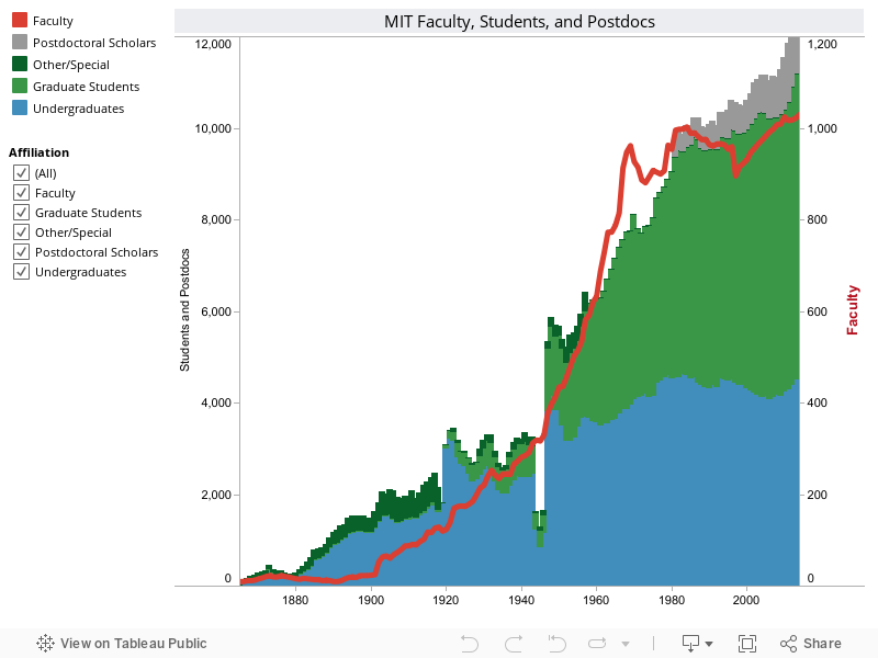
5. Enrollment Figures
MIT Office of the Provost
Originally published on: http://web.mit.edu/ir/pop/index.html
6. Gender Statistics
University of Oxford Academic Administration Division
Originally published on: http://www.admin.ox.ac.uk/aad/sdma/statistics/student/

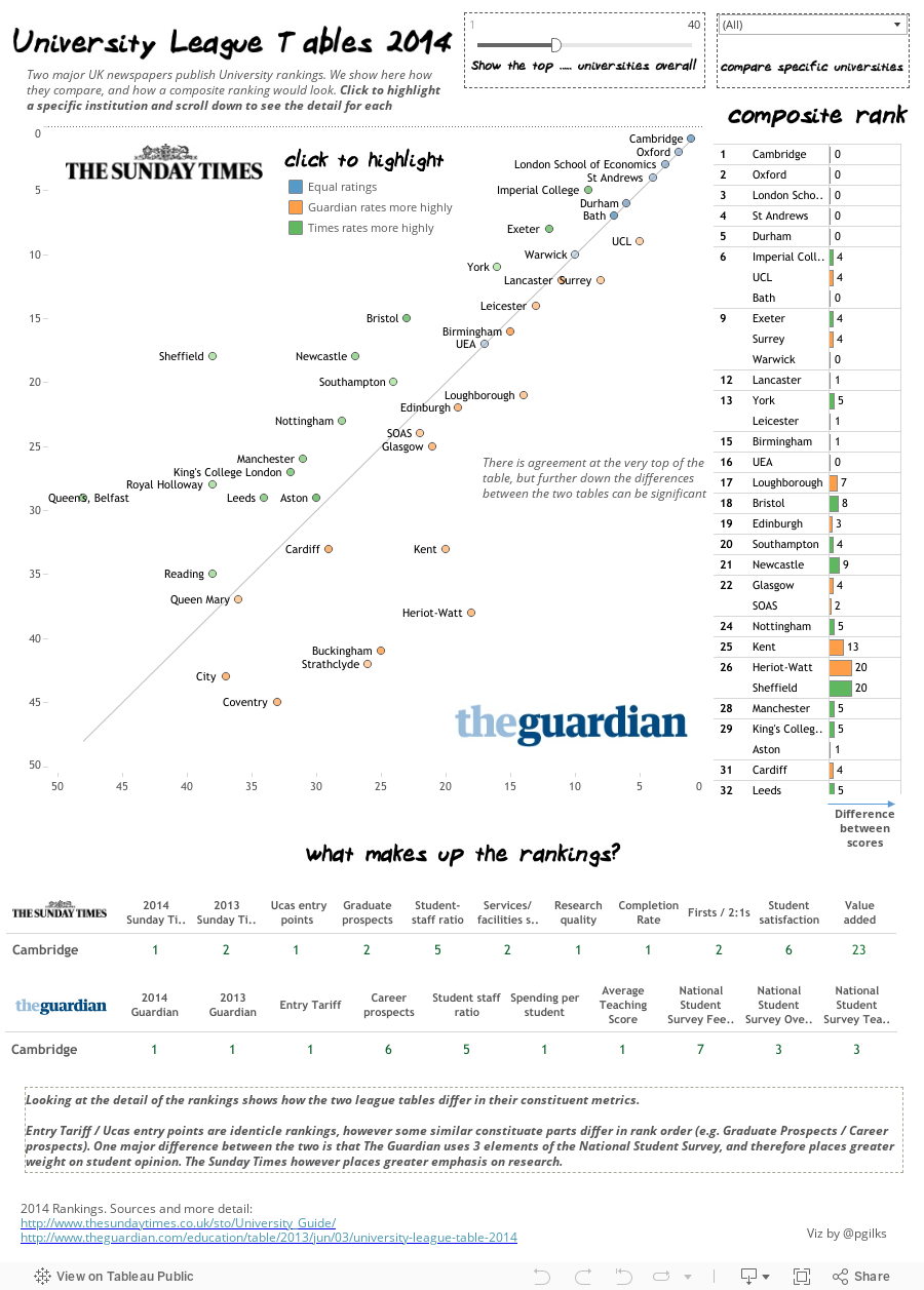
7. University Rankings
Peter Gilks, Paint By Numbers
Originally published on: http://paintbynumbersblog.blogspot.com/2014/01/comparing-university-lea…
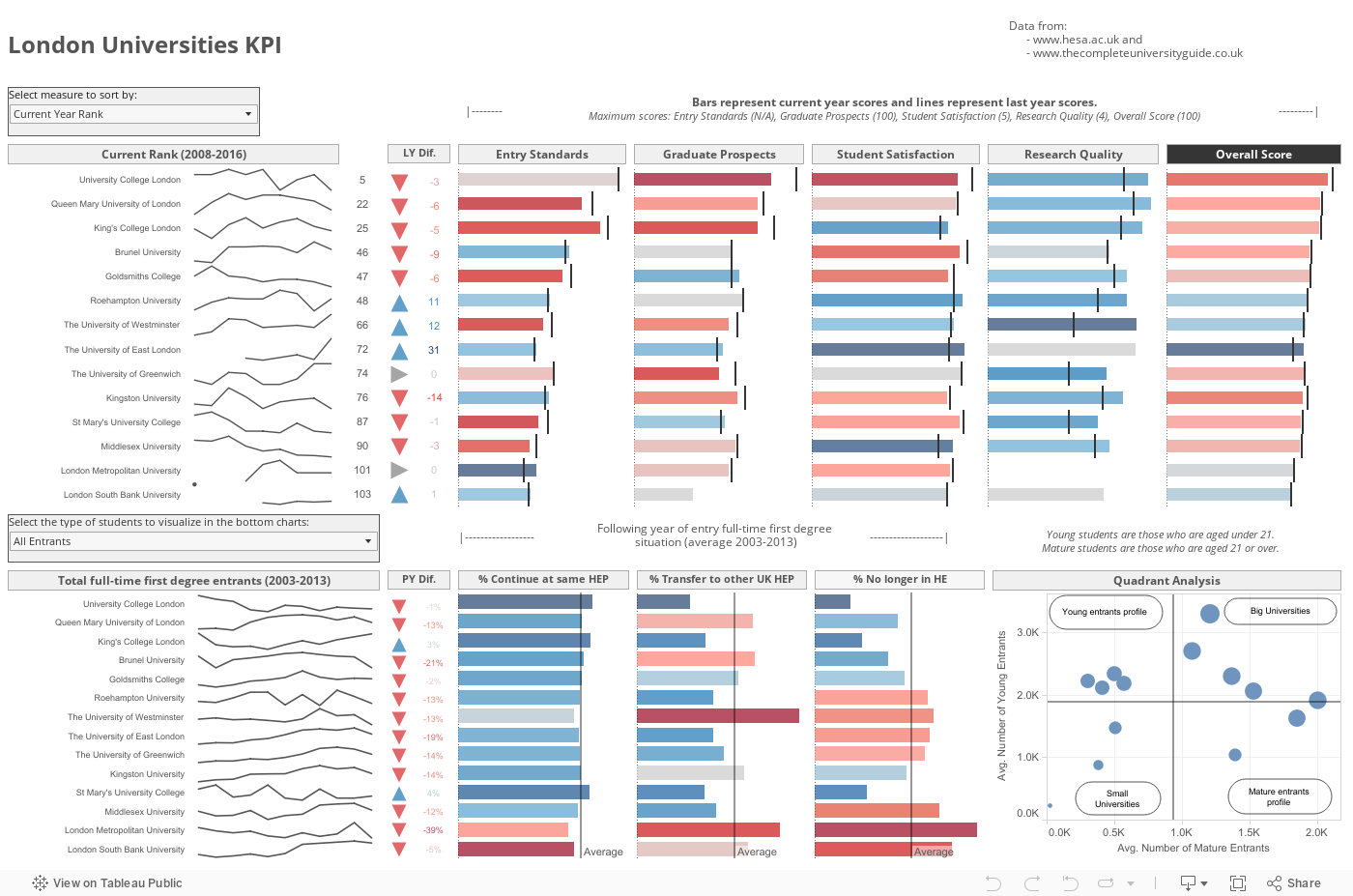
SURPRISE! Here's an 8th: University KPIs
Pablo Saenz de Tejada, The Information Lab
Verwante verhalen

Iron Viz 2026: Read Between the Data
 28 mei, 2026

Tableau's Iron Viz Winners

Explore the 2026 Iron Viz Entries
 15 december, 2025