23 Can't-Miss Tableau Features Released in 2023


It’s not surprising that generative AI was at the center of many discussions in 2023, with exciting developments across companies and industries—including Tableau Pulse powered by Tableau AI and Einstein Copilot for Tableau. Without a doubt, the new year ahead will continue to bring innovative ways to engage with data and leave a revolutionary impact.
To unlock the power of AI, however, organizations will need to continue establishing a strong foundation of working with data. Tableau unveiled an array of new capabilities—more than 100 new features released this year—that continue to help people see and understand data. Let’s take a look at 23 Tableau features released in 2023 and how they can help you in your work.
- Dynamic axis ranges
- Multi-row calculations in Tableau Prep
- Dashed and dotted Line Patterns
- Geospatial enhancements
- Accelerator data mapping
- New Google BigQuery Connector
- Add-on for Google Workspace
- Google Analytics 4 Connector
- Tableau for Slack enhancements
- Image Role for .SVG, GIF, .WebP
- Custom data labels
- Unified Tooltips
- Dynamic axis titles
- Tableau Prep Input Step improvements
- Personal Access Token (PAT) Admin Control
- Embedding Playground
- Amazon S3 Connector
- Athena Connector
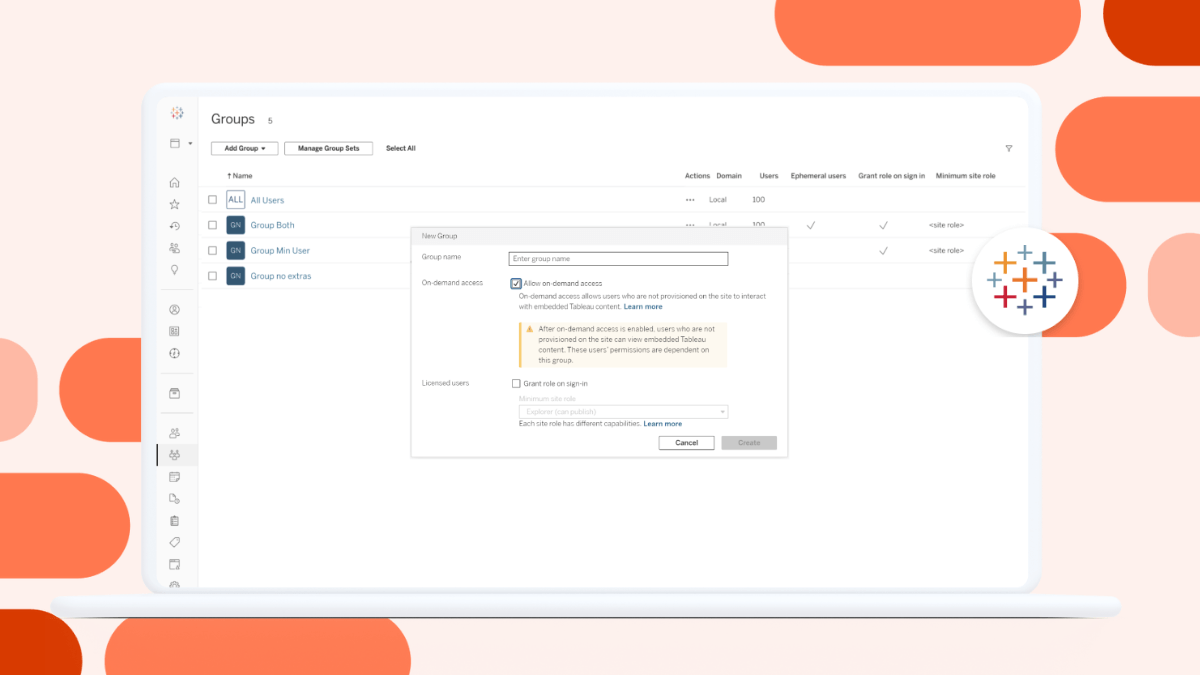
- On-demand access
- Usage metrics
- Editable viz alt text
- Dark mode on Tableau Mobile
- Data Stories
1. Dynamic axis ranges
Create more dynamic visualizations by using the value of parameters in the workbook to set axis ranges with dynamic axis ranges. This feature in Tableau 2023.3 allows you to select different parameters to use as each axis range. You can have a single dynamic axis extent (just start or end) or can set both extents using compatible fields.
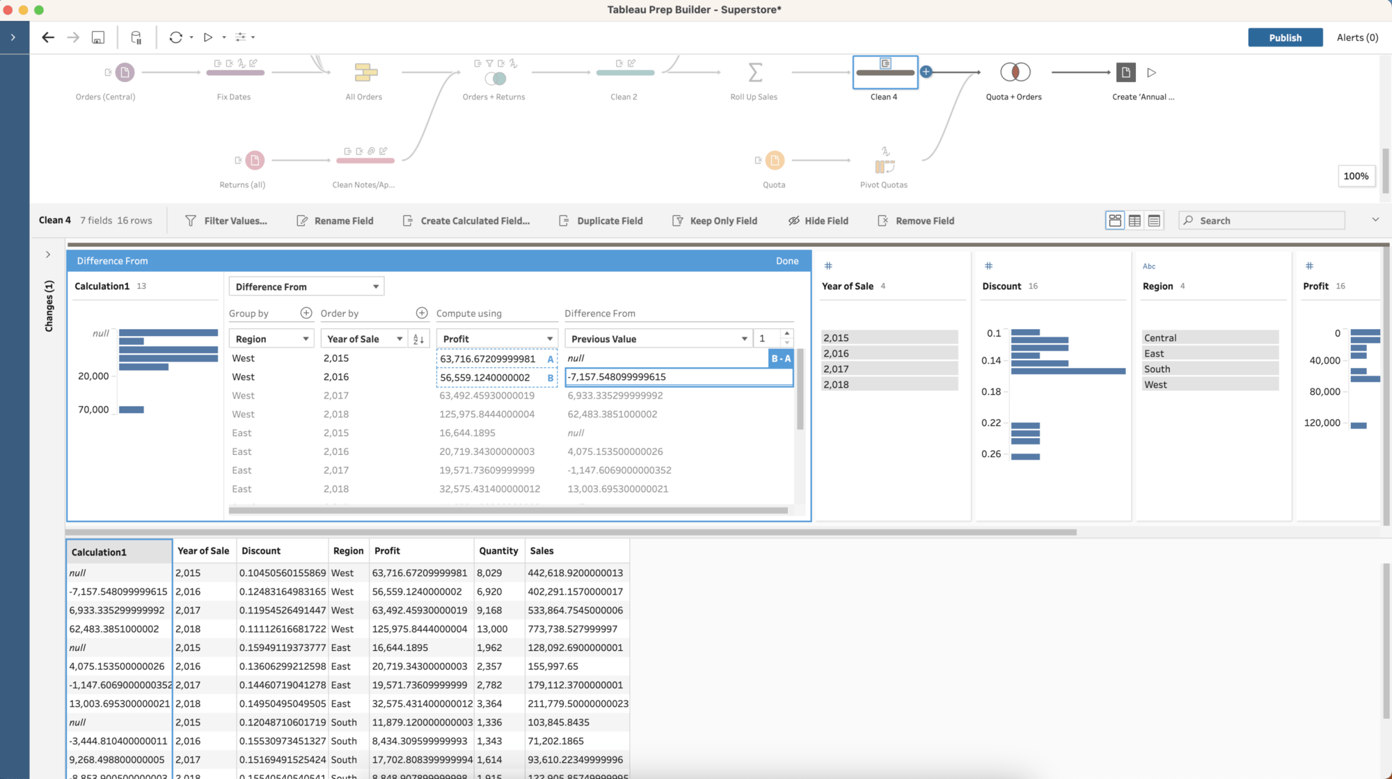
2. Multi-row calculations in Tableau Prep
With multi-row calculations in Tableau Prep you can compute table calculations while preparing your data. Using clicks, not code or complex calculations, it is easier than ever to calculate difference from, percent difference from, and moving calculations. You can also now write LOOKUP calculations in the expression editor of Tableau Prep.
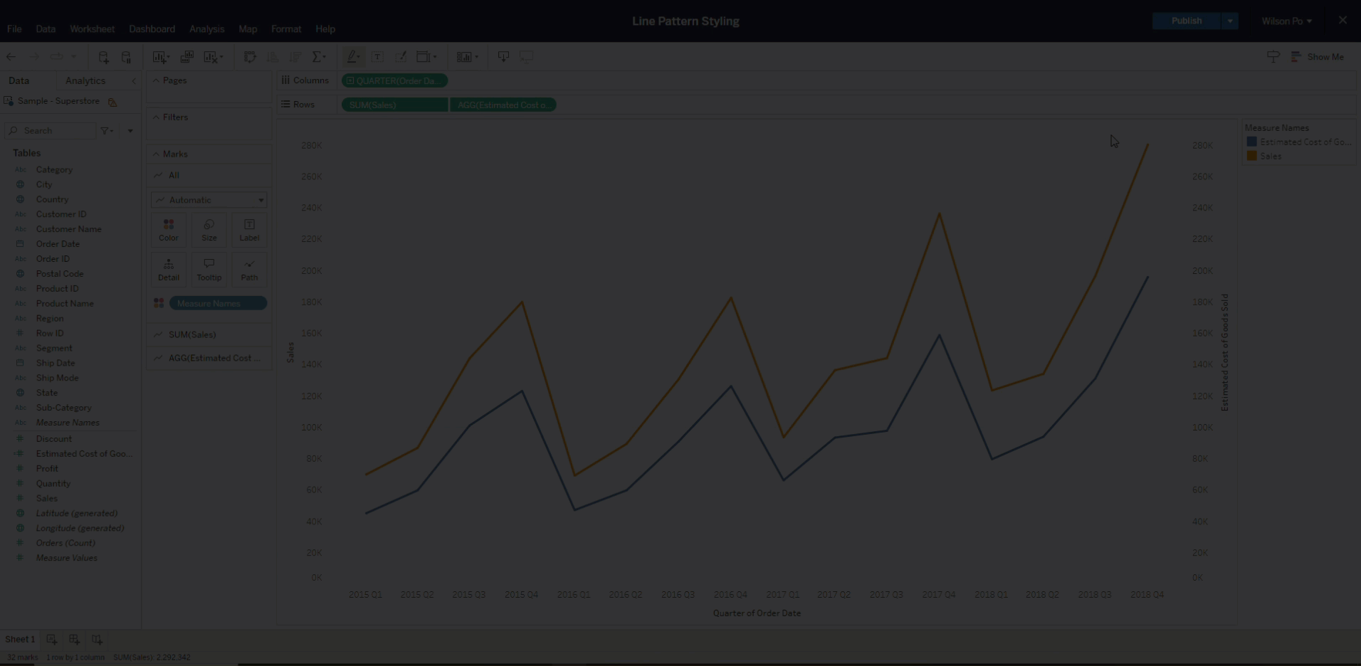
3. Dashed and dotted line patterns
Line Patterns offer new styling capabilities, allowing an author to select any trend line to be represented as a solid, dashed, or dotted lines. This new capability makes it easier to convey nuance when representing multiple trends, where styling can help to convey when certain lines represent unique context, such as thresholds or modeled data points.
4. Geospatial enhancements
Geospatial analysis with Tableau is more comprehensive than ever. In Tableau 2023.2, new enhancements to the spatial calculation language allows you to answer a broad range of questions from your geospatial data. Outline creates new formatting options, ShapeType enables new pivots based on geometry type (e.g. distinct treatments of roads vs. regions), and Length creates new opportunities for route planning. We've also made it easier to bring spatial geometries into Tableau by supporting the full GeoJSON language during import.
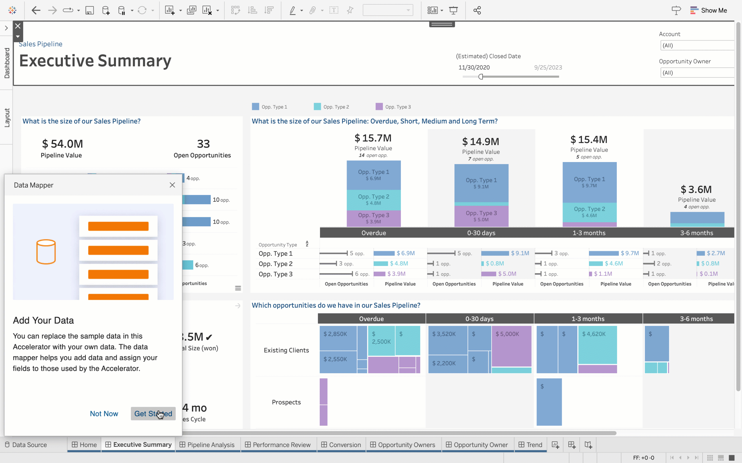
5. Accelerator data mapping
With Data Mapping you can jump start your analytics even faster by reducing the time and effort required to set up an Accelerator’s ready-to-use dashboards. Now, when configuring an Accelerator, the Data Mapper allows users to pull outside data into the Accelerator and map fields from their data source into the fields the Accelerator expects. This will be made possible via the Data Mapping UI—a hybrid dialogue box that opens by default with any Data Mapping enabled Accelerator.
6. New Google BigQuery Connector
The new Google BigQuery JDBC connector uses BigQuery's Storage API to create and refresh extracts more efficiently. This new connector also supports cross project joins as well as initial SQL.

7. Add-on for Google Workspace
Get data insights in the flow of work. With our latest partnership with Google, users can quickly preview a Tableau Cloud visualization from within Google Docs. With the Tableau integration with Google Smartchips for Google Workspace, links pointing to a Tableau Cloud visualization are instantly converted to thumbnail views showing the Tableau visualization’s name, last updated date, and a preview image. Thumbnails are generated on the spot, always showing the latest data! You can also click to open the visualization in Tableau Cloud for further exploration. Available now in the Google Workspace Marketplace.
8. Google Analytics 4 Connector
Connect to event data from your Google Analytics 4 property. The Google Analytics 4 connector is available in the Tableau Exchange.
9. Tableau for Slack enhancements
Collaborate on insights more effectively with the Tableau for Slack app. The latest enhancements make it even easier to put data at the center of every conversation and decision. Now, you can:
- Share Tableau content with context. Links now come with previews so your team can quickly recognize–and act on–relevant information.
- Easily search for and share Tableau content in direct messages and channels.
- Get to insights faster by conveniently accessing recents and favorites from the App homepage.
10. Image Role for .SVG, GIF, .WebP
Improve insight comprehension and help end-users better connect to and understand visualizations using Image Role. Image Role is a new field semantic that offers a scalable and automated way to bring image assets into Tableau. Tableau can now dynamically map images to links in your data and encode them as exportable row or column headers. This new capability makes it possible to manage image assets externally to prevent workbook sizes from becoming too large to maintain and share. More information here.
Previously released in other Tableau products in Tableau 2022.4, this capability is now available in Tableau Server 2023.1.
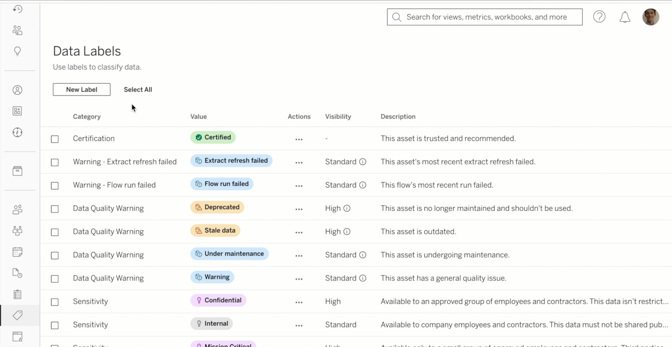
11. Custom data labels
Make your data more discoverable by categorizing it within Tableau. Custom data labels are a continuation of a set of labeling features we've brought to Tableau over the years, including certifications, data quality warnings, and sensitivity labels. Admins can now define custom data labels that Creators and Explorers can add to data assets for improved discovery and auditing within Tableau. You can also use the Data Labels API to allow third-party applications to add labels to a Tableau site for metadata not created in Tableau, such as those in upstream content like databases and tables.
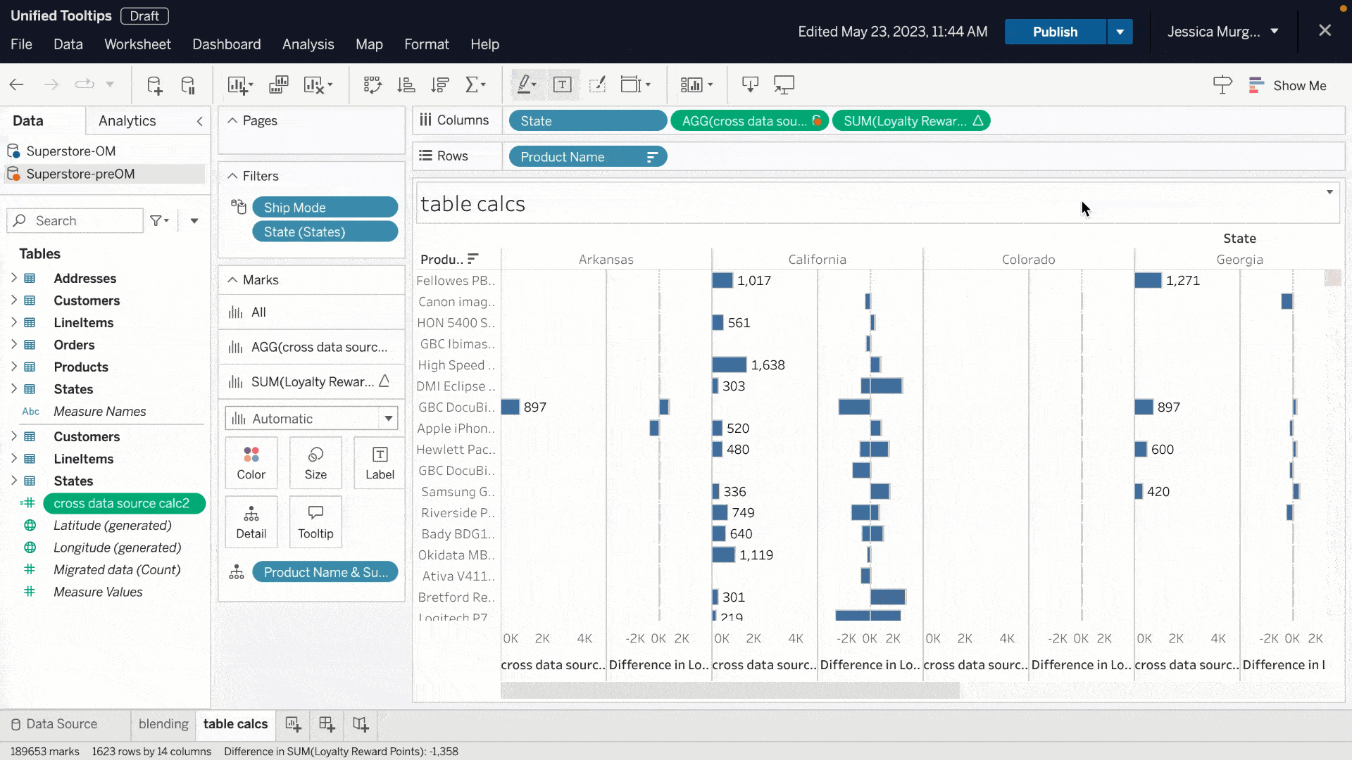
12. Unified Tooltips
Get more context for your in-shelf pills with new tooltips. Unified Tooltips combine up to six previous tooltips into one that prioritizes information based on relevance. Get the field name, table calc details, and field comments in a single place. Any error messages or filter information now displays in the same tooltip. This unified tooltip is available for pills on all shelves.
13. Dynamic axis titles
Users can alter the title of their axis based on the value of a parameter or a single-value field with dynamic axis titles.
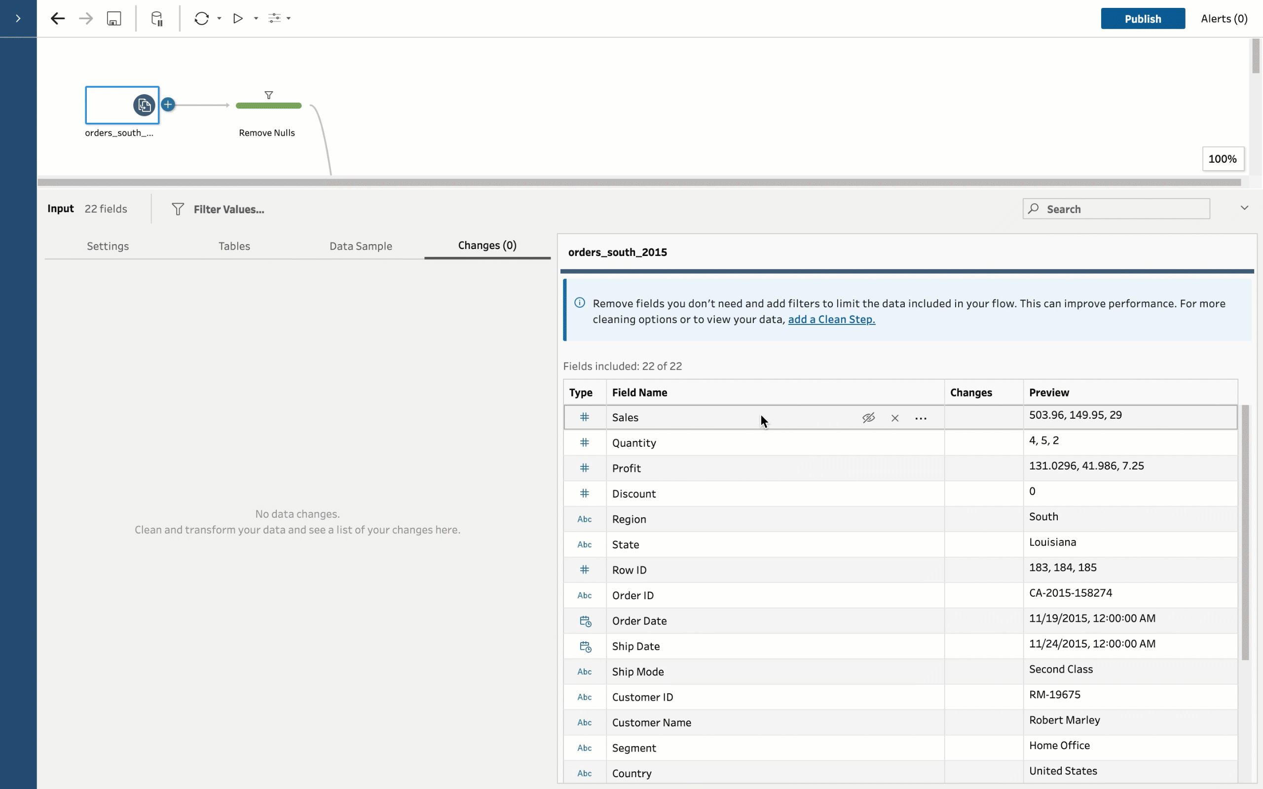
14. Tableau Prep Input Step improvements
Within Tableau Prep's Input Step, you can now bulk select multiple columns. This removes the need to individually select columns to hide or remove them. You can now also use a relative date filter for DateTime data types to remove stale data. These improvements combine to improve interactive performance when authoring flows and help unify the experience across Tableau Prep steps. More information here.
15. Personal Access Token (PAT) Admin Control
Meet your organizational security requirements with additional control over personal access tokens (PATs) in Tableau Cloud.
Changes for all Tableau Cloud sites include:
- Site admins can now control who has the ability create PATs
- Site admins can now control how long PATs are valid, ranging from 1 to 365 days
Changes for Tableau Cloud sites created after 23.2 include:
- PATs are disabled by default
- Default expiry of PATs shortened to 180 days

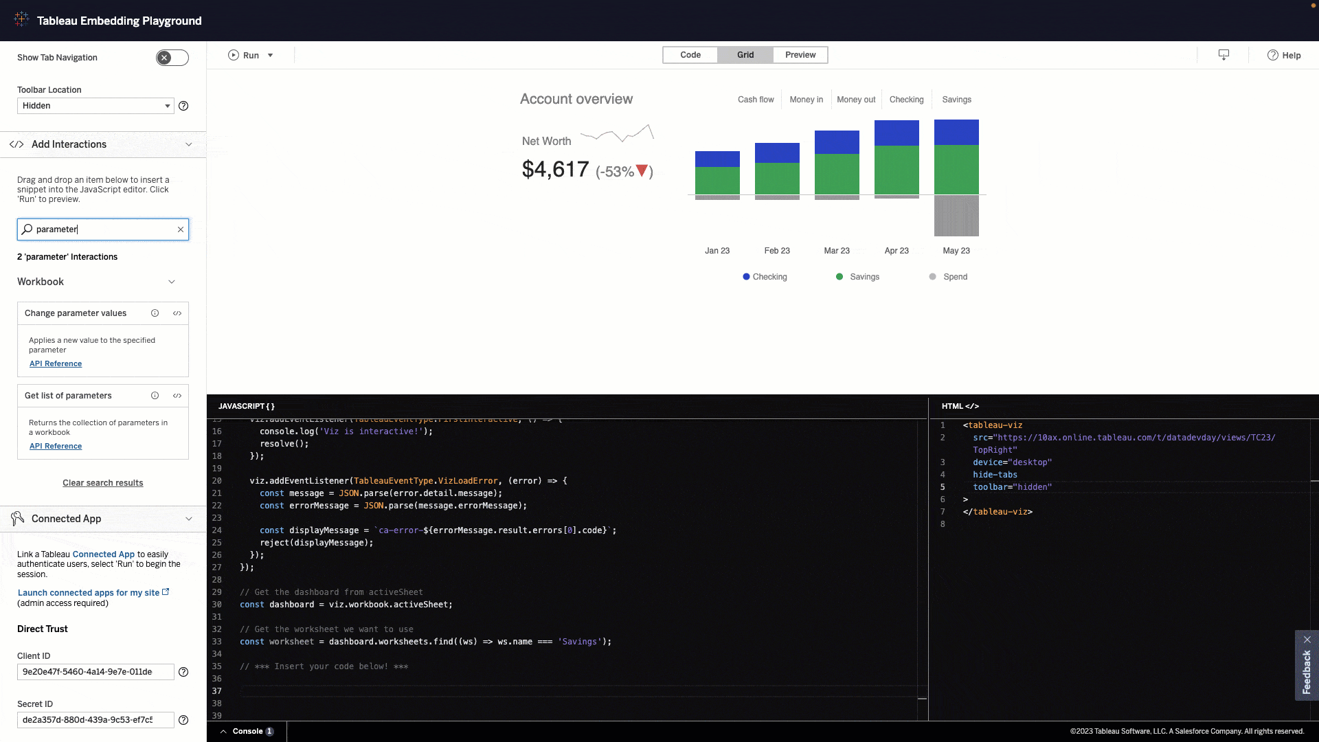
16. Embedding Playground
Rapidly develop custom code in a matter of minutes. The Tableau Embedding Playground is an interactive learning environment where you can gain hands-on experience with key embedded analytics capabilities. In the Embedding Playground, you can quickly create exportable code to embed interactive visualizations into your application. Discover new possibilities, experiment with capabilities, and get inspired to take your embedded analytics solution to the next level. Available now.
17. Amazon S3 Connector
With the Amazon S3 Connector in beta you can connect to Parquet, CSV, and Excel file data in your Amazon S3 bucket. The new connector is available in Tableau Cloud as well as the Tableau Exchange.
18. Athena Connector
Use industry leading 3rd party identity providers such as Azure AD or Okta to manage secure authentication to Amazon Athena data sources. Using the OAuth configuration for an identity provider, you have increased flexibility and security of connections, along with multi-factor authentication, to important data in Athena.
19. On-demand access
On-demand access allows Embedded Analytics Usage-Based Licensing customers to establish a connected authentication system between their application and Tableau Cloud. With on-demand access, customers can use Tableau’s Connected Apps functionality to assert users and permissions at the time of access. You can now maintain a single source of truth for user identities, roles, and privileges in just your application instead of having to create, sync, and/or maintain those accounts in Tableau too.
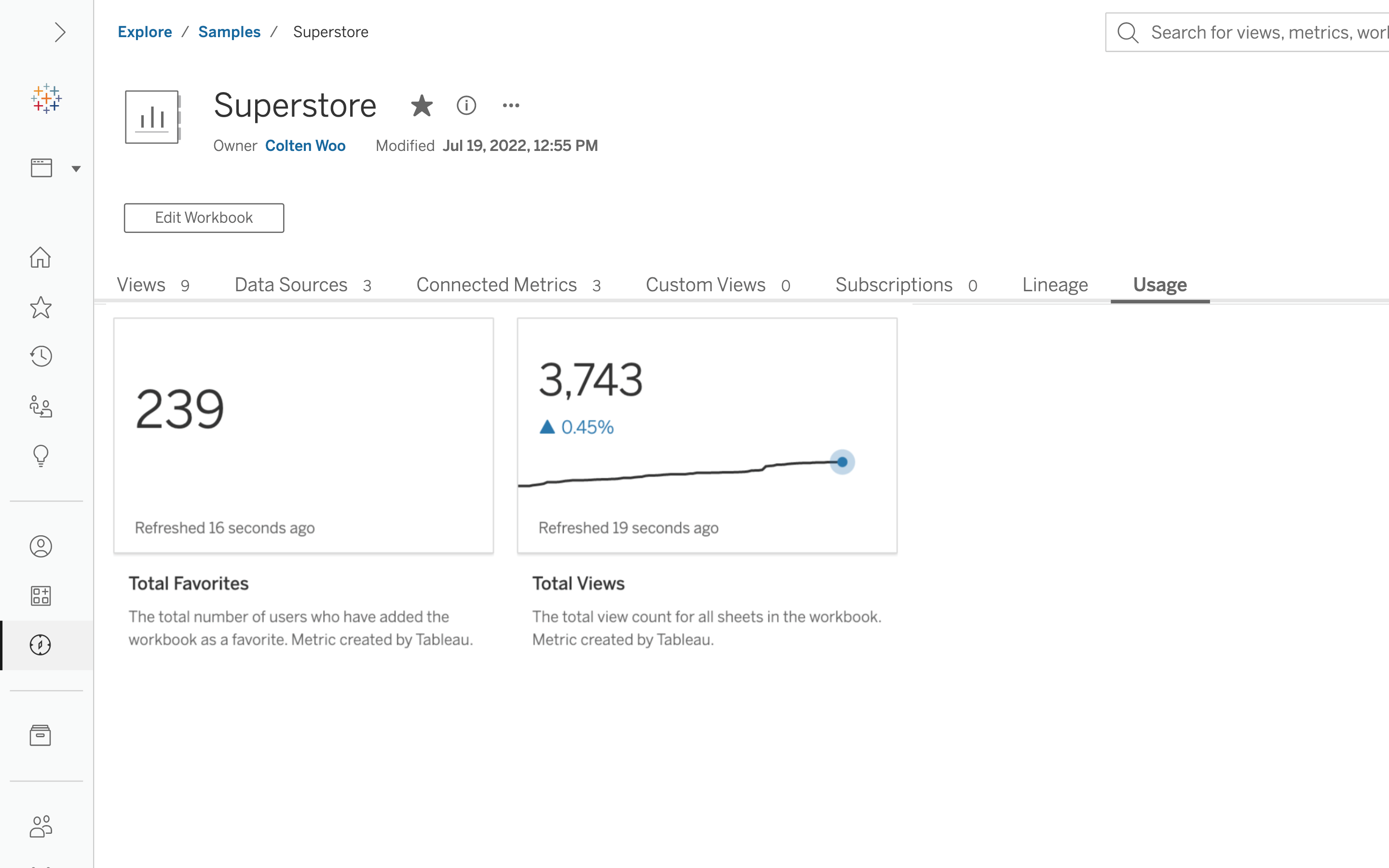
20. Usage metrics
Total views and favorites are displayed as Metrics in the new Usage tab. With these insights, analysts can better understand what workbooks are popular so they can build content that resonates with their audience. Viewers can leverage Usage Metrics to validate that the content is widely used and trustworthy.
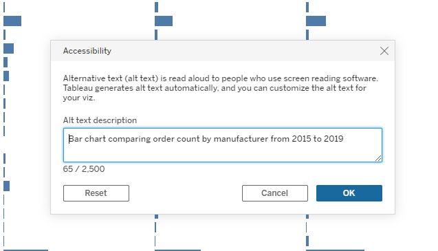
21. Editable viz alt text
You can now edit automatically generated alt text. By default, Tableau provides automated screen reader text, ensuring there's a description to be announced by screen readers for all online visualizations including client and server side rendered and embedded visualizations. Now, content authors can edit the alt text from either the Data Guide panel or by selecting Accessibility in the Worksheet drop down. Authors can add up to 2500 characters of alt text, providing deep insight into the contents of the visualization.
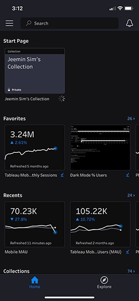
22. Dark mode on Tableau Mobile
Dark mode is now available on Tableau Mobile, providing more flexibility for how you view your data while on the go. Tableau Mobile will respect your device settings by default, or you can configure dark mode through the app's settings.
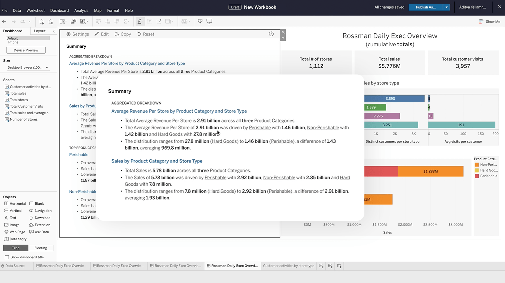
23. Data Stories
Help any user to confidently access, understand, and communicate with data. Data Stories automate the analysis, build, and communication of insights, but are fully customizable, so you can tailor the stories based on your audience. Choose which analyses are included, change the confidence interval, rename fields, apply colors to denote positive or negative changes, and more. Previously released in other Tableau products in Tableau 2022.2, this capability is now available in Tableau Server 2023.1.
Looking ahead at Tableau in 2024
These capabilities are just the beginning. Features like Data Stories set the foundation for transformative innovations like Tableau Pulse, Tableau AI, and Einstein Copilot for Tableau, with more updates to improve critical insights and your ability to take action on them coming in the future. We not only develop Tableau for you, our customers, we innovate with you. Committed to bringing the DataFam with us every step of the way, we continue to focus on community-driven innovation. So, if you’re interested in helping shape the future of Tableau, please join us on the Tableau Community Forums. We can’t wait to see what we can accomplish together in 2024.
Can’t get enough? View all the latest Tableau features to help you see, understand, and act on your data.
Verwante verhalen

Extend Access to Embedded Tableau Content with On-Demand Access
 22 juli, 2026

The Tableau+ Bundle with Premium AI, Enterprise Capabilities, and Premier Success
 24 juni, 2026
What is Tableau Prep?
 30 april, 2026