Best of Tableau Web: February 2022


Welcome to Best of Tableau Web—a monthly highlight of tips, tricks, and inspiration from across the internet on Tableau and data visualization. This month's highlight is by Julia Biedry Gonzalez, Tableau lead solution engineer for the United Nations, and Global Philanthropy Chair for Salesforce’s Latinoforce Equality Group.
A leader on the Tableau Solution Engineering team asked me to record a short video about why I love data for our recent team meeting. After thinking about it for a bit, my answer was clear—data has no language and no borders. Data has the power to tell universal stories that are universally understood and the power to make change.
The truly global nature of our data community always blows me away, and I’m reminded of it in my daily work here at Tableau. From our global Tableau User Groups (TUGs) and Tableau Conference to Community Forums and my favorite Twitter hashtag—#DataFam—the community is as strong as it is vast. I want to shout out to all the Community members providing content and blogs to the Tableau Community in multiple languages and making data skills more accessible across the world. Especially near to my heart is team COMUNI[DATOS], who recently celebrated a full year of TUG sessions in Spanish for the Latino/a/x data community, as well as the launch of a new podcast.
Being a part of Tableau Service Corps (TSC) has given me even more exposure to the global community—through TSC I’ve educated data students in Nigeria, visualized data on gender-based violence in Pacific nations, and helped organizations in the U.S. fight homelessness, expand access to education, and expose injustice and inequity, all using data. I love how our global community comes together to use data for advocacy, equity, and change. Community programs like TSC, Viz for Social Good, Diversity in Data, and the Racial Equity Data Hub harness the power of the global community to bring to light the most important data stories and create a more connected, equitable, and inclusive world. This past month was also Black History Month, and I was incredibly inspired by the impactful data stories shared by the community. The DuBois Challenge, for example, which celebrates W.E.B DuBois’s data visualization legacy, has yielded some incredible work.
With that, let’s dive into this month’s Best of the Tableau Web for February. Be sure to check out the list of blogs that we follow for Best of the Tableau Web. If you don’t see yours on the list, we invite you to add it here.
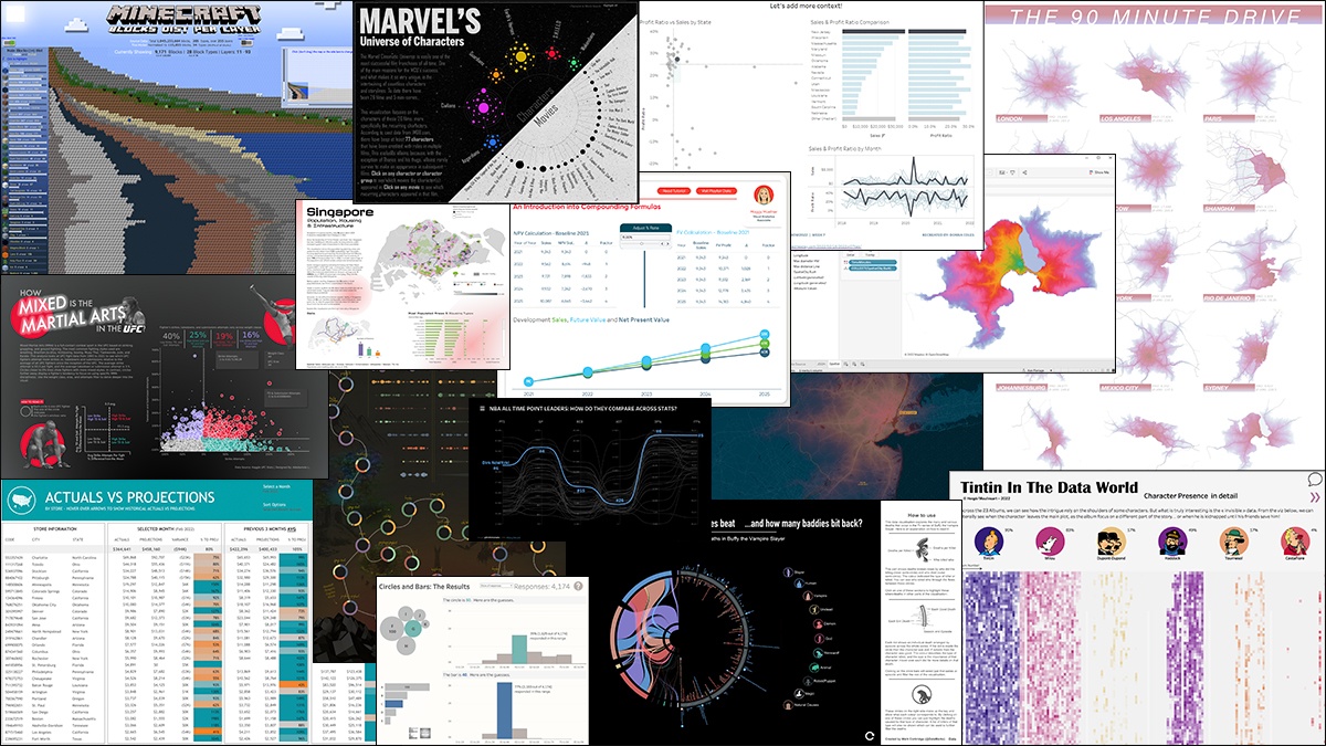
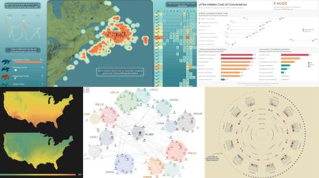
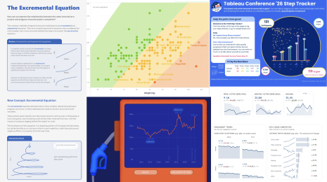
Code
- Adding more detail & context
Donna Coles, Donna + DataViz
- An Introduction to Compounding Formulas in Tableau
Maggy Muellner, Playfair Data
Formatting, Design, Storytelling
- Checklist for your next dashboard
Anya Prosvetova
- How can we use data visualisation to make better decisions?
Neil Richards, Questions in Dataviz
Inspiration
- #DataPlusMusic 2022 | 02 | MIDI Music Analysis
Sean Miller, HipsterVizNinja
- Our Top Ten Favorite Tableau Vizzes of 2021
Ken Flerlage, The Flerlage Twins
- Minecraft- Block Dist per Layer- The making
Nir Smilga
- Ten Table Tips & Techniques - Round 4
Kevin Flerlage, The Flerlage Twins
- Travel/Drive-Time Maps in Tableau by Marc Schønwandt
Marc Schonwandt, guest blog on The Flerlage Twins
- Real Life Dashboards - Actuals vs Projections
Kevin Flerlage, The Flerlage Twins
- Rethink an old viz
Annabelle Rincon, Rativiz
Iron Viz
- Iron Viz Feedback Initiative Recap 2022
Sarah Bartlett, Sarah Loves Data
- How I Used Tableau Prep In #IronViz 2022: Put Some Prep In Your Step
Jared Flores, WhatTheViz
Tips and Tricks
- Custom Axes in Tableau
Klaus Schulte, CO Data
- Calculate the AREA of your polygons in Tableau and then create charts to compare the sizes
Marc Reid
- How to Send Email from Tableau with a Template
Alexander Mou, Vizible Difference
- How to Make Custom Sorting Headers in Tableau
Autumn Battani, phData
- How to use excel named ranges in Tableau | Tableau tutorial
Tim Ngwena, Tableau Tim
Visualizations
View last month’s Viz of the Day on Tableau Public gallery.
Storie correlate
DataFam Roundup June 2026
DataFam Roundup May 2026

Iron Viz 2026: Read Between the Data
 28 Maggio, 2026