Wildfire risk is an equity issue
Wildfire is an important ecological process that’s critical to a healthy ecosystem, but when wildfire intersects with human communities, the results can be catastrophic. Vulnerable communities, who are the least able to handle the impacts of a wildfire disaster, bear an inequitable share of the risks and the consequences.
Living in the WUI
When you think about wildfire, you might assume it’s a seasonal phenomena, occurring in uninhabited wilderness lands. In reality, it’s more complicated.
Human, political, and social factors have all contributed to the growing prevalence of wildfire, and the risk is made more extreme by climate change. Fire seasons are longer, vegetation is drier, and higher average temperatures are among the climate-driven reasons that wildfire happens in most every region in the U.S., on a nearly year-around basis.
In areas known as the Wildland Urban Interface (WUI), where human communities and forests, shrublands, or grasslands intermingle, the risk is especially high. And as more and more people choose to live and play in these areas, the risk increases. In fact, two decades of government wildfire data reveal that 84% of wildfires in the U.S. were started by humans.
Poor land management policies, lack of funding, and inadequate fire mitigation strategies have compounded the existing environmental risks. Today, nearly ⅓ of American homes are in these fire-prone areas—and, in many of these places, there are a lack of building codes and regulations that help ensure development is happening with wildfire risk in mind.
Risk and impact, made worse by inequity
Living in a wildfire-prone area is not necessarily a choice. According to Kelly Pohl, associate director of Headwaters Economics, “The housing crisis and the lack of affordable housing in many parts of the country is also exacerbating this kind of growth and development, so people who can't afford housing in more urban areas may be able to find housing in more rural places where there might be greater wildfire risk. There's a really interesting intersection between the housing policies in urban areas and what we're seeing in terms of growth in these more wildfire-prone lands.”
People in vulnerable populations—including people of color, people living in poverty, people who are disabled, elderly people, and those with language barriers—suffer disproportionate exposure to catastrophic loss because they are the least able to absorb, recover, and reduce risk. Fire mitigation measures such as tree trimming, brush removal, or building a safer home can be financially prohibitive. Access to aid and resources, or relocation can be insurmountable obstacles for people who lack transportation, language skills, or have medical conditions worsened by wildfire smoke.
These same people also face longer-term consequences, should disaster strike. Many in these population groups are renters, who are ineligible for much of the federal assistance available to homeowners. It’s difficult if not impossible to rebuild without equitable access to resources.
Visualizing the risks
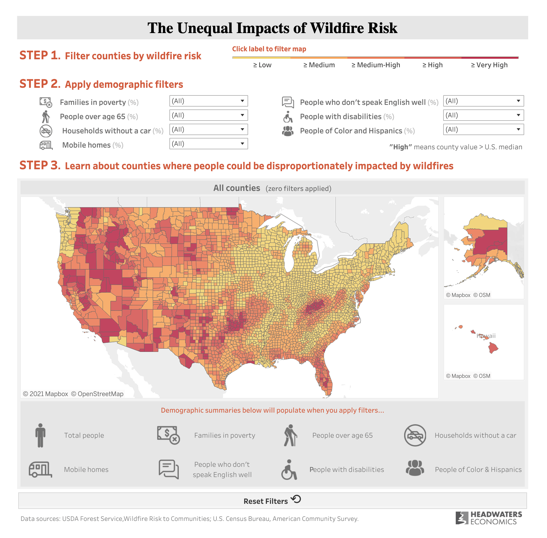
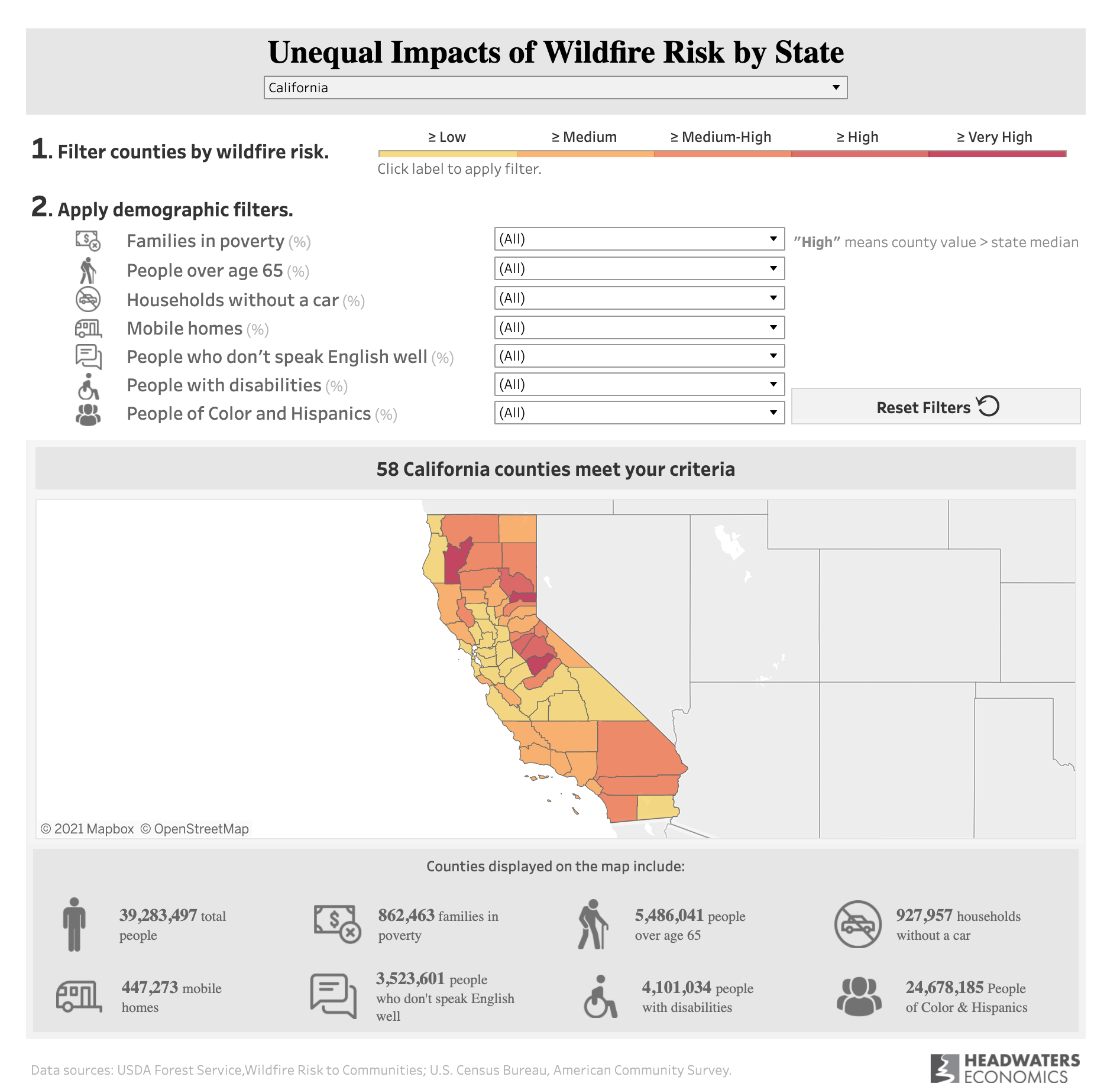
Kelly and her team at Headwaters Economics used Tableau to create two powerful dashboards to visualize the inequitable realities of wildfire risk and help decision makers find solutions. By analyzing complex wildfire datasets from the U.S. Forest Service, the team has been able to determine who is most vulnerable to wildfire, and why. With the dashboards, it’s possible for policymakers, community leaders, and risk managers to understand who is at risk, and create the appropriate policy responses needed to protect communities.
“A lot of leaders don't actually have a good sense of where exposure to wildfire intersects social and economic vulnerability,” Kelly explains. “And so our goal was to provide access to that information so that policymakers, especially at the national and state levels, could understand not only where wildfire risk is high, but where people may need extra support in preparing for and recovering from wildfire.” Kelly continues, “And frankly, we also wanted to draw attention to the scale of this challenge. So we included some high-level statistics. There's some big numbers in there that we hope will be, in some ways, eye-opening and help people really understand the scale of this challenge.”
How to use the dashboards
There are two dashboards: national, and state-level. Kelly recommends beginning with the national dashboard. “First, filter by wildfire risk. The default is to see all levels of risk. To discover the areas with the higher levels of risk, click on the color gradation bar to filter the map to only show places with medium or more than medium-high wildfire risk. At the top of the map, you’ll see that counties are filtered to reveal that level of risk. There’s also a count of the counties, so you can see right away how many places meet that criteria. At the bottom of the map, there’s a tally of the different social and economic variables. You can also apply additional demographic filters.”
The dashboard also includes a link to a PDF report. If you click on a county, a hyperlink is generated that allows you to download a report specific to that county. “What's nice about that report,” Kelly remarks, “is it gives you both the absolute numbers and the percentages, but it also provides some context about why these variables are included, what they're measuring, and further reading if you wanted to really go deep on any of these topics.”
The state-level map is laid out in much the same way, but what is shown is the wildfire risk relative to all the counties in one state. On the national map, the ranking of risk is compared across the whole country. In the state-level map, you're only comparing counties within a single state.
In both of these visualizations, it’s important to recognize overlapping vulnerabilities. According to Kelly, “If, for example, you look at variables together, such as people of color and Hispanics, and people who don't speak English well, the counties that show up are going to be narrowed, but it also gives managers and policymakers important information about people that may face cultural and institutional barriers to accessing information and to accessing resources. And so, these may be places where we need to pay close attention to the ways that we talk about and provide resources before, during, and after wildfire events.”
Prototypes to final product
The final dashboards represent the result of years of workshopping and prototyping. Initial prototypes in 2017 and 2018 focused on Santa Fe, New Mexico, and Austin, Texas, respectively. “We worked really closely with leaders on the ground in both of those places,” according to Kelly, “and we used local data and information to inform those visualizations. Both communities used those data vizzes to help them think about where to prioritize resources and how to plan for wildfire mitigation activities and reduce risk to more people and neighborhoods in their communities.”
Based on the successful prototypes, Kelly and the team saw the opportunity to develop a national version, and decided to move forward. “We were really lucky to have the support from Tableau Foundation and from a Zen Master, Thierry D’Hers. He was fabulous because there are some pretty complicated calculations behind the scenes in this viz, and we got stuck in a couple of places. We were really lucky to have that support helping us unpack some of the technical components.”
From start to finish, the two dashboards took about six months to complete. Headwaters Economics used data from the U.S. Forest Service project called Wildfire Risk to Communities, a project they are a partner in. The team spent a lot of time thinking about the hierarchy of information they wanted to share, the audience they were trying to reach, and the different ways the audience might interact with the dashboards. From there, they iterated and made improvements, and the team also shared the dashboards with their partners at the U.S. Forest Service to get their feedback. To date, the dashboards have been getting a lot of traffic on Headwaters’ website, and they’re also being used by their partners in the U.S. Forest Service.
“I think one thing that's important about this project is that it's all at the county level,” Kelly points out. “We're summarizing the data at the county level for both wildfire and socioeconomic measures. When you're generalizing at that level, it may be accurate when looking at the whole country or across a state. But you lose a lot of granularity, so something that we're hoping to do next is to take this to a finer scale so that you could look within the county at the census tract level or at the town level and see where the risk is distributed.”
Long term solutions to create fire-adapted communities
Addressing a problem of this scale will require coordinated effort across the federal, state, and local levels. Kelly notes that at the local level, her organization is seeing communities working very hard to engage on the ground with existing cultural institutions to think about ways to better address the needs of diverse people, such as using Indigenous knowledge to understand the nuances of how wildfire works in a community, or using the Hispanic cultural centers to talk with people about what they need to make their homes more wildfire-ready, and working through community health programs to access people who have asthma and need air filtration or support when wildfire smoke is in the air.
“These are all strategies that communities are deploying across the country on the ground at small scales,” Kelly observes, “and more resources are needed to do that in a more impactful way.”
Community-level ground truthing
Although Headwaters Economics is a research organization, they have “one foot on the ground.” They activated a community assistance program called Community Planning Assistance for Wildfire, and worked with over 80 communities in the country on wildfire issues related to the built environment. The perspective gained from being embedded in the communities they are researching helps them gain a deeper understanding of the challenges that communities face, and the kinds of help people need to overcome these challenges.
What Kelly refers to as “community-level ground truthing” helps Headwaters when they talk to policymakers. They try to directly reach policymakers at the state and national levels, and with their technical assistance program (funded in part by the U.S. Forest Service) they’re able to work across scales and help local communities implement solutions.
Expanding on lessons learned
Headwaters Economics is discussing how to expand on what they’ve learned from this project. “We're definitely having a lot of conversations about how to take this deeper,” says Kelly. “We're interested in replicating something like this for other natural hazards like flooding. But we're also really interested in scaling this project down so that it could be more useful at a local decision-making level.”
Making a difference with data
Democratizing data and using the insights to help decision makers identify and understand their most vulnerable communities is at the heart of this project. It’s a powerful example of how data can be used to surface inequities and be a catalyst for change. In the case of wildfire, lives hang in the balance.
Learn more about Headwaters Economics and how they are using data visualizations to inform community decision-making and identify solutions for complex land management and development challenges.
