Explore the viz that reigned supreme at Iron Viz 2016


Iron Viz contestants Russell Spangler, Curtis Harris, and Robert Rouse.
Twenty minutes to the start of the Iron Viz competition, the energy in Viz Stadium was palpable. As the music blared and lights flashed, the same question was on every person’s mind: Who will be crowned the next Iron Viz champion?
The contestants, Russell Spangler, Robert Rouse, and Curtis Harris, had each worked hard for a chance to compete in Viz Stadium. Each won a feeder contest with a stunning viz: Russell for Tableau Sushi, Robert with US vs Them, and Curtis with a mobile-friendly viz on home runs.

This year’s MCs, Ross Perez and Kathleen Goepferd, kicked off the competition to deafening applause. They welcomed attendees, set a high bar (chart) for puns, then got down to business.
The challenge? Tell a story using taxi-business data worth 15 gigabytes—150 million rows (“from morning commute to late-night puke”). As Kathleen put it, “This year’s data set is rather large.” No kidding.
So it was especially important to optimize vizzes for performance, as observed by judge and former Iron Viz champ Shine Pulikathara: “Every click and every drag matters.” Ah, the wisdom of those who’ve vizzed before us.
Joining Shine on the judges’ bench was Tableau co-founder Chris Stolte, CFO Tom Walker, and VP of Research and Design Dr. Jock Mackinlay. They’d be evaluating vizzes on three criteria: visual design, storytelling, data viz best practices. Twitter votes would also earn contestants up to 10 extra points.
With 20 minutes on the timer, Ross declared, “Only one viz can reign supreme! This is the human drama of analytic competition.”
He was right. The contestants began their investigations of the data and the stories hiding within. Their respective “sous-vizzers,” Tableau employees who provided audience insights throughout the competition, encouraged their master counterparts toward great viz design and analytical prowess.

Russell Spangler: The Daily Taxi Data Analyzer 2000
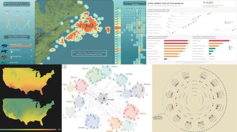
Russell’s viz, The Daily Taxi Data Analyzer 2000, was quickly organized on a dashboard with bar charts, KPI-style callouts, and a map for additional context. His highlighted an impressive depth of information, and used parameters to great effect. For example, he made it easy to discover that it would take about 800,000 minutes and one million dollars for one day’s worth of cab rides in NYC.

Judges Tom and Chris were impressed with the dashboard’s standalone application-like level of detail. And while Shine praised the interplay of visualizations, Jock wanted to find Russell’s remarkable parameters more easily. To that, Russell, who’s also the co-founder of Cincinnati’s User Group, reminded him, “20 minutes, 20 minutes,” prompting the audience to burst into laughter.
Robert Rouse: NYC Taxi Snow Days
Robert took a different approach in his viz, NYC Taxi Snow Days. Between map views, trend analyses, and jump lines, he focused explicitly on how winter weather affects the taxi business.
His sous-vizzer Clara Siegel noted the impeccable use of Tableau’s ad-hoc analytics: “He created the first view, saw those [cab fare] dips, had a second question, and went ahead to answer it. Using drop lines and maps, he effectively showed his ‘wow’ insights.”

Jock applauded Robert's use of the story format to index different viz types. Robert's yellow-checkered, taxi cab-themed formatting also proved to be a big hit with the judges. Chris noted Robert’s use of drop lines effectively highlighted key information. Shine was impressed with the use of blending to bring in outside weather data, taking the viz to the next level.
Curtis Harris: The effect of Uber, Lyft on taxi ridership
Curtis created a comic strip-style dashboard that focused uniquely on the taxi driver’s personal story. His viz announced, “New York City residents and tourists rely on yellow taxis around the clock, but many are moving on,” setting the stage for a message woven throughout the panels in his viz.
Curtis showed how daily traffic and the economic competition of services like Uber and Lyft influence the drivers’ families and livelihoods. “The insights are a reminder of how hard cab drivers work for us,” Curtis noted. To prove it, he created a histogram juxtaposed with overlayed, dynamic area charts. Both the judges and the crowd praised Curtis for using Device Designer to make his viz mobile-friendly as well.

And the winner is...
The judges’ scores and Twitter votes were tallied, and there was a new Iron Viz champion! Curtis Harris had defeated two worthy viz-whiz opponents to win the most coveted prize in all of the data viz land.
With 13,000 eyes fixed on the gleaming winner, and $2,000 of winnings in his pocket, Curtis laughed and said, “This is great! You guys are all my friends, and I want to get to know you all tonight’s party. Let’s go get a drink.”
For your chance at Iron Viz glory, make sure to follow Tableau Public’s Twitter and blog. Competitions run throughout the year to source the best and brightest for such eternal vizzing glory.
Historias relacionadas
DataFam Roundup June 2026
DataFam Roundup May 2026

Iron Viz 2026: Read Between the Data
 28 Mayo, 2026