Ten most-favorited vizzes to celebrate ten viz-tastic years of Tableau Public


For ten years, nearly 1.5 million data rockstars worldwide have explored, created, and shared over three million incredible interactive vizzes on Tableau Public. From music to sports and politics, there's a viz to explore on almost any topic. In celebration of this milestone anniversary, we're taking a look back at the top 10 most-favorited vizzes of all time.
Tableau Public launched in 2010 intending to make data social and ignite a new movement on the web. At the time, the internet wasn't truly data-friendly. For years Tableau had been bringing data visualization and exploration to the world's leading companies but wanted to make it easily accessible for everyone. Tableau Public was a bold new effort to offer a free online product that anyone could use to drive compelling conversations around data—making data online fun, useful, and beautiful.
Time sure flies when you’re having fun with data. With over 3 million vizzes published, Tableau Public features the most extensive gallery of data visualizations on the web. To all of the passionate data enthusiasts using our platform—we couldn't have done it without you. Thank you for sharing a decade of vizzes with us. Here is a look back at the top 10 most-favorited vizzes of all time. Don't forget to "favorite" these vizzes to come back to later.
-
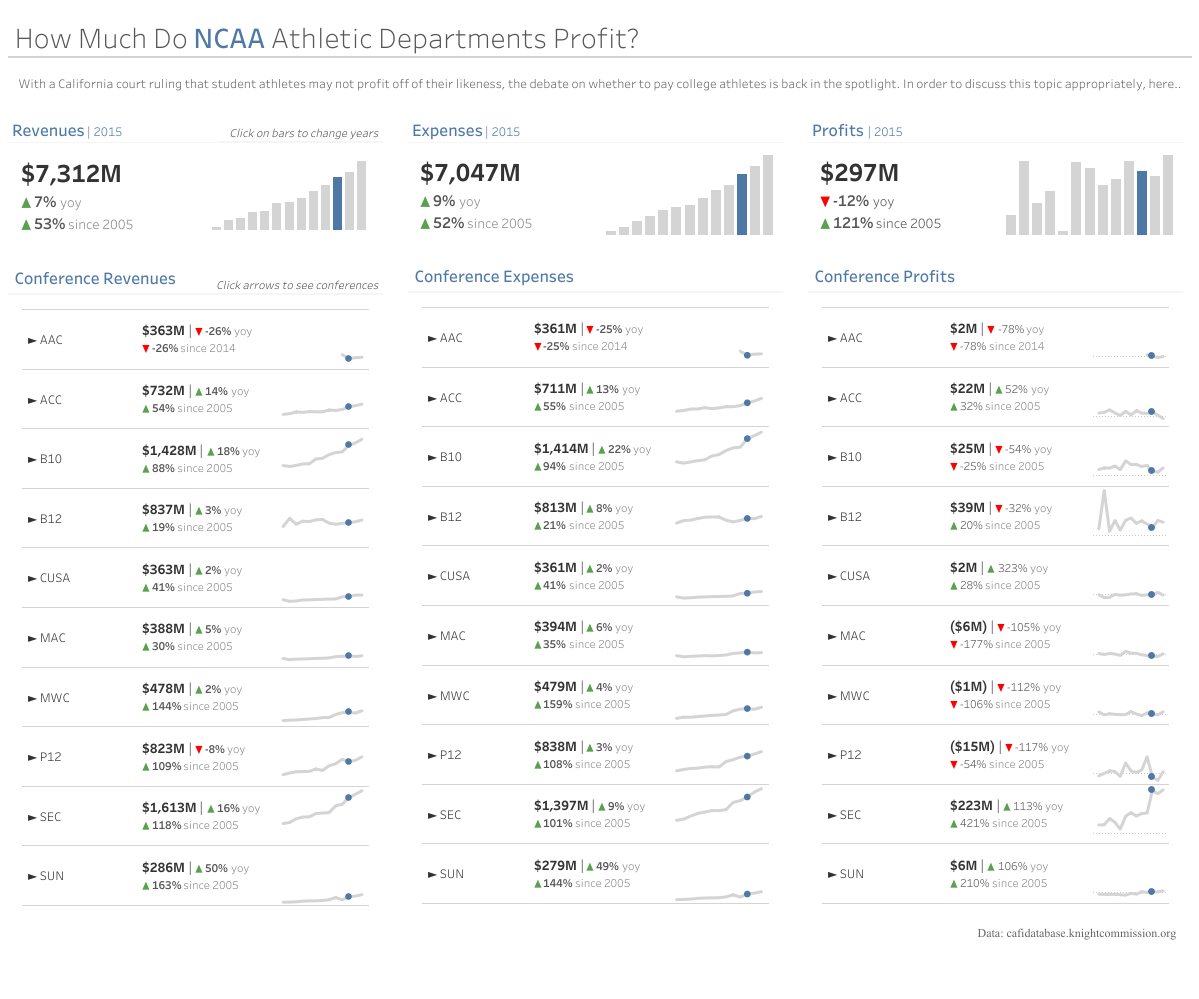
NCAA Profits KPI Dashboard by Spencer Baucke
With a California court ruling that student-athletes may not profit off their likeness, the debate continues to pay or not to pay college athletes. Here Spencer Baucke breaks down athletic department profits and losses from 2005-2017 in a KPI-style dashboard that allows the viewer to quickly come to insights.
-
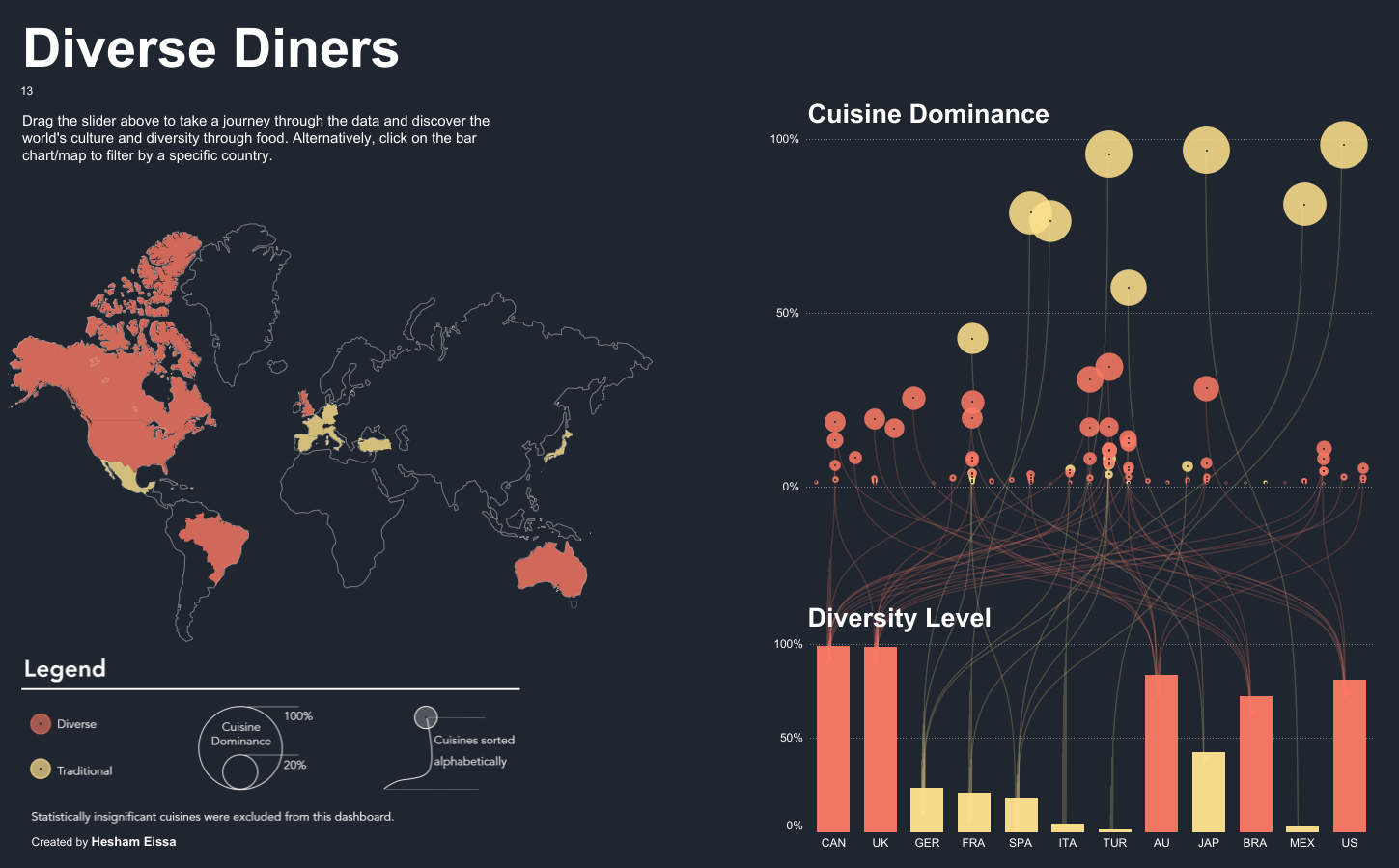
Diverse Diners by Hesham Eissa
Hesham Eissa, 2019 Iron Viz co-champion, uses data from Pitney Bowes to explore cultural identities through cuisine. Hesham’s viz displays which cuisines are more dominant by country and groups color to emphasize how diverse or traditional the dominant cuisine is in each nation.
-
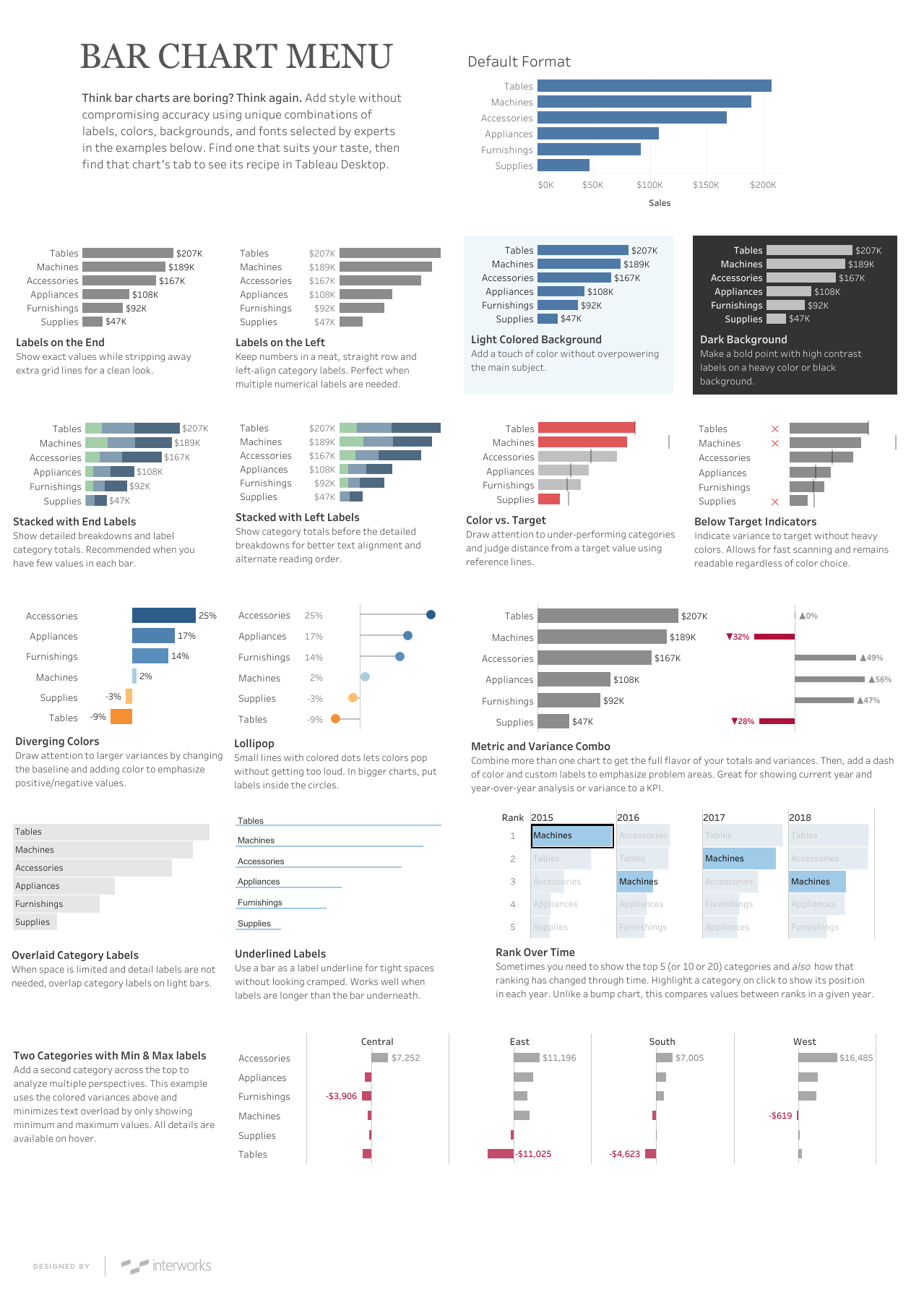
Bar Chart Menu by Robert Rouse
In the words of Tableau Public author Robert Rouse, “choosing the right fonts, colors, labels, references, size, and other nuances can be daunting.” This bar chart menu helps data analysts select the appropriate chart to visualize their data.
-
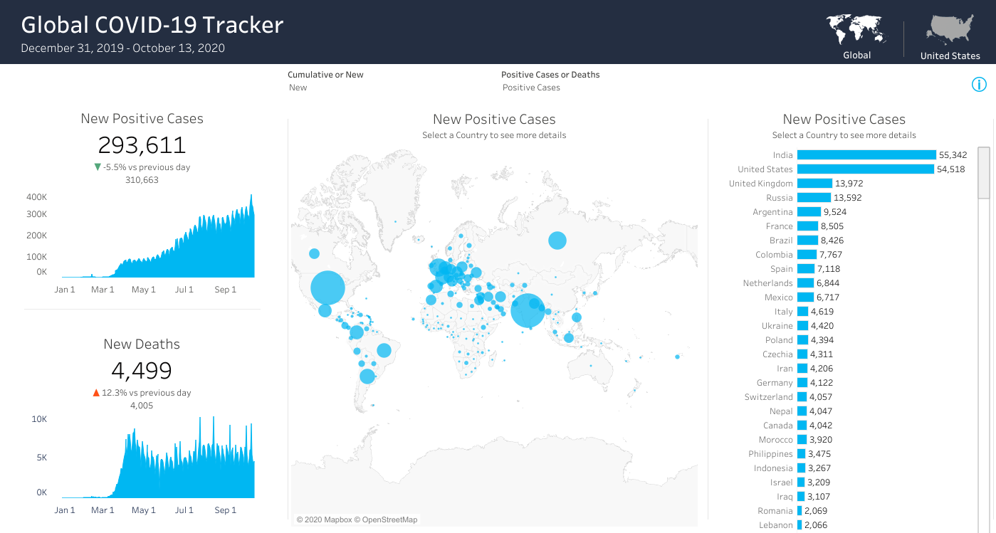
Coronavirus (COVID-19) Cases by Coronavirus (COVID-19) Data Hub
The Global COVID-19 Tracker was created to ensure that everyone has access to the most up-to-date COVID data. This downloadable workbook includes a starter dashboard and an embedded connection to trusted COVID-19 activity data from the European Centre for Disease Prevention and Control and The New York Times.
-
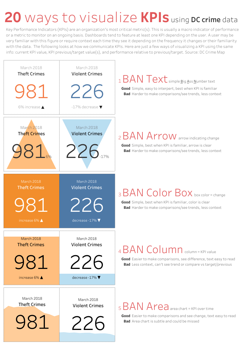
KPI Options by Adam E McCann
Key Performance Indicators (KPIs) are an organization’s most critical metrics. KPIs are used by analysts of all levels to identify problems and make informed decisions. In this visualization, Adam McCann looks at twenty different ways to communicate KPIs using DC Crime Data.
-
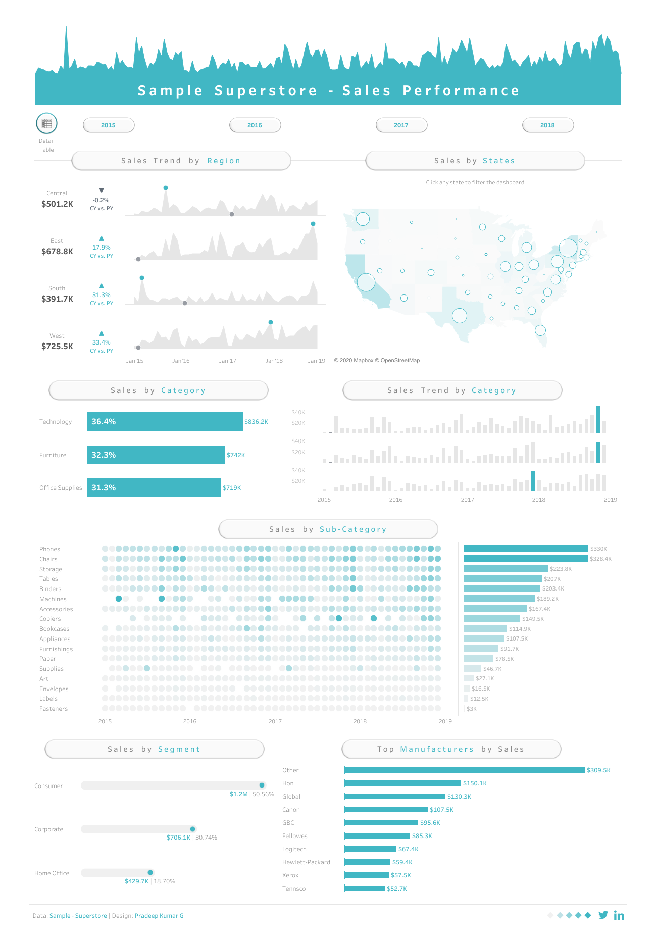
Sample Superstore - Sales Performance by Pradeep Kumar G
If you’ve used Tableau before, you’re probably familiar with the Sample Superstore data set. In this dashboard, Pradeep Kumar G gets creative with the sample data, using collapsible containers to visualize sales performance.
-
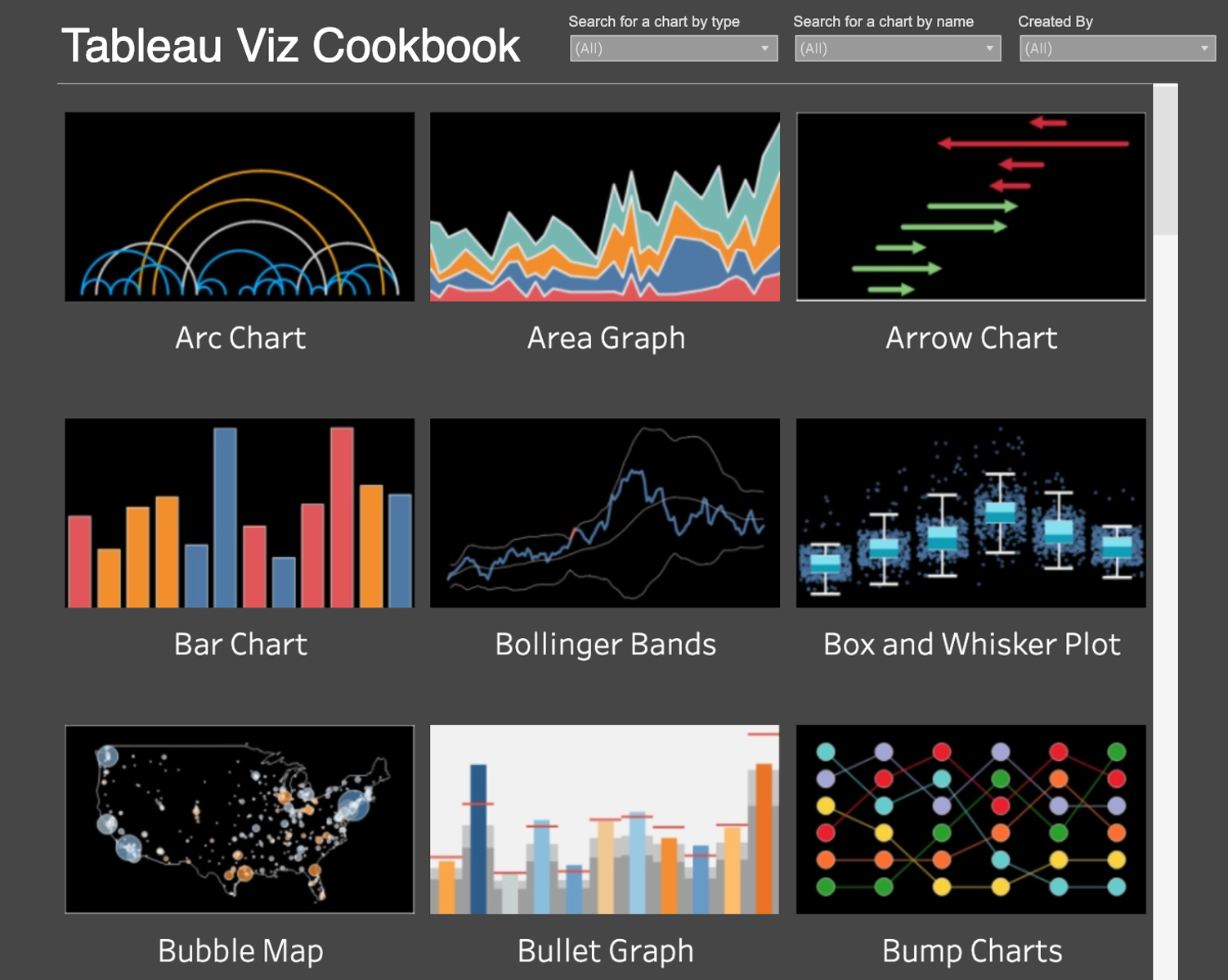
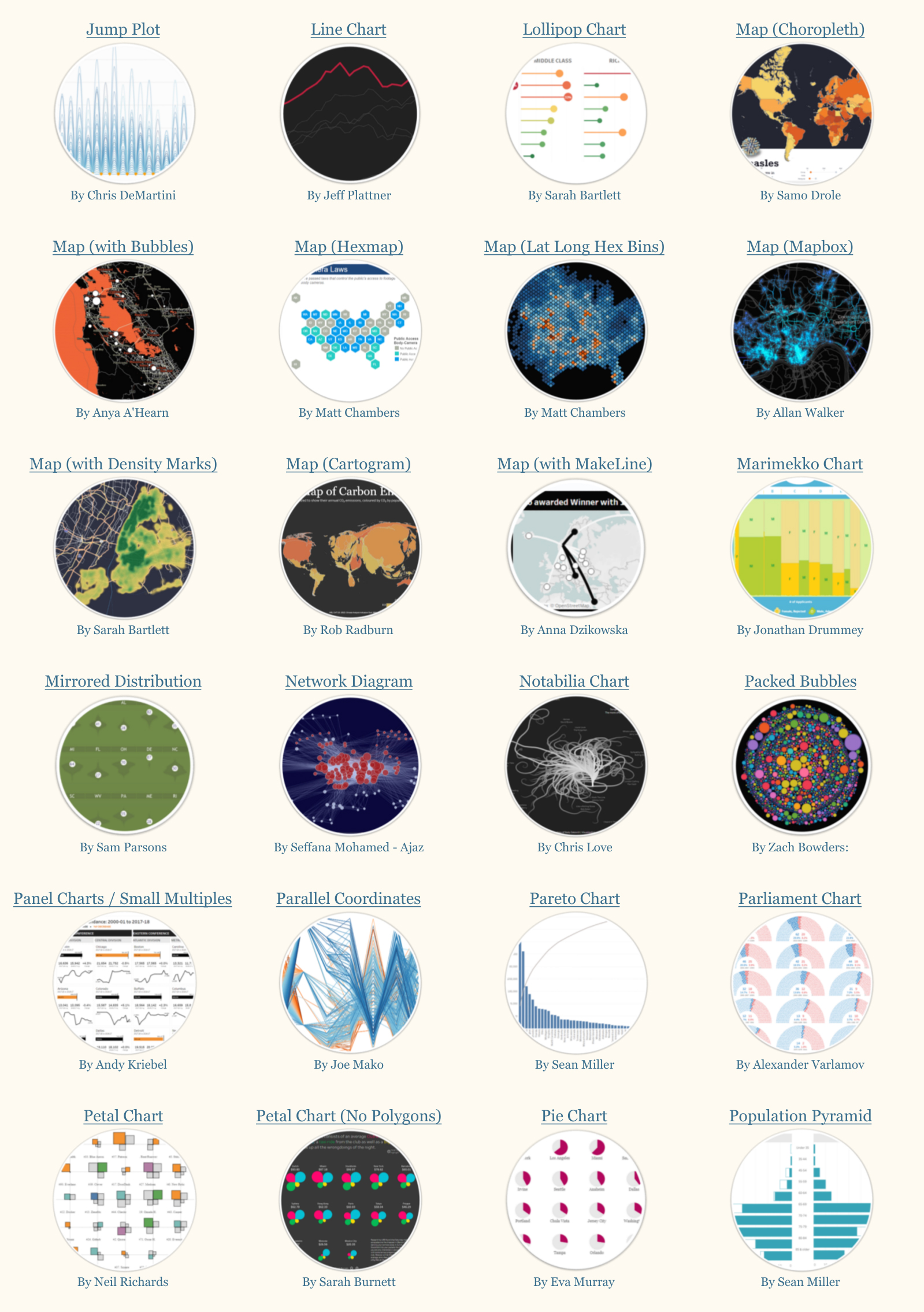
Tableau Cook Book by Josh Weyburne
The Tableau Cook Book is a valuable resource for anyone looking to build a specific chart type in Tableau. This curated collection of “recipes” includes instructions for creating over 50 charts, including heatmaps, lollipop charts, Sankey diagrams, and more.
-
The Tableau Book of Calcs by Sara Hamdoun and Fuad Ahmed
Calculated fields can be used to segment data, find ratios, filter results, and more. The Tableau Book of Calcs shows how to create and use calculated fields in Tableau using various examples.
-
The Tableau Chart Catalog by Kevin Flerlage
Kevin Flerlage created this resource to help others within the community to learn and be inspired. The Tableau Chart Catalog provides a list of 100 chart types with links to actual visualizations created by 74 unique authors on Tableau Public.
-
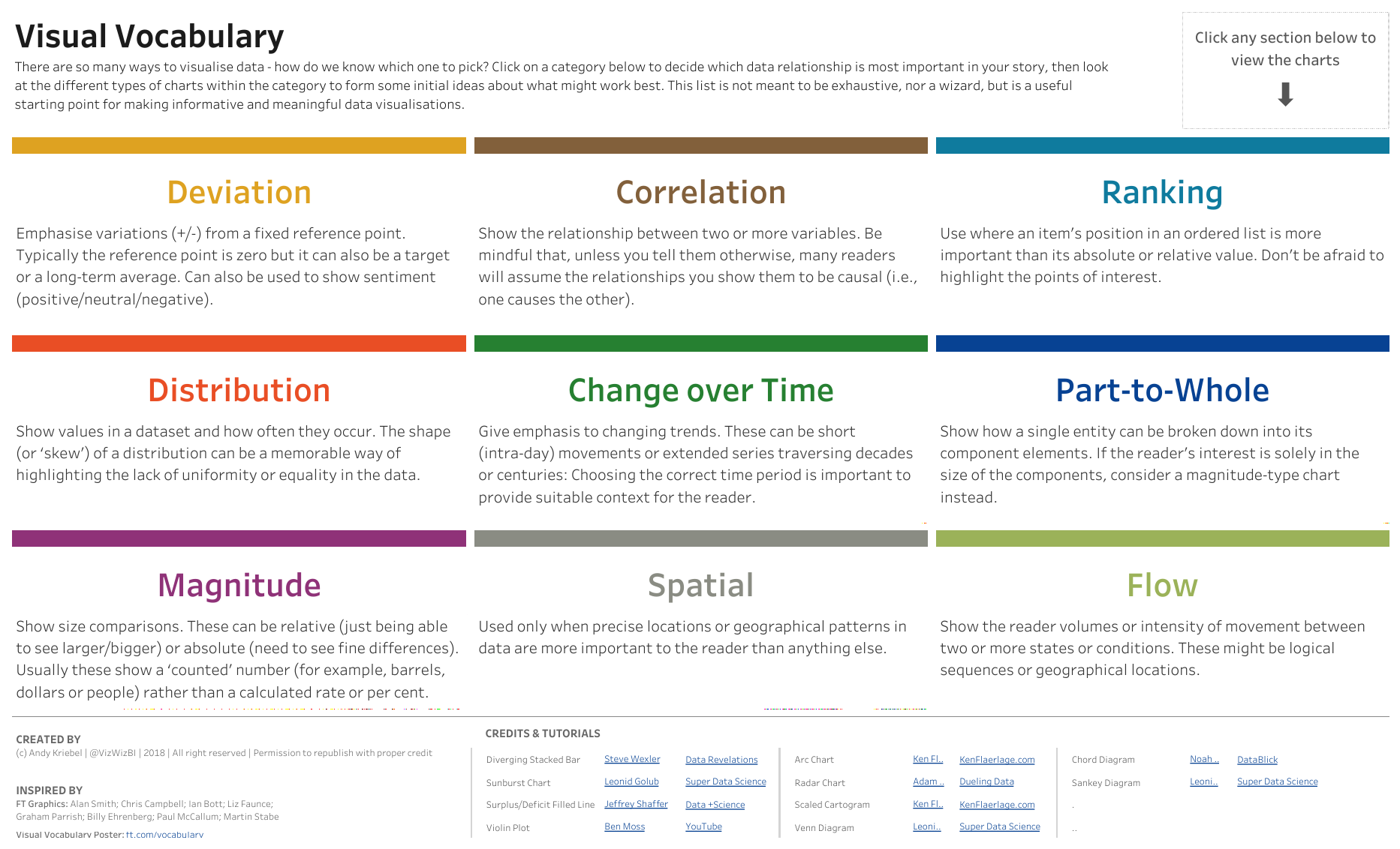
Visual Vocabulary by Andy Kriebel
Inspired by the Financial Time’s Visual Vocabulary, Andy Kriebel created this workbook to help others choose an appropriate chart based on the data relationship they’re trying to show. Interested in learning more about this viral viz? Check out this on-demand video from Tableau Conference-ish (#data20) in which Zen Masters Andy Kriebel and Lorna Brown discuss the most-favorited viz on Tableau Public.
Cheers to these ten amazing Tableau Public authors and for a decade of data storytelling masterpieces. We can’t wait to see what our #DataFam comes up with next.
Historias relacionadas

Iron Viz 2026: Read Between the Data
 28 Mayo, 2026

Tableau's Iron Viz Winners

Explore the 2026 Iron Viz Entries
 15 Diciembre, 2025