Behind the Viz: Samo Drole on choosing the right design for your data visualization


Get to know your fellow Tableau Public authors with Behind the Viz, a blog series where we explore the people and processes behind our featured vizzes.
Meet Samo Drole! Samo is a Product Designer at Uber where he is working on financial- and risk-oriented internal tools for the popular ridesharing innovator. Previously he designed the Bitcoin exchange at cryptocurrency platform Coinbase and co-ran his own blockchain explorer at blocr.io. Amazed by the power of data visualization, he’s always been eager to try products that can help him explore and visualize his ideas, but he found that most of the solutions he encountered either were not flexible enough for his purposes or had a steep learning curve. Then, he discovered Tableau.
According to Samo, engaging and connecting with other Tableau users around the world via virtual community-led initiatives has accelerated his learning. He’s been tackling weekly #MakeoverMonday projects as well as monthly dispatches from #ProjectHealthViz. Along the way, Samo has built an impressive Tableau Public profile. Recently, his submission for #MakeoverMonday’s Week 17 project was selected for Tableau Public’s Viz of the Day!
Samo’s visualizations have certainly caught the #datafam’s attention. Many have complimented Samo’s clear storytelling and exacting design details. We asked Samo to share the secret behind his design skills. Read on to learn more about his process for creating beautiful data visualizations.
Let's take a look behind the viz!
How long have you been using Tableau Public?
I first used Tableau Public in 2017 when I was working on an internal tool at Uber. I wanted to understand the data that was going to be displayed in this tool, and Tableau Public really helped me with the design direction. Soon after that, I discovered #MakoverMonday where I excitedly produced my first bubble chart viz. Fast forward to the end of 2018 where I started investing more of my time into learning the tool and how it can help me to discover new stories with data and test random ideas for job-related projects.
Why did you choose this topic?
This topic was part of a weekly dataset that was provided by #MakoverMonday. Everyone creates a viz based on the same dataset. Since I’m still learning, I try to stay open-minded and embrace any topic as a great challenge to tell the best story I can find. In the future when I start picking my own preferred topics, I see myself working more on finance-related data.
What was the hardest decision you made when creating this viz?
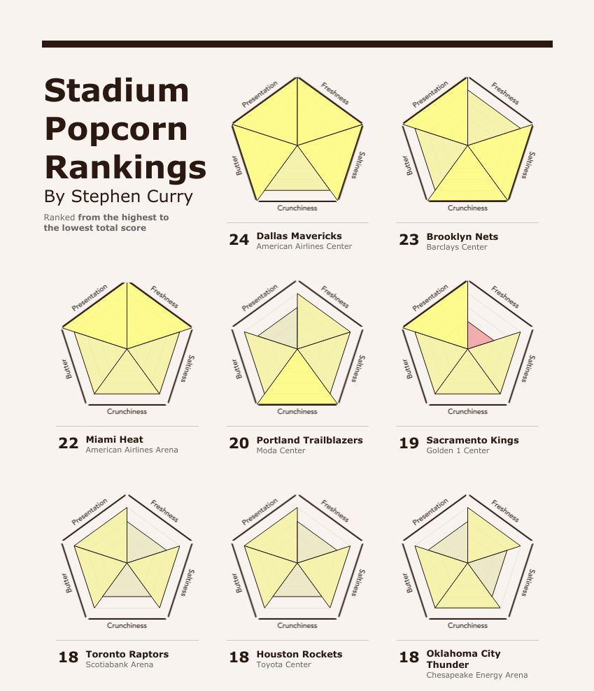
The biggest challenge was choosing which story to tell. After all, every data story can be told in multiple ways. At first, I was imagining a simple exploration approach where the viewer could select a specific basketball team and see what rating NBA player Stephen Curry gave to the stadium’s popcorn. That evolved into an idea where I would let the viewer compare two stadium popcorn scores instead.
Both of those were great stories, but I thought they missed the bigger picture. I decided to visualize multiple scores across multiple dimensions and sought inspiration from datavizproject’s charts library for a solution. I was initially drawn to a radar diagram but wanted each dimension to have its own area so I could highlight and color code each individually. I found the polar area chart in the library, and with a few modifications, I created a version that was perfect for my story.
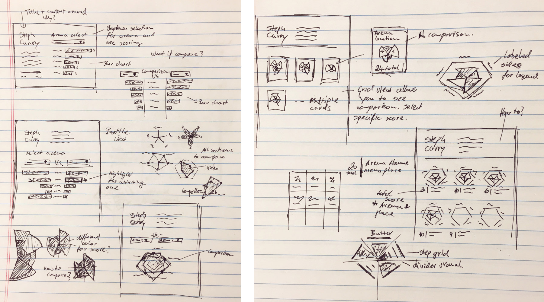
In all my projects, I sketch possible storytelling and visual executions. You can see the evolution of this viz in the sketch below.
What is your favorite new Tableau trick? How can others use it?
Too often we see data visualizations where the data takes a backseat to the viz itself. Don't do that! The best approach is to start very clean and minimalistic. Once you're happy with this minimalist approach, you can start adding— but you should always ask whether your additions will improve readability. If it’s going to add noise, leave it out.
Lastly, I spend time fine-tuning the details: layout, fonts, spacing, colors, and overall presentation. If you can spend time preparing and cleaning data for your visualization, you can also spend time on the design! After all, everyone will judge your visualization by their first impression, and that impression is mostly of design.
When I’m finished, I make sure to give kudos to the supportive and empowering Tableau community. I want to call out a couple of people who’ve helped me improve: thanks to Sarah Bartlett, Mike Cisneros, Lindsay Betzendahl, Kevin Flerlage, Rodrigo Calloni, Ludovic Tavernier, Eva Murray, Jeffrey Shaffer and many many more who aren’t listed here.
What is the best music to listen to while vizzing?
In most cases, good old house music gives me the drive and focus I need while working on my viz. You can check this playlist, it has some good classics.
Be sure to follow Samo Drole on Tableau Public! His profile is full of stunning visualizations and you definitely won’t want to miss his next viz.
Historias relacionadas

Iron Viz 2026: Read Between the Data
 28 Mayo, 2026

Tableau's Iron Viz Winners

Explore the 2026 Iron Viz Entries
 15 Diciembre, 2025