Generate predictions in Tableau with predictive modeling functions
Learn more about the predictive modeling functions coming with Tableau 2020.3 that allow you to generate predictions and surface relationships in your data.


We've spoken with many customers over the last several months about the need for greater flexibility and power in Tableau's predictive functionality. People are eager to make predictions that don't rely on a time axis, to populate sparse data and identify outliers, and to use their predictions in additional calculations and export them to data files. We're excited to announce that Tableau 2020.3 will offer our customers a flexible new way to build predictions within Tableau, using the familiar table calculation infrastructure.
In this post, we’ll introduce the new predictive modeling functions by exploring the relationship between health spending per capita and female life expectancy in the World Indicators data set.
Edit: Upgrade to 2020.3 and follow these examples with this sample workbook.
What are predictive modeling functions?
Predictive modeling functions put powerful statistical modeling tools in the hands of your analysts, enabling them to quickly build and update predictive models. You can use these functions to understand relationships within your data, estimate missing data, and project data into the future—without ever leaving Tableau.
Predictive modeling functions give you full flexibility to select your own predictors, use the model results within other table calculations, and export your predictions. Predictions are re-evaluated based on the data that's being visualized, letting you filter out unnecessary marks and build models from the selected data. Models and predictions are re-evaluated as you change the level of detail, add and remove marks, and subdivide by additional attributes. You don't need to access analytics extensions or write code in R or Python. Since predictive modeling functions are table calculations, you have access to all existing table calculation functionality, including sharing visualizations and exporting data.
These two new table calculations, MODEL_PERCENTILE and MODEL_QUANTILE, use Tableau's unique statistical engine to generate predictions and surface relationships within your data. Let’s dive into our examples of how to use them with the familiar World Indicators data set, included in your sample workbooks in Tableau, and go into further detail on how to construct and work with these calculations.
How to use predictive modeling functions
Start with a visualization that compares each country's health spending against female life expectancy, filtered to the year 2012. Since this is a very skewed data set, we're going to use a logarithmic transform on the health spending axis, as well as using a logarithmic transform for health expenditures as a predictor.
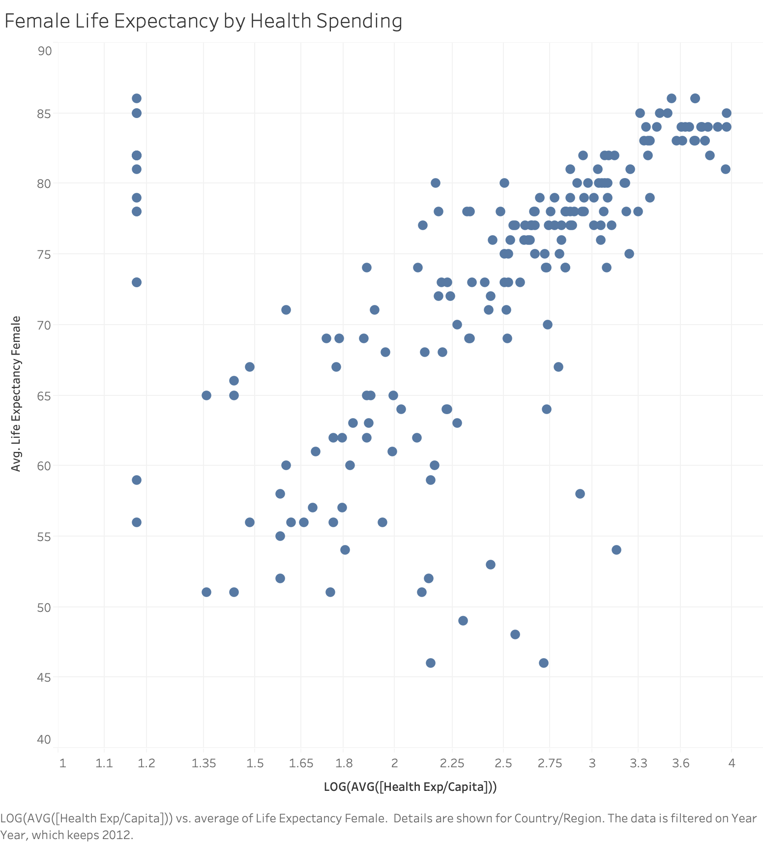
Modeling health expenditure and female life expectancy with MODEL_PERCENTILE
First, let's create our MODEL_PERCENTILE table calculation, using median health expenditures as a predictor for female life expectancy:
Percentile_LifeExpFemale_HealthExpend
MODEL_PERCENTILE(AVG([Life Expectancy Female]),

LOG(MEDIAN([Health Exp/Capita])))
What is MODEL_PERCENTILE?
MODEL_PERCENTILE returns the probability of an unobserved value being less than or equal to the observed mark, defined by the target_expression and based on other predictors that the user can select. This is the Posterior Predictive Distribution Function, also known as the Cumulative Density Function (CDF). This calculation will return a value between 0 and 1.
You might be familiar with percentiles from childhood growth charts, where a five-year-old girl who is 46 inches tall is at the 95th percentile for height: 95% of girls at the same age are shorter than she is.
Syntax
MODEL_PERCENTILE(

target_expression,

predictor_expression(s)

)
target_expression: The target_expression is the measure being evaluated by the model. For MODEL_PERCENTILE, the model will evaluate the mark defined by the target expression.
predictor_expression(s): The second and additional arguments are predictors used to define the model. Customers can use dimensions, measures, or both as predictors.
You can use MODEL_PERCENTILE to surface correlations and relationships within your database, as well as to identify marks that are unlikely given multivariate inputs. The closer the value returned by MODEL_PERCENTILE is to 0.5, the closer it is to the median of the range of modeled values, given the other predictors you've selected. If MODEL_PERCENTILE returns a value close to 0 or to 1, the observed mark is near the lower or upper range of what the model expects, given the other predictors that you've selected.
Using MODEL_PERCENTILE
Dragging Percentile_LifeExpFemale_HealthExpend onto color and setting Compute Using: Country/Region evaluates the life expectancy and health expenditures for all visible marks, allowing Tableau to build a model from those marks and return the percentile for each within that model. We can see the distribution of countries where health expectancy is higher and lower than expected for the level of funding provided. The dark red marks indicate that life expectancy is high relative to healthcare spending; dark blue means that life expectancy is low relative to healthcare spending; and grey means that life expectancy is near the median of the modeled range of values, based on the level of healthcare spending.

To further simplify the visual analysis, we can use Percentile_LifeExpFemale_HealthExpend in a new calculation to group the results. We'll build groups, so that the marks above the 90th percentile or below the 10th percentile are grouped together; marks between 80th and 90th percentile or marks between the 10th and 20th percentile are grouped together, etc. We're also going to highlight the marks with a null percentile. We'll come back to this later.
Color_Percentile_LifeExpFemale_HealthExpend
IF

ISNULL([Percentile_LifeExpFemale_HealthExpend])

THEN "Null"

ELSEIF [Percentile_LifeExpFemale_HealthExpend] >= 0.9 OR [Percentile_LifeExpFemale_HealthExpend] <= 0.1

THEN "<10th &> 90th percentile"

ELSEIF [Percentile_LifeExpFemale_HealthExpend] >= 0.8 OR [Percentile_LifeExpFemale_HealthExpend] <= 0.2

THEN "<20th & >80th percentile"

ELSEIF [Percentile_LifeExpFemale_HealthExpend] >= 0.7 OR [Percentile_LifeExpFemale_HealthExpend] <= 0.3

THEN "<30th & >70th percentile"

ELSEIF [Percentile_LifeExpFemale_HealthExpend] >= 0.6 OR [Percentile_LifeExpFemale_HealthExpend] <= 0.4

THEN "<40th & >60th percentile"

ELSE "50th percentile +-10"

END
Dragging this onto color, setting Compute Using: Country/Region, and adjusting our color palette helps us see the distribution of countries where female life expectancy is at the upper or lower boundaries based on the country's health expenditures. We can now clearly see the green band where health expenditures are a more accurate predictor of female life expectancy, as well as the red, orange, and yellow marks where that correlation is weaker.
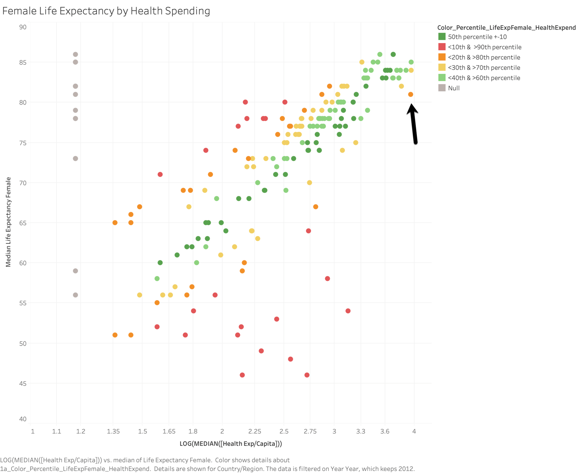
Let's take a look at that orange mark in the top right corner. The United States spends $8895 to get a female life expectancy of 81. Moving horizontally, you can see the spending levels of other countries that also have a female life expectancy of 81: Czech Republic spends $1432, Poland spends $854, and Cuba spends only $558. You can also see how the model evaluates the strength of the relationship at each point, where the US is in the upper range of the model's expected values and Cuba is in the lower range of the model's expected values.
Now, let's see what happens when we add this model to a viz comparing female life expectancy and birth rate. The underlying data tells us that as birth rates go up, there is a correlation with female life expectancy decreasing1; meanwhile, applying Color_Percentile_LifeExpFemale_HealthExpend to color lets us see where the model expects female life expectancy to be higher or lower given health expenditures.
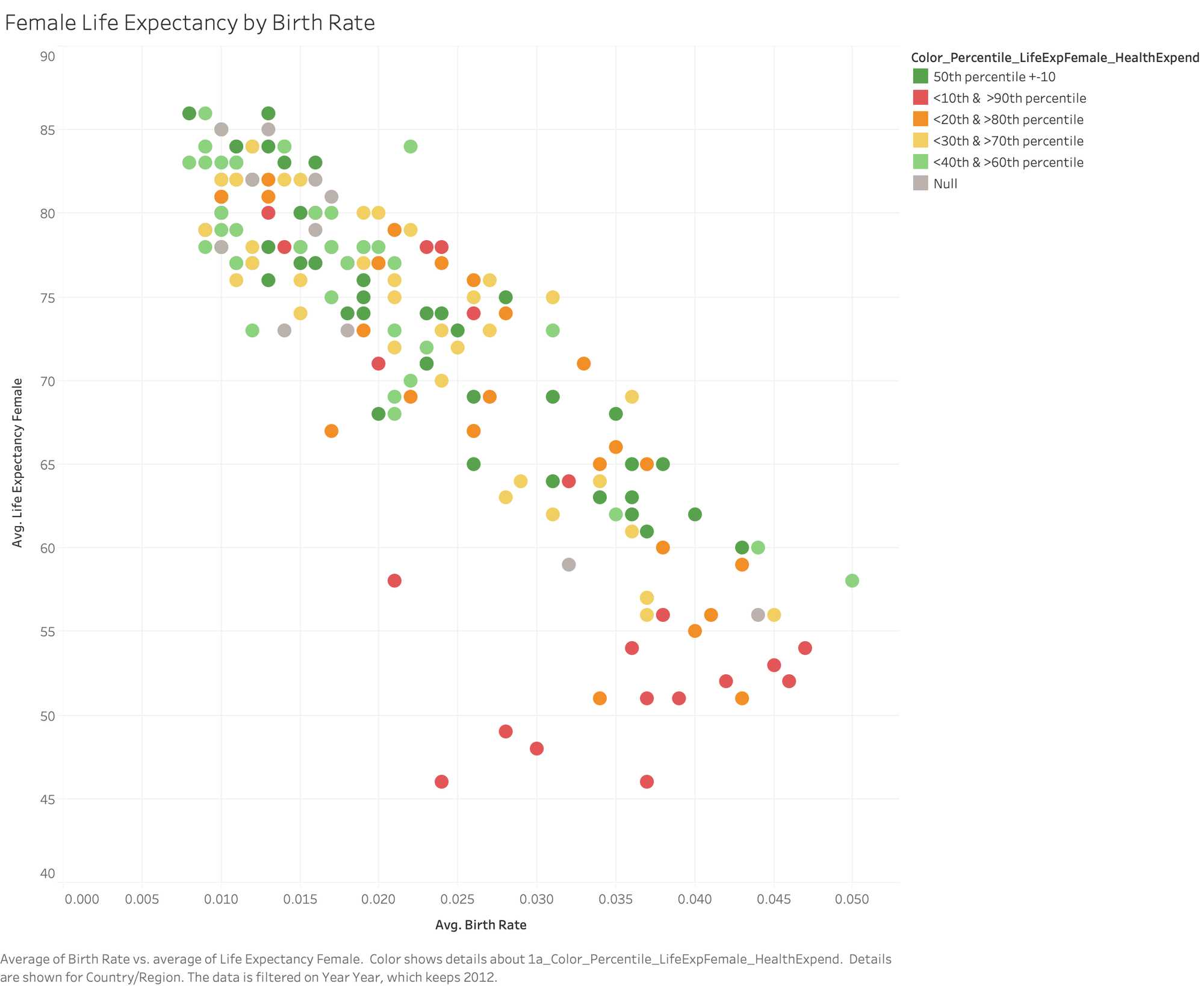
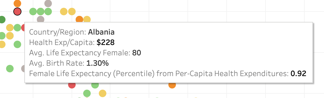
Here, the data are much more distributed. You can certainly see a red region in the lower right corner where life expectancy is lowest, birth rate is highest, and healthcare spend is low relative to life expectancy. But let's look more closely at the two red marks in the top left quadrant.
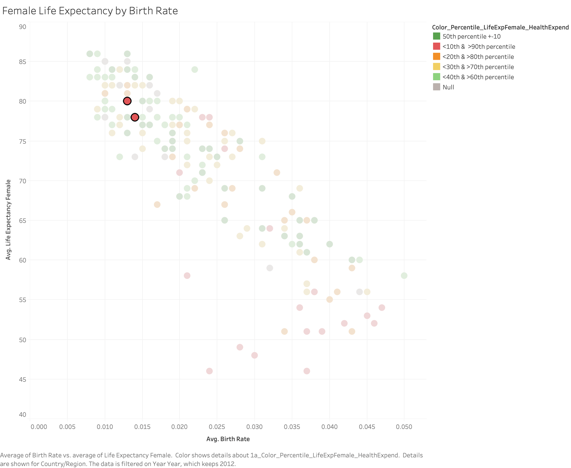
Albania and Armenia both have quite high female life expectancy, relatively low birth rates, and spend very little per capita on healthcare. Albania spends just $228 and Armenia spends only $150. We were able to use MODEL_PERCENTILE to identify that these two countries are outliers in terms of low healthcare expenditures paired with high female life expectancy, and to place that understanding in the context of birth rates.
Predicting missing values With MODEL_QUANTILE
On both of our visualizations, we can see a scattering of countries with "null" results for the MODEL_PERCENTILE function: these countries are missing data for their health expenditures. Here's where we can use MODEL_QUANTILE to estimate those missing values.
What is MODEL QUANTILE?
MODEL_QUANTILE is a table calculation that returns a target value at a specified percentile, based on other predictors that the user can select. This is the Posterior Predictive Quantile. The calculation will return a numeric value within the probable range defined by the target expression and predictors and is the inverse of MODEL_PERCENTILE.
Syntax
MODEL_QUANTILE(

    percentile,

    target_expression,

    predictor_expression(s)

    )
Percentile: The first argument should be a decimal between 0 and 1, specifying what percentile should be predicted; eg, the percentile 0.5 will generate the predicted median. Creating two MODEL_QUANTILE calculations, one of which uses 0.05 as the percentile and the other using 0.95 as the percentile, will return the lower and upper bounds of a 90% confidence interval.
target_expression: The second argument is the measure to predict, or "target."
predictor_expression(s): The third and additional arguments are predictors used to define the model. You can use dimensions, measures, or both as predictors.
You can use MODEL_QUANTILE to generate numeric predictions, given your specified predictors and target percentile. MODEL_QUANTILE can estimate missing values, make projections for future dates, and extrapolate predictions for unseen combinations of dimensions. In addition, you can use it to generate confidence intervals to quantify the level of uncertainty for these predictions.
Using MODEL_QUANTILE
We've been working with Percentile_LifeExpFemale_HealthExpend:
MODEL_PERCENTILE(AVG([Life Expectancy Female]),

LOG(MEDIAN([Health Exp/Capita])))
But now we want to invert this function in order to get a prediction for healthcare expenditure based on female life expectancy. This starts by building a MODEL_QUANTILE function:
MODEL_QUANTILE(0.5,LOG(MEDIAN([Health Exp/Capital)),AVG([Life Expectancy Female]))
In this case, we're going to predict the median (0.5) of the range of potential log-transformed2 values for median Health Expenditures, using life expectancy as a predictor. However, since this function is returning the log transform of expenditures, we still need to convert it back to dollars. So we need to wrap the whole thing in a POWER expression, as shown below:
Quantile_HealthExpend_LifeExpFemale:
POWER(10,MODEL_QUANTILE(0.5,LOG(MEDIAN([Health Exp/Capita])),

AVG([Life Expectancy Female])))
Adding Quantile_HealthExpend_LifeExpFemale to the tooltip and setting Compute Using: Country/Region lets us see what the model estimates the health expenditures should be based on the female life expectancy.
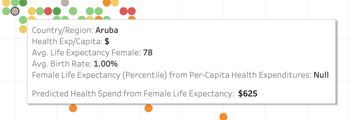
However, let's look a bit more closely at these results. Moving horizontally and examining all data points at a given life expectancy shows us that the model is providing the same estimated expenditure for each mark. Since we're only using one predictor (female life expectancy), the model is returning the same results for all marks where the predictor has the same value. We can add more nuance to the model by including Region as another predictor.
Quantile_HealthExpend_LifeExpFemale,Region:
POWER(10,MODEL_QUANTILE(0.5,LOG(MEDIAN([Health Exp/Capita])),

AVG([Life Expectancy Female])),

ATTR([Region]))
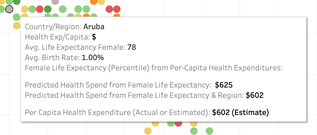
Adding this to the tooltip now shows us that the model is generating different health expenditure predictions for each life expectancy and region. As you're building these calculations, consider the fields that will be a good predictor for your target value and add them to the calculation. You can combine any number of dimensions and measures in your predictors; here, you could also add GDP, population, or other measures and dimensions to improve your predictions.

To further simplify our view, we can even build calculations that combine the actual and predicted values, showing the actual health expenditures where available and the estimated expenditures where not available.
HealthExpend Actual+Predict (value)
ROUND(IFNULL(AVG([Health Exp/Capita]),[Quantile_HE/Cap_LEF,Region]),0)
HealthExpend Actual+Predict (tag)
STR(IF ISNULL(AVG([Health Exp/Capita]))

THEN "(Estimate)"

ELSE "(Actual)"

END

)
Get started with the newest version of Tableau
Predictive modeling functions give you a new lens to see and understand your data. With these new table calculations, you can generate predictions and surface relationships in your data without writing code in R or Python. Edit: It's here! Upgrade to Tableau 2020.3 today or learn more about the other great features we delivered.
We'd like to thank the innumerable customers we spoke with as we built this feature, including those who participated in our beta program. If you’d like to be involved in future betas, sign up today!
1. Note that this is an observed correlation, not an indication that higher birth rates cause a decrease in female life expectancy. There are very likely hidden factors in the data that affect both birth rates and life expectancy for women.
2. Again, since this data set is very skewed, we're going to use a logarithmic transform to normalize it.
1. Note that this is an observed correlation, not an indication that higher birth rates cause a decrease in female life expectancy. There are very likely hidden factors in the data that affect both birth rates and life expectancy for women.
Zugehörige Storys
VizQL Data Service from Tableau: Use Your Data, Your Way
 8 August, 2024

When and How to Use Multi-fact Relationships in Tableau
 1 August, 2024

Top data books of 2021
 12 Dezember, 2021