探索 Tableau 产品组合
从数据开始借助 Tableau 不断前进
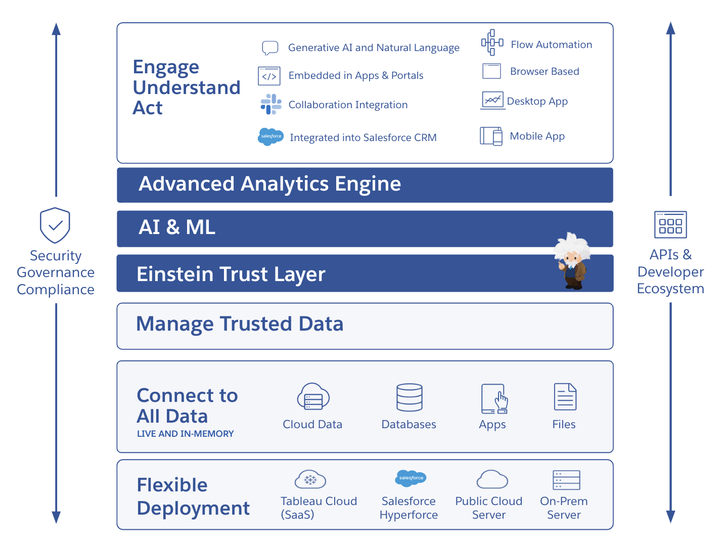
Tableau 提供了一个易于使用的自助式分析云平台,让您无需切换工作界面即可获得见解。Salesforce Einstein 可深入扩展到语义层和工作流中,帮助您在数据和分析用例中快速应用可信的 AI 技术。Tableau 具有内置的数据治理、安全性和合规性功能,可以提供丰富的选择和极高的灵活性,根据您的技术和 AI 策略的发展情况为您提供支持。
Tableau 致力于通过规模宏大的合作伙伴和成功生态系统来满足全球各种组织的需求。充满激情的 Tableau 社区就是这个生态系统中的一环,可以在 AI 之旅的每个阶段为您提供指导和支持,激励您挑战难题,与您一起庆祝成就。
主要特点
适合每个人的直观数据体验
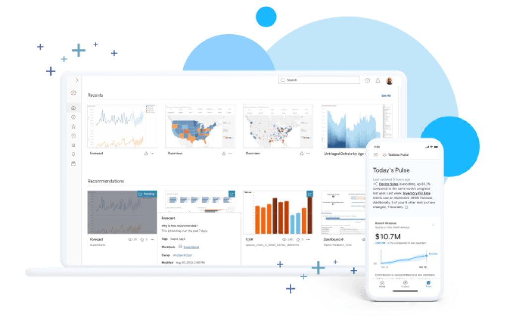
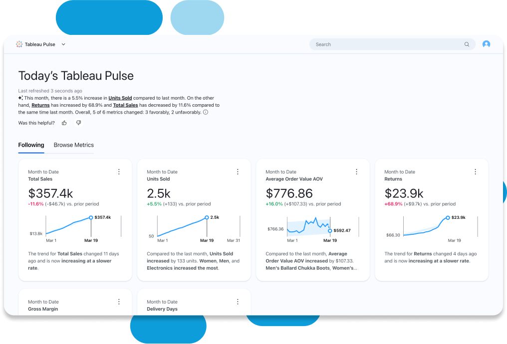
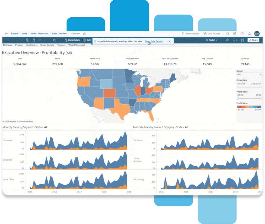
利用 Einstein 的内置见解轻松进行数据探索,从而做出更好的决策。得益于一目了然的数据可视化呈现方式和后台自动化功能,Tableau 自动为分析数据赋予业务背景和意义,使其更加丰富,从而帮助您发现和理解相关数据。借助 VizQL,您能够通过简单的拖放操作轻松探索数据。通过向仪表板添加自动呈现且易于理解的叙述内容来加快分析速度,使用自然语言来探索和回答关键的业务问题,并使用 Tableau Pulse 设置个性化指标。
提升对所有数据的信心和信任度
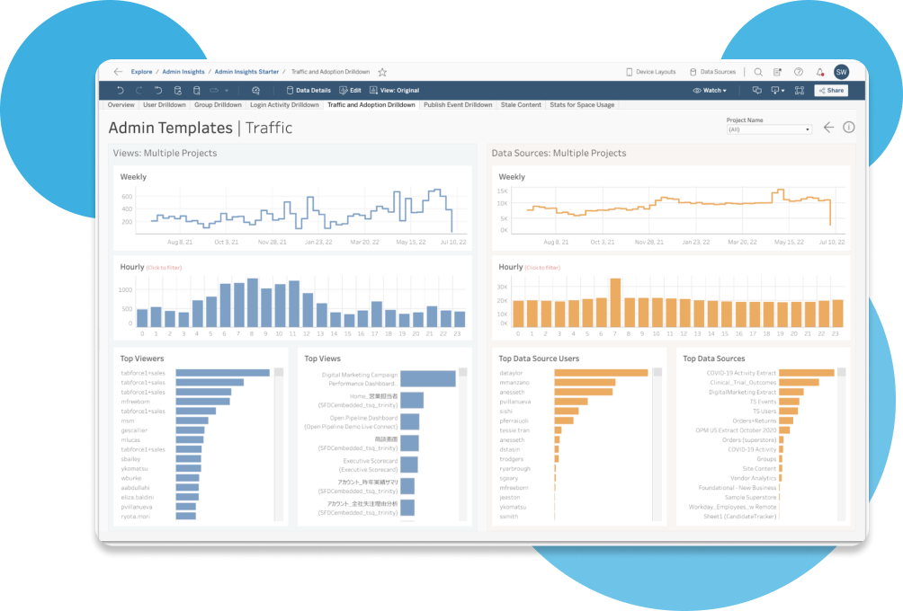
在您需要的地方提供安全可信的数据,同时确保可见性以及管控与治理能力。可与您的单点登录 (SSO) 或身份提供程序相集成。在一个环境中即可监控使用情况,从而更高效地保持合规。您可以尽享符合一流安全认证标准(例如 SOCII 和 ISO)的最新基础架构。Tableau Cloud Enterprise、Tableau+ 和 Tableau Server Enterprise 中的数据管理功能以简单且可重复的方式扩展可信数据。
通过开放灵活的平台轻松扩展
借助可重复使用的模型和分析以适合自己的方式构建和扩展数据架构。您再也不用配置服务器、管理软件升级或扩展硬件容量,因此能够节省时间和资金。使用 Tableau 在移动设备、平板电脑或计算机上发现、共享、协同处理和探索数据,从而有效推动团队合作。Advanced Management 功能可带来无限扩展能力、最优的效率和精简的安全保护机制,让您可以轻松建立和扩展关键分析流程,同时保持对 Tableau 的掌控。使用 Tableau Pulse 指标层创建数据的标准定义,为您的见解和分析提供支持。借助加速器、连接器、扩展程序等访问原生应用,快速上手分析。
利用 Tableau 将见解驱动型决策的数量提高 33%。
![]()
![]()
![]()
![]()

随着组织中数据的增长,需求也在增加,成本不断上升,我们需要一个能够随着需求而增长,能够扩展的平台。

套餐与价格
Tableau Creator
在 Tableau Desktop 中连接您的数据,构建可视化和发布仪表板。
按年付费
包括:Tableau Desktop、Tableau Prep Builder 以及 Tableau Cloud 上的一个 Creator 许可证。
Tableau Explorer
编辑现有仪表板。可用于团队和组织。
Tableau Viewer
访问现有仪表板。可用于团队和组织。