Så här skapar du dashboards som övertygar, informerar och engagerar
Förmedlar dina dashboards det du vill berätta eller går datan förlorad i ett hav av pixlar? Tableau strävar efter att hålla användarna i kontakt med programvara kring principer för design, kognition och perception. Samma principer gäller för effektiva dashboards. Ta reda på hur du kan få nytta av Tableau och skapa dashboards som fångar målgruppens intresse, skapar engagemang och gör det lätt att förstå även de mest komplexa databerättelserna.
Läs det här faktabladet och ta till dig tre speciella åtgärder som hjälper dig att skapa mer informativa, intressanta och effektiva dashboards.
Du kanske också är intresserad av webbinarieversionen om ämnet.
Think about a great conversation you’ve had, with no awkwardness or self-consciousness, just effortless communication. In data visualization, there is a similar concept. Your audience should smoothly absorb and use the information in a dashboard without distractions or turbulence—this is described by people in the data viz world as “flow.”
Psychologist Mihaly Czikszentmihalyi has studied flow extensively. Czikszentmihalyi and other researchers found that people experience flow when their skills are engaged and they’re being challenged just the right amount. Flow is correlated with happiness, creativity, and productivity.
So how do you create flow for your audience? As a dashboard designer, it’s your job to create the smoothest possible experience for users, without unwelcome or obtrusive elements. This is how you create dashboards that persuade, inform, and engage.
The following practices can help you minimize annoyances and facilitate flow:
- Unwrap your brain from the data and focus on your users
- Remove everything you can—and nothing else
- Show your work. Iterate relentlessly.
1. Unwrap your brain from the data and focus on your users
As a data professional, you are likely consumed with data in the same way a music professor is consumed with notes. When that scholar teaches a class, they can’t just spill out every single bit of detail they know. An enormous infodump would be overwhelming, and it would probably turn students off, especially younger or non-major students. Good teachers consider the knowledge and needs of their students.
Similarly, it’s crucial for you to set aside your own immersion in the data and ask the questions: What does my audience need? How often will they look at this data? What do they need from it? What do they already know about this subject? Have they used dashboards before?
If you spend time figuring out the answers to these questions, your dashboards will be better for the only people who really matter: the people using them.
Adapt your story for your audience
Every data set will have a different audience and different point of view. Let’s say you’re visualizing a dataset about America’s bridges, showcasing those that are substandard and at risk for collapse. One might focus purely on bridge quality while another could use census data to factor in how many people use the bridges.
You could approach this project a few different ways depending on the intention—to warn the public, drum up business for a construction company, or to crystallize priorities for the government. It all depends on the audience, their skill level, and their knowledge of the subject. Just as you’re trying to help your audience experience flow, the audience helps you narrow down options for the presentation of data.
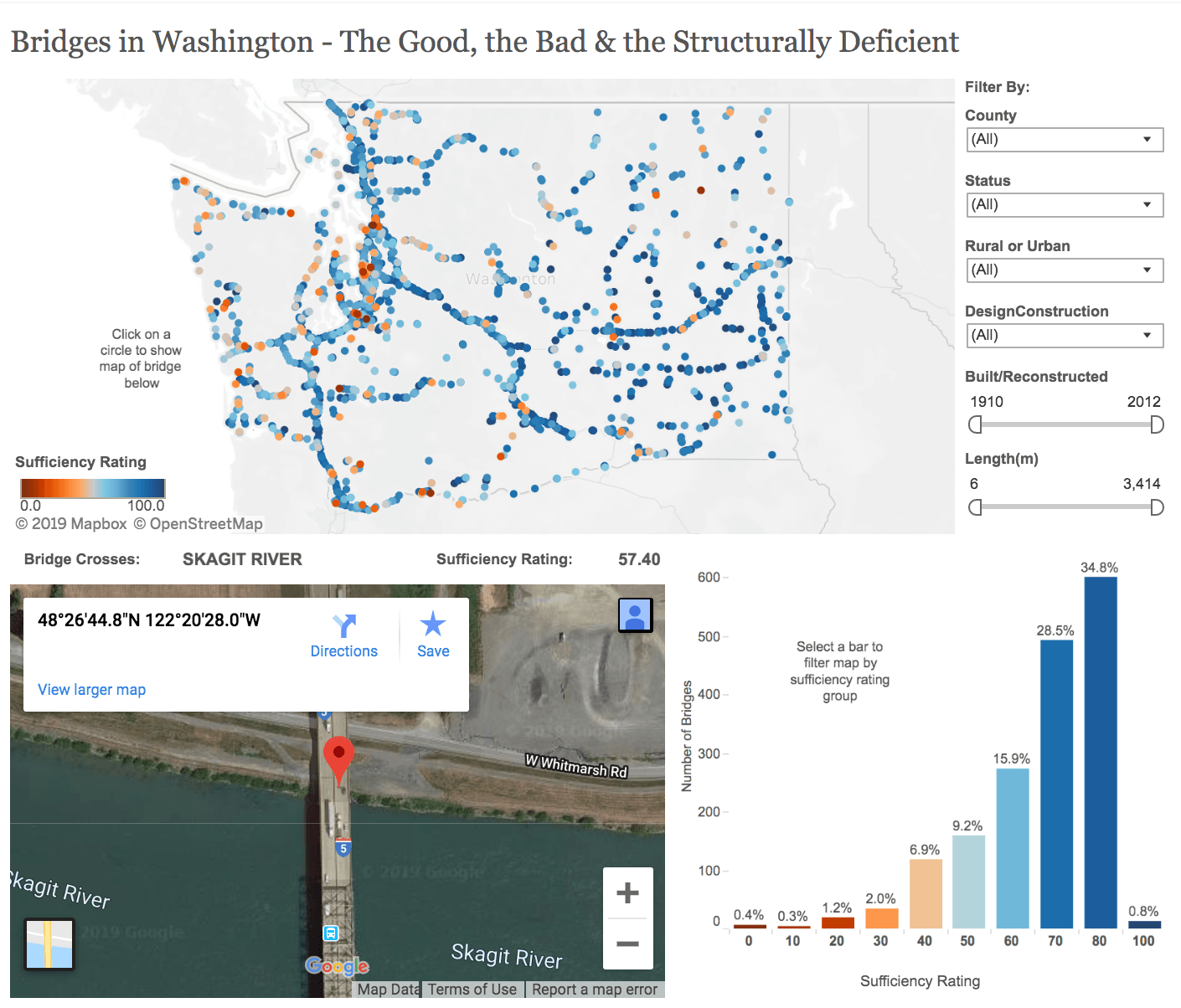
For example, these dashboards by Anya A’Hearn show a range of choices. Each of these dashboards was meant to communicate to specific audiences. Each demands different skills and challenges.
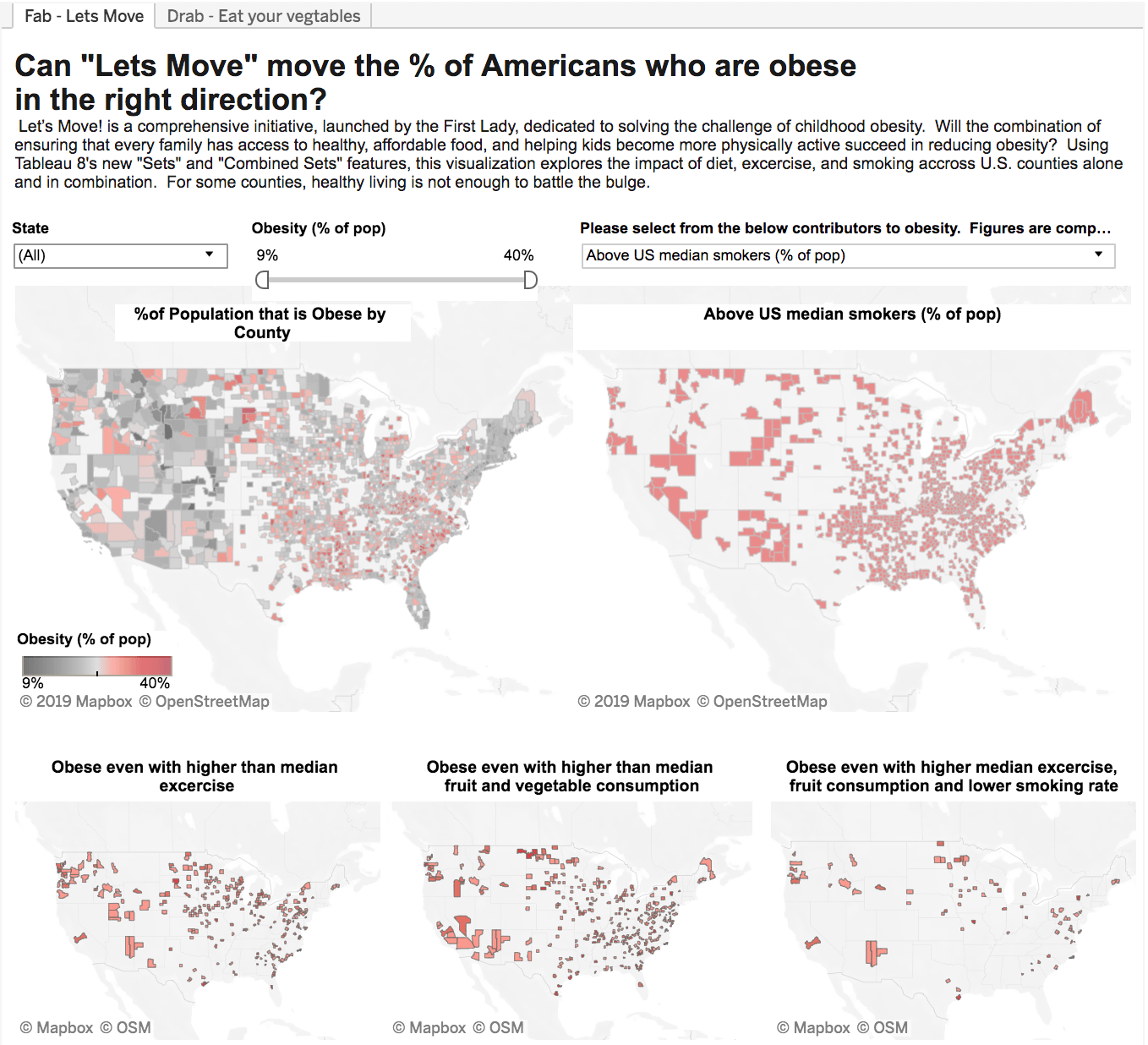
This next dashboard is colorful and eye-catching. It has a strong, clearly worded message and is working hard to get that message across.
2. Remove everything you can—and nothing else
In their book The Elements of Style, William Strunk Jr. and E.B. White advise us to “omit needless words.” In writing, redundancies and empty terms can cause static that gets in the way of communication. The same is true of dashboards. Excess information, confusing graphics, and unnecessary features can also make a dashboard difficult to use and understand.
For example, here are three visualizations of the distribution of tornadoes in the United States, representing the first nine months of the year.
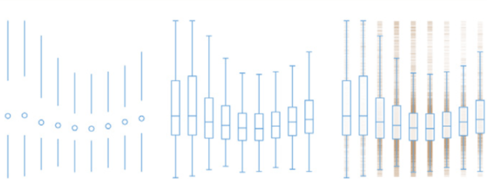
The difference between them is in the amount of visual information used to tell the story. At the left, we have an extremely minimal presentation, which increases in complexity as we move to the right. None of these are inherently better than the rest. The viz on the left may be perfect for audiences intimately familiar with the material; for them, simplicity and removal of redundancy would be quite welcome. For newcomers to the topic—or people who will only look at this visualization once—the explicitness of the visualization on the right might be best.
So how do you know when something is clutter versus something important? This is where your colleagues come in.
3. Show your work. Iterate relentlessly.
As you build a culture of analytics, strive for a culture of critique—supportive, collaborative, frequent critique. The more versions of something you create, and the more feedback you solicit along the way, the better the final product will be. Don’t get isolated or stuck. Start working on something and then show it to someone else. Use the feedback and get back to work. Continue that process until you’re happy with the result. Think of what it takes to make a diamond. The heat, pressure, and time required are extraordinary. So is the result.
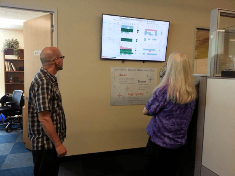
Encouraging critique through trust and publication
To create a culture of critique, a few things are necessary. For one, you have to trust your colleagues. If you and your coworkers respect each other, you’ll trust each other’s feedback.
Also, you need thick skin. Since your final product is ultimately for the benefit of users and clients, your dashboard design should revolve around their needs, not your own preferences.
Writers often talk about how they have to “kill their darlings”—meaning sometimes their favorite part of a story or script might have to be cut. The same thing can happen for designers. Keep your eye on the big picture and be honest if something isn’t working. It also helps to have a public place—on a real or virtual wall—for sharing work.
Iterate, refine, and polish
Iteration is critical to creating effective dashboards. A dashboard should never sit stagnant over years and years. It should adapt to changes in your audience and business. Even small tweaks can make a big difference.
The final result will be a dashboard with drastically less noise and more breathing room for your audience to digest the information. Constant iteration is how good ideas become great.
Work quickly. Get feedback. Consider your audience. Omit needless features. Repeat as necessary. This is how you’ll create flow for yourself, your colleagues, and your users.
