How we designed the new color palettes in Tableau 10


Update: Tableau 10 is here! Download now to try out the feature outlined below.
You might have noticed we redesigned all of the color palettes for Tableau 10. While our classic palettes had served us well (since Tableau 1.5 for the basic ones), we wanted a more elegant, sophisticated appearance, a better blend of functionality and style.
To achieve this, the design was a collaboration between myself and Cristy Miller, our director of visual design. By blending our two perspectives, we achieved a result that is both beautiful and functional.
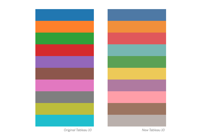
For example, here are the old and new Tableau 10 palettes, which are our default colors for categorical data. You can see that the new colors are similar in that they are basic colors (red, blue, pink, orange, etc.), but are softer, more sophisticated, less “Crayola bright.”
Similarly, our default colors for quantitative dates have also changed. We now default to blue and to orange-blue for sequential and diverging palettes. This change from green and red-green is both better coordinated visually with the categorical colors and much more friendly to our users with common forms of color-vision deficiencies.
If you create a new workbook in Tableau 10, you get these defaults automatically along with the new default theme, which features the new Tableau font and a lighter, cleaner layout.
If you upgrade, we preserve your old views by using the previous theme and our “Classic” colors. To change an old workbook to the new theme, go to Format > Workbook theme. And change the theme to “default” rather than “previous.” When you do this, all colors that are defined as “automatic” will upgrade to the new default palettes. Any colors you specifically set, however, will retain their old values.
We didn’t just update the defaults; we updated all the old palettes and added a bunch more. We created a wider range of choices and styles to better support your taste and needs. Of course, all these new palettes meet the Tableau standards for visual effectiveness, just like the old ones.
How we picked the new colors
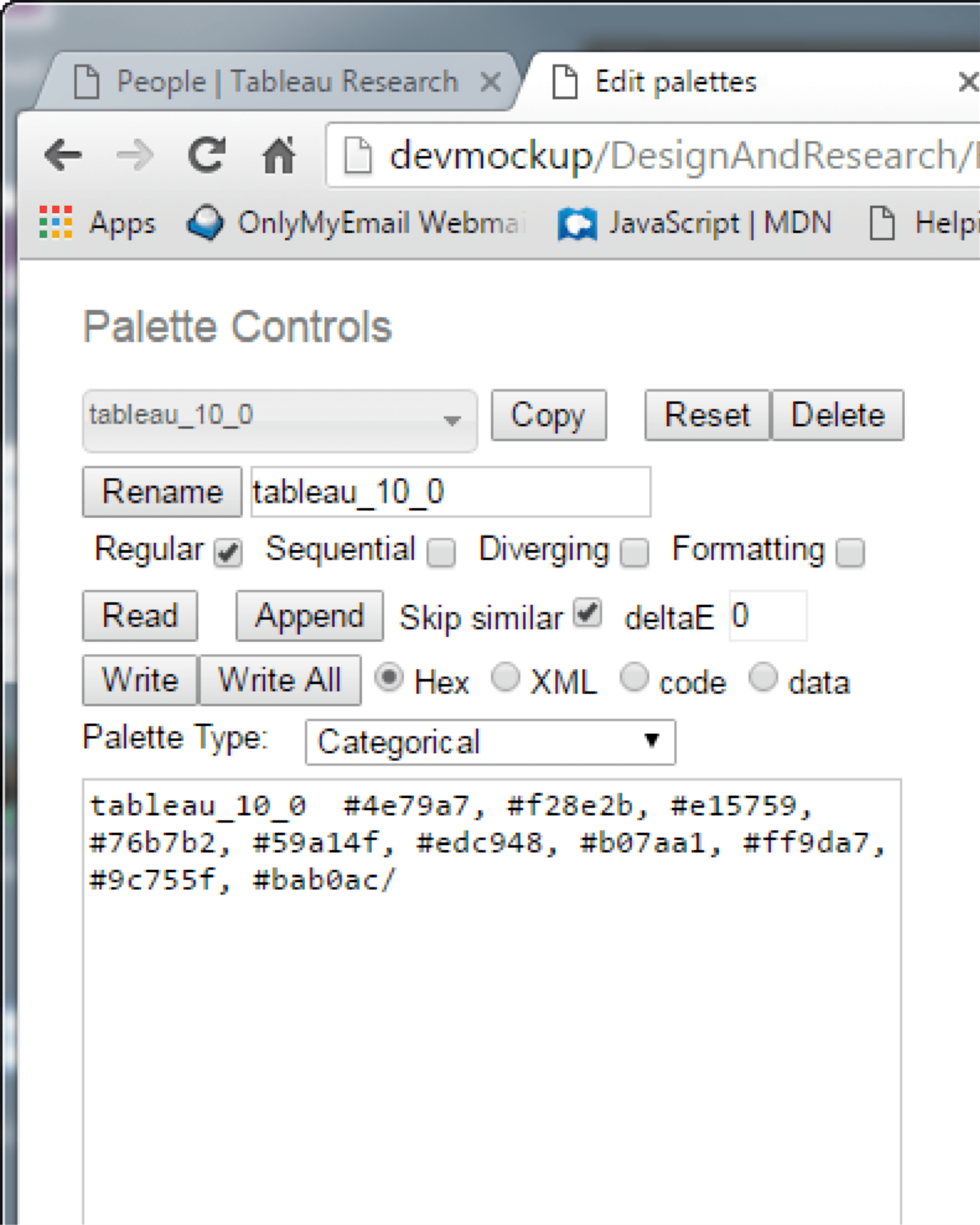
To support this massive redesign effort, we created a special tool that provided all the features and controls we needed to design color palettes. As you can see, there are a lot of them. It may look overly complicated, but it is exactly what we needed to get the job done.
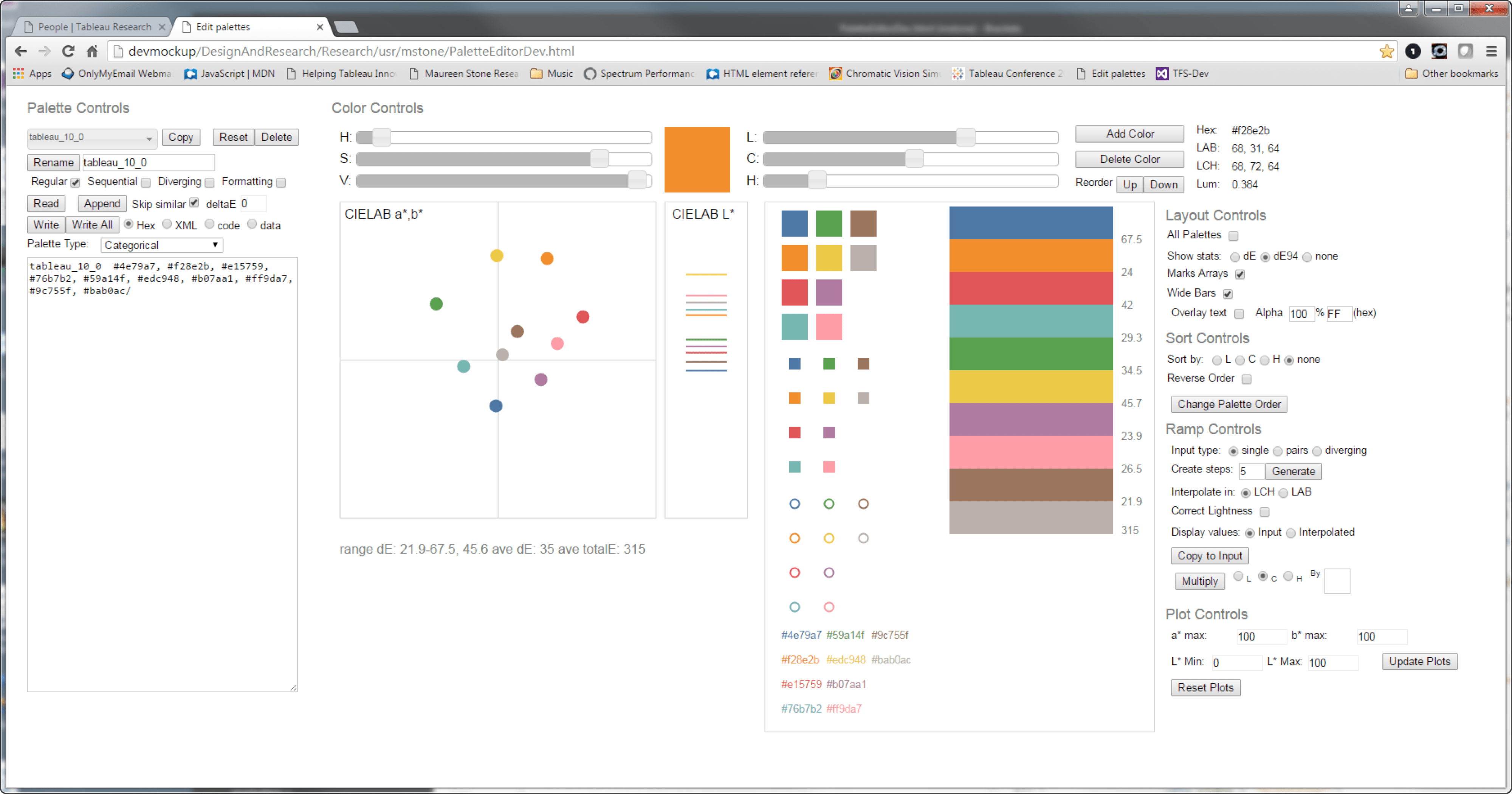
The tool has too many features to describe here, but let me call out a few critical pieces. At its heart is the ability to visualize and edit colors as points in a color space called CIELAB, which is based on human perception. This is a three-dimensional space, but editing in 3D is very difficult. Instead, we split the space into a hue, chroma plane (CIELAB a*, b*) plus a lightness scale (CIELAB L*).
Selecting a color point copies the color to the patch above, and the sliders let you change it along its three dimensions (L, C, H). Alternatively, you can also change the color using the display-based HSV space or by editing its RGB hex value.
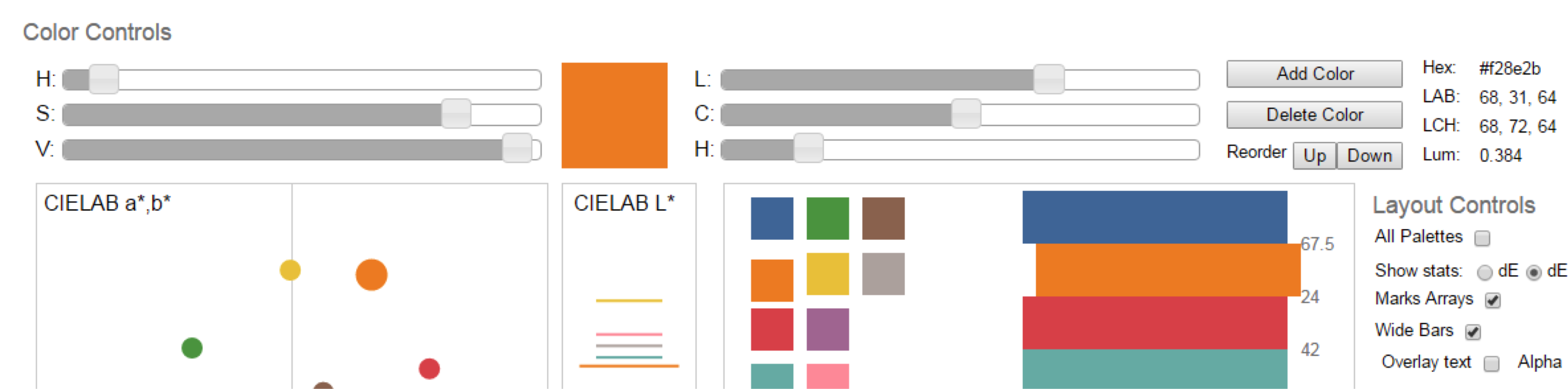
In addition, we display the colors in a variety of ways to simulate their use in the product. In the left column, the larger squares represent the colors displayed in the palette picker, and the smaller squares show their display in a legend. The circles represent our hardest-to-distinguish marks (scatterplot default). At the bottom, we include a test of text readability.
On the right, we show larger swatches of color which are stacked to simulate the appearance of stacked bars or area charts. The appearance of adjacent colors in these views is important, both functionally and aesthetically.
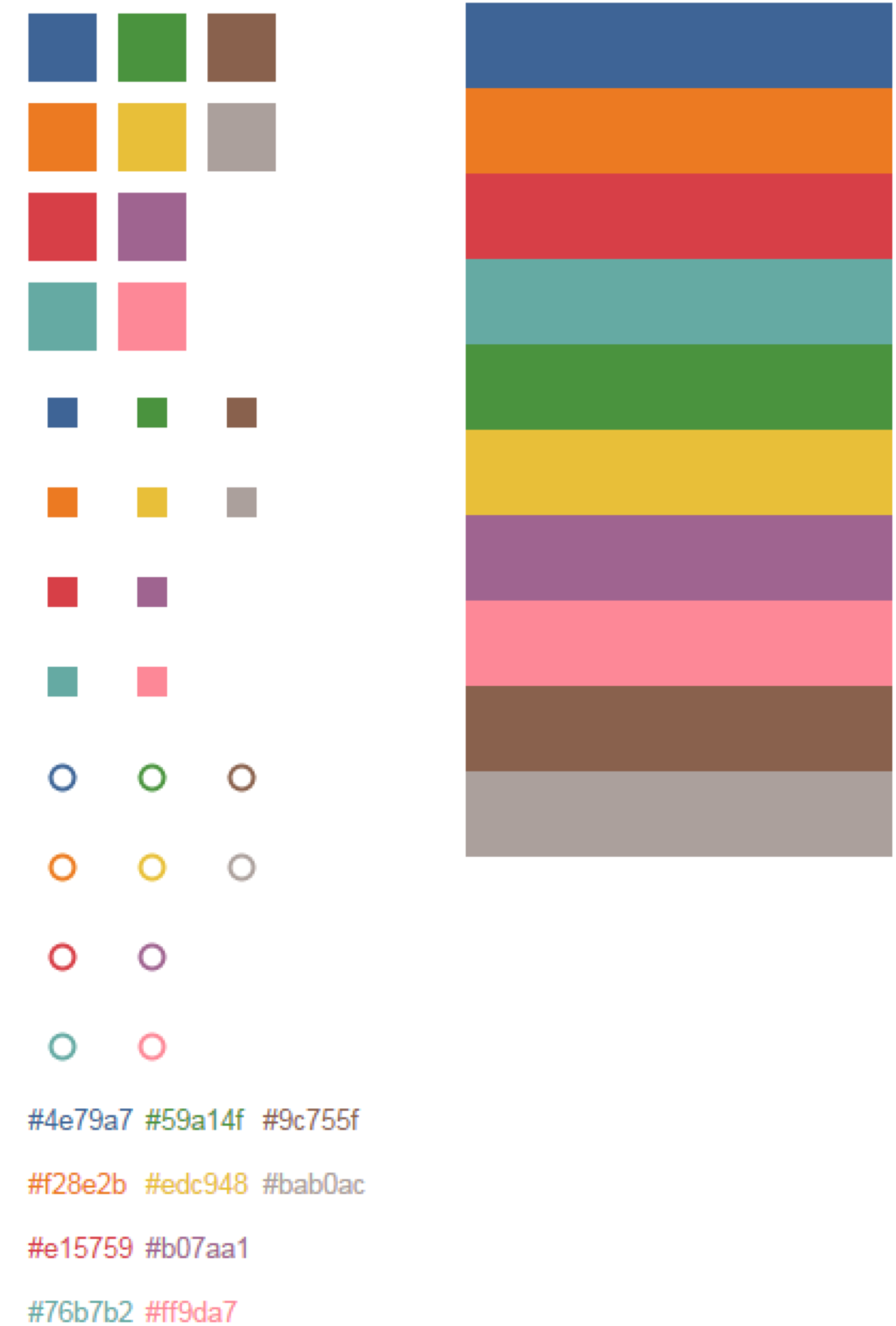
Palettes can be written and read in several different text formats. Simple sequences of hex values are useful for saving and sharing palettes. The XML used in Tableau preferences files is useful for testing the palettes in the product. Finally, exporting the C++ table format used by developers minimizes transcription effort and errors.
Visualizing color palettes
The beauty of using CIELAB to visualize color palettes is that colors that are close together are similar, and those that are far apart are different. These are 3D differences; to match, two colors would need to be in the same position on the a*, b* plane and on the L* scale.
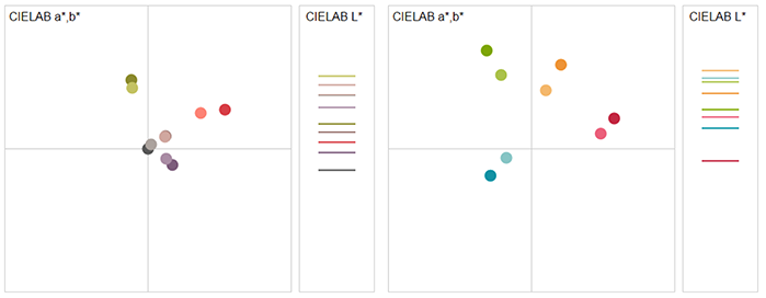
In the a*, b* plane, chroma is the distance from the center (gray has a chroma=0). If you draw an imaginary line from the center to the color, the hue corresponds to the angle, as shown in the figure. Hue=0 is pink, green is hue=130, blue=270, etc.
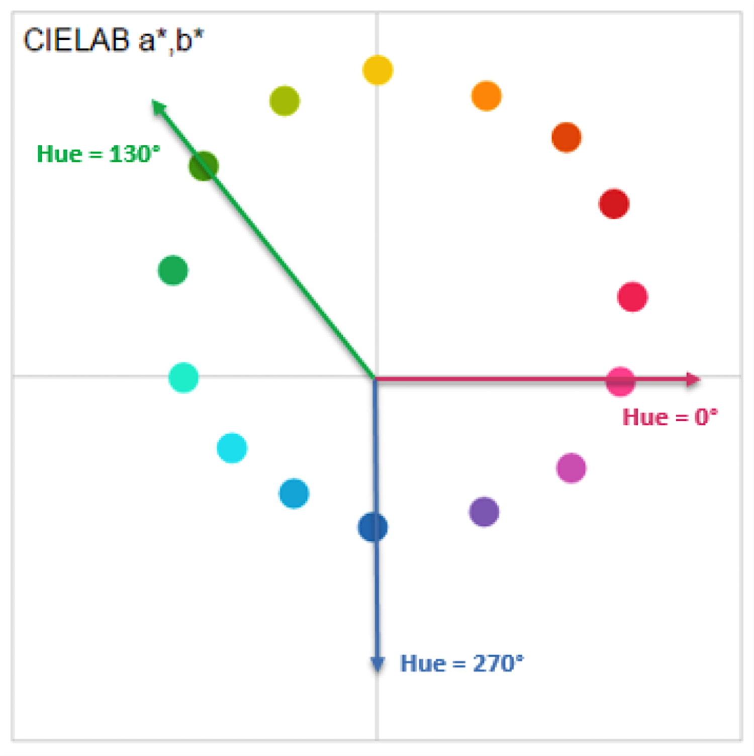
Defining hue angle on the a*, b* plane.
Overall, categorical palettes tend to contain several distinct hues and a range of lightness values. A full-hue circle like the Tableau 10 is a good default because the colors are visually very distinct and correspond to simple color names like red, blue, purple, and brown. To create the Tableau 20, we use light-dark pairs of these basic colors. Below we can see that Tableau 10 contains 10 different hues, with varying chroma. The gray has a light tint. Our classic Tableau 10 has a similar structure, but the colors are higher chroma and somewhat darker.
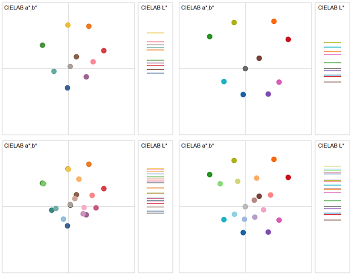
The top row shows new and old Tableau 10 palettes, and the bottom row shows new and old Tableau 20 palettes.
Palettes with fewer hues have a more distinctive visual style, which can be considered more aesthetic.
The left is our winter palette, and the right our summer palette.
In contrast, the palettes we use for quantity trace a continuous path stepping uniformly from light to dark in a small section of hue space.
Here is the Orange palette, which varies from a light orange-tan to a dark brown. Note that the hue for brown is the same as for orange, but it appears brown because it is dark and lower chroma. In fact, any yellow, orange, and red colors can be made to appear brown or tan by manipulating their lightness and chroma. Diverging palettes trace two paths through a neutral center.
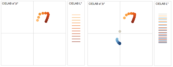
Note that these paths are not straight lines. The variation in hue and chroma that makes them twist and curl also makes them more visually effective.
Formatting and annotation colors
Tableau provides two sets of colors for formatting and annotation, one dark and one light. We have updated these colors as well. The new dark formatting colors now match the Tableau 20’s dark-light pairs, with a medium color interpolated between them.
In addition, we include three distinct colors (teal, pink, yellow) which are colors in the Tableau 10 that are not included in the Tableau 20. That is, these medium colors were replaced by light/dark pairs of a similar hue.
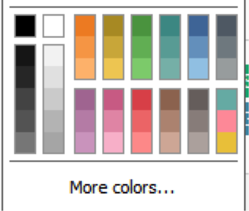
The light colors used for backgrounds and shading were redesigned by visual designer Amanda Laurick to provide a more elegant and subdued set of colors than previously. Unfortunately, this made the small samples in the color picker difficult to distinguish. To solve this problem, we systematically increased the chroma of the samples until they were visually distinct.
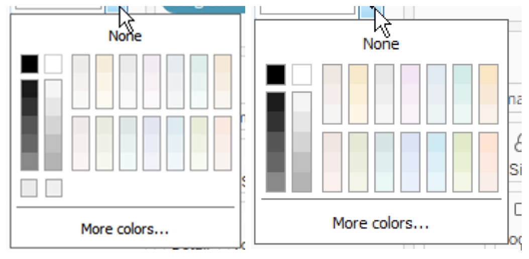
The left shows the color picker without added chroma, and right shows the chroma-enriched version.
In other words, we compensated for the perceptual problem that a large area of any color looks brighter and more colorful than a small one. This effect is familiar to anyone who has selected a color from a small paint chip and has been surprised by how much stronger the color was on the wall.
Send us your thoughts
We blended visual design and color science by creating a collaborative process and tool to support it. Not only did this support Cristy and my working together, we were able to also include designs from dev-team members Carin Fishel, Shahaf Nuriel, Amanda Laurick, and Jewel Loree. In each case, they used the tool to capture their ideas in an initial palette, but then I had to apply the final tuning for quality and effectiveness.
As we move toward encouraging customers to create their own palettes, we will need to better codify what I did by hand. But with Tableau 10, I feel we took a large step toward this goal.
We’ve put a lot of thought into our new palettes, and we’d love to know what you think. Please share your feedback with us in the comments below.
To learn more about Maureen and the rest of Tableau’s Research Team, visit research.tableau.com. To learn how to use color to prove your point, check out this FastCompany article featuring Maureen. You can also read about Maureen's experience working at the most important R&D lab of the past 50 years.
Learn more about Tableau 10
Tableau 10 includes a brand new look and feel, and a host of new features to help you prep, analyze, and share your insights even faster. Check out our Coming Soon page for details.
- Uncover patterns in your data with Tableau 10’s clustering feature
- Quickly find marks in context with Tableau 10's new highlighter
- Build your own custom territories in Tableau 10
- Do more with bar charts in Tableau 10
- Tableau 10 includes more maps data, multilingual auto detection
Answers through analytics
- Integrate your data with cross-database joins in Tableau 10
- As requested, you can filter across data sources in Tableau 10
- Do more with APIs in Tableau 10
- Tableau 10 includes even more data-source options
- Connect directly to Google Sheets in Tableau 10
- (Finally!) see and understand your IoT data with our Google Sheets connector
- Connect directly to your QuickBooks online data in Tableau 10
- Favorite your data sources in Tableau 10
- Tableau 10 includes even more data-source options
Data breakthroughs
- Check out the beautiful look and feel of Tableau 10
- Format your workbook with just a few clicks in Tableau 10
- Tableau 10 includes a new typeface designed for data
Beautiful by design
- Design dashboards that shine on any device in Tableau 10
- Tips for designing device-specific dashboards that make everyone happy
- Manage your Tableau Mobile deployment with AirWatch or MobileIron
Delightfully mobile
- Author dashboards from scratch on the web in Tableau 10
- Do more while publishing workbooks in Tableau 10
- See a history of your revisions in Tableau 10
- What's new in Tableau Online
Do more on the web
Histórias relacionadas

The Tableau+ Bundle with Premium AI, Enterprise Capabilities, and Premier Success
 24 Junho, 2026
What is Tableau Prep?
 30 Abril, 2026
Insights Wherever You Work: Meet the Tableau App for Microsoft 365
 16 Março, 2026