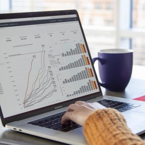
Box bestrijdt cyberdreigingen effectief door de beveiligingsgegevens te verhelderen
Met Tableau Pulse in Tableau Cloud verbetert Box de toch al robuuste beveiliging van content en workflows door inzichten te verkrijgen en zo de beveiligingsreacties op de zich ontwikkelende bedreigingen door misbruik van AI te optimaliseren.


Klant aan het woord
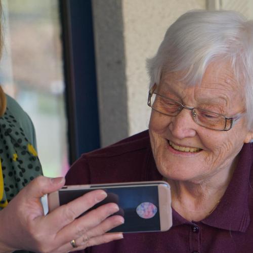
Amstelring gebruikt Tableau Online om door kennis aangestuurde zorg te verlenen
Klant aan het woord