#MyRecentViz: What Politicians Say on Twitter


Editor's note: This is a write-up of the key takeaways from the #MyRecentViz webinar on 13 Dec 2016. It is part of the #MyRecentViz series of blog posts and webinars, each deconstructing a beautiful and insightful viz.
Politicians are on Twitter. This is not a phenomenon limited to the US; it's true in many countries.
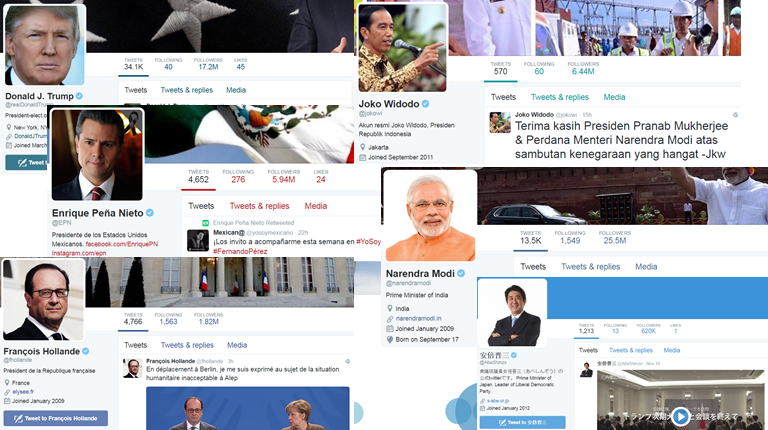
Politicians use social media to communicate their programs and ideas, and they should be held accountable for what they share. I thus wanted to make politicians tweets easily searchable by themes to help citizens better monitor candidates' and elected representatives' positions.
Being a French citizen, I decided to apply this idea to the candidates in the French Republican party's primaries. These primaries were open to all citizens, not only those owning a Republican membership card. Therefore, a big number of people were potentially interested in understanding candidates programs better, as they do not ordinarily follow the Republican party.
Of course, the same data-collection and viz-automation process would work regardless of the country or Twitter account.
The Question(s)
When I started collecting the tweets of French candidates to the Republican primaries in October 2016, the following questions were on my mind:
- Are tweets consistent with candidates programs?
- Are they really authored by the politicians, or do they have teams/bots tweeting for them? I had in mind the analysis of David Robinson, which showed that Trump's angriest tweets came from his personal Android phone.
- Do each politician have a different tweeting pattern in terms of volume, regularity, time of the day?
- Are the most active on Twitter eventually the winners?
The Viz
The viz I created has two aspects that answer the two sets of questions: the top part is focusing on tweeting patterns (volume and time) while the bottom chart focuses on content of the tweets.
The bar chart shows the number of tweets by each candidate since October 17, and clicking on a bar gives way to a line chart showing tweets over time.
The bubble chart below lets the reader choose a word and see how many times it's been used in a tweet by each of the candidates. The horizontal axis is hidden to avoid cluttering the visualization but it represents time. Hovering over a bubble shows the tweet content and time of publication.

Note that as I had some holiday planned in late October, it was really important that this viz would continue updating automatically while I was away. More on this below.
The Answer(s)
Disclaimer: This visualization did not answer all of my questions.
It did work well for getting a quick understanding of candidates values and priorities. Being able to zoom in on words like "immigration" or "Islam" shined the spotlight on their conception of society. It was also interesting to search topics that are not traditionally a Republican focus like health ("santé"), to see how candidates talked about it. Generally speaking, candidates tweets were in line with their voice on other media platforms like TV or the radio, and they often tried to leverage Twitter to reorient the debates towards their own agenda.
The following questions were more difficult to answer. First, the data I collected didn't contain any indication of the device used to tweet. Then, given the limited space available, I couldn't include an analysis of tweets by the hour and had to show tweets daily. So the only pieces of insight I was able to take away were quite obvious, like candidate François Fillon's supposed holiday over the All Saints' long weekend in October, or the fact that all candidates nearly stopped all Twitter activity as soon as they knew they were out of the race.
Even the last question, on whether most active Twitter users end up being the winners, has to be answered in a nuanced way. While François Fillon did have the highest number of tweets by the time he was officially elected presidential candidate of the Republicans, the candidates that are respectively second and third in absolute tweets were both out by the end of the first round of the primaries, while Alain Juppé, fourth in number of tweets, made it to the second round with François Fillon.
The Data
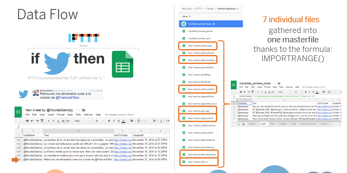
I needed to automatically collect the data and store it in a Google Sheet so that I could use the connection between Google Sheets and Tableau Public to auto-refresh my visualization.
Whenever you think "I need to obtain data from such application and collect everything in a Google Sheet," you should think about free web service IFTTT, which stands for "If This Then That." It lets you connect together hundreds of applications like Twitter, Google Sheets, Evernote, Instagram, Feedly, and so many more.
What I did here was creating "applets" (formerly known as "recipes") performing the simple task of "If new tweet by @Handle_of_Candidate, then add row to spreadsheet in MyEmail@gmail.com's Google Drive." I set up a recipe for each of the candidates I wanted to follow and ended up with as many Google Sheets in my Google Drive.
To be able to union them, I then needed to combine all these Google Sheets in one single master sheet, while still allowing for autoupdate. I did that using the importrange() formula in Google Sheets.
The Chart(s)
As this visualization was thought as a simple tool to get information about the candidates, I wanted it to be easy to understand. The bar chart was an obvious choice to compare the number of tweets per candidate. The line chart also looks like a no brainer to show the evolution of tweets over time, but I must confessed that I had initially used a bar chart with tweet text used to break down the bars in Tetris-like cubes showing individual tweets. This sounded like a brilliant idea at first, but it quickly became overcrowded and difficult to read as candidates kept tweeting their way to the primaries.
This is an important thing to keep in mind when building and automatically updating viz: anticipate what your viz will look like as the data builds up. Do you want to fix your axes, or let them update automatically? Will your chart still be readable with two more months of data? Does it actually make sense to let it update forever?
Gladly, the bubble chart below already served the purpose of showing individual tweets, so I could let go of my Tetris chart. Sure, it looks very clutter if you decide to visualize all the tweets over the past few months (that's selecting the option (Tout) in the dropdown menu), but it does serve the purpose of showing occurrences and usage frequency of individual words.
I've often had questions regarding the themes parameter that apply to the bubble chart, and I have to mention clearly its limitations:
- I manually created this parameter, choosing which key words I wanted to look for in the tweets. There are probably dozens of other words that would be interesting to monitor.
- The formula used to look for the selected word in a tweet is a simple IIF(CONTAINS([Tweet_Text],[Word_Parameter]) OR [Word_Parameter]="(All)","True","False"). Used as a filter of the bubble chart, it can't find tweets related to the theme if they don't contain the word. Also, if you look for a word like "culture," it won't make a difference between "culture" and "agriculture..
The Design
I wanted a simple design, that lets the focus be the interaction with the viz, so I just:
- Made sure the viz wasn't too crowded by showing only two charts by default, and indicating that clicking on a bar would reveal another chart.
- Used blue for the header and titles as opposite to what's done in the US, the Republican party in France is associated with the blue color.
- Applied a default Tableau color palette to the individual candidates as no obvious color association came to mind and I was just looking for contrast.
Closing Thoughts
I received some constructive feedback from the Tableau Public community regarding this viz. Jonathan Trajkovic suggested that I should divide the number of tweets on a given theme by the total number of tweets of each candidate to normalize it, a very valid point. Alexander Mou tweaked the visualization, showing how it could be further improved with a URL action linking to the tweets.
If I was to retrospectively improve this visualization, I would probably add some annotations to give context to the timeline of candidates tweets, include a time filter to allow zooming in on a specific period, and I'd definitely spend some time working out the Level of Detail calculations and parameter settings to normalize the data as suggested by Jonathan.
The Webinar
You will find below the recording of this webinar:
And for my French fellows, here are the slides of a presentation I gave in French:
If you have any thoughts, questions, or feedback on the viz, I'm welcoming them in the comments section and on Twitter: @jadalytics.
Verwante verhalen

Iron Viz 2026: Read Between the Data
 28 mei, 2026

Tableau's Iron Viz Winners

Explore the 2026 Iron Viz Entries
 15 december, 2025