Design secrets we can learn from historic visualizations


Adapted from a conversation between Andy Cotgreave, Technical Evangelist at Tableau and co-author of The Big Book of Dashboards, and data storyteller RJ Andrews, creator of Info We Trust. Skip to the bottom of the article for more resources.
Historic data visualization still matters. Consider why these visualizations were created. Historic practitioners faced the same challenges we do today: Data overwhelmed their capacity to manage it. The audiences they had to inform lacked graphic and numeric and statistical literacy. Historic viz was created to understand the world better.
Yet, historic practitioners worked to meet these similar challenges under different constraints than us. They had different data, different tools, and a different environment. The intersection of their similar pursuit with such different conditions produced many interesting designs. Their natural solutions are less likely to emerge in today’s digital environment, where we work under own unique constraints. Certain creative paths open at different moments in history.
This tour presents eight examples of historic visualization. Each one is brimming with design lessons relevant to today’s practice. These lessons highlight intentional and thoughtful aspects of design—decisions made by real people to better convey information. We have the luxury of hundreds of years of people pioneering our field. It is best to take advantage of their hard work.
Watch the livestream and read on for more information:
Timeless Style
As viable now as the day it was created.
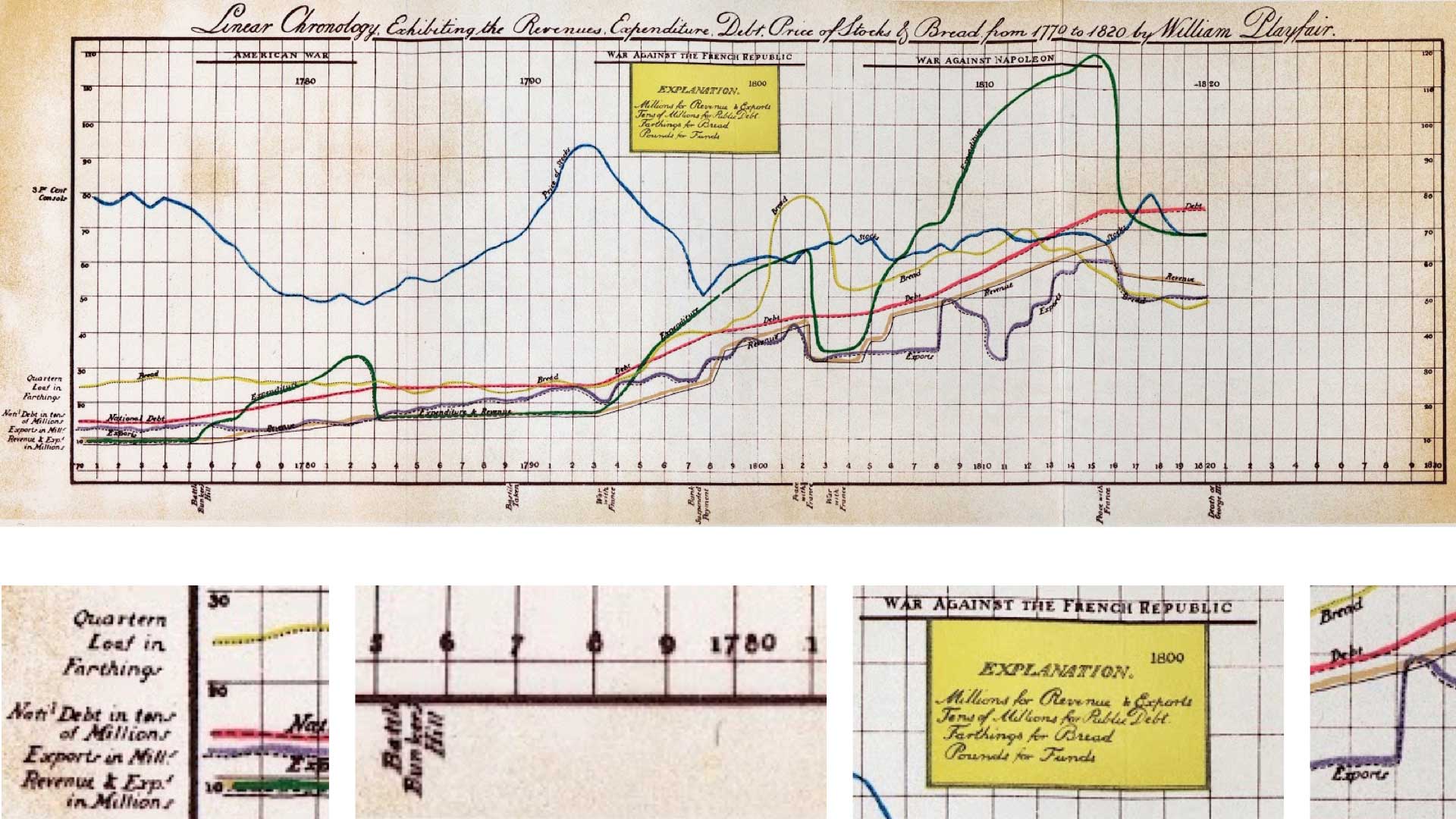
1. LINEAR CHRONOLOGY was published in 1821’s Chronology of Events. The chart shows time series of economic factors from 1770–1820. It is the last known chart created by William Playfair.
Look past the aged paper and elegant script. See how the bold color palette distinguishes different categories. Squint and you might mistake it for something made by Google. Look closer. Each line is not only distinguished by color, but double-encoded with line style.
Lines are labeled where they cross the vertical axis, and along their ensuing curves. Timeline labels mark only the last numeral of intervening years for a clean effect. Annotations at the top and bottom of the chart provide context for war years. Negative space at the end of the chart looks toward the future. This chart was in fact updated—recreated after Playfair’s death—with fresh data.
A brilliant yellow legend orients you to the chart's unique vertical axis. Each line shares the same numerals (0–120). But there is a different unit for each series: tens of millions, millions, pounds, and farthings. This creative design is not a best practice because it creates meaningless intersections. But knowing it might help you someday.
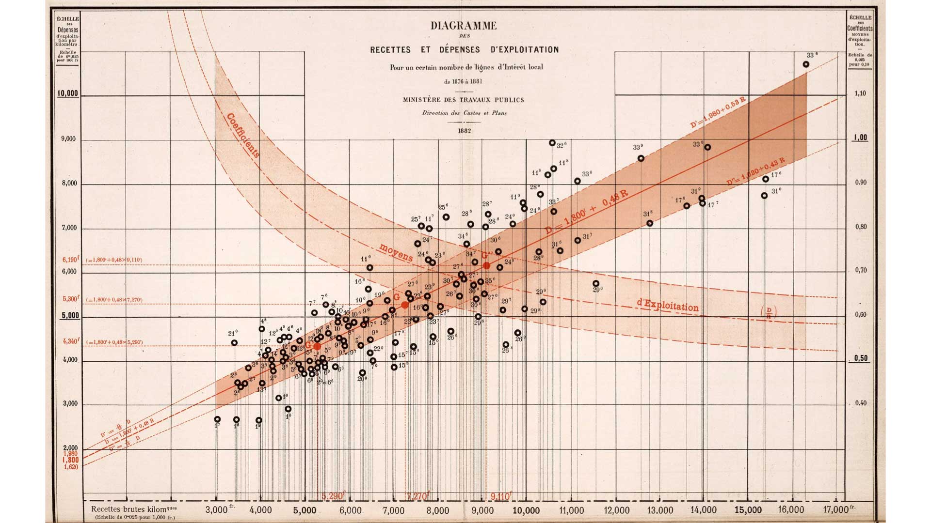
2. DIAGRAMME DES RECETTES ET DÉPENSES (Diagram of Income and Expenditure) was included in Émile Cheysson’s 1882 Album de Statistique Graphique. The album was part of an annual series published by the French Government. The albums are a gold mine of hundreds of examples of golden age visualization.
Before even translating this chart, we can admire its annotations and restrained color palette. Notice how the fine drop lines connect each mark to the baseline. It does not feel 140 years old.
Today, our data and tools bless us with incredible power. But we also suffer under our own particular digital constraints. One of the advantages that historic visualization had is that it was published on paper, allowing for a much larger canvas and higher resolution. Paper allows more colors. Historic constraints were different and that made different solutions possible.
Sublime Maps
Analytic maps demonstrate how exceptional historic work can be.
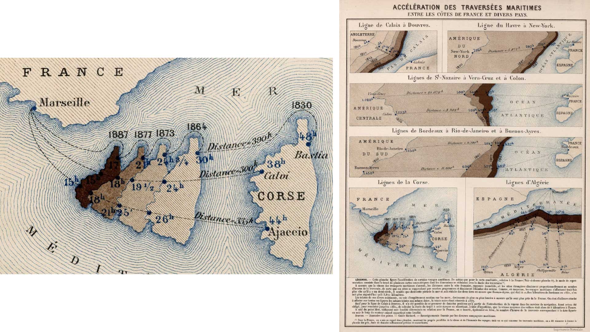
3. ACCÉLÉRATION DES TRAVERSÉES MARITIMES (Acceleration of Maritime Crossings) is part of Émile Cheysson’s 1888 Album de Statistique Graphique. This unique cartogram shows that the time to cross different seas is shrinking. It does this by making the geographic distance appear to shrink.
Across a tableau of views, the trip between Marseille and Corsica is the most interesting. See how travel time goes from 44 hours to only 15 hours between 1830 and 1887. How? In that time we transitioned from sail to steamships. Do not miss the intensifying browns across the set of Corsicas and beautiful blue waterlining.
Think about how you might create this today with modern tools. It would have to be a completely custom solution! When this map was created doing something completely custom was not a relative barrier because so much work was done by hand. Creative limits vanish when you are only armed with a pencil and a blank piece of paper.
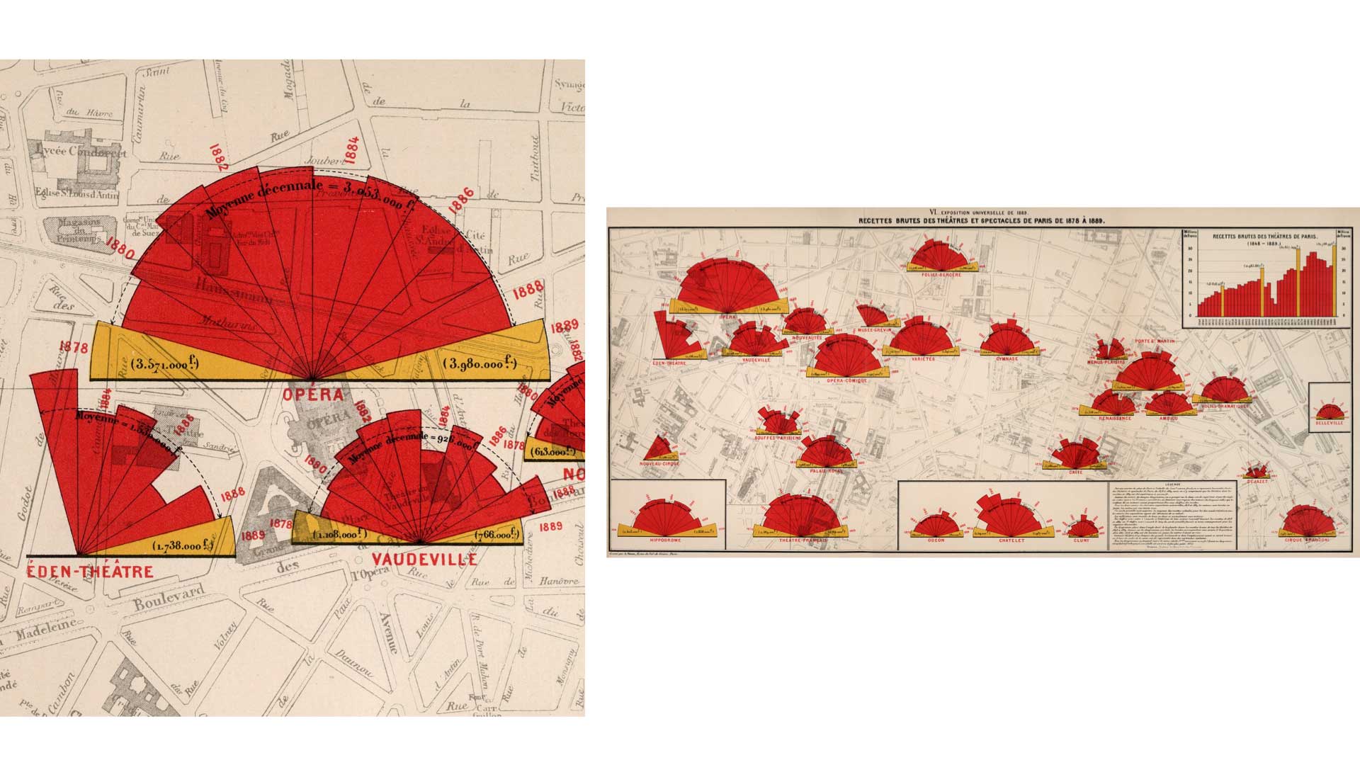
4. THÉÂTRES DE PARIS (Theaters of Paris) is the last example from Émile Cheysson’s Album de Statistique (1890). Each fan diagram represents a different theater in Paris, with one wedge for each year. The total area of each wedge corresponds to that year's gross receipts. You can make macro comparisons between the overall size of each theater's diagram. Then, see micro comparisons across any individual theater’s operation.
The fan is a wonderful form for this data. Its area packs in larger values, allowing the display of many tiers of business. Its natural center orients us to each theater while still keeping the timeline’s left-to-right convention. Missing wedges indicate some theaters opened during the period under examination. Further, there is some visual form linkage between the shape of the fan and the theater audience. Audiences sits in a fan configuration, oriented toward the stage. To keep themselves cool in a packed house (and signal social cues) they fan themselves.
Years with a Parisian Exposition Universelle (World Fair) attracted more visitors to the city. Theater business often correspondingly went up during the expo. Golden yellow highlights these expo years. They anchor each fan’s boundaries. Intervening red years sport a neat dashed summary line. Its average ticket sales is careful to omit the outlier exposition years. Dense annotation calls out values. Text scales with the size of each diagram and year labels angle with the wedges. Magnifique!
Notice how the diagrams are powerfully salient without occluding their basemap. A neighboring bar chart provides extra context in a more standard form.
Design Details
Small flourishes can make the difference.
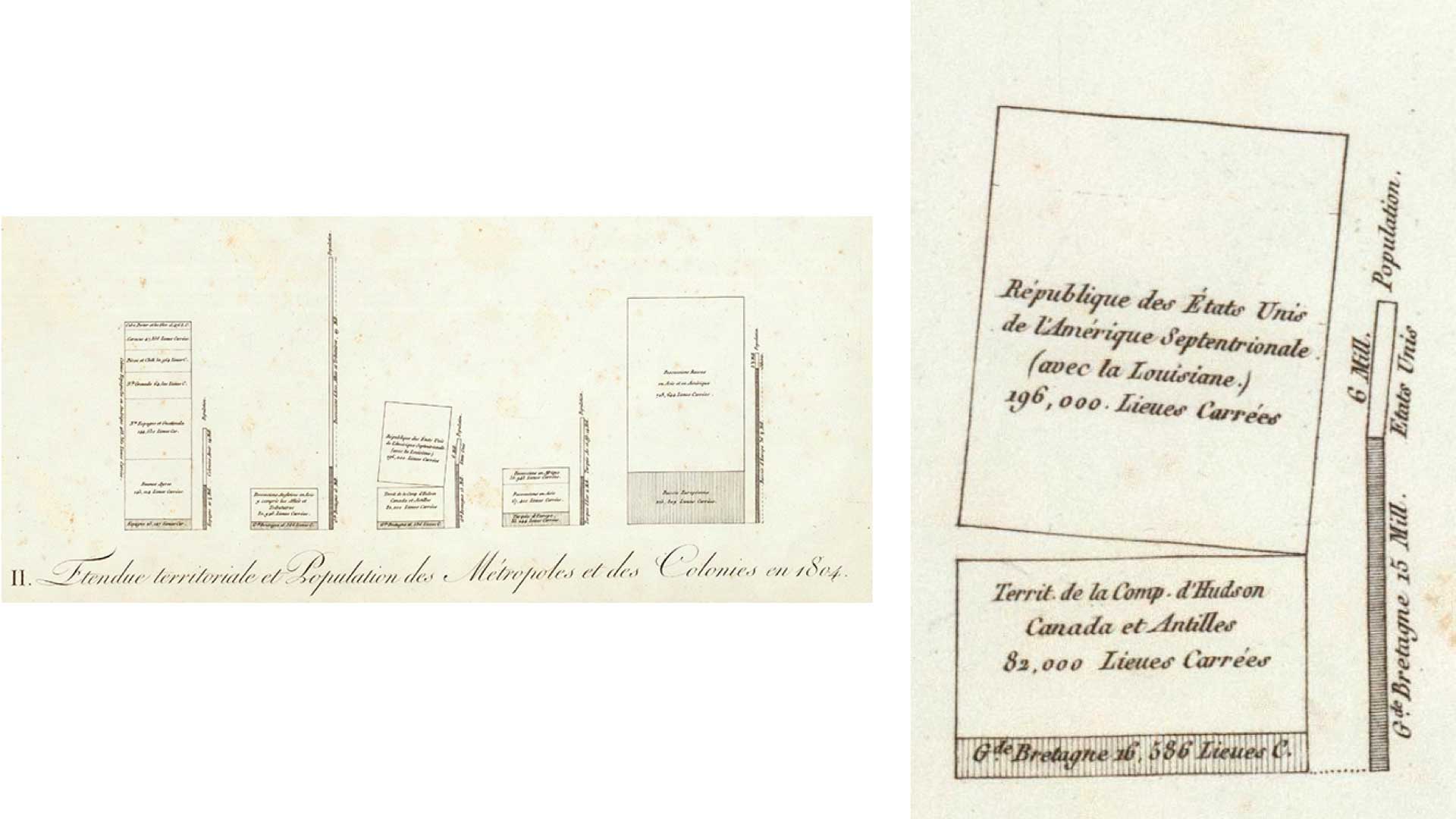
5. TERRITORIAL EXTENT AND POPULATION by Alexander von Humboldt (1811) may present the first stacked bar chart. Each pair of stacks represents an empire (Spanish, British, Turkish, Russian). The big fat stack is territory area of different empire lands. The skinny bars represents corresponding populations.
The block on top of the British Empire stack represents Britain’s American colonies, the recently liberated United States. Its block breaks off from its mother empire. Imagine the moment Humboldt decided to cock that little rectangle to represent the Revolution. This small design flourish gives the whole piece life.
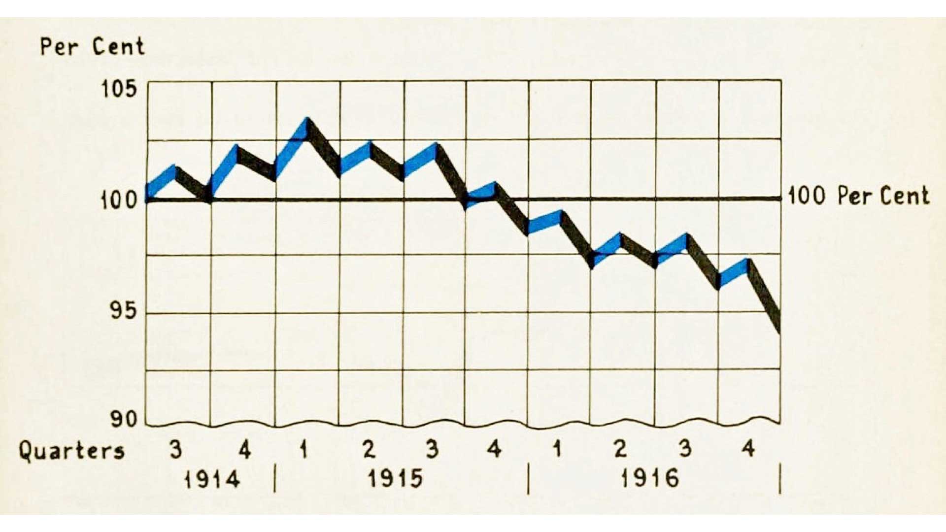
6. INDEX NUMBERS was published in Willard Cope Brinton’s second book, Graphic Presentation (1939). The design detail of note is this chart’s unique baseline. Today it is bad practice to accentuate a non-zero baseline because it implies undue importance. Today’s standard practice has us style all non-zero lines the same as other grid lines because they all share the same significance.
Brinton goes further. He intentionally calls attention to the non-zero baseline by making it wavy, almost like a torn sheet of paper. Without this emphasis a reader might miss that there was a non-zero baseline. Doing it this way calls the viewer's attention to this aspect of the chart. It is a best practice that deserves revitalization.
Pictorial Elegance
Illustrations that inform.
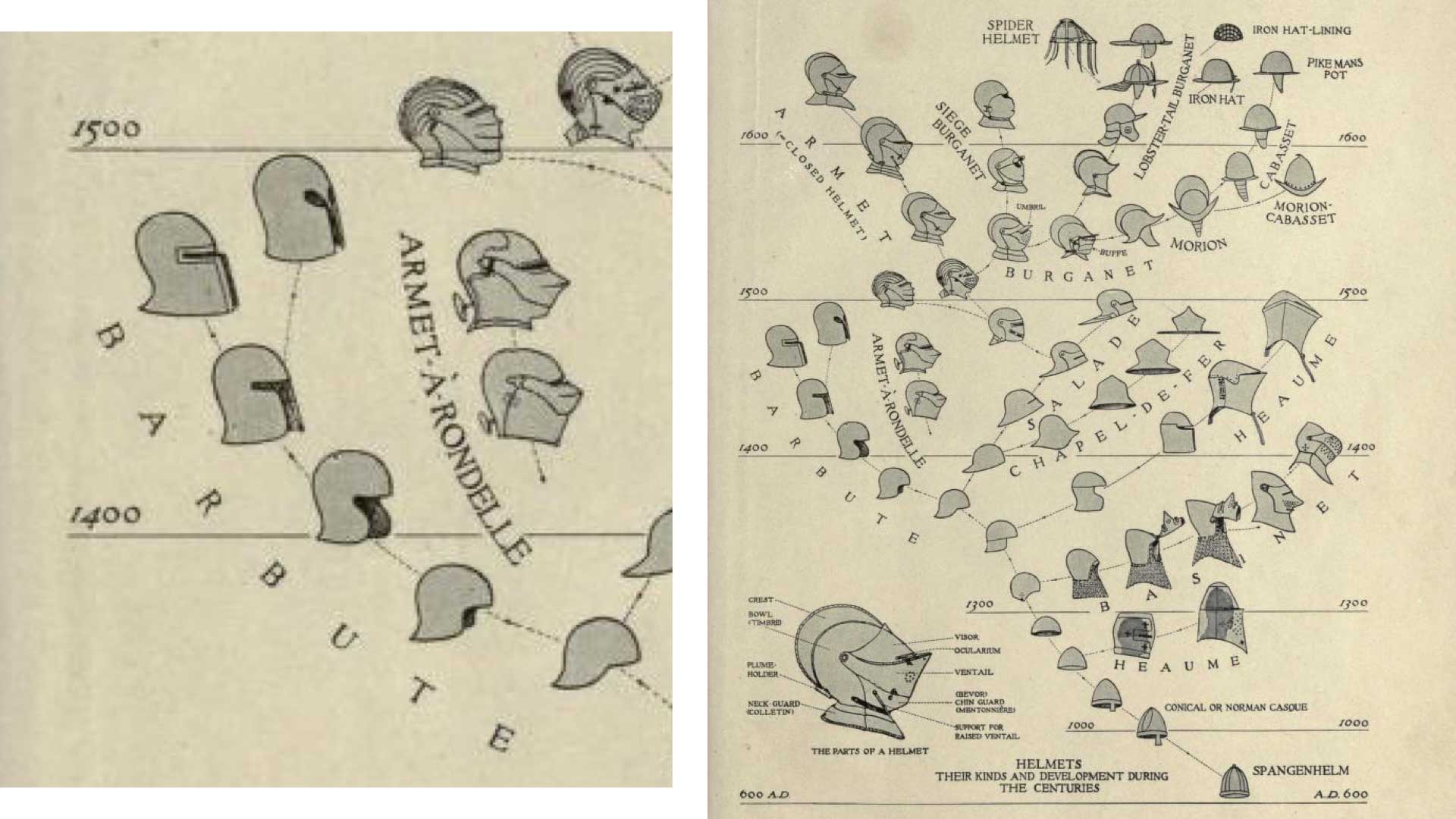
7. HELMETS is by Bashford Dean (c. 1917), a zoology professor and the man who established the Metropolitan Museum of Art's Department of Arms and Armor. You can see his two expertises combine in this Darwinian evolutionary tree of medieval helmet design. The branched structure looks like a biological evolutionary tree. It reminds us that technology morphs over time too.
The illustrations let us know at a glance that the topic we are dealing with is the age of knights. The dots that link the helmets suggest some logical relationship between them. Further inspection reveals that connected helmets look similar to one another. Imagine how less engaging—and less informative—this piece would be if each helmet was represented by a circle instead of an illustration.
This chart prompts so many questions-- why did helmets evolve? Why did certain branches wilt? Were they overly-specialized? Did fashion change? Did tools change? Did metallurgy change? Did weapons change? Were individuals changing their helmets or were centralized designers controlling these decisions?
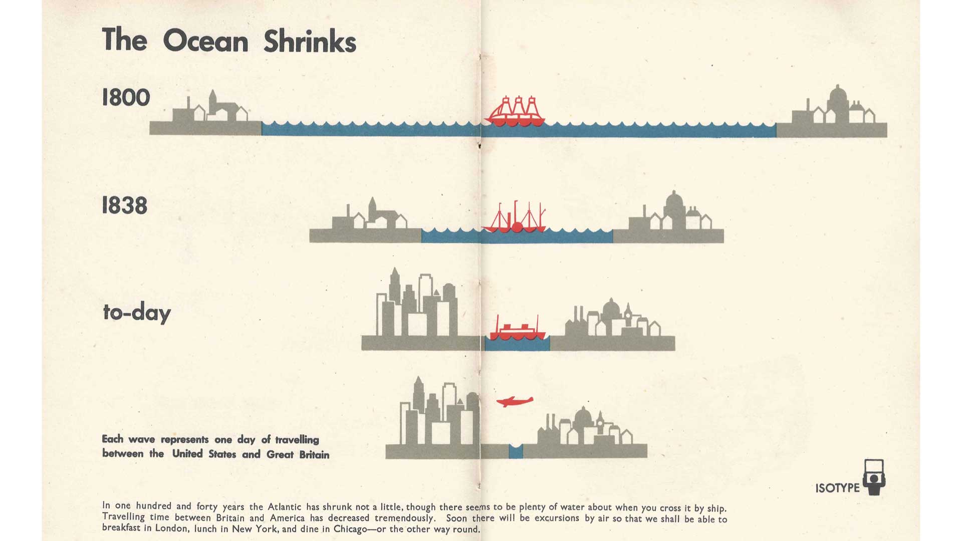
8. THE OCEAN SHRINKS was created by the Isotype Institute (c. 1943) for the book Only An Ocean Between. It shows how the Atlantic Ocean has apparently shrank with faster transportation. It reminds us of Cheysson’s earlier travel-time cartogram.
The diagram and its styling appears simple, almost childish. The big idea hits you first: the world is getting smaller. Look closer. The use of color is sublime. See how the designers baked in all kinds of detail. Each wave represents a day of travel, the most salient red vehicle changes form from boats to a plane. The city skylines grow (is that London with St. Paul's?). Yet these details do not distract from the big lesson.
Learn More
The canon of historic visualization is vast. It can become overwhelming. As you explore the following resources, keep in mind their originating context. They may be static, but they are still interactive. Many examples were designed for a more patient audience. Take time, read the details, zoom in and out with your eyes. Historic viz was not designed for social media feeds. Their original canvases were not pocket-size screens. They were often printed on sheets of paper larger than your biggest monitor. If you find a favorite piece then consider printing it out at the original size. Enjoying it like this will help the viz come back to life. Give them your attention and you will be rewarded handsomely.
Follow RJ @infowetrust and Andy @acotgreave on Twitter.
Resources for further exploration:
- Watch the livestream with Andy and RJ on YouTube
- Explore more historical data visualizations in this interactive timeline of historic visualization milestones
- Check out this list of some of my favorite books about the history of data visualization (and some obscure ones too)
- Join the Data Visualization Society to be part of the #topic-historical-viz Slack channel. We have ongoing discussions in our there with over 500 members
Verwante verhalen

5 Ways to Use Tableau Public to Achieve Your Goals
 11 januari, 2025

World Mental Health Day: Elevating Awareness Through Data Visualization
 10 oktober, 2024

From TV Screens to Tableau: Visualize Your Favorite Shows with IMDb
 31 augustus, 2024