While adorable, gauge charts can be misleading and take up too much space. 5 Diagrammtypen, die Sie vermutlich noch nie verwendet haben und die jedem Dashboard ein optisch attraktives Aussehen verleihen. In just a few weeks, I'll have been working at Tableau for a whole year! What better way to celebrate my "Tableau-versary" than to present this month's round-up of amazing blog posts about Tableau? October was a busy month in the blog-o-sphere. We saw an explosion of creative tips, tricks, and vizzes—and even found out that the Tableau Zen Masters don't know everything. The Tableau community also got wickedly creative this month. KK Molugu built an amazing piece of viz art. And I must give a shout-out to Jonathan Drummey, who wrote what I think may be the best title I've ever seen in a blog post: "O Extract, Where Art Thou?" So what are you waiting for? Check out this month's round-up of Tableau tips, tutorials, and wickedly creative hacks! Eindeutige Zahlen sind ein entscheidender Faktor für Analytics, ob es sich um die Zählung der einzelnen Patienten in einem Krankenhaus, um die Anzahl der eindeutigen Transaktionen im Einzelhandel oder um die Anzahl der Flugzeuge einer Flugflotte handelt. Die Ermittlung eindeutiger Werte in Tableau geht spielend leicht. Sie können mit einem Klick im Handumdrehen die Gesamtwerte für die eindeutige Anzahl ändern. Allerdings handelt es sich dabei auch um eher umfangreiche Berechnungen, die oft sehr langsam ausgeführt werden, vor allem bei großen Datenmengen. Ich möchte nun einige Alternativen vorstellen, die zu den gleichen Ergebnissen führen wie die Ermittlung der eindeutigen Anzahl.Alle Visualizations Storys

Why bullet graphs pack more punch than gauge charts
 20 März, 2015
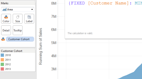
Vorschau auf Tableau 9: Einführung in LOD-Ausdrücke (Level of Detail – Detailgenauigkeit)

5 stilvolle Diagrammtypen, die Ihre Daten zum Leben erwecken
30 Dezember, 2014
Santa on Tableau: "It Takes a Lot of Data to Travel the World in One Night"
 23 Dezember, 2014

Naughty or Nice? Santa Uses Tableau to Decide Who Gets Coal
17 Dezember, 2014
How Santa Claus Uses Tableau
8 Dezember, 2014

Best of the Tableau Web... October 2014
11 November, 2014
Check Out These Data Whiz Kids!
1 Oktober, 2014
What is the Value of Visualization?
 13 Juni, 2014

Where do YOU get inspiration for your dashboards?
20 Mai, 2014

Chocolate + Data = One Delicious Must-Read
17 März, 2014
Tipps und Tricks: Alternativen zur Berechnung der eindeutigen Anzahl
 24 Mai, 2013
Visualizations
Visualizations
Hier finden Sie detaillierte Informationen über einen Aspekt, den wir der Tableau-Berechnungssprache hinzugefügt haben. Die Änderungen in der Sprache sind klein, täuschend klein, aber die Auswirkungen auf Ihre Datenanalyse werden tief greifend sein. LOD-Ausdrücke (Level of Detail – Detailgenauigkeit) in Tableau 9 ermöglichen reichhaltigere und besser wiederverwendbare Visualisierungen.
Visualizations
Visualizations
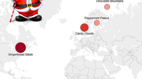
Over the past month, we've had the time of our lives interviewing Santa about how he uses Tableau. Last week, he shared his naughty-or-nice dashboard. And the week before, he told us how he monitors toy quality around the world.
Now, as he enters crunch time for big day, Santa is prepared to share his third and final dashboard. And this one could be the most important of all. After all, what's the single most important part of his global operation?
Being able to travel the world in a single night.
Visualizations
In case you missed it, last week Santa revealed that he uses Tableau to manage his global operations. And for every week in December, he'll share a new dashboard that looks at one area of his business.
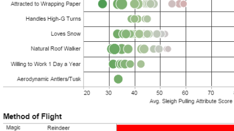
In response to Santa's statements, we received a number of questions—including how Santa uses Tableau to determine who gets a lump of coal.
This week, we're excited to share one of Santa's most important dashboards: His naughty-and-nice list.
Visualizations
Here at Tableau, we get to hear amazing stories about what our customers are doing every day. From transportation to retail to entertainment to education, customers in all industries and job functions are doing amazing things with their data. But there's one customer who defies all classification, and he's just agreed to do a case study with us.
His name is Santa Claus.
Visualizations
Visualizations
Kids these days! From the young girl who shares scatterplots on YouTube to the 11-year-old who builds Story Points in his free time—future data rockstars prove that Tableau is an all-ages tool.
Visualizations
V = T + I + E + C
Does the above equation contain all you need to know about measuring the success of your visualization? John Stasko thinks so, and he explained why in his keynote at EuroVis 2014, in Swansea, last week.
Visualizations
Designing effective dashboards is a challenge of design, usability, and efficient insight. There are many sources of inspiration. At our Conference on Tour in The Hague, Steffen Mueller (@iluvanalytics) from HERE built a NASDAQ-inspired dashboard of net promoter scores.
Visualizations
In 1947, Kilwins opened its first chocolate shop in Petoskey, Michigan. Since then, nearly 100 franchises have opened their doors across the country. And with decadent offerings such as fudge, ice cream, and a signature treat called the Tuttle, it's no wonder this chocolatier has been so successful!
But even with such a delicious existence, something was missing from this business' life. We know, it's hard to believe. But in a recent interview with Jeff Hall—Kilwins' Director of Marketing, Commerce, and IT—we learned what happened when Kilwins added a new ingredient: a better business intelligence tool.
Visualizations