How this data-driven Minnesota school district is supporting students during COVID-19


Heat map of socioeconomic need for meal planning (Northfield Healthy Community Initiative - HCI)
As COVID-19 has progressed through the U.S. and states have implemented stay-at-home orders, nearly everyone’s lives have been disrupted. For schools and the kids who attend them, these changes have been particularly challenging. Instead of sitting with each other in classrooms, students are attending courses remotely, and interacting even more over screens than in real life. Without the usual face-to-face interactions, teachers are struggling to figure out how to assess student engagement and progress, and make sure their kids are feeling supported.
While every school district is grappling with these challenges, the community in Northfield, Minnesota has decided to meet them head-on—with data.
Northfield is home to around 20,000 people, and around 4,000 of them are students in the local public school district. Over a quarter of those students qualify for free and reduced lunch, and around 22% are students of color. The district is part of the StriveTogether network, which helps schools engage a wide range of stakeholders—from parents to businesses to investors—in improving educational outcomes for kids. In 2015, StriveTogether began a partnership with Tableau Foundation to expand its use of data across the network. Through that partnership, Hope Langston, the Director of Assessment Services for the Northfield Public School District, participated in a fellowship program in 2017 to learn Tableau and apply it to her work with the schools. Since then, the Northfield Public School District, as well as the Northfield Healthy Community Initiative, which creates programs to support young people, have used Tableau to make decisions and assess their performance.
When COVID-19 forced schools to close across Minnesota, leaders like Langston and Austin Bauer, the Director of Reporting and Analytics for Northfield Healthy Community Initiative, which serves as the backbone organization for the StriveTogether cradle-to-career initiative Northfield Promise, knew that data could help them ensure that their students continued to succeed throughout the challenges.
Mapping to identify needs
“When we launched what we’re calling Distance Learning here in Minnesota, we knew we had to go after basic needs and make sure our students who depend on free and reduced lunch could still get meals,” Langston says. “We had to figure out where our pockets of need are, map out our bus routes and determine where we could place meal distribution sites.” Student socioeconomic data is protected, so Bauer quickly created a heat map using aggregate addresses that identified the greatest need so the school district could understand where to set up distribution sites. He now manages a daily tracker to show how many meals go out to families each day. That way, Northfield administrators can see changes over time in distribution at each site, and be prepared to respond if they notice a drop in meals or other causes for concern.

Meal distribution counts by location (Northfield HCI)
“Our visualizations are not polished,” Bauer says, “but they don't need to be in order to be actionable.” Langston adds: “It's not about how intricate or complex the dashboard looks. It’s about if it’s helping us meet a need in our community, and getting us the information we need as clearly and as quickly as possible.”
Mapping the community has also enabled the Northfield Public School District to meet another critical need: internet access. When distance learning was first announced, “we had parents calling and saying that they didn’t have internet for their kids to use at home,” Langston says. “So we knew where they were and we knew where other pockets of need are in our community.” Bauer mapped out the information in Tableau, and the team was able to take the images to their local internet service providers—both the corporate provider, Charter Communication, and the city-managed network—and ask them to help bring the houses online.
“It’s an equity issue,” Langston says. “Charter was saying they would offer two months of free internet, but if you have any barriers like language or poverty, it’s difficult to navigate.” Using the data they had on who needed help, Langston and her team were able to mobilize a group of local volunteers to help families in need navigate the process, and the connectivity rates shot up. Now, they’re able to deploy the same tactic—identify the need, and mobilize a support system to help—if a family reports an outage or if their bandwidth is not strong enough to support more users than normal. “We couldn’t have done this if we didn’t have an accurate picture of what the need is,” Langston says.

Map of students without internet access to plan community response (Northfield HCI)
Tracking student engagement
Alongside meeting students’ basic needs at home, the Northfield team wanted to make sure that students stayed connected and engaged with their schoolwork as they transitioned to distance learning. “Getting kids connected to the internet was a first step—and the next step is figuring out if they’re actually engaging,” Langston says. Data could help with that, too.
Bauer created a dashboard that enables teachers and administrators to access real-time information about student attendance in virtual classes and their engagement. Northfield keeps this dashboard private to protect student information, but on it, administrators can easily access data on student attendance. “The nice thing about this is when you click on a student's name, you can quickly see which period they were absent: It gives you their teacher's name and their teacher's email. So if you're an admin, you can quickly find out who to notify and connect with. And it's sorted to show those students who are most at risk based on absences,” Bauer says.
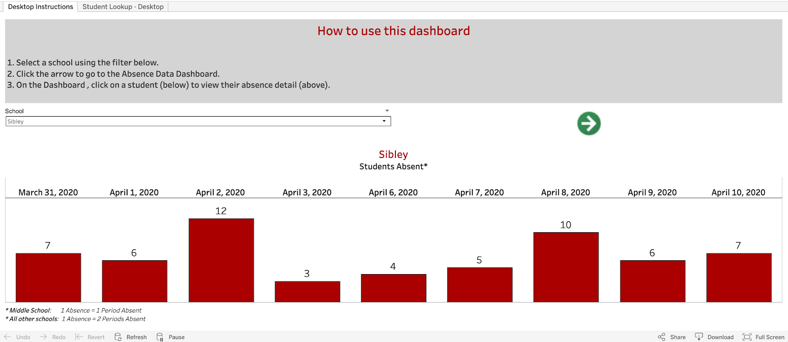
Dashboard tracking student attendance (Northfield HCI)
Having this insight has enabled Northfield to respond in real time to student needs. “This is how we discovered some other kids with ongoing internet access problems, or other kids who haven’t been able to engage because they're taking care of their younger siblings during the day,” Langston says. “That’s helped us adjust and work with students—maybe it makes more sense for them to watch the Zoom meetings in the evening and record their attendance in a different way. It’s building in some flexibility for families.” Teachers and admins get this data every day, Langston adds, so they can respond as quickly as possible.
Understanding opportunities for support
One of the biggest gaps created by distance learning, Langston says, is the loss of emotional connection and understanding that classrooms foster. Teachers and school administrators need a way to be able to read their students emotions and assess their well-being, even if they can’t see them.
So Northfield has crafted a set of surveys that they’re asking students, parents, and teachers to take. “The main need was to know immediately how students were feeling about distance learning,” Langston says. Langston created a chart that reports survey data about student sentiment: Right now, the majority of students are saying they’re adjusting to distance learning but with some difficulty. That tells the schools that they’re doing many things right, but it’s still a time of upheaval and transition. They can repeat the survey to see how sentiment changes over time.

Student sentiment chart by grade level (Northfield School District)
For parents, the survey included questions on how they felt their kids were adjusting, and how much time they were spending on distance learning. It also included a portal where parents could issue “shout-outs” to teachers or administrators who had been particularly helpful. “We want to collect data on engagement and more logistical things like tech issues, but we also wanted to create an avenue for positive feedback and a way to make sure that gets back to principals and other administrators,” Langston says. Staff, too, were invited to fill out a survey assessing how they’re feeling amid the transition.

Staff sentiment tracker (Northfield Public Schools)
“The feedback we’re getting now will help us adjust course—because schools are closed for the rest of the year—and it will allow us to keep assessing how we’re doing,” Langston says.
The Northfield team had a one main goal in their use of data to problem-solve amid COVID-19. They wanted to make sure they could access the most complete information on their students’ needs as they could—and that they could understand it and take immediate action where needed. “You can’t respond if you don’t know what the issue is, right? That's where Tableau helps us identify and really target what the scope of the problem is,” Langston says. The dashboards that the Northfield team created for its COVID-19 response are not those that a Zen Master might create, she adds, but they have been widely deployed and used across the community because they are comprehensible, up-to-date, and actionable. What Northfield has done with their data is leading their community through change, and even though the district is small, their comprehensive approach can serve as a template for any schools navigating uncertainty during the pandemic.
To learn more about Northfield’s data-driven response to COVID-19 and how they’re continuing to serve students, reach out to Hope Langston at hlangston@northfieldschools.org or Austin Bauer at austin@northfieldhci.org.
Tableau is sharing stories and examples of how data is being used to respond to the coronavirus through the COVID-19 Data Resource Hub. Read more here.
Histórias relacionadas
What we can learn from open data: COVID-19 in the Netherlands
 29 Abril, 2021

After a year of COVID-19 charts, eight data communication lessons learned
 19 Abril, 2021
Data innovations in public health: PATH creates COVID-19 diagnostic test dashboard
2 Abril, 2021