The Viz Police: New Tool for Long-Tail Keyword Search
The Viz Police is a series of commentary on visual analysis in the wild, based on how well the chart in question conveys information. Charts that offend will be cited by the Viz Police.


The Viz Police is a series of commentary on visual analysis in the wild, based on how well the chart in question conveys information. Charts that offend will be cited by the Viz Police.
In this graph, Juice Analytics uses its new tool, Concentrate, to analyze the long-tail searches of travel sites: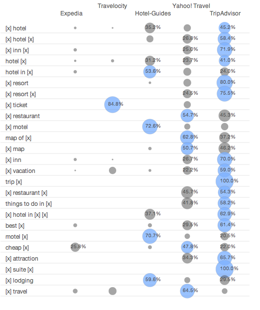
Good Cop: Kudos to Juice for Visualizing Long-Tail Search
Most keyword search data is presented in long, unintelligible lists. Google Analytics adds more dimensions to its list, which would be helpful if that didn’t just make an even longer list. This is typical:
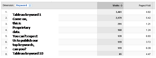
Who could look at that table and pick out meaningful patterns? Google Analytics’ new visualization tool makes the data a bit prettier but no more understandable.
Concentrate does good work by letting you visualize not only your own keywords, but also those of your competitors (you need Hitwise or Compete to get the data). Their view is far superior to lists of keyword traffic, both in its visual presentation and grouping os similar long-tail terms using widlcards (like "hotel [x]"). Andy Cotgreave, commenting on another Juice post, did the same chart in Tableau.
Bad Cop: Bar Charts Might Be Better
While bubble charts can be useful, bar charts might be a better representation of data in this case. On the rightmost column, you can see that several of the bubbles overlap each other. This makes it hard to gauge their relative size. And at first you might think that the bubbles that exceed their upper and lower lines represent data of over 100%, but they don’t.
The numbers inside the bubbles are also distracting, and could probably be done away with. And finally, the colors are a bit confusing. Why some blue and some grey? Why no legend? But now we're just being grumpy. Overall, we really like what Juice has done.
Visionary Cop: Explore the Data
Tableau data visualization guru Jock Mackinlay points out that the real story in this data would be in how you explore it. Ideally, you’d be able to sort, filter, and group terms interactively (yes, you can do that with Tableau).
Viz police bonus link: PTS blog has a great post on bad bar chart practices. Send in the clowns!
